Friday 28 May 2010

Typographic Circle Talk

Yesterday evening I was invited to a Typographic Circle talk at the JWT offices in Knightsbridge. The talk was by Studio8 with the title "Collaboration in Type & Print" and ZoĆ« Bather went through a number of the studio's projects culminating with their identity work for the Central School launched earlier this year.

What was particularly interesting was the way she showed one project leading to another and the way that a friend, contact, previous colleague (etc. etc.) lead to another project and so on. It was cleverly illustrated as follows: 
All the work featured in the talk is on their site: http://www.studio8design.co.uk/

Anyway, it was an all round excellent evening and there was FREE BEER as well!  - thanks to the Typographic Circle sponsors, who are : JWT, Pentagram, Neoco, GF Smith (that's them not us) and the Wynkyn de Worde society.

Here's some pics (...that's Joe Sharpe from Applied Works (http://www.appliedworks.co.uk/) staring at the camera)


The next talk is on 24th June by Airside - book now or risk disappointment.
Posted by Justin Hobson 28.05.2010

Thursday 27 May 2010

& SMITH - new website

Have a look at their new site: http://www.andsmithdesign.com/
It's a new site showing some of their great projects. One particular project which  I love (and worked on, with them) is their project for the PR company, Mission. It is a series of broadsheets folding to A5, printed on Redeem 100% Recycled 100gsm, and all the images are stunning - here are a couple of pics but have a look at their site to really appreciate the project.


Posted by Justin Hobson 27.05.2010

Tuesday 25 May 2010

2010 World Cup Poster - made with no trees at all!

Here's a World Cup poster for the typographic purist! (...and no trees were hurt in the process)

The A1 size poster has been designed for a wine merchant with two shops, Wine One Hundred (Oxted)and The Secret Cellar (Tunbridge Wells)

Design is by Em-Project (http://www.em-project.com/)

The poster is very simply produced in one colour litho and is printed on a brand new paper our ours which is made without using any trees at all! It is part of a new range which we are launching called SHIRO from Italian paper manufacturer Favini. This particular product is called Shiro, Tree Free 120gsm (the clue is in the name - Tree Free means it is made from annual plants such as bamboo, cotton or bagasse ...there is no tree content at all!)

So there you go, you heard it here first! I will be putting a post on the blog about the new papers in this range but if you have a project on the go and you think this might be an interesting option, then get in touch and I can get you some some samples now. I will be mailing out new swatches soon.

In the meantime I have file copies of this lovely poster (that's me holding it up) so if you would like one, please e-mail me (justin@fennerpaper.co.uk) and I'll put one in the post to you.

http://www.thesecretcellar.co.uk/
http://www.em-project.com/
http://www.favini.com/
Posted by Justin Hobson 25.05.2010

Monday 24 May 2010

Lee Goater - Design, Art Direction & Branding.

Lee Goater has decided to take the plunge and branch out on his own. Lee has been Creative Director at Leeds based agency Lowd & Klea (L&K) for five very happy years. During this time I've worked on some lovely projects with them including pieces for the Northern School of Contemporary Dance and Craven College.
Lee is now working on his own projects and as a freelance art director. Good luck and best wishes to Lee and I know everyone at L&K will miss him.
http://www.leegoater.com/
http://www.flickr.com/photos/25452188@N07/
http://www.lowdandklea.com/
http://www.landkbrand.com/
Posted by Justin Hobson 24.05.2010

Friday 21 May 2010

Typeface - The Movie

This Wednesday evening, I went to watch a film! I was kindly invited to the screening of a film called Typeface which was screened at the London College of Communication at the Elephant and Castle in London and hosted by Alex Cooper and Rose Gridneff at the Letterpress workshop at the LCC.

The film is directed by Justine Nagan and is about a rural US midwestern type museum and print shop. The museum is based in the old Hamilton Company's wood type manufacturing factory in Two Rivers, Wisconsin.
It is a fascinating film which not only gives a great insight into the roots and manufacturing of woodblock type and it's increasing use as a design and artistic medium but also documents life in small town America.

Follow this link to read about the film: http://typeface.kartemquin.com/
After the screening, there was a tour of the Letterpress workshop and some drinks!

Below is Alex Cooper talking to letterpress legend Bill Naylor.
It was a most enjoyable evening and great to see so many students and practising designers there.

Sandra Kemp, Head of College, is very supportive of the Letterpress Workshop and announced that they will soon be running Summer School courses which I think will attract a lot of interest amongst graphic designers.

Thank you to all those involved, especially Alex Cooper, Rose Gridneff, Sandra Kemp, Les Claridge and Millie Langlands.

Posted by Justin Hobson 21.05.2010

Thursday 20 May 2010

New Brook Buildings

Here is a job which that just exudes fantastic quality of both print and finishing (oh, and of course a pinch of all right design as well!). The project is a brochure for a property called New Brook Buildings.

Size is 240x330mm. Key points of interest is the fantastic de-bossing on the front cover (which if you enlarge the pic below, you should be able to see). It is also "swiss-bound" (explanation below) and the text is stepped with divider pages (printed with mono imagery).
Below pic shows the Swiss binding. For those that are unfamiliar with this type of binding, it is essentially a section sewn or perfect bound binding method which has a "lip" of about 15/20mm of cloth wrapped around the spine. The cloth covered spine is stuck flat on the reverse of the text block with a strip of glue into a 4pp cover with a "freestanding" spine which means that the cover (which can often be very springy with normal adhesive binding) sits very flat.
The text is stepped and is very tricky from a production point of view, especially with this type of binding. This has been done exceptionally well.
Below is the opening spread - inside front cover on left, stepped text on right.
Some of the spreads below: 
Design is by London design agency dn&co who specialise in property branding. Creative Director is Ben Dale.

Print production is by Push and very nice it is too. Both "ink on paper" and finishing is superb.

Oh and I suuppose I'd better mention the paper! It's printed on our Omnia 320gsm and 120gsm which gives the job a tactile and engaging feel. As well as reproducing the images superbly, it has a high bulk and as a result, the deboss works superbly.

Post by Justin Hobson 20.05.2010

Tuesday 18 May 2010

Poly Records use Deep Orange

Here's a really simple, effective job that's clear, clean and really well produced (and I also have a point to make at the end of this post...).

These are A4+ capacity folders produced for an US record label called Poly Records. They are produced on Colorset Deep Orange 270gsm and are silkscreened in white only. 
Design is by Maddison Graphic based in Ely and silkscreening is by Screenprint Colourworks.

Now, the point I want to make is that I get many people who won't look at less than 300gsm for a folder (many people want 350gsm plus) and the biggest problem is they won't actually look and feel different materials for themseleves and often make incorrect assumptions about how it will feel. It is quite true to say that a 300gsm silk coated probably could be a bit flimsy for a folder such as this. However using uncoated materials such as Colorset (and especially Colorset which has a very high bulk) means that lighter weight can and should be considered. Colorset 270gsm has a bulk of 370microns! This also serves as a good reminder about why it is worth getting a dummy made so you can actually get the look and feel of the end job - here ends the sermon!

Posted by Justin Hobson 18.05.2010

Monday 17 May 2010

Soccer Aid - World Cup 2010 Poster

Now some people might think this is a bit of a strange one to see on my blog as it's not actually printed on our paper BUT it's for charity...(and i'm hoping my reward will be in heaven)

This is a world cup poster which is being sold to raise funds for Soccer Aid, which is a UNICEF charity that raises money to help children around the world and is endorsed by Robbie Williams amongst others. http://www.socceraid.org.uk/.
This A1 size poster has been conceived and designed by David Watson/Trebleseven design.

The Poster was produced in collaboration with G&B Printers in Feltham and is printed on Phoenixmotion.

If you fancy one for the studio, please buy one - all poster sales will benefit Soccer Aid. To get your own copy, please contact david@trebleseven.com

http://www.socceraid.org.uk/
http://www.trebleseven.com/
http://www.gfsmith.com/
http://www.gbprinters.co.uk/
Posted by Justin Hobson 17.05.2010

Friday 14 May 2010

Hero #2

Here is the second issue of the new zine called Hero which is aimed at bringing fresh new international male model talent to the fashion world - "THE FACES OF TOMORROW'S FASHION"

Designed, edited and published by duo James West & Fabien Kruszelnicki under the imprint Fall Press. As before, the list of photographers is too long to list unfortunately but there are some really excellent images.

Size is 210x275mm, portrait, perfect bound with a 4pp cover and 98pp text. It is printed on our lovely uncoated StarFine White 270gsm and 115gsm. As previously, print is by Push.

Here are samples of just a few spreads:
Posted by Justin Hobson 14.05.2010

Thursday 13 May 2010

Tactical A.U. Identity

Here's a lovely new piece of identity work by D8 in Glasgow. Tactical A.U. is a new artists support and ‘creative realization’project which aims to develop, support and advance the artistic ambitions of Scottish based artists both here in the UK and abroad as well as continue to work with some of the most exciting and challenging artists in Europe.
The letterheads are on Colorset Ash 120gsm, printed 1 colour litho and "Microdot foil". The business cards are on Trojan Whiteback 400gsm with black foil and 'Microdot' foil and 3mm forme cut radius corners.

This is a really good example of mixing materials with great effect. With many of projects I work on, people are obsessed about having everything matching (including self ashesive labels!) Sometimes this is necessary but quite often if the identity is strong enough, mixing the materials used can be a really positive asset to the identity.
Print and foiling by Ian Stopford at IST http://www.istprintingservices.co.uk/

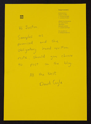
Design by David Coyle at D8 in Glasgow and thanks for the lovely note as well (you'd never guess that their letterhead was on Colorset Solar!):
http://www.weared8.com/
Posted by Justin Hobson 12.05.2010

Tuesday 11 May 2010

London Design Festival 2010

This is an invitation to a press conference in May announcing the plans for the 2010 London Design Fesitval.
The A4 size invitation (top left hand section of above) folds out to an A1 size poster (as above). It is printed on our Offenbach Bible 60gsm, which as regular readers of this blog will know, not only prints exceptionally well but folds beautifully and the paper has a lovely "rattle" in the hand. Perfect for a job like this. We also supplied bright red C4 envelopes for them to be sent out in.

Design is by Pentagram.
The designer is Beatrice Blumenthal from Domenic Lippa's team. Production by Kevin Purdy and print is by Principal Colour. Printed in two colours, black and red.
http://www.londondesignfestival.com/
http://www.pentagram.co.uk/
http://www.principalcolour.co.uk/

Wednesday 5 May 2010

Repitition is Truth

This book catalogues a series of 14 paintings by the British artist Rachel Howard, which Damien Hirst commissioned for his Murderme art collection. The series is based on the Stations of the Cross but is also a broader commentary on the universality of human rights abuses and people’s capability for cruelty towards each other. Including shots from the artist’s studio, the book also gives an insight into Rachel Howard’s practice.

The size of the book is 190mmx320mm. It has a 56pp text printed on our Marazion Ultra 150gsm. The 20 illustrations also have a gloss UV varnish applied.

The publication has a genuine bookcloth cover with black foil text. A particularly nice touch is a deboss logotype on Page 1 of text, very subtle but a really nice touch. The excellent print production is by Push (www.push-print.com)

Design is by Emma Scott-Child and published by Murderme.

http://www.damienthirst.com/
http://www.othercriteria.com/

Tuesday 4 May 2010

Jobs from the Past - Number 8

Regular followers will know that my first post of every month is a "job from the past" so that I can show some of the really good work from years gone by and here's one from three years ago.

Per Una Lookbook - Autumn 2007

This is a very luxurious looking publication published for Marks & Spencers fashion label, Per Una.

The size of the job is 230x305mm Portrait. It uses Flockage Colours 400gsm in Anthracite on the 4pp cover, which is "heat de-bossed" and foiled in pink. The catalogue has an Italian theme with the photography having been done in Venice. The lovely touch was to produce a "Venetian" mask out of the same material for the invitation to the premiere of the collection (see pic below).


The 28pp text is printed on Brand X FSC 150gsm which is a recycled and virgin fibre combination.

Design and Art Direction is by Angela Cann at Rare Creative, based in London.

The cover alone makes this a stunning job but the nice touches such as the invitation and heat de-bossing make it a really accomplished piece of work.

It is printed four colour process, offset litho by Spot On Print in High Wycombe.
Posted by Justin Hobson