Friday 28 December 2012

Studio Cookbook 2

This is the new Studio cookbook2, published by East London Riso printer, Hato Press. Studio cookbook1 was a collection of recipes aimed to inspire social lunches at the workplace and included recipes from åbäke, Alex Bettler, Mind Design, Sara De Bondt studio and many more.

Studio cookbook2 includes recipes from An endless supply, AND Publishing, Art Licks, Goodwin Hartshorn, The Gourmand, Manystuff, Meadham Kirchhoff, Sarah Gottlieb, Fraser Muggeridge studio, Bahbak Hashemi-Nezhad and Sophie Demay  to name but a few!

The book is 236x132mm, portrait. The covers and end papers are cut 20mm short at the head. There are 60pp of text and the binding is "spiral bound" in a dark red plastic spiral. Spiral binding is different from wiro binding. Spiral binding is formed from a continuous length of either plastic or metal and is a finishing method produced by a few specialist binders/finishers. It is an effective binding method which tends to hold things a bit tighter than a wiro.

The book is printed on a mixture of Coriandoli and Flora. The cover is on Coriandoli Blu 250gsm but the text is a mixture of deliberately mixed up shades from Flora and Coriandoli ranges which gives the book a beautifully unstructured feel which works fantastically with the Riso printing. The text is all printed in one colour, although that colour depends on the shade of paper and the recipe - it works really well.
The book is edited and designed by Ken Kirton and thanks to Ken for sending me a copy and a lovely note.
The cookbook costs £12 and although this post comes a bit late to make this a Christmas present, it is a great idea for any upcoming birthdays etc!

www.hatopress.net
http://kenkirton.com
Posted by Justin Hobson 28.12.2012

Monday 24 December 2012

A Triangular Christmas

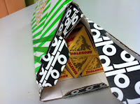
Here at Fenner Paper, we were delighted to receive a GP Tube-Mailer ™ (which is Generation Press's own invention) packed full of Toblerone bars!
Generation Press printed matching sleeves with the correct brand colours to go round the triangular bars of chocolate, honey and almond deliciousness! 
 ...and here's a close up of the GP Tube-Mailer ™, which in many ways is much more convenient and more robust than a postal tube - andthis is an excellent way of showing just how versatile this form of packaging is!
Our thanks to all at Generation Press for their generous, thoughtful and beautifully presented present. It's worth remembering those companies that look after their suppliers and not just their customers, after all any company is only as strong as it's suppliers! 

Happy Christmas!
Posted by Justin Hobson 24.12.2012

Wednesday 19 December 2012

Heal's Christmas 2012

This is a lovely invitation which makes you feel all Christmasy! This is the invitation to the Heal's Autumn Winter press show and it has all the ingredients of luxury, shades of mulled wine, and velvety feel with a bit of seasonal gold all thrown in!

This beautiful inviatation is A5 (210x297mm) landscape format and is made using our Flockage Colours, Bordeaux 400gsm, hot foil blocked in metallic gold foil. It is triplexed, together with two layers of Colorset Crimson 270gsm, which again is hot foil blocked in gloss white foil and metallic gold.
Design is by London based consultancy The Grid. Creative Director is Johnathan Collins and designer on the project is Matt Crowe. Beautiful foiling and finishing is by Push.
 
Posted by Justin Hobson 19.12.2012

Tuesday 18 December 2012

Happy Faces!

From time to time the teachers from Happy Faces pre-school in Tonbridge come and load up their car with left over paper scraps that are just a bit too good to go in the recycling bin!
 
Today, we had a lovely surprise, as a dozen gorgeous cupcakes were dropped off to say thank you and wish us a happy Christmas.  
Thank you Happy Faces, they were yummy! 
 
http://www.happyfaces.plus.com/
Posted by Justin Hobson 18.12.2012

Friday 14 December 2012

Frieze Film 2012

Frieze Film is a programme of artist films screened to coincide with Frieze London. Curated by Sarah McCrory, in 2012 the commissions included five new films by Bertrand Dezoteux, Patricia Esquivias, Jimmy Merris, John Smith and Wu Tsang & Nana Oforiatta-Ayim. This piece of promotional literature is the touring programme and works as both an information leaflet and a promotional poster (front and back film stills by Linder)
The size is  A5, landscape (148x210mm) and is a 16pp broadsheet format folding out to 592x420mm. The material chosen is our Avebury Recycled Wove 135gsm, which is a neutral white shade and very tactile. The material suits the muted colours in the film stills and is beautifully tactile.
Reverse side:

The job was printed and finished by Bethnal Green based print cooperative, Calverts. If you haven't come across them, maybe you should have a look. Unusually for a print company, they are a worker's cooperative, therefore the management, tasks and profits are all shared equitably - almost sounds too good to be true!
  
Posted by Justin Hobson 14.12.2012

Thursday 13 December 2012

Visit to Greiz Mill


Last week, together with Mr Fenner himself (!),  I was fortunate enough to visit the mill in Germany that makes our Colorset paper. Greiz Mill is part of the Koehler group of companies which is still a family owned papermaker. The group is mainly involved with the production of thermal coated and carbonless papers, but the mill we visited specialises in producing recycled products.

Greiz is a very attractive, ancient town in Thuringia in eastern Germany, close to Leipzig and is unusual in having two castles. The mill can trace it's history back to the 1590's, with the current machine at the mill being installed in the 1960's.

You can see from the picture here, how seriously they take their recycling (and it is stacked very neatly)


...and here I am, shivering, in front of the bales of recycled fibre (see the snow on the ground!)


Mr Mallon, the Technology and Quality Manager, taking us through the various stages of the recycling process:


...and below is the picture that shows the reason that Colorset is such a well made sheet of paper. What you are looking at is a picture of a "twin-wire" paper machine, which is generally regarded as the best type of machine on which to make fine paper.
Effectively, the machine starts by making two seperate webs of paper which come together in the papermaking process making a superior, even sided sheet of paper (not to be confused with duplexing).

...and here (above) is the magic piece of equipment manufactured by Escher Wyss, called a "top former".

Here I am standing by the paper machine, which is making our Colorset Magenta, with a smile on my face knowing that our lovely coloured paper is made on a machine with a superior twin wire, while the coloured paper made for that other well known, Hull based paper merchant, is only made on a single wire machine!

I would like to thank everyone at Greiz and Koehler who made our trip very worthwhile and enjoyable.
Posted by Justin Hobson 13.12.2012

Tuesday 11 December 2012

The Rug Company

Chris and Suzanne Sharp founded The Rug Company in 1997 creating really iconic and desirable rugs. Uniquely, they achieve this by combining the ancient craft of rug making with the creative brilliance of contemporary designers including Alexander McQueen, Rob Ryan, Tom Dixon to name but a few. These beautiful rugs are available through a worldwide network of shops and outlets from London to New York, Los Angeles, Moscow, Hong Kong and more!

This is the catalogue for their new Studio Collection which includes Dhurries, Udaipur Dhurries, Tibetan Hand Knotted, Bamboo Ikats and cushions
Image reproduction was paramount but it was also important that the publication also projected the tactility of the actual rugs, so a silk or gloss coated paper wasn't an option. The material chosen was our Omnia. The cover would print, de-boss and foil beautifully and the Omnia would reproduce the photography with the delicate weave, bold patterns and strong blue solids superbly ...and it looks brilliant! Size of the book is 167x230mm, portrait format, perfect bound. 4pp cover is on Omnia 280gsm and the 64pp text is printed in CMYK throughout.  
Detail showing cover which is de-bossed and hot foil blocked in gold foil. This is one of those jobs that images of the publication look good but they can't really project the quality and production values that you feel if you actually had the piece in your hand. The detail in the foiling, the crispness of the de-bossing and the colour reproduction is simply superb. It's worth noting that Generation Press, who produced the job, are one of the few printers to have foiling and finishing in-house so they can keep a close control on quality and they certainly have with this job.  
Suzanne Sharp at The Rug Company, orchestrated the desert photography shoot and design was handled in house.
 
The excellent print, foiling and finishing is by Generation Press.
 
www.therugcompany.com
www.generationpress.co.uk
Posted by Justin Hobson 11.12.2011

Monday 10 December 2012

Amelia's "Drawn to Joy"

Last Thursday, I was invited to Amelia Magazine's little Christmas soiree hosted at eclectic fashion retailer, JOY in Brick Lane. This was combined with a book signing of her last book "Amelia's Compendium of Fashion Illustration". Drinks were supplied by Adnams and cakes by Molly Bakes.

Amelia Gregory is the founder of the magazine which published (on paper) ten issues over five years and became an independent publishing phoenomenon. Writing about fashion, music, art, photography, illustration and a whole host of other subjects, the publication built a popular following. We at Fenner Paper supplied most of the paper used for the magazines, printed by Principal Colour.  Amelia published her last printed magazine publication about four years ago in favour of concentrating her efforts on the website, blogging and twitter with great success and she also now has a beautiful baby.
Lovely cakes and Adnams ginger beer (alchoholic) ...very nice!
I met several interesting people including illustrator Emma Block (pictured) who makes many of her illustrations out of different papers, often printed paper pieces - they are really beautiful and cleverly put together. Emma is currently working on a children's book.
www.emmablock.co.uk

I also met Michelle Urvall Nyren, an illustrator who is establishing her own fashion range called Ever Reve.
http://www.everreve.com/

It was a lovely evening and great to see that Amelia's Magazine is continuing to go from strength to strength.

www.joythestore.com
http://www.ameliasmagazine.com/
http://www.principalcolour.co.uk/
Posted by Justin Hobson 10.12.2012

Thursday 6 December 2012

Irrational Marks: Bacon and Rembrandt

Irrational Marks: Bacon and Rembrandt is an exhibition hosted by Savile Row gallery, Ordovas. The exhibition is concerned with the influences of Rembrandt's self-portraits on Francis Bacon's own self-portraits.

Here's the description of the idea by the designer of the book: "Bacon kept a number of documents and source images relating to Rembrandt's work in his studio. The cover image is one of those working documents on show in the exhibition. Covered in paint from his studio, folded and creased, it represents both artists who lived three hundred years apart. The typography draws you into the eyes, something which Bacon refers to in his acknowledgement of the influence of Rembrandt on his work. The red lettering on the cover along with the red endpapers give a spark of energy and echo the life which is present in both the artists' works."
The size of the book is 240x310mm, portrait and is section sewn, casebound in a paper over board cover. The end-papers are our Colorset Bright Red 120gsm. The 88pp text is divided between two papers. The majority of the book with both editorial content and images is printed on our our Omnia 150gsm which works brilliantly with both the reproduction of the oil paintings and the mono photography (below).
The remainder of the text showing the finished works is on 170gsm silk coated paper.

Design and art direction is by Sinéad Madden and it really is a beautifully designed book. Sinéad also created the exhibition identity, invitations, signage and advertising.
 
Faultless print and finishing is by Pureprint.
 
Posted by Justin Hobson 06.12.2012

Tuesday 4 December 2012

Jobs from the past - Number 38

 
Regular followers of this blog will know that my first post of every month is a "job from the past" so that I can show some of the really good work from years gone by and here's one from 2004.

Annual Review 2003
Campaign to Protect Rural England
 
This modest, yet exceptionally beautifully produced, piece of literature is deliberately "newsy" in look and format. It's A3, portrait in size and is a 24pp self cover on our Redeem 100% Recycled 70gsm to give it that large, floppy, newsprinty look and feel. It is saddle stitched with two wires.
With a foreward by the then president, Sir Max Hastings, this is a hard hitting policy document - not just to contain some pretty pictures of the countryside (I remember being told that when I was being briefed on the job by Andrew) but to get across the CPRE objectives and to be used for lobbying. It also neede to be produced on recycled paper.

 
The photography is by Phil Sayer and the images are amazing. It looks as fresh today as it did then. Images are printed in Duotone on the Redeem 100% Recycled, printed in black and grey.
 
Art direction and design is by Andrew Ross at Osborne Ross. Big format with lots of space  and dramatic photography gives this job a beatifully crafted feel.
 
It was printed by a west London printer called Fernedge who have sadly since gone bankrupt and disappeared.
 
Posted by Justin Hobson 04.12.2012