Thursday 21 December 2023

VIP Invitation

This is the beautifully produced invitation for the VIP preview of  thePaddington Square development in west London held at the Chiltern Firehouse.

Size of the invitation is 215mm square and looks stunning.

The square on the front of the invitation is hot foil blocked in Rainbow SHLR from Foilco and the type printed in "Just Black 700" which is one of Foilco’s most popular pigment foils and has a Gloss finish.
The invitation is printed on SUMO, which is our a heavyweight, thick board manufactured by FAVINI in Italy. It is available in black and white and the consists of 1mm, 1.5mm, 2mm up to a whopping 3mm thick ...seriously chunky! Last year, the range was extended to include a small range of colours - five new shades all available in 1mm thick.
This invitation is produced on Sumo, White 2mm thick, which is really substantial and the result is absolutely dead FLAT - unlike the risky business with duplexing boards together which can result in a warped finish...
The hot foil stamping looks superb, sinking into the thick board and giving a wonderful, tactile, quality. 
Design is by property marketing specialists Wordsearch. Designer on the project is Ana Iugulescu and the artworker is Alex Shannon. Printing is by Trident Printing in London.

Wednesday 13 December 2023

Made by Shannon

Here is a lovely selection of cards from Made by Shannon...

This greeting card publishers is run by a lovely lady called Shannon and they are based in Surrey. The below card is printed on our CRUSH Grape 250gsm
Click on images to enlarge
Above is a more detailed image and hopefully you can see the small specs and inclusions in the paper. Crush is made partly using the residue from the industrial processing of agro-industrial "end of life" products replacing up to 15% of conventional tree pulp. The 15% process residues are combined with 40% recycled fibres (post consumer waste) and the remainder is FSC virgin pulp and the product is FSC certified. The range is produced using green energy and is carbon balanced at the mill gate (we can also supply the paper in the UK, certified as carbon balanced)
The A6 cards are printed and hot foil blocked in-house, where they have letterpress and a 1980's hot foil blocker which is used on cards and envelopes. However, they also sometimes just hand apply gold leaf as you can in the small embellishment below.
The above SIXTEEN TODAY card is printed on our Colorset Storm 270gsm. The beautifully hot foiled envelopes are made using Colorset Storm 120gsm.
...which also have a superb embossing on the flap:
At this time of year, personalised Christmas cards are in great demand and below is an example printed on our CRUSH Kiwi 250gsm.
Click on images to enlarge
Thank you to Shannon for sending me this selection and if you would like to see her range of cards and gifts, you can see them HERE.

Posted by Justin Hobson 13.12.2023

Friday 8 December 2023

Fenner Paper Diary 2024

If you are a user of the Fenner Paper ranges and therefore one of our wonderful customers, you may well have already received one of our new 2024 diaries...
This year’s cover has been created by Oswin Tickler, a designer and lecturer based in London. Oswin’s initial experiments with code as a means of generating variable digital print were developed into the software HP Spark by HP Indigo. The result is that each cover is totally unique, generated by HP Spark.
Which one will you get...?
The 4pp cover is printed on our Creative Print, Diamond 270gsm using an HP Indigo digital press. The 40pp text is printed in one colour, on our lovely Offenbach Bible 60gsm, which has a superb opacity and a good writing surface making this an ideal paper for a diary or notebook.

The diary has been designed by long term collaborator and friend David Coates an independent designer and director of ISTD.  As in previous years, the diary is 230x162mm, portrait and retains the popular 'month to view' format.
The typeface used is BWord (2.0) designed by Matt Willey which is available through Buy Fonts Save Lives.
Buy Fonts Save Lives sells typefaces to raise money to support Cancer Research UK and Macmillan Cancer Support. 100% of the proceeds go to the charities and to date, over £115,000 has been raised!
Founded by Paul Harpin in memory of his niece Laura who sadly died from cancer, aged just 26. We’re delighted to support and help promote the initiative with our diaries. Any purchases of the fonts help to raise vital funds that literally save lives.

If you are one of our worthy clients (!), you should be receiving one of our diaries in the post. If you want to make sure you are in our address book, drop me an email: justin@fennerpaper.co.uk. For people who aren't customers, they will be available to purchase through an online store.
Posted by Justin Hobon 08.12.2023

Friday 1 December 2023

Jobs from the past - Number 169

Regular followers of this blog will know that my first post of every month is a "job from the past" so that I can show some of the really good work from years gone by - this project is from ten years ago.

Racinne UK Launch 2013

Racinne is a skincare and beauty product formulated in Korea. With a science-driven approach, these new skincare products have taken seven years to develop and incorporate ground-breaking developments in biotechnology with the regenerative powers of plants. This is a series of three press brochures, one for each product area, prepared for the UK launch.
Click on images to enlarge
The three brochures are 240x170mm, portrait. They are all "self covers" with an 8pp cover and an 8pp text (16pp in total) printed on Omnia 120gsm. The pale shades work really well on the Omnia with it's matt flat nature - but the small details and metallic highlights in the CMYK images also work superbly on this paper.
Click on images to enlarge
There are a couple of really lovely features, the RE logo is hot foil blocked in metallic gold foil on the outer covers and the wire stitches are in brass (see pic below) ...but they look like gold!
Design is by BOB Design. Creative directors are Mireille Burkhardt and Kieran O'Connor. Designers on the project are Clara Goodger and Aaron Merrigan.

The beautiful printing was handled by Bath based Opal Print and they also produced some lovely carrier bags for the launch made out of a Takeo product called Tassel, Grey 244gsm ( ...which is stocked by that other, Hull based, paper merchant!)
Thanks to Opal Print for supplying me with the photographs.

www.racinne.co.uk
www.bobdesign.co.uk
www.opalprint.co.uk
Posted by Justin Hobson 01.12.2023

Wednesday 22 November 2023

destination by Caroline Penn

Book artist Caroline Penn was asked to collaborate with thirteen other artists on a project, published by WhnicPRESS and launched at the Bristol Artist Book Event (BABE). Project C is about inter-semiotic translation: the translation from images to words, and words to images and the paths that form between them. Each artist was given an anonymised book cover and asked to respond to it with another book form.  All of the resulting fourteen books are held within a slip case in an edition of 25 copies.

Caroline wanted the form of her book to reference dictionaries and an unfolding train journey, hence the choice of Offenbach Bible, a double-sided, single sheet of Offenbach Bible folded into a concertina, and sewn into a cover.
Click on images to enlarge
The finished size is 173x124mm with the 8pp concertina text folding out to a 494mm length. You can see from the below image how the text folds into the 4pp cover...
Concertina text fully extended...
Given the lightweight nature of the Offenbach Bible, you probably won't be able to believe that it's digitally printed! The job was printed and finished by print company Typecast Colour, based in Paddock Wood. It was printed on their Xerox digital press and the result is excellent. For a limited run, such as this (25 copies) printing digitally makes a project such as this viable.
Click on images to enlarge
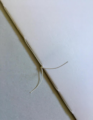
The above image shows the '5 hole sewn' binding, which is hand finished, as is the hole punching. Five hole sewing is just an evolution of three hole sewing, which I wrote about on this blog before HERE. The below picture shows the text fully extended:
The Offenbach Bible is enclosed within a Pergamenata paper cover which was all put into a loose cover, with the photo of the train in snow, supplied by WhnicPRESS. The other 13 artists also had their books enclosed within similar printed covers. All 14 books were then put into a slip case, see below...
Image courtesy of whnicPRESS
This was a lovely project to be involved with and many thanks to Caroline for taking the time to send me a copy of the finished publication and a handwritten note.
https://carolinepenn.com/
https://whnicpress.tumblr.com/
http://www.typecast.co.uk/
Posted by Justin Hobson 22.11.2023

Wednesday 15 November 2023

The Rough Stuff Fellowship book

The Rough-Stuff Fellowship was established in a pub near the Welsh/English border in 1955, making it the oldest off-road cycling club in the world. Recently, the club appointed an archivist, and the photos, hand-drawn maps and memories poured in – an unexpected treasure trove of incredible value and beauty. The photos are full of the joy of riding your bike and evocative of a bygone style – of a time when you might set off on a club ride wearing a shirt and tie, a deerstalker or a bobble hat, and no ride was complete without a stop to brew up some tea and smoke a pipe.

In their own quiet, very British way, these men and women were pioneers, pedalling and carrying their bikes and pitching their tents where angels feared to tread. Mountain bikes, gravel bikes, bikepacking – they all followed in the tyre tracks of the RSF. This book celebrates their style and their spirit. It is a document not only of the history of cycling off the beaten track, but of British outdoor culture...
This book is published by Isola Press. Size is 270x210mm, portrait and is section sewn, limp bound in a soft cover. The 208pp text is printed on Gardapat 13, Kiara 135gsm.
For readers not familiar with GardaPat 13, it's a fully coated paper but it really does have a dead flat MATT surface. There are many papers on the market which profess to be matt - some which incorporate the word matt in the name, but aren't! Apart from the high quality matt surface, this paper has an extraordinarily high bulk (thickness).
There is a 20pp illustrated text section printed on Popset Fawn (below)
It is hard to describe the 'dead flat' mattness that is a characteristic of this coated paper but the print result is totally flat as you might see in the below images...
Gardapat Kiara is a neutral white shade and is perfect for colour reproduction as well as the mono images.
I mentioned about the bulk of this paper and I thought it might be helpful if you could actually see what this means! The 208pp book using Gardapat 13 gives a spine that is 20mm thick, as you can see in the below picture...
The text is printed on Gardapat13, 135gsm which has a bulk (thickness) of 175microns which gives a spine thickness of 20mm (see above pic); but to give you a true comparison, if it were printed on another 135gsm matt paper (example Creator Matt, also made by the same mill group -Lecta) where the bulk is 115microns, it would mean the spine of this book would (only) be around 13mm thick. If you would like to know more about the relationship between gsm and mics, you can read a post I wrote HERE.

Design is by Myfanwy Vernon-Hunt at This Side. Published by Isola Press. Printed by Graphius in Belgium.

You can purchase this beautiful book for only £32 HERE

https://www.isolapress.com/shop/rsf-archives-2

Monday 6 November 2023

Restore Home and Organics - Product Packaging

The creative studio of Sina Luck has received international recognition, won design prizes by ADC Switzerland, and has been featured in magazines such as Grand Designs, Enki Magazine, Ideal Home, Homes and Gardens, Living etc. Sina Luck helps clients across the UK and internationally with multi-sensory interior and graphic design projects.
Sina Luck designed the branding and beautiful packaging design for this new candle and home fragrance brand Restore Home and Organics which includes the packaging for their range of candles. The size of the carton is 90mm x 92mm x 102mm.
The cartons are produced on our PaperWise Natural 295gsm, which is manufactured from 100% agricultural waste - this is the stems and leaves left over the harvest and which is usually left in the field and burnt. PaperWise is produced in factories in India and South America that make a big difference to local communities with investments made in education, infrastructure, and healthcare. You can read all about PaperWise HERE. As you can see from the images PaperWise is a natural shade and is completely unbleached and home compostable too... 
The carton is very simply printed offset litho in one colour and blind embossed on the lid. The labels are hand applied to indicate the various different blends.

The cartons are produced by specialist carton and boxmaker Custom Cartons who are based in Romford, Essex and they have made a beautiful job of it.

Grateful thanks to Sina Luck for providing me with the images. Photography by Kathryn Taylor.

https://www.customcartons.co.uk/
Posted by Justin Hobson 06.11.2023

Wednesday 1 November 2023

Jobs from the past - Number 168

Regular followers of this blog will know that my first post of every month is a "job from the past" so that I can show some of the really good work from years gone by - this project is from 2016.

Paul Smith - Spring/Summer 2016
The Paul Smith brand (and person) has become synonymous with classic British tailoring and style. Renowned for well-made, good quality, simple cut clothing with interesting fabrics which is easy to wear. There is often a splash of vibrant colour, a floral print or the signature multi-coloured stripes. Paul Smith now has 19 shops and concessions in the UK and 200 shops worldwide with the business still based where it was founded, in Nottingham.

This is the lookbook for the Spring Summer 2016 collection. The finished size is A5 (210x148mm) portrait and it is a 16pp 'closed double gatefold' making the flat size 210x880mm.
..opening out to this spread:
...and then this one:
The below image showing both sides of the publication, fully open:
Click on images to enlarge
It is printed in CMYK offset litho on our Omnia, White FSC 280gsm and is printed and finished beautifully. Birds eye view below:
The material chosen is our Omnia 280gsm which gives it that dead matt, tactile feel but with great reproduction.

...and here's the plug for the paper!  - As you can see from these images, there is lots of colour and images with CMYK dark areas - loads of ink going down and it looks great on the Omnia, reproducing bright vibrant colours, whilst retaining detail in the dark areas (in my opinion- but I would say that wouldn't I?) See the detail in the bag image below
Although this is a simply produced publication, it's often the simple jobs which don't get the attention to detail. This is well creased and folded square which is just perfect
Creative direction and design is by the in-house design team at Paul Smith. Printing is by Leicester based Greenshires with Richard Dalby handling the project. Beautifully printed and finished - a really well produced piece. 

https://www.paulsmith.com/uk
https://www.greenshires.com/
Posted by Justin Hobson 01.11.2023