Wednesday 31 August 2022

Examination Paper for Paper!

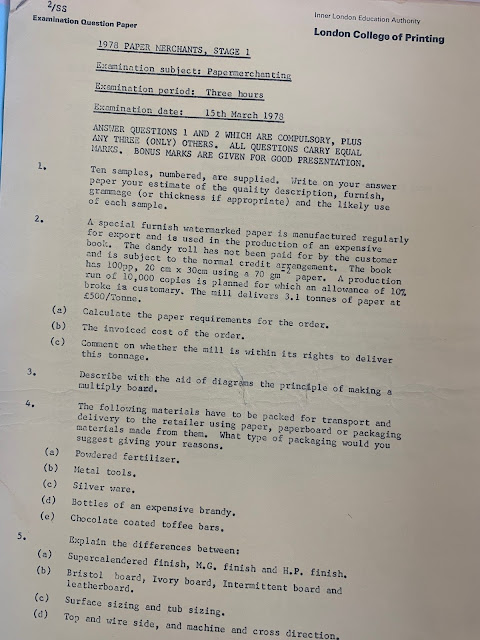
There has been much in the news about examinations with the recent GCSE and A level results announced recently, so it was quite a surprise when I received an email from Simon at the London Centre for Book Arts asking how I would fare answering the below examination paper from 1978!
The exam paper from the London College of Printing came to light in the archive that the LCBA has inherited from the late Jane H. Reese who was a hand paper maker who ran the Nautilus Press and Paper Mill based in North Kensington in the 1970's 80's and 90's.

If I couldn't answer the questions on the paper, I can always look at my paper merchanting handbook to find the answers - 722 pages of paper merchanting information, given to me when I left the James McNaughton Paper Group 30 years ago!
Thanks to Simon for sending over the old exam paper, which is now very much a historical artifact!

Posted by Justin Hobson 31.08.2022

Monday 29 August 2022

Photo quality on Astralux

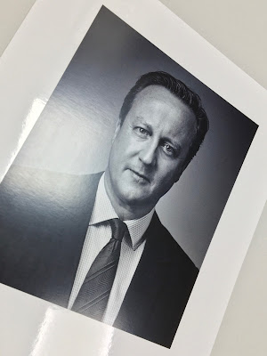
ASTRALUX is the market leading range of cast coated papers and boards produced in Italy by the Favini Crusinallo paper mill. 'Cast Coated' papers and boards have an extremely high gloss, reflective surface on one side with an uncoated reverse and is perfect for photographic reproductions.
The photographs are for the former Prime Minister, David Cameron and are printed on Astralux 1 sided 350gsm. The size is 250x198mm. They are digitally printed in CMYK on a Ricoh 9200pro digital press.
As you can see, it's a high gloss finish and a perfect result.
 
You can read more about Astralux HERE
Posted by Justin Hobson 29.08.2022

Friday 26 August 2022

Notorie

Notorie is a new stationery company that began with one thought... "what if we made a notebook that not only looks good but made you feel good? We're on a mission to prove that recycled is beautiful and we've created 20 unique notebooks to prove it."
Made using 100% recycled paper and eco-friendly inks, the notebooks are environmentally conscious at their heart and as you can see, a real feast for the eyes!
The cover and text are both printed on our Shiro Echo, White which is 100% Recycled and manufactured by Favini. The notebooks are A5 (210x148mm) size, portrait format and are wiro-bound using an antique copper wire...
The covers are digitally printed on Shiro Echo Bright White 300gsm duplexed to 600gsm, which as you can see from the image above, makes an excellent thick cover.

Text is litho printed on Shiro Echo White 100gsm. There's not a lot for me to tell you about the text pages, except to say that there are 140pages, which are ruled - in fact the colour of the rules is wonderfully quirky... it's a sort of mustard/terracotta colour.
Notorie is based in Kent and all the printing, collation and biding is produced locally in the county. They are a lovely set of notebooks and will enhance any desk! 
Thank you to Donna at Notorie for sending some notebooks for us to see for ourselves.
https://www.notorie.co.uk/
Posted by Justin Hobson 26.08.2022

Monday 22 August 2022

London Packaging Week at Olympia in one month

London Packaging Week, is coming to Olympia London. Ten years ago, Easyfairs launched Packaging Innovations London and Luxury Packaging London, creating a meeting place for packaging designers, technologists and suppliers in the capital. This year, it is bigger and better - London Packaging Week – a series of four events bringing a new, sharper focus on packaging development for the capital’s key luxury and FMCG markets.
Each of the four events targets a specific community – and they will combine to create an inspirational event that will drive packaging innovation, business and connections at the heart of the UK’s luxury and consumer products markets.
We will be showing our range of luxury packaging papers alongside the PaperWise range, manufactured from agricultural waste. We will be sharing our stand together with the team from PaperWise in Holland.
Come and see us on stand B102 and if you would like to register (for free!) you can do that HERE.

Posted by Justin Hobson 22.08.2022

Thursday 18 August 2022

Maghreb

Les Terrasses du Ciel

This is the exhibition catalogue of a show by photographer François-Xavier Haage. The exhibition titled "Maghreb, Les Terrasses du Ciel" (Maghreb, The Terraces of Heaven) was first shown on June 30, 1987 and shows photographs taken during trips to Algeria and Morocco between 1985 and 1987. The exhibition was shown again in 2019 at Hang'Art in Paris.

The catalogue is a 28pp self cover publication printed on our lovely Offenbach Bible 60gsm. The size is 230x190mm, portrait and is saddle stitched. As you can see from the image above, the pages just flop and roll over beautifully.
Offenbach Bible 60gsm has a very high opacity for it's light weight, but the show through can be used as part of the design...
Click on images to enlarge
The inside back spread (below) is the key as to where the images were taken
You probably won't be able to guess, or even believe, is that it's digitally printed! The job was printed and finished by digital print company Typecast Colour, based in Paddock Wood, Kent. It was printed on their Xerox digital press and the result is superb. For a limited run, printing digitally makes a project such as this viable - and on a a material like this, which many litho printers are scared of!...just look at the print result in the detail image below...
Designers Martí Peréz Palau and Carole Haage collaborated on the design of the catalogue.

https://le-hangart-restaurant-paris.eatbu.com/
http://www.typecast.co.uk/
Posted by Justin Hobson 18.08.2022

Monday 15 August 2022

The Blue Angel mark

I am often telling people about the Blue Angel mark as here in the UK, it is hardly known about or recognised, whereas in Germany (where it was established) and in mainland European countries, it is both highly visible on products and very highly regarded.

The Blue Angel (Der Blaue Engel) is a German certification for products and services that have environmentally friendly aspects. The Blue Angel mark is the oldest ecolabel in the world, and it covers some 10,000 products in some 80 product categories!

It was originally conceived and put in place by the government of the former West Germany and has been awarded since 1978. The Environmental Label Jury (Jury Umweltzeichen) is an independent, decision-making body for the Blue Angel and includes representatives from environmental and consumer associations, trade unions, industry, the trade, crafts, local authorities, academia, the media, churches, young people and the German federal states. As a result, it isn't open to political interference, industry pressure groups or vested interests, either from industry or the fanatical green groups. This is the reason that I rate the scheme so highly and it frustrates me that the UK government has never had the guts to put such an independent system in place in the UK - equally it's a shame that there isn't a pan European system.

The award of the Blue Angel is preceded by a review of the entire life cycle of the products. Such review considers as many aspects of environmental and health protection as possible for the respective product. Subsequently, the criteria limit or rule out those environmental impacts which are considered to be the most important impacts for the respective product. The Basic Award Criteria for a product are specified for each product group and they are all published.

The Blue Angel covers a wide range of different products including paints, gardening products, construction, electronics and many more, including paper and board.

We carry products which have been awarded the Blue Angel mark. The Creative Print range of 100% recycled text & cover paper manufactured by Koehler Greiz mill carries the Blue Angel mark, as do some of the recycled colours in our Colorset range.

You can read more about the scheme here:
https://www.blauer-engel.de/en
Posted by Justin Hobson 15.08.2022

Friday 12 August 2022

SUMO from Favini

SUMO is our a heavyweight, thick board manufactured by FAVINI in Italy. It is available in black and white and the consists of 1mm, 1.5mm, 2mm up to a whopping 3mm thick  ...seriously chunky! Originally just in Black and White, the range has now been extended to include a small range of colours - five shades all available in 1mm thick and below is the new lighter weight swatch...
 Size of the swatch is 240x152mm with 10mm spine
Thanks to the dyeing process, the colour distribution is consistent throughout to give excellent results especially when the edge is visible. The finest quality makes Sumo perform excellently for invitations, tags, coversbusiness cards, luxury POS material and high-end packaging.
The SUMO range is FSC certified. Below shows the five new shades, all available in 1mm thick.
If you would like samples, please drop me an email: justin@fennerpaper.co.uk

http://www.favini.com/gs/en/fine-papers/sumo/features-applications/
Posted by Justin Hobson 12.08.2022

Tuesday 9 August 2022

Wichelstowe

Wichelstowe is a development by Swindon Borough Council, south of Swindon Old Town. Bell Integrated were commissioned to develop the Wichelstowe place brand, guidelines, messaging, literature and collateral, followed by a site-level sub brand including naming Canalside for a number of mixed use parcels sitting alongside the Wilts Berks Canal. This is the sales brochure for Canalside.
Size of the publication is 265x210mm, portrait with a 4pp cover on Omnia 320gsm and a 12pp text on Omnia 150gsm. 
Click on images to enlarge
The material chosen for the publication is our Omnia. This material has a high bulk, required as effectively this is only a 20pp brochure. The photography has reproduced brilliantly on the Omnia, with the combination of exterior and interior photography and fleshtones..
A really nice feature is the singer sewn binding, which you can see here on both the exterior and interior of the publication.
Click on images to enlarge
Even though the 150gsm text paper is bulky, it still rolls and flows nicely in the hand without feeling too stiff and rigid.
Art direction and design is by Bell Integrated. You can read more about the whole project here: https://www.bell-integrated.co.uk/portfolio/wichelstowe/. Printed offset litho throughout. The excellent print, repro and finishing is by Gavin Martin based in London

https://www.bell-integrated.co.uk/
https://www.gavinmartin.co.uk/
Posted by Justin Hobson 09.08.2022

Tuesday 2 August 2022

Jobs from the past - Number 153

Regular followers of this blog will know that my first post of every month is a "job from the past" so that I can show some of the really good work from years gone by...

The 58th "Not DeAd yet" - The Bootleg Annual 2020 

In 2020, D&AD announced that they would not be printing the paper annual for the first time ever. However, creative team Rhys Hughes and Barret Helander, who work together in London decided to produce a few copies for themselves and the idea just grew resulting in an unofficial dodgy knock-off of the 58th annual...
In their words...
"That huge mysterious book, made by creatives for creatives, to celebrate and inspire creativity. 2020 was finally going to be our year, but just as we were getting our bookshelves ready, the announcement came. The annual was going digital. There are so many great reasons to make the annual available online. It connects creatives all over the world with an infinitely inspirational archive, that tucks neatly away in a tab. The digital annual is a good thing, there’s no doubting that. But do the book and the website have to be mutually exclusive? Physical traditions are often lost to technology, and sometimes, we don’t appreciate how nice they were until they’re already gone. This particular physical tradition is one that means a great deal to us. So, unwilling to part ways with this iconic book, we decided to take matters into our own hands, and make use of the new, freely accessible website. This is the resulting knock-off. We cut corners, definitely took some artistic liberties and racked up some serious hours of copying and pasting, but it was well worth it to honour all of this brilliant work. This is our wonderfully dodgy tribute to the book we can’t bear to let go." 
With a beautifully written intro by John Hegarty. ‘When we’ve lost so much, it’s important to hold onto that which is precious. This is precious.’
At 542 pages, it features all of the 2020 pencil-winning work. The book draws on its unofficial ‘knock off’ complete with a cardboard cover and the D&AD Annual logo has also been reimagined to fit the tagline ‘Not Dead Yet’.

It features all the award winning projects including Twenty-five Sculptures in Five Dimensions a project Fenner Paper was involved with, which was conceived and sculpted by poet Tom Sharp, designed by Studio Sutherl&, soundtracked by Tony-nominated composer Alex Baranowski, with an introductory essay by art writer and curator Anna Souter. This project was printed on our Sixties 60gsm paper by Fenton Smith at Printsmith...
The Bootleg annual is printed in a limited edition of just 100 copies. With a natural corrugated cardboard cover and printed on 100% recycled uncoated paper.
Where Fenner Paper came into the project is that the yellow end-papers are printed on our Colorset Lemon 120gsm (100% recycled)...
The edition was digitally printed by Pureprint and carbon balanced with the World Land Trust.

What a great project and it's a shame that no one has taken the job on of producing the 2021 annual in print.