Friday 29 July 2022

Refit from Favini...

REFIT is a new paper made with residues from the production of textile and wool production. These fibres partially replace tree fibres and is a real example of industrial symbiosis that enhances industrial by-products, to support the fight against waste within an ethical supply chain. The waste used in this paper is from carding, spinning and weaving processes which were destined for landfill, are used to produce the new REFIT material with a high aesthetic and an expressive value for print and premium packaging.
Here's some more information from the mill... "The residues of wool and cotton are visible on the surface and give a distinctive appearance. From a tactile point of view, the wool contained in REFIT WOOL tantalizes the fingertips with a distinctive roughness of the product, whilst the cotton gives a soft touch to REFIT COTTON. The content of the new REFIT paper includes more than 15% fibre derived from textile by-products, 40% post-consumer recycled cellulose that is certified FSC® and 45% virgin cellulose fibres also FSC® certified. For the production of the REFIT paper the textile by-products used are of Italian origin, coming from spinning and weaving. The use of industrial by-products limits the use of virgin raw materials and promotes the creative reuse of waste, according to the circular economy philosophy. The range consists of five colours: Blue and Black for the REFIT WOOL line, and White, Pearl and Grey for the REFIT COTTON variant. The available basis weights range from 120 to 360 gsm and includes coordinated envelopes, offering a comprehensive solution for packaging and printed communication"
Click on images to enlarge
In the above image, you can see the visible fibres.

REFIT is a paper conceived and produced by Favini, a company with impressive experience in creative reuse since the 1990’s with its Shiro Alga Carta. The portfolio of innovative and unique ecological papers was expanded in 2012 with Crush, later in 2015 with Remake and now extends to REFIT

https://www.favini.com/en/press-release/refit-the-paper-that-tips-the-wink-to-fashion-and-sustainability/
Posted by Justin Hobson 29.07.2022

Tuesday 26 July 2022

Gorse - Simone Rocha

Simone Rocha was born in Dublin, Ireland in 1986. In 2008 she graduated with a BA in Fashion from The NCAD in Dublin followed by an MA from Central Saint Martins in 2010. Simone debuted at London Fashion Week in September 2010 and her collections can be found in some of the most prestigious stockists in the world.

This year at the British Fashion Awards Simone received the “British Womenswear Designer Award” as well as the 2016 Harper’s Bazaar Designer of Year Award.
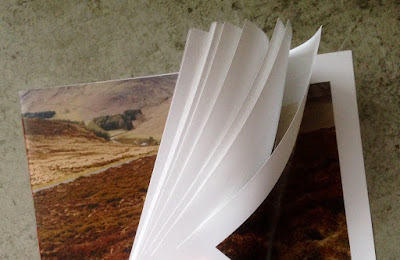
This publication is a limited edition book produced in collaboration with photographer Colin Dodgson in Ireland. Titled "Gorse", the scale is a luxuriously large 303x420mm, landscape format, which flops and rolls beautifully.

Front Cover....
There is lots of white space, a very uncluttered feeling.
Click on images to enlarge
The publication is printed offset litho on our Omnia White 120gsm, the result is superb. The look and feel of the whole publication is very uncoated and tactile but there is absolutely no loss of detail in the images.The feeling of space continues with many unprinted pages...
It is bound using three hole sewing in a red thread. Actually this has two rows of three hole sewing. Below is the centre spread, showing the binding on the inside. 
Detail showing the binding (inside)...
Below pic shows detail of the three hole sewing on the spine:
So successful was this publication that many of the images were used as campaign imagery in titles such as Dazed and Confused, The Gentlewoman and Self Service.

Design is by Simmonds. Print production, including the binding is by Pureprint.

https://simonerocha.com/
http://www.simmondsltd.com/
https://www.pureprint.com/
Posted by Justin Hobson 26.07.2022

Friday 22 July 2022

Introducing NEW Crush Cocoa

The latest addition to the Crush range is Crush Cocoa which is now available from stock together with Citrus, Grape, Cherry, Lavender, Corn, Olive, Coffee, Kiwi, Hazelnut and Almond.

Cocoa is a big market, in fact in a year we spend $100 billion on chocolate products. Estonia tops the country list: Consuming more than 7 kg of chocolate per capita p.a. The cocoa plant has very ancient origins and the first farmers were the Maya around 1000 BC. But it is only since 1500 AD that it reached European civilization. Criollo, Forastero and Trinitario are the most common varieties of cocoa from which chocolate is obtained, one of the most popular foods for adults and children. But who would have thought that it can also be used to produce paper...? 

Below shows the life cycle of cocoa from the fruit to the ecological Crush paper.
Which by-product does Favini use? The skin of the cocoa bean is used to make the Crush paper. It is micronized at their factory in Vicenza, Italy so it can replace up to 15% of virgin cellulose.
You can read more about it HERE or if you would like a sample, please just email me justin@fennerpaper.co.uk

https://www.favini.com/en/news/from-the-bean-to-crush-cocoa/
Posted by Justin Hobson 22.07.2022

Tuesday 19 July 2022

Orla Kiely Ltd Editions...

Today is the hottest day ever in the UK apparently, so here is some hot news!

Harvey Lloyd Screenprint is a silkscreen print studio based in the South East of England and their work has appeared on this blog many times over the years. Established 40 years ago, they produce work for some of the best names in the industry, Harvey Lloyd have gained a reputation for having artists at their studio and working together to produce their artworks.

At the end of last year, Harvey Lloyd Screens printed three Limited editions for Orla Kiely - within 2 hours of launching the print, it sold out!
This image 'Colour Block Stem' is printed silkscreen in 4 colours and is printed on our 100% recycled Creative Print Champagne 270gsm...
Size is 297x420mm (A3)
The prints are produced in an edition of 100 copies. and have been beautifully printed by Harvey Lloyd Screenprint, who are based in Wadhurst, East Sussex.

https://orlakiely.com/
https://www.harveylloydscreens.co.uk/
Posted by Justin Hobson 19.07.2022

Friday 15 July 2022

The Charles Hotel - Munich

Set within the verdant Lenbachgärten quarter and close to the historic Königsplatz, the effortlessly elegant Charles Hotel in Munich is where contemporary style meets traditional Bavarian hospitality. Centrally located by the Alte Pinakothek and the Lenbachhaus, The Charles Hotel also enjoys the calm backdrop of the Old Botanical Garden. Built on the site of a former university library, the hotel was created in 2007 and named in honour of Sir Rocco Forte’s and Olga Polizzi’s father, renowned hotelier Charles Forte.

This the brochure for the hotel, which follows the recent branding by Pentagram.
Size of the brochure is 266x204mm, portrait and is saddle stitched. The cover is an unusual format as there is an 8pp cover with 140mm wide flaps and there is an outer jacket, only 210mm high, also with 140mm flaps. It is the first time I've seen this combination and the effect is superb...
The materials used for the covers is our Dali range, which is a 'felt-marked' paper with a linear effect and a natural, tactile feel. If you click on the image below, you will be able to see the texture in the paper.
Click on images to enlarge
The cover is on Dali Nero 200gsm and is hot foil blocked in matt white and copper foil. The jacket is printed on Dali, Candido, 160gsm and is litho printed in CMYK on one side only.
The 16pp text is printed offset litho on our Marazion Ultra 135gsm, chosen because of it's dead matt flatness which would reproduce the interior images well without a glossiness which would detract from the classic look and feel of the hotel.
The brochure has a beautiful, quality feel and flows in the hand superbly. The combination of photography, materials and quality print makes this a wonderful piece of print.

https://www.pentagram.com/
https://www.gavinmartin.co.uk/

Posted by Justin Hobson 15.07.2022

Tuesday 12 July 2022

Tolerance

Inspired by the home-made posters displayed in windows during the Covid lockdowns, this print pledges solidarity with marginalised communities and is a reminder to try and see both sides.
Seemingly random elements printed on the front and back of the sheet are revealed as letterforms when backlit. The print measures 720 x 145mm.
Created for window display, it is actually provided with hangers, so it hangs perfectly. It is printed on our Sixties paper in 60gsm. SIXTIES is a paper which has a similar translucency as a tracing paper - but it feels and behaves like a normal paper … you can see the degree of translucency in the images above and below.  Perfect for a project where the theme of being able to see both sides at the same time is of the utmost importance.
Set and printed by hand in a limited edition of just 25. Here it is set up on press (a 1959 Korrex Berlin precision proofing press) with the red inked up and ready to go...
Design and printing is by Richard Ardagh at New North Press. He gave himself the self-imposed limitation of only using three shapes: 'I', 'V' and ‘.’ As can often be the case, the font he chose was lacking in characters so they commissioned Type High Design to cut the additional glyphs needed, as you can see in the image below...
It isn't the first time Richard has used this paper, it was his little new years card, also printed on Sixties 60gsm, that you can see below that served as the inspiration for this print...
You can read more about the Tolerance project and buy one of the prints HERE

My thanks to Richard at New North Press for sharing the story and the images with me.
Posted by Justin Hobson 12.07.2022

Friday 8 July 2022

Preen Home

Preen By Thornton Bregazzi was founded in 1996 by Justin Thornton and Thea Bregazzi, built on an aesthetic of darkly romantic and effortlessly modern, juxtaposing the masculine with feminine and mixing of hard and soft. Their debut collection at London Fashion Week for Spring Summer 2001 established the brand’s essence of punkish sensibilities with vintage elements and hand crafted details

Preen by Thornton Bregazzi has now expanded to include Preen Home – an opulent offering of soft furnishings
Size of the brochure is 330x240mm, portrait and is singer sewn. The text material chosen was our Omnia, which would beautifully reproduce the photography with the delicate patterns and dark colours superbly - without forgetting the fleshtones ...and it looks wonderful! There is a 4pp cover on Omnia 200gsm and 16pp text on 120gsm.
Click on images to enlarge
Unlike many of the look-books featured on this blog, which are printed offset litho, this has been digitally printed on an HP Indigo press. The colours are strong and punchy and the whole publication has a matt, tactile look and feel - in fact I can honestly say, every bit as good as litho!
Although Omnia was never originally developed for digital, we now keep it as a stock item with "sapphire treatment". This treatment is often applied to more unusual papers and provides a "key" so that the inks (which are different to litho inks) work on the paper surface. The great thing is the job just doesn't look and feel like a digital job. Below is a detail shot showing the excellent fleshtone reproduction.
Click on images to enlarge
Below shows the detail of the red thread used on the singer sewing - just beautiful!
Omnia is a very bulky paper, and the 200gsm cover just works perfectly with the format and the singer sewing
The art direction is by Mark and Chris Thomson and the quality of the direction and photography (by Ash Reynolds) is matched by the exceptional digital print by Screaming Colour.
https://preenbythorntonbregazzi.com/
https://studiothomson.com/
https://www.screamingcolour.com/
Posted by Justin Hobson 08.07.2022