Monday 29 February 2016

Are you a parent ...?

Here's an interesting project which I thought you might like to see...

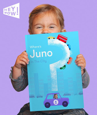
Regular readers of this blog will be aware of some of the projects which I have featured which have been funded by Kickstarter. Lorna and Daniel Freytag contacted me about this fun project which is on Kickstarter right now.
In their words:
We're a mum and dad team called HeyWow! working from the small seaside town of Oban on the north-west coast of Scotland with our two little highland monsters (aged 2 and 4). Twelve months ago we had the crazy idea of creating our own personalised children's books, to bring a bit more WOW to kids lives. Our aim was to create something vibrant, well designed and exciting that parents could enjoy too! How hard can that be??? Ha! Nearly one year later (in between caring for the kids) and after lots of brain storming, cups of tea, sketching, tea, emails, business plans, photo shoots, more tea, Skype calls and many many late nights, we're now ready to reveal our first picture book... 'In the City'.

Here are some HeyWow links
Our Kickstarter campaign
www.heywow.co
www.twitter.com/HeyWowBooks
www.facebook.com/heywow
Posted by Justin Hobson 29.02.2016
Thursday 25 February 2016

Spa - Treatment Tariff

The Spa at the Gleneagles Hotel by ESPA is proud to be one of the "Leading Spas of the World". Launched by the exclusive Leading Hotels of the World group, this is the first global evaluation and certification programme for the spa industry.
This simple, well executed piece of literature is the tariff list for the treatments offered and works with the other pieces of Spa literature, such as the brochure.
Click on images to enlarge
Size is 195mmx 130mm, portrait and is a 6pp gatefold format.
 
First spread...
Folding out to...
The board used is our StarFine Natural White 240gsm. This uncoated paper is a subtle, neutral, white which perfectly suits the imagery and typography in the publication. Below is the tariff, pictured with the A5 Spa brochure, which I wrote about previously - a piece of seamless, quality branding for their publications.
It is printed offset litho in CMYK plus a special - gold, the result of which is subtle but works well.
Design is by Burgess Studio. Creative director is Alexis Burgess. Designer on the project is Tom Green. Printing is by Glasgow based 21 Colour.

http://www.gleneagles.com/
www.espa.com
http://burgess-studio.co.uk/
http://www.21colour.co.uk/
Posted by Justin Hobson 25.02.2016

Tuesday 23 February 2016

McQ Women


McQ, is the contemporary brand from Alexander McQueen which takes inspiration from street culture "evoking the varied and ever-evolving style tribes that spring up around Britain’s rich music and art scenes. Drawing on references from uniform and the military, core staples of the British wardrobe are re-imagined each season in new guises. Traditional techniques are used in contemporary ways, creating pieces that are both functional and beautiful"

Creative Director of Alexander McQueen and McQ is Sarah Burton. This is the season's lookbook for women.
The size of the publication is 450x320mm, portrait and is a 12pp self cover. It is printed on our lightweight Offenbach Bible 60gsm and is a beautifully designed piece of literature.
The lookbook is printed in four colour offset litho and is a superb example of printing on Offenbach Bible - superb solid coverage and deep monochrome images reproduced in CMYK.
Click on images to enlarge
Due to the lightweight nature of the paper it just flops beautifully, with a bewitching feel.
Design and art direction is by Rupert Smith who is a freelance art director based in London. This is an elegant and splendidly produced publication. To get these dark images to look this good on an uncoated paper is a real achievement. Print is by Rob Squires at Pureprint.
www.pureprint.com
Posted by Justin Hobson 23.02.2016

Monday 22 February 2016

Freedom of the City of London

The Guildhall, City of London 
In October, I was admitted to the Freedom of the The Worshipful Company of Stationers and Newspaper Makers, which I wrote about here. As part of the link between the Livery companies and the City of London, I have now been admitted to the Freedom of the City at a ceremony at the Guildhall in London last Wednesday. Admission to the freedom is organised by the Chamberlain's Court and is accompanied with this lovely piece of calligraphy produced on vellum. Vellum is a thin, specially prepared calfskin, which pre-dates paper and has been used for documents for centuries.

Originally this certificate was effectively a 'licence to trade' within the city and was essential to do business from the middle ages up until at least the 19th century.
The short ceremony was conducted by the Clerk of the Chamberlain's Court, Murray Craig. Here I am being presented with my Freedom Certificate.
I went together with my family and it was a very interesting, special day. My thanks to Murray Craig for making it so interesting and enjoyable.

http://www.guildhall.cityoflondon.gov.uk/
Posted by Justin Hobson 22.02.2016

Thursday 18 February 2016

WPF Therapy

WPF Therapy began life in 1969 as the Westminster Pastoral Foundation at the Methodist Central Hall in Westminster. They have grown to become a significant national provider of psychodynamic counselling, therapy and training and are based in a modern, purpose-designed centre in London Bridge. WPF provide affordable therapeutic services to promote mental and emotional well-being, provide training and educational opportunities for therapists and cares, engaging in research into mental health and raising awareness of mental health issues.

This delightful information pack has been thoughtfully designed and produced. The outer 6pp folder is 225x115mm with a 10mm spine, printed offset litho in solid grey (special pantone colour) with type reversed white out and hot foil blocking in bright yellow, gloss, pigmented foil.
Printed on StarFine 350gsm it produces a really nice 'solid' square pack.
Below picture shows the folder open, with "Making life feel better" also hot foil blocked.
...and this is where is starts getting clever! The below picture shows the folder open with a capacity pocket on the middle panel. In the pocket is an array of the WPF lead colours used in the identity, all at different angles.
If you take out what appears to be a booklet, it is as below.
BUT ...and here's the clever bit, it's five individual 6pp leaflets, all die cut at angles that just hold together, without binding, that make up this one 'booklet' like so..
with the beauty being that they can still be used as individual leaflets, or as one booklet. Incredibly simple and extremely effective. The image below shows the individual leaflets.
Each of the 6pp leaflets is printed on StarFine 200gsm, which is the perfect weight, heavy enough to hold together to make the booklet without being too 'springy'. All print is offset Litho and the colours are all made out of tints, not specials. The image below shows the reverse of all the individual leaflets:
There are also appointment cards also printed on the StarFine 200gsm in the same colour references.
The identity and design (including the website) is by Playne Design who have studios in London and Hastings. Creative Director is Clare Playne. Production is handled by Simon Hack and my thanks to Simon for sending me the complete set.

This is just an excellent example of a well thought out and well executed piece of print. Good consideration of the format, materials and printing processes is where this job scores most highly. It's not lavish or expensive and it's entirely appropriate for the client.

Printing and the tricksy die cutting is by Banbury Litho.

http://wpf.org.uk/
http://www.playnedesign.co.uk/
http://www.banburylitho.co.uk/
Posted by Justin Hobson 18.02.2016

Tuesday 16 February 2016

What is ...Gsm & Mics?

What is ...Number 26
Regular followers of this blog will know that in the middle of the month, I publish a "What is ....? post. The article covers various aspects of paper, printing and finishing in greater depth. However, many of these subjects are complex, so these posts are only intended to be a brief introduction to the topic.

What is ...Gsm & Mics?
To those that know, this may sound an obvious question. However many people that I speak to base their knowledge on information picked up over years and is not always correct ...so read on!

Gsm is the abbreviated term for ‘Grams per Square Metre’. In the metric system,  the mass per unit area of of paper and board is expressed in this term and is also described as weight, substance or grammage (although I've yet to determine whether this is a real word!) It is generally written g/m2,  gsm, g/m² or even g2m.

As the term suggests, it is calculated by the physical weight of one sheet of paper measuring 1metre x 1 metre. In reality, no one actually folds down a sheet of paper that large to weigh it, so it is generally measured using a scaled down measure of 7cm x 7cm, on a scale such as the one pictured below
Mics - is the abbreviation for Microns, which in metric terminology is also a shortened name for Micrometre. This is a measure of the physical thickness or caliper of a sheet of paper or board. It is usually written as Mics, mics, Mi, or µm (using the classical Greek µ - mu). To give you an idea, a sheet of 80gsm copier paper would have a thickness of around 85-90microns. The measurement is made using a micrometer such as the one pictured below (measuring a sheet that is 105microns)
Both the gsm and mics form part of the specification of any paper when it is made - if you want to know more about a mill making, you can read about it here:
http://justinsamazingworldatfennerpaper.blogspot.co.uk/2015/10/what-is-mill-making.html
Posted by Justin Hobson 16.02.2016

Friday 12 February 2016

Rapha GT Shoes

Rapha was launched in 2004 with one mission: to create the finest cycling clothing and accessories in the world. Designed without compromise for the most discerning riders, Rapha products use the finest fabrics and components to create apparel and accessories that offer road riders unrivalled levels of performance, comfort and style. If you are familiar with Rapha you'll know that they stand for quality and as you might expect their literature is produced in an exemplary way.

This small publication is the care guide for the Rapha GT shoes, produced in partnership with Giro in California.
 
The book is A6 (148x105mm) portrait and is perfect bound with the spine measuring about 3mm. Cover is hot foil blocked in two colours.
The 40pp text is printed on our StarFine White 130gsm. As you can see from the above image, there are 6pp printed in their "Rapha Pink" a solid vibrant pink, which neatly divides the book, separating the English (in the front half) from the other three languages.
Click on images to enlarge
Printing is two colours offset litho. Design and typography is just beautiful. So simple, clear, clean and timeless quality. It reflects the ideals of the brand perfectly. German language section below
Design is by the Rapha in house design team. Print and finishing is by Gavin Martin Colournet..

http://www.rapha.cc/
http://www.giro.com/
http://www.gavinmartincolournet.co.uk/
Posted by Justin Hobson 12.02.2016

Wednesday 10 February 2016

Collection 003

Faye Toogood is a British designer who's work has appeared on this blog many times before. Her work covers interiors, installation, furniture, fine art fashion and more! 

Collection 003 is Faye Toogood's new collection of unisex outerwear designed in collaboration with her sister fashion designer Erica Toogood. 
This promotional literature is a small folded up piece measuring 70x100mm, folding out to 280x600mm. It is printed Offset Litho in four colour process, one side only, on our lovely Offenbach Bible 60gsm, giving it a lightweight feel but with a beautiful quality.
Click on images to enlarge
The large format concertina folds this way...
...and then this way:
The advantage on concertina folding is that you are reducing the stress on the paper and not trapping air in the folds, whereas if you fold paper on itself, on itself and on itself etc - you will get what is called a "Crow's foot" - if you don't know about this or haven't heard this expression, I wrote about it, at length, here: http://justinsamazingworldatfennerpaper.blogspot.co.uk/2014/04/what-is-number-4.html. This is a perfect example of a folded piece without a crow's foot!

Creative Director is Faye Toogood and the designer on the project is Catherine Acornley. Printing is by Chadbon Printing based in London.

Posted by Justin Hobson 10.02.2016

Monday 8 February 2016

UK Mill Visit

Last Friday, I was fortunate enough to visit James Cropper, one of the last remaining fine paper mills in the UK. Located in the village of Burneside, on the outskirts of Kendal, they are situated in the Lake District, an area of outstanding natural beauty and one of our great national parks. James Cropper was established in 1845 and although now a PLC, the Chairman of the company is the sixth generation of the family to lead the company. 

This amazing mill has a combination of beautiful old stone buildings which have been combined with modern buildings and machinery. Unfortunately the weather on Friday was a bit grim, so the mill probably doesn't look it's best in these pictures!
The mill has four paper machines and is one of the world's leading coloured and textured paper producers. This is pretty impressive given that the UK paper industry, which at one time was a world leader, hardly exists nowadays - a very sad situation. Croppers are also staying ahead of the competition with their subsidiary Technical Fibre Products (TFP) which manufactures high specification non-woven products which have a specialist uses including aerospace and motorsport.
Here are a couple of pictures inside the mill, showing of one of the paper machines in production.  
Croppers manufacture paper for many companies both in the UK and around the world. They also manufacture directly for some of the fashion brands and high quality packaging markets. Most importantly, they have an increasingly wide range of mill branded products including Vanguard, Croxley Heritage, Porcelain, the new Carvetian Suede and many, many more...
My thanks to our hosts, Rob Tilsley, Tim Tidman and Chris Brown. We had a great insight to the mill's capabilities and look forward to supporting this British manufacturer wherever and whenever possible.

Posted by Justin Hobson 08.02.2016