Thursday, 7 November 2019

Honest Burgers Collectors Cards

When Tom and Phil set up Honest Burgers in Brixton in 2011, they had a single goal: do fresh, high-quality British burgers and do them well. Since then, they've stayed true to that goal and even opened their own butchery. Honest Burgers now have 36 restaurants throughout the UK, plus a field kitchen for festivals and events.

Honest Burgers produce beautifully designed print items - not lavish, just functional, well considered and produced - and sometimes quirky! ...like the wonderful Meat & Potatoes publication that I wrote about here.

Last year they produced a set of 14 "Collectors Cards" which are based on the old cigarette cards that used to be included with packs of cigarettes and which were avidly collected. Cigarette cards are still highly collectable with a record $2,8 million paid for a single extremely rare card back in 2007 - here's hoping these cards will be so collectable!
Click on images to enlarge
The size of these cards is really quite small at 68mm x 37mm and you can see the scale with a regular size ballpoint pen in the image below....
I was asked to supply a board which was similar to the card used in the production of these original cards. This meant finding a board which was coated on one side, but not too high white, with an uncoated cream reverse with a tactile feel. The other thing is that the board is not too heavy, the cards were originally quite flimsy and not like the majority of "flicky" solid boards produced today.

The board we supplied is Milana Graphic [1 sided] in 200gsm and I hope you can see from the detail image below, both sides of the card...
The cards are printed offset litho. Graphic design is by Connie Barton at Studio Connie.

Yet another excellent example of a really well considered piece of print where the design, materials and processes are just right.

https://www.honestburgers.co.uk/
https://www.studioconnie.com/
Posted by Justin Hobson 07.11..2019

Monday, 4 November 2019

Jobs from the past - Number 121

Regular followers of this blog will know that my first post of every month is a "job from the past" so that I can show some of the really good work from years gone by. 

Modern Art Oxford 2016
KALEIDOSCOPE

In 2016, Modern Art Oxford celebrated 50 years as an internationally acclaimed powerhouse of contemporary visual culture. KALEIDOSCOPE was a year long series of interlinking exhibitions, performances and events, presenting an unmissable opportunity to reflect on some of the great moments in Modern Art Oxford’s history.

The following items formed part of a suite of literature designed and produced by Fraser Muggeridge Studio for the series which ran throughout the whole year...
The 8pp concertina leaflets are A5 size and are printed on Shiro Echo, White 120gsm. The below image shows a birds eye view of the leaflet.
The leaflets are printed offset lithoin CMYK, although the "Invisible Present" included the use of a pantone gold.
Above shows the leaflets spread flat and the image below shows the reverse side...
The below image shows the gold printed on the "Invisible Present" leaflet, and as you can see the Gold looks really gold, rather than a brown!

All the publications are printed on our Shiro Echo, White which is 100% Recycled and also carries the FSC Recycled classification. Shiro Echo is available in two shades; there is a white shade (which is a natural/off white) and a Bright White shade.
There are also notebooks, which are also A5 portrait, saddle stitched with a 4pp cover on Shiro Echo White 300gsm with 44, unprinted text pages on 80gsm.
The books are saddle stitched with copper wire - very nice...
The private view cards are A6 size, printed on Shiro Echo White 300gsm.
As you can see the finishing is excellent, as you can see from the image below...
Concept and design is by Fraser Muggeridge Studio. Printing and finishing is by Holywell Press who are based in Oxford.

Posted by Justin Hobson 04.11.2019

Monday, 28 October 2019

Christian Dior - Designer of Dreams

Spanning 1947 to the present day, this exhibition traces the history and impact of one of the 20th century's most influential couturiers, exploring the enduring influence of the fashion house, and Dior's relationship with Britain. This exhibition presents over 200 rare Haute Couture garments drawn from the V&A's couture collection and the extensive Dior Archives alongside accessories, fashion photography, film, vintage perfume, original make-up, illustrations, magazines, and Christian Dior’s personal possessions. The exhibition ran from February to 1 September this year and was a total sell out.
This is the private view invitation for guests invited for a special dinner to celebrate the opening of the exhibition in January this year.
The format is an 8½pp concertina folded invite. The size is 183 x 675mm folding to a finished size of 183x150mm with a 75mm flap, which I hope you can see from the birsdeye view above. Having the half page flap means that on the front, you have coated and uncoated meeting together which is a wonderful juxtaposition.

The below image shows both sides of the invitation...
Click on images to enlarge
Hopefully you'll be able to see from the image above that one side is very colourful and glossy and the other side is uncoated with mono images and hot foil blocked in silver. It is printed on Astralux [1 sided] 300gsm and is finished with gloss film lamination - this might sound unnecessary,but it is what gives the super high gloss lustre, which only lamination on top of a cast coated paper can give you.

Below shows the hot foil blocking on the uncoated side of the Astralux.
 
The invitation is designed by the in-house design team. Print and hot foiling is by Identity Print, based in Paddock Wood with Paul Martin handling the project.

Posted by Justin Hobson 28.10.2019
Monday, 21 October 2019

Picpus

Picpus is a free magazine edited by Charles Asprey and Simon Grant. It carries articles from the art world, with a particular interest in historical curiosities, overlooked artists, arts and politics and is distributed through a selection of specialised art bookshops, galleries and libraries. 
The format of Picpus is a folded down broadsheet, measuring 594x420mm (A1 size) which folds down to a 32pp A6 (105x148mm) finished size. 
Click on images to enlarge
Picpus is printed quarterly and there have been 22 issues so far, this issue is a reprint of issue #1 with a special cover by Christian Flamm in a limited edition of 1000 copies only.

Below shows the broadsheet folded out...
...and the reverse side:
Picpus is printed on Redeem 100% Recycled 80gsm and is printed offset litho, CMYK one side and one colour (black) on the reverse. Design is by Alfonso Iacurci and is printed by Push Print based in London.
http://www.charlesasprey.london/picpus-press.html
http://www.push-print.com/
Posted by Justin Hobson 21.10.2019

Tuesday, 15 October 2019

Wei Ligang

Michael Goedhuis specialises in the best contemporary Asian and Western art. Their collection includes painting, sculpture, ink painting, bronzes and antiquities. They also represent contemporary artists and this brochure is for one such Chinese artist - Wei Ligang.
The size of the publication is 265x216mm, portrait with three hole sewn binding. It has a 4pp cover with 120mm flaps printed on our Colorset (100% Recycled) Dark Grey 270gsm and a 28pp text printed on Gardapat 13 Bianka 150gsm.
Click on images to enlarge
For readers not familiar with GardaPat 13, it's a fully coated paper but it really does have a dead flat MATT surface. There are many papers on the market which profess to be matt - some which incorporate the word matt in the name, but aren't! Apart from the high quality matt surface, this paper has an extraordinarily high bulk - this 150gsm text with a thickness of nearly 200mics. If you would like to read more about the bulk, you can read it here.

Centre spread...
Detail image showing the exceptional reproduction and three hole sewing...
The text is digitally printed using an HP Indigo digital press and the results are superb, beautifully showing the artworks. As many readers will know, many materials have to be "Sapphire Treated" to work successfully on HP Indigo presses, however this project has been printed without sapphire treatment.
Click on images to enlarge
The 28pp text flows nicely in the hand, feeling substantial but not overly heavy.
Detail of the three hole sewing on the spine......
Detail of the hot foil blocking on the outside front cover.
Design and Art Direction is by Ornan Rotem at Sylph Editions.

Printing and the terrific finishing - which was all achieved in house is by Zone Graphics, based in Paddock Wood in Kent.

https://www.michaelgoedhuis.com/
http://www.sylpheditions.com/
www.zonegraphics.co.uk
Posted by Justin Hobson 15.10.209

Monday, 7 October 2019

The Shepherd’s Whistle

Earlier this year, the John Hansard Gallery, part of the University of Southampton presented an exhibition titled The Shepherd’s Whistle, a commissioned project by Stefan Gec. The exhibition centres around the artist’s fascination with top-secret maps of strategic cities worldwide that were created by Soviet intelligence during the Cold War, alongside an M-72 Soviet army motorbike and sidecar from 1957. Riding the M-72 and navigating using the Soviet maps, Gec journeyed to five UK towns and cities that were identified by the Soviets as having strategic importance.

This is the accompanying literature produced for the exhibition...
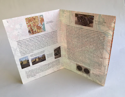
The size is A5, portrait and the format is an 8pp right angle fold.
Click on images to enlarge
The leaflet is printed offset litho on our Sixties, 60gsm ...and it works superbly as SIXTIES has the same type of translucency as a tracing paper - but it feels like a normal paper! … so it works perfectly for this publication, allowing the map to show through and provide the backdrop for the essay about the exhibition, written by Ros Carter. You can see the way the translucency works in the image below:
Front cover:
...opens to this spread
Open at full size:
Click on images to enlarge
This image shows the Soviet map which appears on the inside of the leaflet.
The publication is printed offset litho in CMYK and the colour reproduction on Sixties is excellent, as you can see in the image above.
Click on images to enlarge
The exhibition ran from February to April this year. Design is by Daly & Lyon who are a studio based in London that specialises in design for the arts. Printing is by Aldgate Press.

http://www.jhg.art/event-detail/374-stefan-gec-the-shepherd-s-whistle/
http://www.daly-lyon.co.uk/
http://www.aldgatepress.co.uk/
Posted by Justin Hobson 07.10.2019

Friday, 4 October 2019

Autumn shapes using Stardream

Patternise are based in Ewhurst, Surrey, specialising in creative design and laser-cutting services. They work with a wide range of clients across the UK - managing large volume projects for major corporates and visual merchandisers to smaller projects for individuals and weddings. Patternise use state of the art laser cutters and they specialise in cutting “clean” materials such as fine papers, cards, acrylics and plastics (PP/PET).
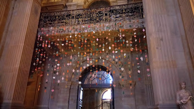
Patternise have used boards from our Stardream range to cut out Autumn shapes to form the hanging display at Castle Howard near York. The display forms part of the Autumn Festival which opened last week and is open from now until Christmas.
Click on images to enlarge
The shapes are produced using their "super pulsed" Trotec galvo system (GS1000), which enables extremely high-speed laser cutting and high volume paper finishing. Using this system they are able to cut many 1000's of sheets within very quick time-frames, which would be impossible with conventional lasers.
Sadly I haven't got a detailed image of the leaves but this is an excellent example of the creative uses of lasercutting and laser engraving and of course our Stardream board as well!

www.patternise.co.uk
Posted by Justin Hobson 04.10.2019