Thursday, 16 July 2020

Pills, Potions & Points: Letterpress Art in Science

Have you ever wondered how a 1950’s metal type fleuron can explain cutting edge Parkinson’s research? Who the naked reverse wifi guy is and what he’s got to do with enzymes? Or how flight and neurons can be connected? Glint lover Elizabeth Fraser has. In this lecture at the St Bride Foundation, she will explain her love of pattern, science and her journey bringing letterpress and the laboratory together.
This online lecture (via Zoom, next Tuesday 21st July) is by Elizabeth Fraser a.k.a Frauhaus who is an artist and printmaker working mostly with letterpress and linoprint. As well as puzzling over make-ready and inspiration in her garden studio Elizabeth teaches as an Associate Lecturer at Anglia Ruskin University in Cambridge. Her prints and artist books have been loaned, donated and acquired by Kent University special collections archive, Oxford University Bodleian Library, RIT Cary Graphic Arts Collection and The British Library. Most recently an essay about her sci-art work has been included in the book Ways of Thinking published by Ruskin Arts.

Why not take some time out and book for next Tuesday, 21st July 6.00–7.30pm Tickets: £3.00 – 5.00

You can book online HERE

www.frauhaus.co.uk
https://www.sbf.org.uk/
Posted by Justin Hobson 16.07.2020

Tuesday, 14 July 2020

dzek

Marmoreal is an engineered marble for architectural surfaces developed by Dzek in collaboration with the British designer Max Lamb. The graphic and immersive visual qualities of this engineered marble have also been harnessed in pieces of furniture, developed to illustrate the material’s capabilities beyond the typical two-dimensional expressions common to architectural surfaces.
This piece of literature works as both product information guide and promotional poster. Size is 838 x 590mm folding down to 148mm square. It folds into a 40pp broadsheet with an additional 8pp of 100mm high flaps.
It is concertina folded both horizontally and vertically as you can see in birdseye image below... The whole publication is printed offset litho on our Offenbach Bible 60gsm and it looks and feels absolutely gorgeous - it flops and folds in a delightful way when handling the publication as I hope these images demonstrate.
which folds out flat as below
The below image shows the way it concertina's from top to bottom (vertical folds) before folding horizontally.
The striking Marmoreal poster, which shows this amazing material...
Reverse, with details about the material together with images and the items of furniture made using Marmorial.
Photography is by Frank Hülsbömer. The publication is printed offset litho in CMYK and the colour reproduction on the Offenbach Bible is excellent, as you can see in the detail image below.
Field Projects, a London based studio, is responsible for the superb art direction and design. Creative Director on the project is Tom Watt.
...and many thanks for Tom for kindly sending me file copies and a lovely note.

https://dzekdzekdzek.com/marmoreal#marmoreal
http://maxlamb.org/157-marmoreal/
http://www.field-projects.com/
https://www.frankhuelsboemer.de/
Posted by Justin Hobson 14.07.2020

Friday, 10 July 2020

PIE

PIE is a new breed of recruitment agency for automotive, consumer goods and B2B. Their mission is to cut out all the hassle that typically comes with job search and have a straightforward, direct approach. London based design and branding studio, Studio Mean have produced for them, a no-nonsense brand that doesn't mince it's words. You can see the strong branding working across the PIE website here.
An important part of the branding is the business cards. The 54 x 84mm cards, literally have a slice of pie cut out of them! They are digitally printed on our Colorset 100% Recycled 350gsm in Deep Orange, which has been duplexed to make 700gsm, which is 1mm thick.
The cards are digitally printed in black on the face and the name and contact details are all printed in digital white (HP Indigo printed) on the reverse, with the angle die-cut off...
Colorset is a range of 36 colours, available in 120, 270 and 350gsm. The below image gives you an idea of the thickness achieved with the duplexing.
Design is by Studio Mean. Print and finishing is by MTA Digital, based in South London.

https://pie-recruitment.com/
https://www.studiomean.co/
http://www.mtadigital.co.uk/
Posted by Justin Hobson 10.07.2020

Wednesday, 8 July 2020

Nothing is Permanent

Cross-disciplinary designer and printmaker, Paul Wolterink works across a range of media, believing "Anything can function as a carrier for information". From his roots as graphic designer, Wolterink's design vision is based on rapid instinctive 'design intuition' resulting in strong communication and simple visual language, that quickly burns on the retina - which is certainly true with this bright fluorescent print!

In Paul's own words: "Small edition re-print no. 2, in a new colour combination, of my ode to the classic marker pen series and, also, as a tribute to one of my favourite mottos 'Nothing is Permanent'. Useful in a headwind, but also in a tailwind. This Blue & Fluorescent orange version comes in an edition of 50 prints only".
Paul Wolterink finished screen printing this new colour way reprint a day before 14 days isolation. The size is 230x500mm and is hand silkscreen printed on our Matrisse 200gsm, signed and numbered
as you can see below...
Below image shows the screen...
You can read more about his work here: http://portfolio.paulwolterink.com/filter/design/ and you can buy one of these lovely prints here

http://portfolio.paulwolterink.com/filter/design/
Posted by Justin Hobson 08.07.2020

Monday, 6 July 2020

Hackney Winter Night Shelter Annual Report

Each winter, Hackney Winter Night Shelter (HWNS) provides food, shelter and a warm welcome to homeless people in Hackney. They help get their guests out of homelessness and into homes. A project of Hackney Doorways, HWNS is a grassroots project run by volunteers from Hackney churches and the local community providing a meal and a bed for homeless people at 7 different venues around Hackney.

This is their annual report for the latest financial year...
The size of the publication is 225x152mm, portrait and is a 28pp, self cover on our Omnia 120gsm. The design uses bold, solid colours made out of CMYK...
As you can see from the image below, there is lots of colour and images with CMYK dark areas - loads of ink going down and it looks great on the Omnia, reproducing bright vibrant colours as well and the darker shadowy areas - all with an uncoated tactile feel and unlike many of the publications featured on this blog, which are printed offset litho, this has been digitally printed on an HP Indigo press. The colours are strong and punchy and the whole publication has a matt, tactile look and feel - in fact I can honestly say, every bit as good as litho!
Although Omnia was never originally developed for digital, we now keep it as a stock item with "sapphire treatment". This treatment is often applied to more unusual papers and provides a "key" so that the inks (which are different to litho inks) work on the paper surface. The great thing is the job just doesn't look and feel like a digital job.
The look and feel of the whole publication is very uncoated and tactile but there is absolutely no loss of detail as you can see in the detail image below...
This 28pp self cover publication flows superbly in the hand.
An interesting feature is that it is saddle stitched but has a square back! ..as you can see below. It is produced on a Morgana PowerSquare machine which produces this SquareBack™ finish.
The result is the book sits nice and flat and the finishing is well done, with no cracking on the spine.
Creative Director is Louise Desborough at Loud Creative. The job was printed and finished by digital print company Typecast Colour, based in Paddock Wood, Kent.

https://www.hwns.org.uk/
https://www.loud-creative.com/
http://www.typecast.co.uk/ 
Posted by Justin Hobson 06.07..2020

Thursday, 2 July 2020

Jobs from the past - Number 128

Regular followers of this blog will know that my first post of every month is a "job from the past" so that I can show some of the really good work from years gone by and this publication is from 2000. 

My Ford Mondeo - Sardinia 2000
This very industrial looking notebook was produced for the Ford Motor Company by Imagination, who have worked for Ford for many years and still do. This notebook was presented to participants of a Ford Mondeo symposium held on the beautiful island of Sardinia.
The book has a deliberately "workshop manual" feel. Size is A5 (148x210mm) Landscape and is wire-o-bound with a silver wire. The covers are produced on our Construction Blackstone 1500mics and the 60pp text is printed on Neptune Unique 170gsm.
The text is printed CMYK throughout and the text in this particular edition is in Hungarian!
The cover is silkscreen printed in three colours, silver, white and dark grey.
If you aren't familiar with Construction Blackstone, it is what is often described as a "millboard". It is produced on a board machine which makes up the board using wet layers of fibres, which is similar to the way Greyboard is produced, but this is not a Greyboard! This is a hard, dense, 100% recycled board with extraordinary rigidity and stiffness. It has a dark grey colour and a very hard surface. The below image shows the recycled, flecky nature of the surface with the Ford logo silkscreened in silver on the outside back cover.
The below image shows a detail of the wiro and the 1.5mm thick covers.
Concept and design is by Imagination. The print, silkscreen and wire-o-binding is by Gavin Martin with Phil Le Monde handling the project ...back in the days when they were based in West Norwood!

https://imagination.com/
https://www.gavinmartincolournet.co.uk/
Posted by Justin Hobson 02.07.2020

Tuesday, 30 June 2020

New paper bottle to rival glass

Today, the Frugal Bottle has been launched. Hailed as "the biggest innovation for wine and spirits since the launch of the glass bottle" the 75cl Frugal Bottle is made from 94% recycled paperboard with a food-grade liner to hold wine or spirits. It can be refrigerated and keep liquids cooler than glass.
With thanks to Frugalpac for images - www.frugalpac.com
The Frugal Bottle, which is comparable in cost to a labelled glass bottle, is the brainchild of British sustainable packaging firm Frugalpac. This UK company creates and supplies recycled paper-based products with the lowest carbon footprint that are easily recycled again so they don’t need to go to landfill. The Frugal Bottles are made at Frugalpac’s facility in Ipswich.
With thanks to Frugalpac for images - www.frugalpac.com
The first wine to go on sale in the Frugal Bottle is from the award-winning Italian vineyard Cantina Goccia. 3Q is an unwooded Sangiovese red with a hint of Merlot and Cabernet Sauvignon.

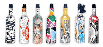
Concept designs for Frugal Bottles...
With thanks to Frugalpac for images - www.frugalpac.com
It's great to see such an environmental innovation, which can help reduce the carbon footprint of the drinks industry. You can read more about this innovative product here: https://www.frugalpac.com/frugal-bottle-the-recycled-paper-wine-bottle-that-thinks-outside-the-wine-box/

https://www.frugalpac.com/
https://www.cantinagoccia.com/
Posted by Justin Hobson 30.06.2020