Friday, 10 February 2012

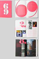
Typographic 69 - Australasian issue

This is the latest edition of Typographic, published by ISTD (International Society of Typographic Designers) issue 69.

This is a good read and always something in it to inspire and as the "Australasian Issue", the content is entirely devoted to those practising typographic design, both past and present, in the Southern Hemisphere.

The contents are eight articles by/about: Cal Swann, Gail Devine, Simon Pemberton, James de Vries, Annette O'Sullivan, Stephen Banham, Jack Yan and Vince Frost. The Editor is Nick Kapica.


Design is by Frost based in Sydney, Australia. Art direction and design is by Vince Frost, Ray Parslow and Graziela Machado.

It is A4 Portrait, with a 4pp cover and 48pp text, perfect bound ...and in true Oz fashion, all the folio numbers are printed upside down.

And now for the paper plug! ...now if the truth be known, because Vince is is on the other side of the planet, he'd originally spec'd Mohawk Superfine but it's bonkers expensive! So after getting real and looking at the budget and considering the page count and postal weight, I suggested our StarFine 115gsm text and 240gsm cover. It came in on budget and the Fluoro pink looks brilliant on it. It is beautifully printed by Gavin Martin in London.

If you aren't already a member, you should really think about joining - there are many benefits, this is just one! www.istd.org.uk

...and if you aren't a member, have a look http://www.istd.org.uk/ - it costs less than £10 per month - still excellent value!

www.istd.org.uk
www.frostdesign.com.au
www.gavinmartincolournet.co.uk
Posted by Justin Hobson 10.02.2012

Wednesday, 8 February 2012

CDG Brochure

This is a lovely, simple piece of literature for legal maritime specialist CDG. The brochure is designed by Crescent Lodge who had also previously designed the CDG identity a couple of years ago.
Brochure size is 260x220mm, portrait, saddle stitched. It has a 4pp cover on Omnia 280gsm and 24pp text on Omnia 150gsm.

The photography for the four section divider spreads is by Rodger Banning. I believe, he created the images by mixing oil and water (photographed on glass, I think?). Very effective.


Creative Director on the project is Lynda Brockbank and the designer is Malcolm Metcalfe.

Now this was only a short run job of 200 copies and was printed digitally on an HP Indigo press by the re-incarnated FS Moore at DG3 - see previous post... http://justinsamazingworldatfennerpaper.blogspot.com/2011/09/sad-end-for-fs-moore.html

Posted by Justin Hobson 08.02.2012

Tuesday, 7 February 2012

News from down under...

Yesterday I received some news from down under from my old friend Vince Frost - and he's cooking! Vince is joining hundreds of other Australian CEOs and many celebrity chefs to raise money and awareness related to homelessness. 


The CEO CookOff is a joint initiative of OzHarvest and Qantas. The event will bring together 30 celebrity chefs and 200 CEOs to raise awareness around food security and one of Australia's major social issues, homelessness.
You can help support Vince by clicking here http://www.ceocookoff.com.au/profile/776
to check out the site and then click on the 'donate now' button to help fund this worthy cause.
Is it my imagination, or do they just seem to have a lot more fun down in Australia?!

Posted by Justin Hobson 07.02.2012

Thursday, 2 February 2012

Jobs from the past - Number 28

Regular followers of this blog will know that my first post of every month is a "job from the past" so that I can show some of the really good work from years gone by...

Christmas at Liberty 2007
Press Invitation
This is quite simply one of the most stunning invitations that I've seen, it is one of the most beautiful and innovative pieces produced on our Flockage Litho.If you click on the image below, it will enlarge and hopefully you'll be able to see what I mean...
The size of the invitation is 210x148mm (A5).  It is totally unprinted on the flock side, just "heat de-bossed"  - This is a process where you make a block as if for hot foil blocking, and using the foiling machine you simply de-boss using the combination of heat and pressure but with no foil. On the Flocked surface this has the effect of flattenning the pile, so that it becomes smooth and the effect is subtle yet very noticeable.

The Flockage Litho 300gsm has been mounted (duplexed) onto another thicker white board, probably another 300gsm  (unfortunately the type of board has been lost in the mists of time) giving a total thickness of about 700microns. The text on the reverse of the invitation is printed in litho silver.  


Design is by Studio Thomson. Print production, which is simple (but very well executed) is by Xtraprint based in London EC2.
Posted by Justin Hobson 02.02.2012

Tuesday, 31 January 2012

Bywa

Last September I was contacted by Cornish based artist, Natasha Chambers. She produces and sells her own prints and she also makes a calendar every year.

Bywa - means “to be alive” in the ancient Cornish language of Kernewek and is also the name given to her series of limited edition prints. The calendar is to be a showcase of twelve of these prints and here it is....


The finished size of the calendar is 165x245mm. The text pages are on Flora Avorio 130gsm - for those that aren't familiar with it, Flora is a 50% recycled paper with natural deliberately visible inclusions and fibres and it works amazingly well with these beautiful artworks.

These are two interesting things to add about this job. Natasha showed me the calendar that she had done the previous year, which was a similar format but with just one "pin-hole" to hang on a nail. We discussed that this always looked a bit wrong and I suggested two holes with a "treasury tag" device but Natasha went one better and used the two holes with a lovely black ribbon, as below:
The other thing was that the cover is on our lovely Chagall, Fragola 260gsm (which is a strawberry coloured, feltmarked board) and the reason that Natasha chose it was because when I sent the samples, I wrote a note on a postcard that used the Fragola and she liked it so much, she used it!
It is a lovely calendar and it's well worth having a look at Natasha's website. The calendar was printed by Redruthian printer, Active Colour. Thanks to Natasha for sending me a file copy and a lovely note.
Posted by Justin Hobson 31.01.2012 

Monday, 30 January 2012

icrossing - a belated thank you

Here's the beautiful Christmas card that was sent to me from Brighton based design company, icrossing.
The front of the card is a lasercut snowflake which registers perfectly with a clear gloss hot foil blocked snowflake on the interior. A lovely idea and well produced.
Size is A6, portrait and is produced on our Omnia 280gsm. Print, lasercutting and foiling all produced by Evolution Print based in Sheffield.

...and thanks to Matt and Marc for sending me some file copies. 

www.evolutionprint.co.uk
www.icrossing.co.uk
Posted by Justin Hobson 30.01.2012

Sunday, 29 January 2012

A new face at Fenner Paper

Now I'm sure that most readers know that we aren't a massive company and we're a small (and perfectly formed!) group of individuals at Fenner Paper. So expanding our team is a big deal for us and I'm pleased to announce that Gillian Thomas has joined us.

Many of you will know Gill from her previous role at Howard Smith paper, where she worked for many years promoting papers that aren't as good as ours (...just kidding!) Anyway I'm pleased that she is now working with us and representing Fenner Paper.
Posted by Justin Hobson 29.01.2012