Tuesday 27 April 2021

Sublime Data

For over 20 years, the British artist Dan Holdsworth has been blending art, science and nature to produce works which challenge our perceptions and reinvent the notion of landscape. He studied photography at the London College of Printing (1998), and has exhibited internationally including solo shows at BALTIC Centre for Contemporary Art, Gateshead, and Barbican Art Gallery, London; and group shows at Tate Britain, London, and Centre Pompidou, Paris. 
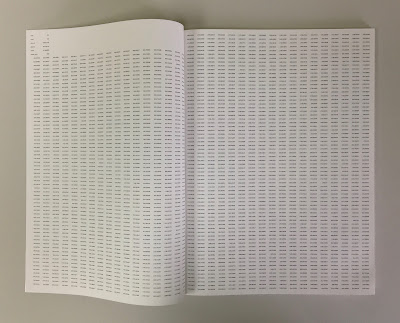
Published by Alaska Editions, Sublime Data is divided into three sections, each being accompanied with an essay.
The size is 320x230mm, portrait and is saddle stitched. It has a 4pp cover using a 115micron acetate and a 136pp text.
So the amazing thing about this publication is the use of a one sided 90gsm for the text, which is a lightweight 'cast-coated' paper which is high gloss coated on one side and dead flat uncoated on the reverse - our Astralux 90gsm. Above image is a gloss coated spread and below is an uncoated spread... 
Colour reproduction is superb and with the light 90gsm weight, the pages flop and fold beautifully.
You probably won't be able to guess, or even believe, is that it's digitally printed! The job was printed and finished by digital print company Typecast Colour, based in Paddock Wood, Kent. It was printed on their Ricoh C901 digital press and the result is superb. For a limited run (this is a limited edition of 75 copies) printing digitally makes a project such as this viable - and on a a material like this, which many litho printers are worried about!...just look at the print result in the detail image below...
The 136pp, sit nice and flat...
...and barely 'gapes' in the middle.
The saddle stitching with black wire is really neat:
My thanks to Typecast Colour for allowing me to photograph their file copy. Publication is designed by Sébastien Montabonel and this really is a superb example of a limited edition artbook. 

http://www.typecast.co.uk/

Thursday 22 April 2021

Today is Earth Day

Earth Day is an annual event first held on April 22, 1970. It now includes a wide range of events coordinated globally by EARTHDAY.ORG including 1 billion people in more than 193 countries.

What better day to tell you about the recently refreshed Shiro Echo 100% Recycled paper range!
Favini is a paper manufacturer based in Italy with mills in Vicenza near the city of Venice and at Crusinallo. They have taken a lead in the utlisation of non-wood pulps since the early 1990’s and they are the manufacturers of the Shiro Echo range. It was launched over a decade ago being a range of  text & cover papers manufactured using 100% post consumer waste.  
Shiro Echo was originally just two shades; a white shade, which is a natural/off white (and similar to the old shade of Cyclus) and a Bright White. With weights from 80gsm up to 350gsm, it is 100% Recycled and also carries the FSC Recycled classification.
The new additions to the range are three 'RAW' shades which have a slightly rougher/toothier surface and are in earthy tones of Grey, Sand and Black. The new shades are available in 120, 200, 250 and 350gsm. 
To accompany the brand refresh, there is a new printed sample book too...
Artist Lyndon Hayes was commissioned to capture the processes and the sheer scale and the noise of the production at the mill.
Size is 240x154mm, portrait and shows offset litho, silkscreen and hot foil blocking.
Design and art direction is by Silk Pearce. If you would like a copy of the Shiro Echo showbook and swatch, just ask me for one! Email justin@fennerpaper.co.uk

Posted by Justin Hobson 22.04.2021

Wednesday 21 April 2021

The worst day in the paper industry, so far...

I don't wish to be over dramatic, or a gloomy doom monger, but this news today is the worst that I can ever remember in my career...
I'm not sure the Printweek headline conveys the gravity of the situation. StoraEnso are one of the largest pulp and paper producers in the world and they have announced that they are closing two mills (Veitsiluoto and Kvarnsveden) which account for over 1.3 million tonnes of paper - and that's not including the pulp production that is also going. This is truly dreadful news and sadly includes well over 1,000 job losses.
You can read the full article in Printweek HERE.


You can also read about it in the Financial Times here:

These closures are on top of the fact that StoraEnso pulled out of coated paper production last year with a reduction of 1 million tonnes of two sided coated paper.

Last year I wrote an article on this blog about the state of the industry HERE.

We have dealt with StoraEnso for decades and we feel terrible for those people who are set to lose their jobs. These are incredibly difficult times in the paper industry but sadly inevitable as the ongoing contraction of our industry is set to continue for many years to come.
Posted by Justin Hobson 21.04.2021

Tuesday 20 April 2021

Amaffi

The Amaffi Perfume House is a luxury fragrance brand based in Switzerland. With boutiques in New York, London and Moscow, they create only naturally derived fragrances and are at the very exclusive end of exclusive!
Baddeley Brothers were commissioned to produce these luxurious correspondence notecards. They are exceptionally beautifully hot foil blocked using The Tube, Black 260gsm, which have been duplexed with an uncoated white board for the reverse.
If you aren't familiar with The Tube, you can read about it HERE. The Tube is made by Favini in Italy and is engineered to give a gorgeous flawless matt effect and the smoothly tactile surface exudes luxury.
As well as being hot foil blocked, the cards are also 'gilt edged' with gold foil, as you can see from the detail image below...
Detail showing the hot-foil blocking using a combination die, which raises the foil with an embossed finish, which highlights the matt flatness of the board.
To accompany the notecards are matching, handmade DL size envelopes which are foil lined 
My thanks to Baddeley Brothers for sharing these exceptional samples with us.
https://www.amaffi.com/
Posted by Justin Hobson 20.04.2021

Monday 19 April 2021

Jan Tschichold and the New Typography

On 29th April you can join author and curator Paul Stirton for an exciting Zoom lecture hosted by the St Bride Foundation. Paul Stirton was curator of the exhibition Jan Tschichold and the New Typography held in New York in 2019 and author of the book of the same title (Yale, 2019). His previous books include“Is Mr. Ruskin Living too Long?”: Selected Writings of E.W. Godwin(Oxford 2005). He is Professor of Modern European Design at the Bard Graduate Center in New York and editor of West 86th: A Journal of Decorative Arts, Design History, and Material Culture, published by University of Chicago Press.
During the 1920s Jan Tschichold began corresponding with many emerging graphic designers throughout Europe and the Soviet Union, offering to exchange works or requesting examples of adverts, posters and letterheads. What began as a means of educating himself in the principles of modern design, developed into a comprehensive survey collection of progressive graphics in Europe. Tschichold even referred to it as his “museum”. This collection is now dispersed, but we can recapture the spirit of the heroic period of modernism through Tschichold’s eyes by examining the designs he acquired.
This talk will illuminate works by some leading figures such as ElLissitzky, Kurt Schwitters, Moholy-Nagy and Piet Zwart, as well as lesser known designers like Johannes Molzahn, Walter Dexel and Max Burchartz.
Book Online HERE for an incredibly reasonable £5!
his talk is part of the ‘Celebrating 125 Years of St Bride Library’ lecture series and has kindly been sponsored by: Adobe Commercial Type, Eye Magazine, Eric de Bellaigue, Google, Jerry Wright, Just Another Foundry, Klim Type Foundry, Lexon GB, Creative & Innovative Print, Mayor of London, Medioto - Graphics & Animation, Peter Longland, R-Typography, Type By, Usborne Publishing and The Wynkyn de Worde Charitable Trust who have sponsored students and recent graduates across the UK to attend this lecture.
https://www.sbf.org.uk/whats-on/view/jan-tschichold-and-the-new-typography/
Posted by Justin Hobson 19.04.2021

Friday 16 April 2021

Paper leaves...

At present, there aren't many good news stories in retail, however today (yes, today!) the US fashion and lifestyle brand Anthropologie opened a new store in the ancient university city of Cambridge. Anthropologie was founded in Pennsylvania, in 1992 and now operates over 230 stores worldwide, 15 of which are in the UK.

For the opening of the new store, the Anthropologie windows and interior of the store were dressed in bright Spring/Summer leaves which were all laser cut using Fenner Paper! We supplied a mixture of our Stardream (pearlescent board) and our Colorset 100% Recycled board - which were laser cut by Patternise and then hand assembled by Anthropologie’s window display team into these beautiful displays. The result is simply amazing - and plastic free!

The materials were chosen after testing the board for lasercutting at the studio. Patternise are based in Cranleigh, Surrey, specialising in creative design and laser-cutting services. They work with a wide range of clients across the UK - managing large volume projects for major corporates and visual merchandisers to smaller projects for individuals and weddings. Patternise use state of the art laser cutters and they specialise in cutting “clean” materials such as fine papers, cards, and plastics.
Here are detail images of the leaves. The shapes are produced using their "super pulsed" Trotec galvo system (GS1000), which enables extremely high-speed laser cutting and high volume paper finishing. Using this system they are able to cut many 1000's of sheets within very quick time-frames, which would be impossible with conventional lasers.
With thanks to the team at Anthropologie for the images and to Rob at Patternise for the technical information.

https://www.anthropologie.com/ 
Posted by Justin Hobson 16.04.2021

Thursday 15 April 2021

New Dali Swatch

There are some new swatches in town ...!

The Dali range is a 'feltmarked' text and cover range manufactured by the Cordenons paper mill in Italy. We have been selling Dali for over twenty years and supplied it for the Historic Royal Palaces, Textile Conservation Studio review, printed in 1996, which you can read about HERE 
Click on images to enalrge
Since those days, there have been new shades, such as the Banana, which is used on the cover and there are thirteen shades in total including four white shades, Candido, Neve, Bianco and Camoscio.
Dali has a subtle linear feltmark, which I hope you will be able to see in the image below...
Click on images to enlarge
This paper can look amazing and make a publication look really special, as it did for the Textile project I referred to earlier. For that project, from a range of different papers shown to the client, the feedback was that "Dali is the paper which most represents the tactility and weave of cloth"

If you would like one of these swatches, just drop me an email: justin@fennerpaper.co.uk

http://www.gruppocordenons.com/
Posted by Justin Hobson 15.04.2021