Showing posts with label FS Moore. Show all posts

Thursday 2 November 2017

Jobs from the past - Number 97

Regular followers of this blog will know that my first post of every month is a "job from the past" so that I can show some of the really good work from years gone by...

Design for Life - DixonBaxi 2004
DixonBaxi is the studio established by Simon Dixon and Aporva Baxi in 2001. Having both worked at Attik, they set up their new studio as a partnership, to be just the two of them, working without the trappings of a large agency. Throughout the 2000's, they consistently delivered exciting and innovative design, art direction and branding, predominately for television. Their work for MTV, SciFi Channel, Five and Formula One was high profile and lauded within the industry.

Rather than produce big flashy studio brochure, the two partners deliberately produced a modest portfolio piece to show the work that they had recently produced for clients with a title reflecting their philosophy: design for life
The size is A6 (105x148mm) landscape and is perfect bound with a lovely, neat, square 4mm spine. The cover is printed on StarFine 200gsm, printed in the bright magenta.
The text is made up using "French-folded" sections on Offenbach Bible 50gsm which gives it a sensational light feel and flows beautifully in the hand. 'French Folding' is where the folded edges are on the fore-edge of the book, as in the picture below:
Of course 'french - folding' uses more paper - in fact double the amount! - so this job is actually in conventional terms a 64pp text, which is actually 32x 4pp French folded sections, so in actuality its 128pp! ...but of course it's on 50gsm, so it's only a 4mm spine.
The spreads are sublime, the information pages printed in solid magenta and the project with images from their projects over the previous three years...
Bearing in mind much of the imagery used is from RGB screen grabs, the reproduction is really good, below is the work for MTV...
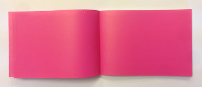
...and on an introduction spread, no words or image at all - just magenta space!
...you can see the way the text pages rolling and flopping over, flowing superbly.
It was printed offset litho by FS Moore in London and they really made a superb job of it. Richard Davey handled the project and he is now Sales Director at DG3/Leycol.

Design is, of course, by DixonBaxi. Simon and Aporva absolutely loved the finished piece and Simon was kind enough to send me file copies and a handwritten note...
DixonBaxi are now a much larger agency with 30 staff, still headed by Simon and Aporva, so sadly as is the way with bigger studios I no longer have regular contact with the two founders but it's great to have played a small part in the studio's development and history.

http://dixonbaxi.com/
http://www.leycol.com/
Posted by Justin Hobson 02.11.2017

Wednesday 2 September 2015

Jobs from the past - Number 71

Regular followers of this blog will know that my first post of every month is a "job from the past" so that I can show some of the really good work from years gone by...

The Wapping Project - 2000
The Wapping Project was, until recently, an arts project housed in the old Wapping Hydraulic Power Station (built 1890). The building originally housed steam operated boilers to generate electricity in the early days of electrification. The works was decommissioned and mothballed in 1977. The building was converted and reopened by the Womens Playhouse Trust (WPT) which is a charity and under the management of Jules Wright, it was opened as an arts centre in October 2000.
Click on images to enlarge
The project included exhibition space in the basement and SHED54, where pieces of original equipment were still in place. On 14th October the bar and restaurant WAPPING FOOD was opened, unusually with an all Australian wine list!

This is the promotional concertina folded leaflet, produced to give the information about events and exhibitions. Size is 225x696mm folding down to a finished size of 225x89mm.
Click on images to enlarge
Many readers of this blog may be unfamiliar with the contents of the panel on the left hand page - the 'reply card' or often 'reply paid card' which was the way that people used to get onto a mailing list before the days of the internet and email! (...and well before QR codes!)
It was printed in CMYK plus a special - a metallic antique gold on one side and one colour gold, reverse. It is printed on our Neptune Unique 160gsm, which has reproduced images superbly.

The superb photography is by John Spinks.from East Photographic. Amazing images.
Art direction and design by Frost in London. Creative director was Vince Frost who now runs Frost in Australia and the designer is Sonya Dyakova, who now runs her own studio in London.

It was printed offset litho by FS Moore in London. Richard Davey handled the project and he is now Sales Director at Leycol.

Sadly the building was sold to developers in 2013 and the project has subsequently closed - a great loss for London and the Wapping area.

http://www.thewappingproject.com/
http://www.frostdesign.com.au/
www.atelierdyakova.com
http://east.co/artists/johnspinks/
http://www.mooreprint.co.uk/
http://www.leycol.com/
Posted by Justin Hobson 02.09.2015 

Tuesday 2 December 2014

Jobs from the past - Number 62

Regular followers of this blog will know that my first post of every month is a "job from the past" so that I can show some of the really good work from years gone by...

The Wapping Project
Diary - 2001

The Wapping Project was, until recently, an arts project housed in the old Wapping Hydraulic Power Station (built 1890). The building originally housed steam operated boilers to generate electricity in the early days of electrification. The works was decommissioned and mothballed in 1977. The building was converted and reopened by the Womens Playhouse Trust (WPT) which is a charity and under the management of Jules Wright, it was opened as an arts centre in October 2000.

The project included exhibition space in the basement and SHED54, where pieces of original equipment are still in place and a restaurant on the ground floor, called WAPPING FOOD, under head Chef Justin Aubrey.
A folded down broadsheet called 'Wapping Diary' was regularly produced to give the information about events and exhibitions. The size of the broadsheet is 420x712mm, folding down to a 32pp 210x89mm.

It was printed in CMYK plus a special - a metallic silvery blue on one side and one colour (special) reverse. It is printed on our Redeem 100% Recycled 80gsm, which is a neutral white recycled paper with enough industrial feel that really worked well for this project with it's mix of heritage and electricity/neon imagery. A beautifully simple piece of literature which just used all the elements correctly and sets this piece miles away from just a 4 colour leaflet on a bit of silk coated paper!
Below is a close up of the way the metallic has worked on the paper:
This project was designed by Frost in London. Creative director was Vince Frost who now runs Frost in Australia and the designer is Sonya Dyakova, who now runs her own studio in London.

It was printed offset litho by FS Moore in London. Richard Davey handled the project and he is now Sales Director at Leycol.

Sadly the building was sold to developers in 2013 and the project has subsequently closed - a great loss for London and the Wapping area.

http://www.thewappingproject.com/
www.atelierdyakova.com
http://www.frostdesign.com.au/
http://www.mooreprint.co.uk/
http://www.leycol.com/
Posted by Justin Hobson 02.12.2014

Wednesday 7 September 2011

A sad end for FS Moore


This is the report that appeared in Printweek, yesterday, about the demise of London printer FS Moore, which I reproduce below...

FS Moore owed almost £2m when administrators appointed
By Adam Hooker Tuesday, 06 September 2011

East London printer FS Moore went into administration owing almost £2m to creditors, according to the administrator's report.

The Bank of Ireland was the largest creditor, owed £517,000, but a number of paper companies, print finishers and trade printers were also included.

One paper company was hit for £137,000, while another two were each owed just under £50,000. One finisher included in the creditors' list was hit for as much as £70,000, although most were owed £10,000 to £20,000.

The company also left £250,000 owed to HMRC, around £50,000 of which was for VAT. Redundancy claims accounted for £182,000. Insolvency practitioner BDO was appointed as administrator on 28 July, before selling the business and assets to DG3 Europe in a pre-pack deal the same day.

The report reveals that the business was bought for £140,000, comprising £135,000 for plant and machinery and £5,000 for stock. DG3 also agreed to pay 1% of annual turnover from FS Moore up to £1m and 2% over £1m annually for a period that has yet to be agreed.

According to the report, FS Moore saw turnover drop by around £800,000 in the two years leading up to its administration, from £4.2m in 2008 to £3.4m in 2010.

Initially the directors planned to sell the company in November 2010, however the deal fell through when HMRC refused to defer the repayment of its debt.

It's a real shame when companies which have a good reputation, such as Moores (who's work has appeared before on this blog) hit the buffers. However, it is indicative of the current state of the print and paper market.

You can read the article in full on the following link:
http://www.printweek.com/news/1089465/FS-Moore-owed-almost-2m-when-administrators-appointed/?DCMP=ILC-SEARCH
Posted by Justin Hobson 07.09.2011

Friday 20 November 2009

Richard Sanderson - Illustrator

I just received a very nice self promo piece from illustrator Richard Sanderson printed by FS Moore but on paper supplied by Howard Smith! - come on Richard, wake up and smell the coffee, I'm meant to be writing about papers we do here at Fenner Paper! Anyway, I like the piece so much I thought I would share it with you, so have a look at www.rjsanderson.co.uk
www.mooreprint.co.uk

Friday 9 October 2009

Reinventing the Square

This is a superbly produced little book called "Reinventing the Square". It is designed and published by ico Design.

The project was overseen by ico Founder Niall Henry. Creative Director is Ben Tomlinson, Design Director is Vivek Bhatia and the writer is Gerard Ivall.

This publication is about ico's work on the branding of Dolphin Square, a 1930's residential development in London which has been redeveloped over the last few years. The book looks into the branding of the building including the sub-brands: Dolphin House, Dolphin Bar & Grill and Dolphin Fitness Club.

It will be of great interest as a reference source for anyone looking at branding or re-branding a property development.

The book is175x125mm and has 52pp. It is printed on our BrandX FSC 150gsm (this is part FSC virgin fibre and part recycled). The material was chosen so that it would not be bright white and give the historical mono images a period feel whilst still giving a bright vivid reproduction for the new images showing the new brand at work.

Now the really clever production thing about this job is that every spread also folds upwards to reaveal an 8pp "broadsheet" type spread. The spread below then folds up to reveal....
this spread...

It has been very well printed and finished by printers FS Moore. Keith Arnold handled the job at Moores. Bearing in mind that every section has been back to back laminated, it has been done really superbly and certainly my copy is perfect (...as I'm sure they all are!)

The good news is that they have been published with an ISBN number and are available to buy at a very reasonable cover price of £9.99. It's worth buying to see the finishing alone!

http://www.icodesign.co.uk/

http://www.mooreprint.co.uk/