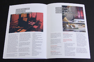
 Here is a really excellent piece of literature, which I guess we would all hope for and expect as it's for Central St Martins.
There's also one thing in particular which I would like to point out [below]. The job size is 165x240mm which is an economical size to produce from a B1 sheet. It is printed on our StarFine White which is an uncoated with a good bulk but you wouldn't describe it either as toothy or smooth! It has a 4pp cover and only a 24pp text. Potentially this could have posed a problem, because a printed spine was considered important and part of the design brief but by using 130gsm for the text it gave a 2.5-3.0mm spine width which is about the thinest that you can successfully perfect bind (and it's been very well finished with the 6 point, I think, type on the spine)
Now the thing that I have noticed about this piece and that I want to point out is that the cover is not as heavy as most people (that I speak to) would use - but it really, really works. It is only on 200gsm and the
point is that the relationship between the text and cover is perfect. It just flows and feels perfect in the hand. The cover doesn't feel cheap or insubstantial. Getting the relationship between the text and cover right can make or break the piece of literature -it's crucial - heavy covers do not always give a job a prestigious feel, often it makes a brochure unusable! ...so don't always reach for the 350gsm, just get the relationship right!
This piece is designed by Paulus Dreibholz who runs his studio in London and lectures at CSM and University of Applied Arts in Vienna amongst others.
Print is by Principal Colour.
http://www.csm.arts.ac.uk/
http://www.dreibholz.com/
http://www.principalcolour.co.uk/
Posted by Justin Hobson 23.08.2010


No comments:
Post a Comment
Thanks for your comment! If I like it, I'll add it on. Cheers J