Showing posts with label Gavin Martin. Show all posts

Tuesday 17 July 2012

Penthouse - Wellington House

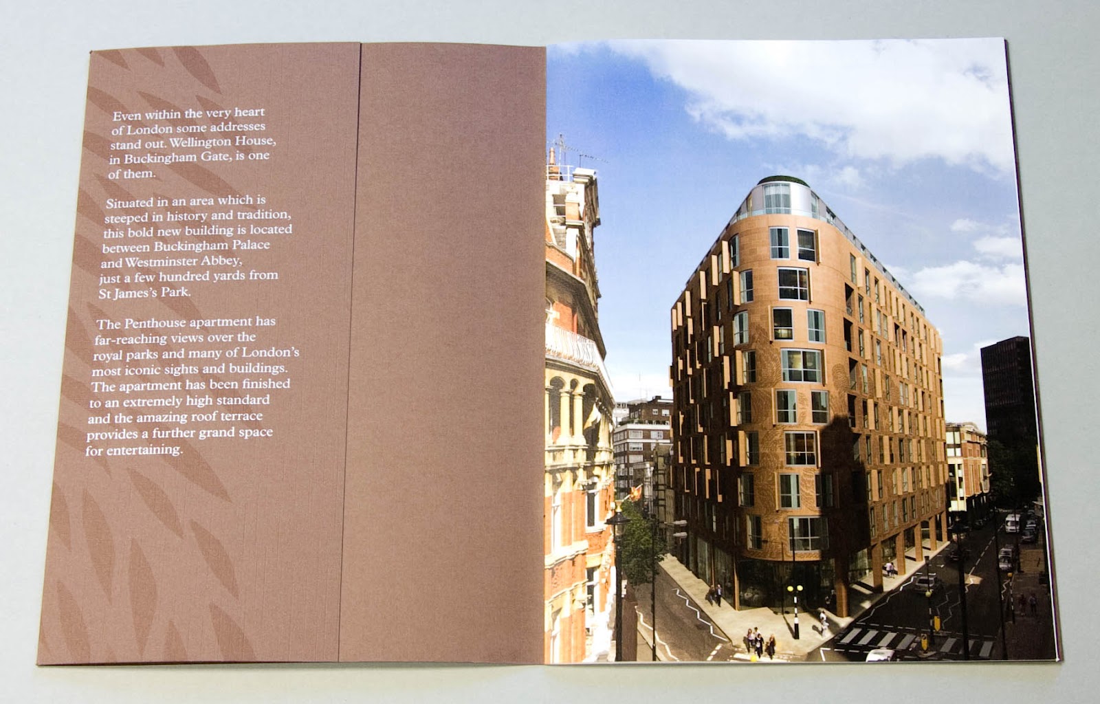
Wellington House in Buckingham Gate, London SW1 is one of London's most prestigious addresses. This is the literature especially commissioned to sell the penthouse appartment (which, incidentally, comes with the roof terrace!)

The cover which is litho printed with leaf illustrations and hot foil blocked in silver and white foil uses a linen embossed brown board supplied by that other, Hull based, paper company! Size is 190x265mm portrait and is saddle stitched.
However, it's the text where the job really starts to shine! ...printed on our Omnia 150gsm.
Centre spread:
Interestingly, the brochure only has a 4pp text stitched in, with the 6pp "plans" section forming a roll fold which has been stuck into the inside back cover using a tab stuck parallel to the spine (below)

...rolling out to it's full extent:


Design is by NB:Studio. Creative Directors on the project were Nick Finney and Alan Dye. Designer was Eng Su. It has been beautifully printed, foiled and finished by Gavin Martin.

Posted by Justin Hobson 17.07.2012

Thursday 28 June 2012

Hardy Amies S/S 2012

This is the spring summer lookbook for British menswear brand, Hardy Amies. Creative Director, Claire Malcolm, has developed the brand’s Savile Row roots of craftsmanship with these new, modern collections.

“A man should look as if he had bought his clothes with intelligence, put them on with care, and then forgotten all about them”  
Hardy Amies

Size is 345x265mm, portrait. It is a 20pp self cover printed on our Marazion Ultra 150gsm. Colour reproduction (and solids) are superb.


For readers not familiar with Marazion Ultra, it's a fully coated paper but it really does have a dead flat MATT surface. There are many papers on the market which profess to be matt (and some which incorporate the word matt in the name, but aren't!) ...but this really is - and if you don't believe me, please ask for a sample.

Creative director at Hardy Amies is Claire Malcolm. The amazing photography is by Angelo Pennetta. Print is by Gavin Martin.

http://hardyamies.com/
http://www.angelopennetta.com/
www.gavinmartincolournet.co.uk
Posted by Justin Hobson 28.06.2012

Friday 4 May 2012

Jobs from the past - Number 31

Regular followers of this blog will know that my first post of every month is a "job from the past" so that I can show some of the really good work from years gone by...

Ballpoint 
Exhibition Catalogue 2004

In 2004, Angus Hyland, a partner at Pentagram's London office, curated an exhibition celebrating 50 years of the Parker ballpoint jotter. Introduced in 1954, the Parker Jotter sold more than 150 million pens worldwide and was Parker's first ever ballpoint pen. Angus's aim was to explore and celebrate the artistic potential of the humble ballpoint pen. His inspiration came from a collection he had begun to make of the doodles and drawings made by his fellow Pentagram partners during their international meetings. A conversation with his wife, the illustrator Marion Deuchars, gave rise to the idea of an exhibition of artwork created using only ballpoint pens. The result was Ballpoint, a collection of works by over 50 fellow creatives from around the world.
I remember that I went along to Pentagram for a meeting with Angus together with Gary Bird from Gavin Martin. Angus briefed us about the project as a whole and the exhibition catalogue in particular. He showed us some of the submitted exhibits including the school desk (see below) which illustrator Billie Jean had submitted - not just a photograph, Billie went out and bought a desk, illustrated it and sent the whole desk to Pentagram - how cool is that!

A spread showing work by Ian Wright and Billie Jean.
The brief was to produce something that had the actual look and feel of a sketchbook rather than something that just reproduced the images. He didn't want a pastiche, just something that felt realistic ...and of course a solution that was also affordable. After discussing pagination and economical formats with Gary, the result is a book of 235x300mm, portrait, saddle stitched. The 72pp text was printed on our Redeem 100% Recycled 130gsm, which has the utilitarian feel but which would reproduce some of the more demanding images really well. The cover is Idaho Blu Sky 275gsm, which has an "excercise book feel" and colour and which worked really well with the blue binding tape that went down the spine. The tape is also used to create a pen holder - there is a full flap on the inside back cover which is glued  down allowing a slot with the loop of tape which cleverly holds the pen.

A spread showing a detail from Roderick Mills’ “The skies are full, 101 aircraft, 101 pens (no.2).”
Work by Angus Hyland and Marion Deuchars.
Invitation to the private view:
Images from the exhibition:

I wasn't sure how I could pick one or two people to highlight in this piece, so I've listed all the contributors here:
Ceri Amphlett, Lorenzo Apicella, Ron Arad, Alan Baker, James Biber, Nicholas Blechman, Anthony Burrill, Margaret Calvert, Nina Chakrabarti, Paul Davis, Mike Dempsey, Ryan Denton, Marion Deuchars, Stephen Doyle, Daniel Eatock, Jonathan Ellery, Sara Fanelli, Alan Fletcher, Jeff Fisher, Jason Ford, Tom Gauld, Michael Gillette, Fernando GutiƩrrez, George Hardie, Thomas Heatherwick Studio, Julian House, Sharon Hwang, Angus Hyland, Benoit Jacques, Billie Jean, Kerr Noble, David Lancashire, Uwe Loesch, Ross Lovegrove, Fernando Medina, Abbott Miller, Roderick Mills, Flavio Morais, Christoph Niemann, Woody Pirtle, Shonagh Rae, Lucinda Rogers, Paula Scher, Sophie Smallhorn, Leonardo Sonnoli, DJ Stout, Adrian Taylor, Patrick Thomas, Peter Till, Aude Van Ryn, Ian Wright.

From my point of view, it was a great project to be involved with. It won  many awards including the 2005 DesignWeek Award for Promotional Brochures, the Best in Book Creative Review Annual 2005 and the main award in the Books and Exhibition Catalogues category at the 23rd International Biennial of Graphic Design in Brno in 2008 and probably many other awards I'm not aware of!

A particularly lovely touch (especially from my point of view) is the beautiful way in which our business cards were illustrated on the credits page:


Art direction is by Angus Hyland with artwork by Marion Deuchars. Designer on the project was Charlie Hanson. Charlie has since established her own studio together with Jessie Earle called Studio 10½. The exhibition was co-curated by Steven Bateman, PR and gallery coordinator at Pentagaram, he is now an established and revered wordsmith.

It was beautifully printed and finished by Gavin Martin in London.

If you've got a copy, you're lucky as it's an absolute gem!

http://www.parkerpen.com/
www.pentagram.co.uk
http://mariondeuchars.com/
www.tenandahalf.net
Steven Bateman: http://www.26.org.uk/members.asp?ID=3442
www.gavinmartincolournet.co.uk
Posted by Justin Hobson 04.05.2012

Friday 10 February 2012

Typographic 69 - Australasian issue

This is the latest edition of Typographic, published by ISTD (International Society of Typographic Designers) issue 69.

This is a good read and always something in it to inspire and as the "Australasian Issue", the content is entirely devoted to those practising typographic design, both past and present, in the Southern Hemisphere.

The contents are eight articles by/about: Cal Swann, Gail Devine, Simon Pemberton, James de Vries, Annette O'Sullivan, Stephen Banham, Jack Yan and Vince Frost. The Editor is Nick Kapica.


Design is by Frost based in Sydney, Australia. Art direction and design is by Vince Frost, Ray Parslow and Graziela Machado.

It is A4 Portrait, with a 4pp cover and 48pp text, perfect bound ...and in true Oz fashion, all the folio numbers are printed upside down.

And now for the paper plug! ...now if the truth be known, because Vince is is on the other side of the planet, he'd originally spec'd Mohawk Superfine but it's bonkers expensive! So after getting real and looking at the budget and considering the page count and postal weight, I suggested our StarFine 115gsm text and 240gsm cover. It came in on budget and the Fluoro pink looks brilliant on it. It is beautifully printed by Gavin Martin in London.

If you aren't already a member, you should really think about joining - there are many benefits, this is just one! www.istd.org.uk

...and if you aren't a member, have a look http://www.istd.org.uk/ - it costs less than £10 per month - still excellent value!

www.istd.org.uk
www.frostdesign.com.au
www.gavinmartincolournet.co.uk
Posted by Justin Hobson 10.02.2012

Thursday 26 January 2012

This is the latest brochure for tableware designers and producers Robert Welch Designs.

I wrote about the company and some of their literature on a post last year:
http://justinsamazingworldatfennerpaper.blogspot.com/2011/09/robert-welch.html

This brochure is a 32pp self cover, saddle stitched. Size is 297x155mm, printed on our Marazion Ultra 135gsm. The cover is varnished with a gloss UV varnish. It is printed CMYK throughout plus a pantone silver - which given the flat mattnes of the paper works beautifully well, while all the metallic tabelware reproduces exceptionally in four colour process...


Design is by Dowling Duncan. Art direction and design was by John Dowling who works closely with Alice and Rupert Welch. Photography is by Trevor Innes and Tony Muranka. Print is by Gavin Martin Colournet
 
Posted by Justin Hobson 26.01.2012

Tuesday 27 December 2011

Ding Dong

This is the clever little festive greeting card (...or should that be parcel?) from Magpie Studio.
Have a look and then I'll explain...

As Magpie see it, posties are the unsung heroes of Christmas. Up early in all weathers contending with impossible addresses and dogs nipping at their heels, this is their tribute to these troopers.

Working with photographer John Angerson, Magpie contrived to getting as many of the posties from around the Shoreditch area and the various routes (or walks as they call them in the PO) as possible ending up with thirteen in total. Words are written by Scott Perry (Bard of Bray).

The outer cover which looks like a package is formed using our Rib-Tone 2 sided 340gsm and forms both the cover and envelope. The fourteen cards are "bound" in using the Royal Mail red rubber bands that we are so familiar with, littering the outside of many front doors and workplaces!

Print, finishing and rubber-banding (!) is by Gavin Martin Colournet. It's also worth pointing out that the Rib-Tone is printed in 1 colour - white - on their new HP Indigo digital press! not silkscreen or hot foil ...it's white ink! 
 
The cards are printed on our Omnia 280gsm, which as you can see from above, prints a solid red, just beautifully and are also printed on the HP Indigo.

Posted by Justin Hobson 27.12.2011

Tuesday 20 December 2011

New digital installation

I popped in to see London based printer Gavin Martin Colournet last week and they are excitedly experimenting with their new bit of kit, a digital press - an HP Indigo 5500 ...so I took a picture of their new machine:
This new press is their first digital installation and is to compliment with their existing Heidelberg B1 Offset Litho press. The press features a capability to print special colours and opaque white.

Personally I was also excited about their other machine installation, a new Nespresso machine, which Gary Bird was kind enough to operate for me... 
Posted by Justin Hobson 20.12.2011


Thursday 17 November 2011

Morgan McKinley

This is an excellent example of a corporate brochure. It is beautifully designed, with innovative print and finishing features and is produced to a very high standard.

Morgan McKinley are a company working in the global professional recruitment industry and this corporate brochure is to give a company overview to potential clients.
Hot foil blocking in gloss black foil together with matt red foil features on the front cover and on the endpapers, gloss UV varnish used to great effect, below.
The publication is 215x280mm, Landscape, perfect bound. It has a 4pp cover, 2x2pp endpapers (front and back) and a 28pp text printed on our Omnia 150gsm - which as you can see from the mono photography and the flat solid areas of red and black, have given this job an amazing mattness and tactility.


Design is by Glazer. Creative director on the project is Jonathan Wybrow. Print and finishing is by Gavin Martin.

One final word ...how lovely to see an outstandingly produced corporate brochure that doesn't rely on stock photography, bright four colour work and glossy paper - it looks great.