Showing posts with label Sapphire Treatment. Show all posts

Friday, 6 March 2020

Le Ster

https://www.le-ster.com/
Aishleen Lester established her London based jewellery brand, Le Ster, in 2018. As a child with an active imagination and a magpie of colour and stories, Aishleen has always been drawn to the power of objects and the stories they can tell and her jewellery designs are testament to that. In 2018 Aishleen won Designer to Watch at International Jewellery London and her work has been featured in a number of publications including International Wall Street Journal and Departures Magazine.
This is a series of five 2pp, A5 size cards produced under the title of 'Light the Grey' which shows each individual jewellery piece.
Click on images to enlarge
The cards are printed on Omnia 320gsm. Unlike many of the printed items featured on this blog, which are printed offset litho, this has been digitally printed on an HP Indigo press. The colours are strong and punchy and the cards have a tactile look and feel. Being a digital print process it also means that small quantities can be printed economically and updated frequently, without the pressure of having to do a large print run. Below image shows the reverse of the cards...
Although Omnia was never originally developed for digital, we now keep it as a stock item with "sapphire treatment". This treatment is often applied to more unusual papers and provides a "key" so that the inks (which are different to litho inks) work on the paper surface. The great thing is the job just doesn't look and feel like a digital job. Below is a detail shot showing the excellent reproduction of the fleshtones and in the dark areas.
Brand strategy and marketing agency is Studio Luxmore. Photographer and lighting specialist is Rhys Gray. Design is by Laura Purdy and digital printing is by Screaming Colour.

https://www.le-ster.com/

Posted by Justin Hobson 06.03.2020

Tuesday, 20 February 2018

Grey Goose Alpine Cabins

Grey Goose vodka partnered with Radio Rooftop at ME London, to run a spectacular winter experience: Three luxuriously Alpine Cabins overlooking the London skyline together with a range of specially created Grey Goose Cocktails.
 
This is the piece of literature produced to promote the experience and to also list the exclusive cocktails.  
Click on images to enlarge
The 6pp invitation is 220x145mm, portrait and is printed on our Omnia 320gsm, which is a very bulky board with a subtle, natural texture and tactile surface. Reproduction is superb and the reproduction of the wooden cabin planks reproduced on the outside, feels wonderfully tactile.
The invitation has been digitally printed on an HP Indigo press. The inside colours are strong and punchy and the invite has a matt, tactile look and feel - in fact I can honestly say, every bit as good as litho! Although Omnia was never originally developed for digital, we now keep it as a stock item with "sapphire treatment". This treatment is often applied to more unusual papers and provides a "key" so that the inks (which are different to litho inks) work on the paper surface. The great thing is the job just doesn't look and feel like a 'digital' job.

I must also mention two other aspects of the production. The cover is beautifully hot foil blocked (the printers, Ashwyk, have got hot foiling machinery in house)
Click on images to enlarge
...and it is also beautifully finished, well creased which means it folds well, sits square and folds flat too.
Creative direction and design is by London based branding agency Ragged Edge.
 
Print and finishing is by Essex based printers, Ashwyk. Thanks to Joe de Wykerslooth for giving me some file copies.
 
Posted by Justin Hobson 20.02.2018

Saturday, 27 January 2018

Abram Games, Designs with Type

Abram Games is acknowledged as being one of the 20th Century's greatest image makers, his work is now a fascinating record of social history. For over 60 years he produced some of Britain’s most memorable images including the war years as Official War Poster Artist producing over one hundred posters. He was the designer of the Festival of Britain emblem and his clients included the United Nations, London Transport, British Airways, Shell, the Financial Times, Guinness and of course book jackets for Penguin books. He also created the first animated BBC on-screen ident in 1953.

This small booklet was designed to accompany a talk by his daughter, Naomi Games, to the Wynkyn de Worde society.
The size of the publication is A6 (148x105mm) portrait and is saddle stitched. It is a 16pp self cover and is digitally printed (HP Indigo) on our Omnia Natural 120gsm.
Click on images to enlarge
The work in this booklet is a combination of his work before WW2, during WW2 (as the only official War Poster Artist) and his work in peacetime.
Click on images to enlarge
The publication is digitally printed by Typecast Colour, based in Paddock Wood, Kent. It was printed on their Xerox digital press and the result is excellent. The great thing is the job just doesn't look and feel like a digital job, which is mainly down to the choice of substrate.
As a 16pp 'self cover' saddle stitched publication, it sits nice and flat.
Booklet design is by Paul Harpin. Printing is by Typecast based in Paddock Wood in Kent.

I have a few file copies of this publication available, so if you would like one, please drop me an email (justin@fennerpaper.co.uk)

It's also just worth pointing out that the work of Abram Games, along with many other pioneering Jewish émigré designers is being shown in the 'Designs on Britain' exhibition at the Jewish Museum in London until  15th April

https://www.abramgames.com/about
http://www.typecast.co.uk/
Posted by Justin Hobson 27.01.2018

Tuesday, 8 August 2017

Vive L'Espresso Martini!

To create GREY GOOSE vodka, François Thibault maintains an unrivalled level of craftsmanship, using only the very finest ingredients. Its signature smoothness and distinct character are the result of an extraordinary passion for spirit making and an unparalleled commitment to the highest possible quality.

Grey Goose have a list of cocktails that can be made using their Vodka and they also have a range of featured "Holiday Cocktails". and this 8pp menu/recipe card is for a L'Espresso Martini.
The size is 195x105mm portrait and is an 8pp concertina format printed on our Omnia 280gsm. Omnia was chosen because it would work with the rich detail that is present in the images but that would still give a natural look and tactile feel. As you can see from images, the photography is quite dark, but there is no loss of detail, which is what can often happen printing on an uncoated paper. The "Grey Goose Blue" is rich and the solid has printed beautifully. Printed offset litho throughout.
Click on images to enlarge
Omnia 280gsm is a very bulky board with a thickness of over 400microns. As you can see below it creases beautifully and this has been professionally matrix creased.
Birds eye view below:
Creative direction and design is by London based branding agency Ragged Edge.
 
Printing is by Identity, based in Paddock Wood, Kent and they made a superb job of it - colour reproduction and solids are superb.
 
..and if you are over 18 (!) you can watch a video about the Coctails here: https://www.youtube.com/watch?v=gNR3Gx-a34s
 
Posted by Justin Hobson 08.08.2017 

Thursday, 20 July 2017

Gillian Hyland cards

Originally from Ireland, Gillian Hyland began her career in publishing, where she worked as a fashion stylist and features writer for a number of well-known national magazines. This led to a move into the television industry, and later into the film industry.

As an artist and photographer, she creates supernatural staged images, presented as film stills or dramatic moments. Hyland’s unsettling mise-en-scene are full of sex and desire, sadness and nostalgia. Last year Gillian won a Royal Arts Prize and is represented by Saatchi Art.

This series of 2pp, A6 size cards are printed on Omnia 280gsm. The images have lots of detail but are all quite dark and therefore it was important to retain as much detail, especially in the dark areas. This is the reason that Omnia was chosen rather than a regular uncoated board, Omnia gives the uncoated look and feel but with great colour reproduction.
Click on images to enlarge
Unlike many of the printed items featured on this blog, which are printed offset litho, this series of cards has been digitally printed on an HP Indigo press. The colours are strong and punchy and the cards have a tactile look and feel. Being a digital print process it also means that small quantities can be printed economically and updated frequently, without the pressure of having to do a large print run.
Click on images to enlarge
Although Omnia was never originally developed for digital printing, we now keep it as a stock item with "sapphire treatment". This treatment is often applied to more unusual papers and provides a "key" so that the inks (which are different to litho inks) work on the paper surface. The great thing is the job just doesn't look and feel like a digital job. 
All the cards have the artwork details printed in black on the reverse, as you can see above.

Design is by Gillian Hyland Creative. Printing is by Chadbon Printing based in London.

https://www.gillianhyland.com/
http://chrischadbonprinting.com/
Posted by Justin Hobson 20.07.2017

Thursday, 27 August 2015

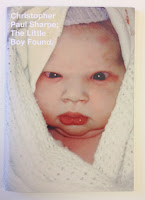
Little Boy Found

This limited edition publication is the second of two publications produced by London based photographer  and artist Christopher Paul Sharpe. This is the second book titled The Little Boy Found (the first book is called Little Boy Lost) contains images edited by Lu Bowan, with each of the photographs relating to the theme of ‘lost and found’ ...a very eclectic mix.
Click on images to enlarge
Size is 210x148mm (A5), portrait with a 4pp cover printed on Omnia 200gsm and 36pp text printed on Omnia 120gsm. 
The book is digitally printed on an HP Indigo press by Gavin Martin Colournet. Omnia is suitable for use on HP Indigo presses if it has been 'sapphire coated'. The colours are strong and punchy and the whole book has a matt, tactile look and feel, the effect of which is every bit as good as litho.
The book is 'singer sewn' with a white thread which is a perfect detail that just adds to the overall effect of this beautifully produced little book.
Outside back cover:
Design is by Studio Thomson, Creative directors are Mark Thomson and Chris Thomson. The book has a limited print edition size of 150 copies. Books are for sale online and also at Foyles. Print and finishing is by Gavin Martin Colournet.

...and for your interest, both books were recently featured as book of the day on the 'self publish be happy' website: http://www.selfpublishbehappy.com/2015/04/book-du-jour-the-little-boy-lost-the-little-boy-found-by-christopher-paul-sharpe/

http://christopherpaulsharpe.com/
http://www.studiothomson.com/
http://www.gavinmartincolournet.co.uk/
Posted by Justin Hobson 27.08.2015


Friday, 14 August 2015

GREY GOOSE Boulangerie François

This summer, GREY GOOSE Boulangerie François, in partnership with Harvey Nichols, has created the World’s Most Intimate Martini Bar. Hidden inside a beautifully designed camionnette (a vintage Citroen delivery van) GREY GOOSE has created a luxurious space reserved for the select few to experience the mixing of a their own bespoke Martini.

The 'van' is visiting London, Edinburgh and Manchester.
Click on images to enlarge
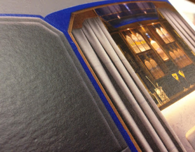
This 4pp invitation is 210x120mm, portrait and is printed on our Omnia 320gsm, which is a very bulky board with a subtle, natural texture and tactile surface. Reproduction is superb with the colours bright and vibrant.
The invitation has been digitally printed on an HP Indigo press. The colours are strong and punchy and the invite has a matt, tactile look and feel - in fact I can honestly say, every bit as good as litho!
Although Omnia was never originally developed for digital, we now keep it as a stock item with "sapphire treatment". This treatment is often applied to more unusual papers and provides a "key" so that the inks (which are different to litho inks) work on the paper surface. The great thing is the job just doesn't look and feel like a 'digital' job.

Centre spread:
Outside back cover printed in a gorgeous, rich blue:
The Boulangerie François concept was developed and implemented by London based branding agency Ragged Edge  founded by Max Ottignon.
 
Print and finishing is by Essex based digital printer, Ashwyk. Thanks to Joe de Wykerslooth for sending me some file copies.
 
Posted by Justin Hobson 14.08.2015 

Thursday, 30 July 2015

The Little Boy Lost

This limited edition publication is one of two publications produced by London based photographer  and artist Christopher Paul Sharpe.
This first book titled The Little Boy Lost (the second book is called Little Boy Found) contains images edited by Lu Bowan, with each of the photographs relating to the theme of ‘lost and found’ ...a very eclectic mix.
Size is 210x148mm (A5), portrait with a 4pp cover printed on Omnia 200gsm and 36pp text printed on Omnia 120gsm. 
Click on images to enlarge
 
The book is digitally printed on an HP Indigo press by Gavin Martin Colournet. Omnia is suitable for use on HP Indigo presses if it has been 'sapphire coated'. The colours are strong and punchy and the whole book has a matt, tactile look and feel, the effect of which is every bit as good as litho.
The book is 'singer sewn' with a white thread which is a perfect little detail that just adds to the overall effect of this beautifully produced little book.
Design is by Studio Thomson and the book has a limited print edition size of 150 copies. Print and finishing is by Gavin Martin Colournet.

http://christopherpaulsharpe.com/
http://www.studiothomson.com/
http://www.gavinmartincolournet.co.uk/
Posted by Justin Hobson 30.07.2015