Showing posts with label Singer Sewing. Show all posts

Thursday 24 December 2020

When does a rainbow become an Amazebow?

Earlier in the year Superunion designers from around the world came together to create a colouring book for girls from disadvantaged backgrounds.
During the dark days of the first lockdown we were asked by Superunion to collaborate on a colouring book project  Superunion had partnered with I Can Be, a children's charity that breaks down barriers to future opportunities for disadvantaged girls, to create Amazebows, a colouring book designed to remind young girls of their potential and to help them realise the power of their imagination. With 24 unique illustrations created by Superunion creatives from around the world, from Brazil to Singapore, Amazebows shows the girls that something even as predefined as a rainbow can be reimagined.
Initially the project was the idea of  Leanne Kitchen, Stuart Radford, Scott Lambert, Louise Hunter and Inga Howell, the key to the idea was the collaboration with the global network of Superunion creatives. The brief to each creative was left entirely open, to reimagine the rainbow, asking only to include the seven familiar coloured stripes of the rainbow, which start and finish on two sides of the page.
Amazebows was produced pro-bono, sponsored and printed by Identity Print and Fenner Paper, to help girls with no access to online schooling or tools during lockdown. The 200 colouring books were singer sewn with thread to match one of the seven colours of the rainbow as you can see in the below image...
The superb singer sewing was produced by Wayte Fine Binding, who are Identity's own bindery.

Along with each book, the Superunion team gave every girl, rainbow coloured pencils in an origami paper sleeve...
Leanne Kitchen said: "Working with I Can Be during lockdown was really important to us, helping them to reach out to the girls they work with and spread their message to children in those really difficult times. With this in mind, we wanted to build on the familiar symbol of hope, simply allowing their imaginations to explore the idea that if a rainbow can be anything, so can they. We'd created such an open brief, with only a couple of compositional guidelines, so that creatives across our network could really inspire the girls to continue to imagine their own possibilities. This charming objective led to some beautifully unexpected illustrations for the colouring book and brought many of our creatives together at a time of isolation. We're also very grateful to have partnered with Identity Print and Fenner Paper to produce Amazebows, who have been integral in enabling the team to gift a physical colouring book to each of the girls."
It was a superb project to be involved with and is the result of amazing collaboration.

Monday 28 September 2020

Zollanvari Catalogue

Zollanvari carpets embody the spirit of carpet design and weaving – an extraordinary art form that has been treasured across the world for more than 2,000 years. The story of Zollanvari began in 1947, when Gholamreza Zollanvari joined his father’s carpet business, a legacy that had been handed down from his great grandfather. In 1985 Gholamreza’s son Reza established the company in Zurich to directly access the European market and established the Zollanvari name as a global trail-blazer in creating carpet art.
This wonderful catalogue tells the story, explains the types of carpet showing the range and possibilities.
Size of the catalogue is 274x173mm, portrait and is 'singer sewn'. There is a 4pp cover and a 36pp text. It is printed throughout on Omnia 280gsm and 150gsm which gives the publication a tactile uncoated feel but with a great print result.
The publication is digitally printed by Identity Print. It was printed on their Ricoh digital press (dry toner) and the result is exceptional. The great thing is the job just doesn't look and feel like a digital job, which is mainly down to the choice of substrate.
Click on images to enlarge
The images have reproduced superbly and are totally lush and even the flat solid grey/brown looks flat and even, which can sometimes be a problem printing digitally.
The colour is so vibrant and works brilliantly on the Omnia as you can see in the detail image below...
Click on images to enlarge
Above is the centre spread. This catalogue is singer sewn, so you can see the way the thread runs along the inside of the spine - see detail image below...
...and on the outside of the spine below.
Printing is by Identity Print with Paul Martin handling the project. Finishing and singer sewing is by Wayte Binding in Tunbridge Wells who are part of the Identity Print group, so they are are one of the few print companies with their own bindery.  

Posted by Justin Hobson 30.09.2020

Monday 10 August 2020

Healeys Notebooks

Who doesn't love a notebook ...?

This is a lovely series of promotional notebooks manufactured by Healeys Printers in Ipswich. Healeys are one of only ten carbon balanced printers working with the World Land Trust (the same organisation we work with, when we supply carbon offset paper) and have been since 2013. They are also FSC accredited and a member of the Two Sides campaign group.

This collection of notebooks highlights their commitment to the environment and uses the Crush range, manufactured by Favini and supplied by Fenner Paper in the UK. The paper is made partly using the residue from the industrial processing of crushed citrus fruit, coffee, nuts, olives, kiwi, corn, lavender cherries and grapes, these agro-industrial "end of life" products replacing up to 15% of conventional tree pulp.
The notebooks are A5 (210x148mm) portrait, with  4pp cover and 28pp text. The covers are on a variety of different shades in 250gsm and the text pages are printed on Crush, Corn 100gsm.
Intro pages...
Click on images to enlarge
You'd be right in thinking that there's not much to write about a notebook, after all it's just ruled lines...
...but you'd be wrong, as the singer sewn binding is superb!
Everyone loves Singer sewing!
Click on images to enlarge
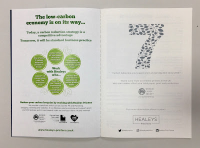
There are also a couple of pages of useful information about print and paper:
...and the World Land Trust endorsement:
A couple of other things worth pointing out. The paper for the text pages is 100gsm, which is the right weight (or lighter) for a notebook, otherwise you don't get enough pages in the book and it could also 'gape' in the inside spine of the book, which as you can see, this book sits nice and flat.
The books which are printed on deep shades are printed using Healeys digital white toner, as you can see on the cover below. Digital white toner is a much more cost effective solution than white silkscreen, hot foiling or other methods of digital white printing and the results are great...
The notebooks have been produced during the lockdown period and are being sent out now a part of a marketing campaign focusing on Healeys commitment to the environment.

https://healeys-printers.co.uk/
https://www.worldlandtrust.org/
Posted by Justin Hobson 10.08.2020

Tuesday 14 January 2020

HOMOgeneous

HOMOgeneous is a series of new portraits by photographer Christian Trippe. This series of photographs seeks to explore the similarities and differences in gay men of a certain age, identifying individuality in a subculture existing within the more mainstream gay culture.

All of the selected models identify themselves as gay or pansexual males and have been photographed without clothes to remove any distraction, however small personal elements to every image remain. The men have been photographed in high resolution giving an extraordinary level of detail. The resulting close-up portraits teeter between intimacy and confrontation.
Christian Trippe was born in Vienna and grew up in Germany. After completing his studies in graphic design and photography, he moved to London where he has lived and worked for the last 13 years. During this time, Christian has been developing his own art and photography projects.

This book accompanied the exhibition held last October at New Art Projects in London E8.
Size of the publication is 255x180mm, portrait and is singer sewn. The 4pp cover is printed on Omnia 280gsm and the 28pp text is on Omnia 150gsm
Click on images to enlarge
The above image shows the centre spread with the singer sewing in the centrefold and on the spine on the outside in the image below. 
Click on images to enlarge
Unlike many of the look-books featured on this blog, which are printed offset litho, this has been digitally printed on an HP Indigo press. The colours are strong and punchy and the whole publication has a matt, tactile look and feel.
Although Omnia was never originally developed for digital, we now keep it as a stock item with "sapphire treatment". This treatment is often applied to more unusual papers and provides a "key" so that the inks (which are different to litho inks) work on the paper surface. The great thing is the job just doesn't look and feel like a digital job. Below is a detail shot showing the excellent fleshtone reproduction.
Design of the catalogue is by Christian Trippe. The digital print by Screaming Colour.

https://www.christiantrippe.com/
http://newartprojects.com/events/new-photographs-christian-trippe/
http://www.screamingcolour.com/
Posted by Justin Hobson 14.01.2019

Thursday 21 November 2019

25 sculptures in 5 dimensions

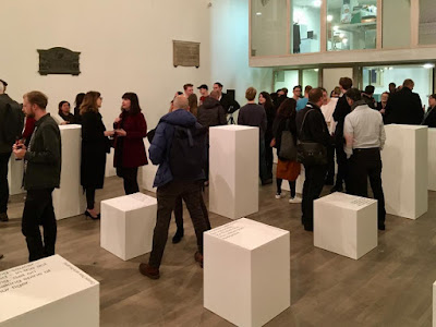
The installation ‘Twenty-five sculptures in five dimensions’ manifested for one night only this week on Tuesday 19th November in the Swiss Church, Covent Garden. The exhibition is conceived and sculpted by poet Tom Sharp, designed by Studio Sutherl&, soundtracked by Tony-nominated composer Alex Baranowski, with an introductory essay by art writer and curator Anna Souter. In a high-ceilinged environment of contemplation the guests experienced twenty-five sculptures. They exist between the four dimensions of thirty syllables and the fifth dimension of your mind.
Words about the exhibition are as follows... "Each sculpture is made from four dimensions of thirty syllables – a five syllable title and five further lines of five syllables – combined with the material of your imagination. The sculptures do not exist without your consciousness and these sculptures are about your consciousness. How language shapes it. How distinct it is from the blood and mess of your body. Whether it is a fundamental of the universe or a materialistic phenomenon destined one day to be recreated by IBM. What art’s role in exploring consciousness is. How we create an unnatural division between our minds and the many minds of nature." 
Each of the sculptures is made from a pillar of paper - made up using sheets of our Sixties paper in 60gsm. SIXTIES is a new paper which has a similar translucency as a tracing paper - but it feels like a normal paper! … you can see the translucency in the image below:
There is also a catalogue produced using the same Sixties paper
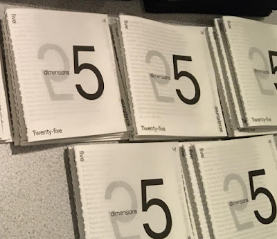
There is an introductory essay by art writer and curator Anna Souter, placing the work in an art historical context. The catalogue is five inches square (127mm sqaure), with five Helvetica Neue 55 type sizes and is singer sewn, as you can see below...
The books are produced in a limited edition of 200.
Design is by Studio Sutherl& and the print of both the sheets and the book is by Boss Print and are printed offset litho in just one colour throughout.

https://www.poetrybytomsharp.com/collection/twentyfivesculptures
http://studio-sutherland.co.uk/
https://www.bossprint.com/
Posted by Justin Hobson 21.11.19