
Now is the time when many readers of this blog will be receiving invitations to degree shows from all corners of the country. Here is a particularly lovely and inspired example for the University of Portsmouth.
Below is the A1 poster (841x594mm) printed in CMYK, one side only, on Redeem 100% Recycled 130gsm.
...then to make the invitations, the material on the run was changed to Redeem 100% Recycled 315gsm and the run completed. The reverse of the board was then printed in one colour forming 16 x A5 invitations with CMYK on the reverse of the invite - a smart idea!
 |
| Reverse of the A5 Invitations |
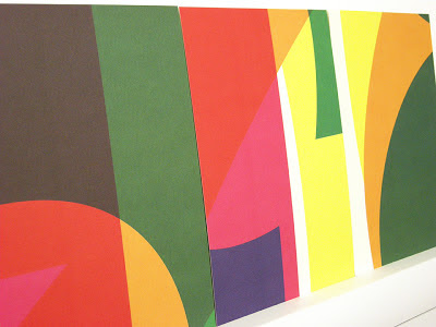
The design is by Michael Harkins, who is a senior Lecturer in Graphic Design and the course leader of the MA Graphic Design at the University of Portsmouth. Given the complexity of the design, I asked Mike to write some words to explain the project:
Often my work
plays with complex ideas found within the design problem itself, yet this is something for the viewer to find within the
work, not something obvious initially.
The idea really came from thinking about 2013 as a number in
itself. For many people the date could be seen as a portentous one,
unlucky, lucky, superstitious etc. This led me to think about what it is when we read into
numbers as individuals, we often bring our own meanings/readings.
The numbers within the date are also the first in the
sequence of natural, ordinal or cardinal numbers. 2013 is also the first time these numbers appear together in a year
date since 1320, so quite special in that sense. They also form the idea of a countdown 3,2,1,0 to the show. As
in the ordered sequence 0123, we arrive at 3, the number of years students commit to their degree
programmes, culminating in the show.
So really the numbers become celebratory and playful. The
use of the CMYK adds to this idea of playfulness in terms of interaction of form and colour. It also gets us,
the viewer to bring about our own readings of the numbers.
The invitations extend the playfulness by dividing the
colour composition into 16 parts, each one producing a unique composition in itself, something we take time to view,
enjoy, contemplate.
 |
| Posters on display behind glass |

Printing is by L&S Printing based in Worthing, West Sussex and a beautiful job they've made of it.
...and thanks to Mike for sending me some file copies and a note (written on the printed reverse of the A5 invitation):
The preview is tomorrow evening at the Eldon Building at University of Portsmouth and the show is open from 3-14 June.
Posted by Justin Hobson 30.05.2013
 You may remember that back in the summer I went to New Designers exhibition, where I wrote about one of the students from Portsmouth University (Eric Downer) who was awarded the coveted "New Designer of the Year" title. http://justinsamazingworldatfennerpaper.blogspot.co.uk/2014/07/new-designers-2014.html I also mentioned that the course showcase publication at the show was printed on our paper and that I would write about it at a later date ...well, here it is!
 The covers, which are all printed just one colour - magenta- have been printed on five different colours of our Colorset, 100% Recycled. This is a wonderful 'print design' solution as maximises the impact and the processes used. It looks and feel like you are getting so much more out of a project, but a no extra cost!


