Showing posts with label saddle stitching. Show all posts

Tuesday, 22 August 2023

Manuel Canovas

This is the gorgeous brochure for the Trianon Collection from luxury brand Manuel Canovas, based in Paris. Trianon is a range of wallpapers and fabrics based on paintings, drawn in Chinoiserie style, by Jean-Baptiste Pillement in the 18th Century.
The size of the publication is 240mm x 170mm, portrait and is saddle stitched, printed on our StarFine White. 4pp cover on 300gsm and 8pp text on 200gsm. Printed CMYK offset litho and hot foil blocked in gold metallic foil on the cover.
StarFine is a quality, uncoated paper and as the images show, image reproduction is excellent. The detail of the wallpaper and fabrics is stunning - great detail for an uncoated paper, colours are bright and vivid.
The brass wire used for the saddle stitches is a really lovely touch - which brilliantly compliments the gold foiling on the cover.
Click on image to enlarge
Manuel Canovas is one of the Colefax group brands and this beautiful piece of literature has been created in house at Colefax & Fowler. Print production is by Pureprint

https://www.manuelcanovas.com/
https://www.colefax.com/
https://www.pureprint.com/
Posted by Justin Hobson 21.08.2023

Thursday, 1 July 2021

Jobs from the past - Number 140

Regular followers of this blog will know that my first post of every month is a "job from the past" so that I can show some of the really good projects from years gone by. Given the sad news announced today that Gap is closing all it's UK retail outlets, I thought I'd show you this superb project for Gap from 2011.

Gap 1969 Premium Jeans - Spring 2011
This lovely look-book was produced to support the 1969 jeans campaign launch by Gap. Founded in 1969 in SanFrancisco in 1969 by Doris and Don Fisher. Gap's original intent was to make it easier for every customer to find a great fitting pair of jeans, a philosophy that lives on today.
Size is A5, portrait. It has a 4pp cover and a 12pp text, printed offset litho CMYK throughout. The text material is printed on Marazion Ultra 115gsm.
Cover is from the popular Hull based company on Colourplan 135gsm with a Buckram emboss. The cover also has a gloss UV varnish on the large 1969. It has a deliberately floppy feel which works really well for the denimy subject!
For readers not familiar with Marazion Ultra, it's a fully coated paper but it really does have a dead flat MATT surface. There are many papers on the market which profess to be matt (and some which incorporate the word matt in the name, but aren't!) ...but this really is - and if you don't believe me, just ask for a sample!
Click on images to enlarge
...and here's the clever bit - see below image. The cover means the book works both ways round - one way men/womens, the other kids/baby. Not the first time it's been done but very effectively executed.
Below showing the kids/baby cover...
Click on images to enlarge
The job is nicely folded and creased, as you can see from the birsdeye view.
A nice touch is the use of black coloured wire stitching, as you can see below....
Printing is by Absolute Ink who were based in East London but they sadly went bust last year. Art director and designer on the project was Jonathan Baron from Studio Baron.

Posted by Justin Hobson 01.07.2021

Tuesday, 30 March 2021

Vive Le Vodka Martini!

To create GREY GOOSE vodka, François Thibault maintains an unrivalled level of craftsmanship, using only the very finest ingredients. Its signature smoothness and distinct character are the result of an extraordinary passion for spirit making and an unparalleled commitment to the highest possible quality. 

Grey Goose have produced this little booklet of Vodka Martini cocktails that can be made using their Vodka including a look at the history of the Martini and contemporary reinventions.

Size of the booklet is A6 (148x105mm) portrait and has a 4pp cover on Omnia 200gsm and 12pp text on 150gsm.

Click on images to enlarge
Omnia was chosen because it would work with the rich detail that is present on the cover image but that would still give a natural look and tactile feel to work with the beautiful illustrations used to accompany the recipes. Printed offset litho throughout.
As you can see from the image below, it sits open on it's own, so if being used in a bar, it will stand up perfectly.
...and as you will also be able to tell, it has been properly matrix creased and the saddle stitches are perfectly central. It's details like this that get noticed on smaller printed pieces like this.
Creative direction and design is by London based branding agency Ragged Edge and litho printing is by Identity, based in Paddock Wood, Kent.

Posted by Justin Hobson 30.03.2021

Friday, 6 November 2020

The Marylebone

The Doyle Collection is a carefully curated collection of eight Irish family-owned luxury and urban hotels. Each hotel has a strong identity that is closely connected to its location. Set in the heart of London, minutes from Oxford Street, The Marylebone has 252 beautifully appointed guest rooms and suites, a host of facilities and an 18 metre swimming pool!
Branding agency, Brave New World undertook an extensive re-branding exercise of the parent brand and of each individual hotel. The work included everything from strategy to interior design, website, high-profile advertising campaigns and the literature for each hotel.
The size of the brochure is 260x185mm, portrait and is saddle stitched. The cover is printed on an uncoated 300gsm board.
Click on images to enlarge
The brochure is saddle stitched using three stitches:
The text material chosen was our Omnia, which would beautifully reproduce the photography with the rich interiors and exteriors superbly ...and it looks wonderful! The 20pp text is on Omnia White 150gsm, printed offset litho in CMYK throughout.
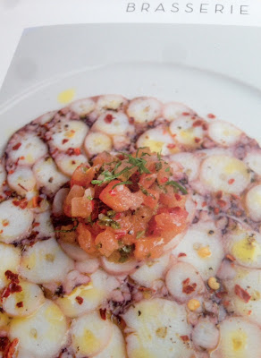
Image reproduction is paramount but it was also important that the publication also projected the tactility of the interiors and in the image below the detail of the brasserie and the reproduction of the culinary fare. An ordinary feeling silk or gloss coated paper wasn't an option, so Omnia fitted the bill perfectly.
Click on images to enlarge
Omnia is a very bulky paper but with a 20pp text and the saddle stitching, it lays nice and flat allowing each spread to be enjoyed without 'fighting' against the binding.
Branding and creative direction is by Brave New World. The designer on this project is Caroline King. Print offset litho by 21 Colour, based in Glasgow.

Posted by Justin Hobson 06.11.2020

Tuesday, 12 December 2017

The Kensington

The Doyle Collection is a carefully curated collection of eight Irish family-owned luxury and urban hotels. Each hotel has a strong identity that is closely connected to its location. Set in the heart of one of London’s most desirable neighbourhoods, The Kensington’s grand stucco façade is characteristic of this affluent 19th Century district. With 126 guest rooms and 24 suites, this is a wonderfully luxurious hotel.
Branding agency, Brave New World  undertook an extensive re-branding exercise of the parent brand and of each individual hotel. The work included everything from strategy to interior design, website, high-profile advertising campaigns and the literature for each hotel.

The size of the brochure is 260x185mm, portrait and is saddle stitched. The cover is printed on an uncoated 300gsm board.  
Click on images to enlarge
The text material chosen was our Omnia, which would beautifully reproduce the photography with the rich interiors and exteriors superbly  ...and it looks wonderful! The 20pp text is on Omnia White 150gsm, printed offset litho in CMYK throughout.
The brochure is saddle stitched using three stitches:
Image reproduction is paramount but it was also important that the publication also projected the tactility of the interiors and in the image below the detail of the upholstery and the extraordinary reproduction of the mirrored surfaces. An ordinary feeling silk or gloss coated paper wasn't an option, so Omnia fitted the bill perfectly.
Click on images to enlarge
Omnia is a very bulky paper but with a 20pp text and the saddle stitching, it lays nice and flat allowing each spread to be enjoyed without 'fighting' against the binding.
Branding and creative direction is by Brave New World. The designer on this project is Caroline King. Print by 21 Colour, based in Glasgow.

https://www.doylecollection.com/hotels/the-kensington-hotel
http://bravenewworld.co/
http://www.21colour.co.uk/
http://www.carolinelking.com/
Posted by Justin Hobson 12.12.2017

Tuesday, 24 October 2017

The Marylebone

The Doyle Collection is a carefully curated collection of eight Irish family-owned luxury and urban hotels. Each hotel has a strong identity that is closely connected to its location. Set in the heart of London, minutes from Oxford Street, The Marylebone has 252 beautifully appointed guest rooms and suites, a host of facilities and an 18 metre swimming pool! 
Branding agency, Brave New World  undertook an extensive re-branding exercise of the parent brand and of each individual hotel. The work included everything from strategy to interior design, website, high-profile advertising campaigns and the literature for each hotel.
The size of the brochure is 260x185mm, portrait and is saddle stitched. The cover is printed on an uncoated 300gsm board.
Click on images to enlarge
The brochure is saddle stitched using three stitches:
 
The text material chosen was our Omnia, which would beautifully reproduce the photography with the rich interiors and exteriors superbly  ...and it looks wonderful! The 20pp text is on Omnia White 150gsm, printed offset litho in CMYK throughout.
Image reproduction is paramount but it was also important that the publication also projected the tactility of the interiors and in the image below the detail of the brasserie and the reproduction of the culinary fare.  An ordinary feeling silk or gloss coated paper wasn't an option, so Omnia fitted the bill perfectly.
Click on images to enlarge
Omnia is a very bulky paper but with a 20pp text and the saddle stitching, it lays nice and flat allowing each spread to be enjoyed without 'fighting' against the binding.
Branding and creative direction is by Brave New World. The designer on this project is Caroline King. Print by 21 Colour, based in Glasgow.

https://www.doylecollection.com/hotels/the-marylebone-hotel
http://bravenewworld.co/
http://www.21colour.co.uk/
http://www.carolinelking.com/
Posted by Justin Hobson 24.10.2017