Friday, 5 May 2017

Multiplicity in Brighton


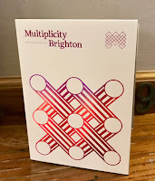
Yesterday evening, we were pleased to be the sponsor of  Multiplicity in Brighton. Hosted by Foilco, this is the third event hosted by Foilco, with the previous talks having been in Glasgow and Leeds. Just over 150 creatives came together at The Old Market in Hove to hear three great speakers.
The three fantastic speakers were Hamish Makgill, Anthony Burrill and Andy Stevens from GTF.

Hamish began the evening. His talk began by likening the amazingly simple concept and design of the JEEP to the work that they strive to achieve at his studio by "stripping away the unnecessary and drawing out the essential"
Hamish then spoke about his work for The It's Nice That 2014 Annual, Nike WE, ONCA, James Reade, the WW Chair and of course his work for that other well known paper merchant based in Hull!
 
Next up was Andy Stevens, one of the founders of Graphic Thought Facility (GTF). He spoke about their beginnings at the RCA and how they established the studio, including spending the money they won as a prize on a poster ...see below image:
Anthony Burrill gave us an insight into his beginnings at college and then at the RCA. He spoke about his years in the advertising industry and it's rather abrupt end when he made the decision that he wanted a change telling his agent not to look for new work - and how everything, including his existing work, just stopped! He then described his journey establishing himself as an independent graphic artist, print-maker and designer.
It was a great event and everyone I spoke to came away feeling enthused and charged.

Even I said a very few words at the beginning of the evening....
Afterwards may of us went to the bar until kicking out time!
This is the third event hosted by Foilco, with the previous talks having been in Glasgow and Leeds. They have been arranged by Andrew Cottam at Foilco and my thanks to Andrew and to Dave Sedgewick at Studio DBD
 
Foilco has been servicing the graphic arts industry for over 25 years, offering the largest range of hot stamping foils in all sectors. With a wealth of expertise on all types of applications, they have a wide range of colours and grades offering endless creative possibilities to designers the world over.
 
Posted by Justin Hobson 05.05.2016

Wednesday, 3 May 2017

Jobs from the past - Number 91

Regular followers of this blog will know that my first post of every month is a "job from the past" so that I can show some of the really good work from years gone by.
 
Earth Centre - 1998
The Earth Centre in Doncaster was intended to "establish a world centre for sustainable development promoting the best environmental and sustainable practice" and opened in 1999 in Conisbrough, near Doncaster, South Yorkshire.

In 1995 the Millennium Commission made an award of £41.6 million to Earth Centre which became one of its Landmark Millennium projects. From 1996 work progressed on the remediation of the remaining land and the design and construction of the many buildings and exhibitions. Phase 1 was only just completed in time for the gala opening in 1999.

This brochure was produced to promote the centre, to be received by the press and sponsors and used as a mission statement.

The brochure is covered in a full size sleeve (below)
Image below shows the brochure going into the sleeve:
Front cover....
The brochure is designed and produced by Cartlidge Levene in London. The size of the publication is 240x330mm, Landscape and is a 40pp 'self cover'.
 
Introduction by Tony Blair, the then Prime Minister
Click on images to enlarge
The whole publication is printed in just one colour, but in the middle, there is a colourful surprise! ...a 12pp concertina fold which fits perfectly and snugly in the middle spread.
Below image shows the 12pp concertina fold:
The 12pp concertina is 240x325mm, folding out to 1950mm long! ...so how was this printed? - simple, it was printed on one sheet of B1 (700x1000mm) and has a nifty 7mm 'tab' which enables the sheet to glued end to end. Neat, simple solution. 
In keeping with the subject, a paper with green credentials was required. Rather than just using a recycled range, the paper chosen was Mais Carta 120gsm. This paper was made by FAVINI in Italy and was made partly using the agricultural waste from Maize production together with recycled paper fibres ...a forerunner of our current CRUSH range. Mais Carta as a range is no longer produced. 
Click on images to enlarge
Outside back cover:
Job is saddle stitched...
Being a landscape format and on 120gsm, it flopped and folded beautifully in the hand:
Printing was by Pillans and Wilson in Edinburgh, but they collapsed in 1999. Main photography is by Peter Marlow, Magnum Photos. Design is by Cartlidge Levene ...and as I think you can appreciate from the images, this was a very contemporary piece of graphic design.

Unfortunately ...
"Following Earth Centre progress was a roller coaster ride of false starts, wild hopes and dashed plans." The Guardian

The Earth Centre sadly closed its doors after going bankrupt in 2004, having never reached it's potential or the majority of the planned features.

http://cartlidgelevene.co.uk/
Posted by Justin Hobson 03.05.2017

Thursday, 27 April 2017

Hawkins Brown

This is the brochure for Hawkins Brown, an internationally-renowned award winning practice of over 200 architects, interior designers, urban designers and researchers. Design is by Shoreditch based studio, Huddle.
The size of the publication is 310x230mm, portrait and is saddle stitched. It has a 4pp cover on 280gsm and a 28pp text on 120gsm, all printed on our Omnia. As you can see from the image above, it looks like there are four separate brochures, however they are all the same brochure, just featuring different covers ...and this is what Huddle say about the covers:
"The covers of the new practice brochures break with convention by featuring ‘abstract’ close-ups of structural elements of Hawkins\Brown projects, reflecting how the practice does things differently. And because each brochure’s colour picks up on a colour from its image, the secondary colour palette is in effect infinite, yet is a flexible, coherent and distinctive asset for the practice."
Click on images to enlarge
As you can see from the above images above and below, inside there are lots of colour images and solids throughout - and it just looks (and feels!) just beautiful on the Omnia - no mottle - just gorgeously even, solid areas. The four colour images look amazingly detailed and vibrant.
Click on images to enlarge
Of course, the solid colours used on the front covers, wrap around to the back cover giving a satisfying display of rich tones.
You can read more about this project on this link here.

Creative Director is Louise Desborough. Lead designer on the project is Tom Ward, together with Mike Bone and the account handler is Nicole Posner. The superlative print is by Leycol handled by Richard Davey.

Posted by Justin Hobson 27.04.2017

Tuesday, 25 April 2017

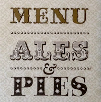
Fuller's Menu

Fuller's Brewery has been brewing fine ales for the past 170 years at their Griffin Brewery and they also have several of their own pubs. The food and beverage menus for these pubs has been printed on our Flora range of papers.
The menus are A4 (297x210mm) portrait printed in three colours offset litho, including a metallic gold ink. They are a gatefold design, so they can stand up on their own , but when open, show an A3 size spread...
Click on images to enlarge
Inside spread...
Image showing the outside, open flat...
If you aren't familiar with Flora, it is a part recycled paper (with FSC accreditation) with natural, deliberately visible, inclusions and fibres. It has a tactile, rough feel and has a character all of it's own! Below is detail showing the inclusions:
Click on images to enlarge
This menu is printed on Flora Anice 240gsm and print is by Matthews in London.

https://www.fullers.co.uk/
http://www.matthews-printers.co.uk/
Posted by Justin Hobson 25.04.2017

Thursday, 20 April 2017

Thread

Thread is a studio specialising in design for a wide variety of clients from the art and cultural sector. Thread is the design studio of Michael Windsor-Ungureanu, who has previously worked at Tate Britain and Tate Modern. This is the second edition of his studio promotional brochure:
The format is A5 (210x148mm) portrait and is saddle stiitched. The 40pp text has a short cover, 150mm high which is centred head to foot.
There are three different coloured covers, all produced on Colorset - a mix of Ash, Lemon and Deep Orange, all printed in one special pantone (PMS 072U) blue. The "thread" design runs from the cover throughout the middle of the brochure.
Click on images to enlarge
The 40pp text is printed on StarFine Natural White 115gsm and shows the work that Thread has produced over the previous couple of years.
Click on images to enlarge
Starfine Natural White was chosen (because it prints well ...but that's a given!) mainly because of the neutral white shade which is not cream. Given the nature of the work, a stark bright white paper would not have worked with such a variety of art based subjects. Text is printed CMYK offset litho throughout.
Below shows a birds eye view of the publication
Design is by Michael Windsor-Ungureanu. Printing is by Bowmans based in Leeds and it's a very accomplished piece of print and finishing.

http://www.threaddesign.co.uk/
http://www.bowmans77.co.uk/
Posted by Justin Hobson 20.04.2017