Monday, 14 June 2010

Blog goes to print...

This is a very interesting job for many reasons. This is a paper edition of a blog and is titled 'otherhistories' - extracts from the blog.

In August 2009 photographer Christoper King was commissioned by the Historic Royal Palaces to be photographer in residence at the Tower of London for eight months.

During this time he wrote a blog and this simply printed piece of literature has been produced to accompany the blog and show his achievements in a physical publication.

The job is a 36pp self cover and the size is 190x250mm portrait and is saddle stitched. It is printed in one colour only (black) so all the images are halftone and look really effective on the Redeem 100% Recycled 130gsm - black and white images on a 'neutral' shade uncoated aften look better than those on a high white sheet. 
This really is a very simple but effective job. I believe it does everything it set out to do whilst being on a very 'realistic' budget! Design is by Steve Burgess.

Posted by Justin Hobson 14.06.2010

Friday, 11 June 2010

House of Illustration

This is the membership invitation for the House of Illustration to enrole sponsors and donors for the new House of Illustration Gallery instigated by Quentin Blake (there was also a brochure produced - see my previous post on 25th February).
The size of the invitation is 900x150mm which concertinas down to 150mm square. It uses our Modigliani Candido 260gsm, which has a "feltmark" texture similar to that of a watercolour paper which gives it exactly the right feel. Needless to say, illustrations are by Quentin Blake...
The project was designed by BOB Design. Creative Directors are Alexis Burgess and Mireille Burkhardt. Designer is Matt Price.
Posted by Justin Hobson 11.06.2010

Thursday, 10 June 2010

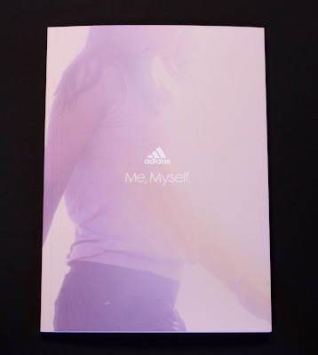
Adidas - Spring/Summer 2010

Here is a set of two brochures for Adidas which form the Spring Summer 2010 look books - Mens and Womens.

They are 165x230mm Portrait (an economical format out of a B1 sheet size), section sewn with an 8pp cover and 48pp text (200gsm cover/120gsm text). These are printed on Omnia and the result is just simply stunning. The art direction and photography (by Ben Ingham) is great and the colours are really vibrant ...see for yourselves:  
And this is the Women's...
Art Direction and design is by Made Thought. Print is by Push.

This is a fabulous example of printing on Omnia - this job does truly have the tactile feel of an uncoated with the reproduction of a coated - it does look amazing. Right job, right images, right design, right printer, right paper, right right everything! 

Posted by Justin Hobson 10.06.2010

Tuesday, 8 June 2010

TYPOGRAPHIC Playing Cards


This has to be one of the most interesting jobs of the year from a typographical point of view.

It's a self initiated project by Jim Sutherland at Hat-Trick who has produced some absolutely spectacular visual imagery and iconography by just using letterforms. Each card uses a different typeface.

I'll let the images do the talking...
The cards were printed on one sheet of B2 (520x720mm) board in two colours. The cards were then die cut out of the sheet. However, at the same time they also made posters using the full size sheets and these were "debossed" with an impession where the cut should be (as above) which look amazing. 

The material (which is why Jim called us in the first place) had to be right. Substantial, but not too heavy and flicky was the order of the day. We supplied our Altura Gloss 330gsm which is just right (I think!)
The print production and finishing has been superbly excecuted by Boss. All the elements have been really well finished including the box which is solid, square and just as a box containing playing cards should look and feel like!
Below are some of the sketches which show the work in progress.
This was a really nice project to have been involved with and it's great that there are companies which are prepared to spend some of their own time and money producing some really well crafted self initiated work. 

I'm a bit short of file copies of the cards but I have a few posters left so if you ask really nicely, I might send you one!
Posted by Justin Hobson 08.06.2010

Friday, 4 June 2010

Grace Kelly - Style Icon

Q: When is a leaflet, not a leaflet?
A: When it's designed and produced like this one.

I just received some file copies of the gallery guide for a Grace Kelly exhibition that's on at the V&A over the summer and it's just looks and feels great.

Ostentsively, this is a leaflet but this has been printed on Omnia 120gsm which means that rather than feeling like the vast majority of mass produced leaflets printed on a bit of 130gsm silk or gloss, this has real character and value.

Equally the design and the superbly chosen imagery, both mono and colour, really work to make this feel anything but a leaflet!
Design for the gallery guide, invitations and other collateral is by Nadine Fleischer.

Print is by Principal Colour.

Posted by Justin Hobson 04.06.2010

Thursday, 3 June 2010

Quarantine - Projects & Ideas

Here are two superb little jobs done for a performance dance company called Quarantine.

Neither of these jobs are "big budget" promotions and therefore cost and impact have to be closely considered.

The tour leaflet is a 4pp A6 format but it is printed on Omnia 150gsm, so it doesn't feel like most A6 leaflets! It is tactile and the four colour and solid flat colours have reproduced fantastically well.
The company portfolio called "Projects + Ideas" is packaged in an envelope style wallet made from Episode IV 115gsm and held together with a printed die cut label. The wallet has a left and a right folded up pocket containing a series of cards (also printed on Omnia) 280gsm showing images of the performances together with a description on the reverse. A really nice little touch is that each of the nine finishers who made up the wallets has a cedit on the job and ticks their name if they made it up! ...probably good for quality control too!
The job was designed by Manchester based agency, Corporation Pop. Designer is Jo Cartwright.

These are both jobs which make the most of the materials and the budget available and I think work very well with the ethos of the performance company who wanted a no frills approach but with a design lead look.

Thank you for sending them and the note Jo.
Posted by Justin Hobson 03.06.2010

Tuesday, 1 June 2010

Jobs from the Past - Number 9

Regular followers will know that my first post of every month is a "job from the past" so that I can show some of the really good work from years gone by and here's one from nine years ago.

Design Council Annual Review 2001 - Inspire

This was one of the Annual Reviews produced by Johnson Banks for the Design Council which they did for a number of years around the turn of the millennium.

The job is made up using two sizes of text 175x297mm & 210x210mm for the "divider leaves" and it features a "split wiro" on the binding - this is interesting as most people don't realise that you can use different lengths and multiple pieces of wire rather than the conventional continuous piece that is used in most literature.
There are some cracking visual puns and great art direction. Photography is by Philip Gatward and printing is by Gavin Martin Associates.

The job was printed on Neptune Unique using 350gsm for the covers and 200gsm for the text and dividers. As I recall the mono images were printed as halftones and I've just checked under a linen tester and they are! so it is a stunning result - very, very crisp and clean reproduction.

Creative Director was Michael Johnson and the designer was Sarah Dezille (Fullerton as she was then!)

This is a lovely piece of work, thought provoking and really well finished. The literature that Johnson Banks did for the Design Council during this period was of the very highest quality both in terms of creativity and production values. I hope the Design Council are producing literature of the same consistently high quality today.

Posted by Justin Hobson 01.06.2010