Showing posts with label Gavin Martin Associates. Show all posts

Tuesday, 2 June 2015

Jobs from the past - Number 68

Regular followers of this blog will know that my first post of every month is a "job from the past" so that I can show some of the really good work from years gone by...

Pigs are Great - 2001
This self promtional piece of literature was designed by The Partners for Gavin Martin, the printing company back in 2001. The mailing is designed to be one piece, inserted into a neat 'Oink' envelope. The photography is by Geoff Smith.
The finished size is 120x77mm, portrait and is a long concertina. This gives the mailing 5 spreads in total.
The concertina which is 987mm long, folds up as below:
One of the things to note is the 2mm, free standing spine, into which the concertina folds. This is where the choice of material is important, so that the weight/bulk is light enough that it will take a machine made crease, yet be light enough for the pages to turn over nicely.
It is printed on our Matrisse 140gsm, which is a white very bulky uncoated with a toothy feel. Images, showing the fully extended mailer, printed CMYK plus pantone special, with the inside printed with the special only...
Art direction and design is by The Partners. Print is by Gavin Martin. Photography is by Geoff Smith.
A clever and well thought out piece of literature, which maximises the format of a B1 press and sheet of paper...

http://www.gavinmartin.co.uk/old_site/
http://www.the-partners.com/
http://www.gavinmartincolournet.co.uk/
Posted by Justin Hobson 02.06.2015

Monday, 21 February 2011

Caruso St John Architects - Invitation

Just when you've written about one invitation on Offenbach Bible (see below), another one turns up as well!
This is an A1 folded to A4 invitation for Architects, Caruso St John, celebrating twenty years in practice.
Reproduced on the front of the invitation is a painting from the National Gallery titled "Landscape with Cephalus and Procris Reunited by Diana" by Claude Lorrain, 1645, painted when he was 45 years old. John Constable described Claude as "the most perfect landscape painter the world ever saw", and declared that in Claude’s landscape "all is lovely – all amiable – all is amenity and repose; the calm sunshine of the heart". What architect wouldn't want to be associated with such an accolade?
The invitation folds out showing thumbnails of a variety of their work over the last twenty years and printed on the reverse of the numbnail is the name of each project. Being printed on Offenbach Bible 60gsm, which has the lightweight feel and a little show through, it is possible to match up the pics with the titles.
The invitation was designed by John Morgan Studio. It was printed and finished by Gavin Martin Associates.
...and thanks to Michael for the note and for sending me a copy.

Posted by Justin Hobson 23.02.2011

Friday, 11 February 2011

See Opposite

This is the latest example of Pentagram's superb holiday mailings from the festive season of 2010. These pieces are never really “cards”! Pentagram mailings typically involve puzzles or another kind of visual diversion and this is no exception.


This year’s booklet features a series of antigrams illustrated with shadowy silhouettes. An antigram is a rare type of anagram. The object of the exercise is to discover a word or words that are the opposite of those printed using the same letters. The antigrams can be worked out with the help of a clue and the illustrations. The above and below pics show the illustration with the clue, Stargazers. The Antigram is No More Stars. The answer is Astronomers. Frustratingly clever!

 ...and this is the page with the answers:
The books are A6 landscape 148x105mm with an 8pp cover and a 28pp text. The paper chosen is Modigliani which is a feltmarked paper with a texture reminiscent of a watercolour paper. The cover was produced using Modigliani Nero 200gsm and the text on Modigliani Neve 145gsm. It has been beautifully printed in two colours (pantone specials) by Gavin Martin. Cover is hot foil blocked with a matt white foil. Another lovely feature is the "plate sinking" which is where a panel in the printed areas on the right hand pages have been de-bossed and not forgetting the singer sewing in black thread through the spine.
All in all, a beatifully produced job. Creative director on the project is Angus Hyland and the designer is Fabian Herrmann. Print production was handled by Gary Bird at Gavin Martin.

http://www.pentagram.com/
http://www.gavinmartin.co.uk/
Posted by Justin Hobson 11.02.2011

Friday, 14 January 2011

V&A and me

Here's a job which started life with a brief of a single sheet of paper folded in a seemingly random way (for which I was sent a pdf) like this:
Well that's how this amazing job for the V&A started for me. Michael Johnson and the Johnson Banks studio created this idea for display at the V&A museum during the London Design Festival last year. 

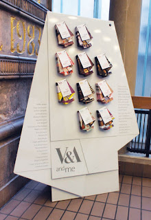
Many creatives find the V&A influential, so the idea to create different maps of the museum, based on notable people’s favourite items was conceived. This set of "maps" was devised for the project and ten different creative people were picked. The maps were then displayed on an exhibition stand.

...and this is how they turned out:
Size is A2 (420x594mm) folded to an unmeasurable size! An open example showing the inside:
...and how they are all displayed on the stand:

From a material point of view it was important to select a material which was substantial enough to take a machine crease but which was light enough so that the final fold wasn't too 'springy'. We made several dummies on a variety of different materials and StarFine White 100gsm was selected because it had the right feel and a good opacity.

Print production was by Gavin Martin Associates and so was the excellent print finishing. The complexity of this folding shouldn't be underestimated plus they had to be accurately punched.

Creative Director on the project was Michael Johnson. Senior Designer was Julia Woollams and the placement paper engineer busy folding up sheets of paper for days on end was Bethan Jones.

You can read more about the project and see more pics on the following link:
http://www.johnsonbanks.co.uk/thoughtfortheweek/index.php?thoughtid=601

http://www.vam.ac.uk/
http://www.johnsonbanks.co.uk/
http://www.gavinmartin.co.uk/
Posted by Justin Hobson 14.01.2011

Tuesday, 1 June 2010

Jobs from the Past - Number 9

Regular followers will know that my first post of every month is a "job from the past" so that I can show some of the really good work from years gone by and here's one from nine years ago.

Design Council Annual Review 2001 - Inspire

This was one of the Annual Reviews produced by Johnson Banks for the Design Council which they did for a number of years around the turn of the millennium.

The job is made up using two sizes of text 175x297mm & 210x210mm for the "divider leaves" and it features a "split wiro" on the binding - this is interesting as most people don't realise that you can use different lengths and multiple pieces of wire rather than the conventional continuous piece that is used in most literature.
There are some cracking visual puns and great art direction. Photography is by Philip Gatward and printing is by Gavin Martin Associates.

The job was printed on Neptune Unique using 350gsm for the covers and 200gsm for the text and dividers. As I recall the mono images were printed as halftones and I've just checked under a linen tester and they are! so it is a stunning result - very, very crisp and clean reproduction.

Creative Director was Michael Johnson and the designer was Sarah Dezille (Fullerton as she was then!)

This is a lovely piece of work, thought provoking and really well finished. The literature that Johnson Banks did for the Design Council during this period was of the very highest quality both in terms of creativity and production values. I hope the Design Council are producing literature of the same consistently high quality today.

Posted by Justin Hobson 01.06.2010

Friday, 30 April 2010

Daniel Lock arrives!

Now many of you may be reeling at the recent news of Ben Stott's departure from NB:Studio but there is yet another piece of news from the Bankside based studio. In a totally unrelated departure, Senior designer Daniel Lock is also leaving NB: Studio to pursue freelance work.

Over the last six years Daniel has been designer on several projects that I have worked on at NB:Studio including HOUSE magazine for Soho House (printed on Omnia, Redeem 100% Recycled and Concorde Pure Brilliance):

and a wide range of other projects including this D&AD awards promo poster (on Offenbach Bible 60gsm)
Now it's a little ironic being on this blog, that his new business cards are printed on a Dark Grey 700gsm board with a cord emboss from a paper merchant based in Hull, but I'm not bitter! (sadly, no prizes for guessing the paper range). But they have been very beautifully produced by Gavin Martin Associates using Holographic Foil.
Daniel is now actively looking for engagements, so you can find him on http://www.daniellock.co.uk/ ...and don't forget to stick my commission cheque in the post!
http://www.gavinmartin.co.uk/
http://www.nbstudio.co.uk/
ww.daniellock.co.uk
Posted by Justin Hobson

Friday, 12 February 2010

Holmes Wood is 10!

Last night I was invited to the Holmes Wood tenth birthday party and book launch at Ransome's Dock in Battersea.
What a great party! Lots of people were there that they had worked with over the last ten years. Clients, suppliers, friends and family made up the really lovely mix of people that I met. Founders Lucy Holmes and Alex Wood have established a serious company with a great reputation and a fantastic body of work but also managed to keep a real sense of fun (... for example, see their lovely aprons on this blog!)

The book called "First Ten" is a comprehensive record of their work for large clients large and small. Superbly written by David Gibbs with much of the photography by the prolific Phil Sayer. Although the material (Heaven 42) wasn't from Fenner Paper, I can easily forgive that oversight as the material is perfect for the job!

The book is pictured below with the now world famous red bag (see their website and you'll see what I mean).
Above are some spreads from the book although it hardly gives you a good idea of the quality of the publication! It has been beautifully printed by Gavin Martin.

Below are some of my truly awful pictures from the party but it gives you a flavour of the evening...


Thank you for a lovely evening