Friday, 18 June 2010

Central St Martins - MA Communication Design

Last week I went to the Central St Martins show for MA Communication Design at the Rochelle School in London E2 for the private view.

It was a beautiful evening and the bar was outside in the sunshine!


The show was well attended and well layed out both on the ground and first floors.
There was a lot of great work on show but there are two students in particular who produced great pieces of work (...on paper, obviously!) which I will try and show here:

Firstly, Hila Ben-Navat (hilulimb@gmail.com) who has produced "The Genocide Project" which comprise  several pieces of exceptionally well produced literature plus a series of posters. The disturbing work covers the subject of genocide from the Holocaust up to "ethnic cleansing" of the present day and is a very powerful piece of work. What this project in particular shows is the way she has considered the relationship between the subject, design, imagery and the physical material substrate, printing and binding.

The second student is Kristina Kostadinova (kristina.kostadinova@gmail.com) who produced a fantastic project showing the most amazing photography (she did all the photography) of dozens and dozens of Soviet built edifices in her native Bulgaria.  The project not only documents the current state of their decay, but illustrates their history and makes a social commentary about the current lack of any kind of national pride in these once great monoliths.  
It goes without saying that my pics here do very little justice to either of these projects and there was also a lot of other really great work on display as well, it's just that these are two projects which particularly stood out, specially with my papery angle on things!

Thank you to the course tutors who invited me, Roz Streeten and Maria Da Gandra.

Hila Ben-Navat: hilulimb@gmail.com
Kristina Kostadinova: kristina.kostadinova@gmail.com
Posted by Justin Hobson 18.06.2010

Thursday, 17 June 2010

Aquascutum invitation

Here's an invitation that really makes a statement when it arrives! It is A5 in size and very simply hot foil blocked in a single metallic deep blue foil on our Construction Blackstone 1500microns ...so it's 1.5mm thick and weighty! The contrast of the fine gloss foil with the roughness of the board works really well.
The outside of the envelope (which is produced on Neptune Unique SoftWhite 250gsm) is also foiled to match - see pic below:
Design and art direction is by Luciana Newell. Print and production is by Orchid Print. Pictures of the accompanying catalogue, coming soon... 

Posted by Justin Hobson 17.06.2010

Tuesday, 15 June 2010

World Cup poster at the World Cup!

Now here's a man that takes his type and his football seriously!

David Coates was so taken with his Em-project designed, World Cup wall chart that he's actually taken it to South Africa AND to the actual stadium as well!

David and his friends went to the brand new Moses Mabhida stadium in Durban to see the Germany vs Australia match. He says "The stadium is very impressive and the atmosphere and support from fans around the world was incredible"

Here are some pics from inside the stadium.
David Coates is a designer at London design consultancy To The Point and is also the ISTD (International Society of Typographic Designers) co-deputy chair. The ISTD run an excellent education program which is truly international and one of David's friends from college coordinates the program in South Africa.

...and let's not forget that it is printed on the new Shiro TREE FREE 120gsm which is made from 100% non-tree fibres - it's made from annual plants such as bamboo, cotton or bagasse.

Thanks to David for taking the time and trouble to send it over and I hope it brings the England team that little bit of extra luck!
http://www.istd.org.uk/
http://www.em-project.com/
http://www.wineonehundred.co.uk/
http://www.thesecretcellar.co.uk/
Posted by Justin Hobson 15.06.2010

Monday, 14 June 2010

Blog goes to print...

This is a very interesting job for many reasons. This is a paper edition of a blog and is titled 'otherhistories' - extracts from the blog.

In August 2009 photographer Christoper King was commissioned by the Historic Royal Palaces to be photographer in residence at the Tower of London for eight months.

During this time he wrote a blog and this simply printed piece of literature has been produced to accompany the blog and show his achievements in a physical publication.

The job is a 36pp self cover and the size is 190x250mm portrait and is saddle stitched. It is printed in one colour only (black) so all the images are halftone and look really effective on the Redeem 100% Recycled 130gsm - black and white images on a 'neutral' shade uncoated aften look better than those on a high white sheet. 
This really is a very simple but effective job. I believe it does everything it set out to do whilst being on a very 'realistic' budget! Design is by Steve Burgess.

Posted by Justin Hobson 14.06.2010

Friday, 11 June 2010

House of Illustration

This is the membership invitation for the House of Illustration to enrole sponsors and donors for the new House of Illustration Gallery instigated by Quentin Blake (there was also a brochure produced - see my previous post on 25th February).
The size of the invitation is 900x150mm which concertinas down to 150mm square. It uses our Modigliani Candido 260gsm, which has a "feltmark" texture similar to that of a watercolour paper which gives it exactly the right feel. Needless to say, illustrations are by Quentin Blake...
The project was designed by BOB Design. Creative Directors are Alexis Burgess and Mireille Burkhardt. Designer is Matt Price.
Posted by Justin Hobson 11.06.2010

Thursday, 10 June 2010

Adidas - Spring/Summer 2010

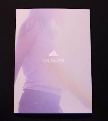
Here is a set of two brochures for Adidas which form the Spring Summer 2010 look books - Mens and Womens.

They are 165x230mm Portrait (an economical format out of a B1 sheet size), section sewn with an 8pp cover and 48pp text (200gsm cover/120gsm text). These are printed on Omnia and the result is just simply stunning. The art direction and photography (by Ben Ingham) is great and the colours are really vibrant ...see for yourselves:  
And this is the Women's...
Art Direction and design is by Made Thought. Print is by Push.

This is a fabulous example of printing on Omnia - this job does truly have the tactile feel of an uncoated with the reproduction of a coated - it does look amazing. Right job, right images, right design, right printer, right paper, right right everything! 

Posted by Justin Hobson 10.06.2010

Tuesday, 8 June 2010

TYPOGRAPHIC Playing Cards


This has to be one of the most interesting jobs of the year from a typographical point of view.

It's a self initiated project by Jim Sutherland at Hat-Trick who has produced some absolutely spectacular visual imagery and iconography by just using letterforms. Each card uses a different typeface.

I'll let the images do the talking...
The cards were printed on one sheet of B2 (520x720mm) board in two colours. The cards were then die cut out of the sheet. However, at the same time they also made posters using the full size sheets and these were "debossed" with an impession where the cut should be (as above) which look amazing. 

The material (which is why Jim called us in the first place) had to be right. Substantial, but not too heavy and flicky was the order of the day. We supplied our Altura Gloss 330gsm which is just right (I think!)
The print production and finishing has been superbly excecuted by Boss. All the elements have been really well finished including the box which is solid, square and just as a box containing playing cards should look and feel like!
Below are some of the sketches which show the work in progress.
This was a really nice project to have been involved with and it's great that there are companies which are prepared to spend some of their own time and money producing some really well crafted self initiated work. 

I'm a bit short of file copies of the cards but I have a few posters left so if you ask really nicely, I might send you one!
Posted by Justin Hobson 08.06.2010