Friday, 14 January 2011

V&A and me

Here's a job which started life with a brief of a single sheet of paper folded in a seemingly random way (for which I was sent a pdf) like this:
Well that's how this amazing job for the V&A started for me. Michael Johnson and the Johnson Banks studio created this idea for display at the V&A museum during the London Design Festival last year. 

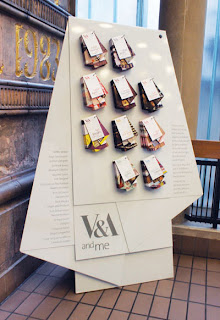
Many creatives find the V&A influential, so the idea to create different maps of the museum, based on notable people’s favourite items was conceived. This set of "maps" was devised for the project and ten different creative people were picked. The maps were then displayed on an exhibition stand.

...and this is how they turned out:
Size is A2 (420x594mm) folded to an unmeasurable size! An open example showing the inside:
...and how they are all displayed on the stand:

From a material point of view it was important to select a material which was substantial enough to take a machine crease but which was light enough so that the final fold wasn't too 'springy'. We made several dummies on a variety of different materials and StarFine White 100gsm was selected because it had the right feel and a good opacity.

Print production was by Gavin Martin Associates and so was the excellent print finishing. The complexity of this folding shouldn't be underestimated plus they had to be accurately punched.

Creative Director on the project was Michael Johnson. Senior Designer was Julia Woollams and the placement paper engineer busy folding up sheets of paper for days on end was Bethan Jones.

You can read more about the project and see more pics on the following link:
http://www.johnsonbanks.co.uk/thoughtfortheweek/index.php?thoughtid=601

http://www.vam.ac.uk/
http://www.johnsonbanks.co.uk/
http://www.gavinmartin.co.uk/
Posted by Justin Hobson 14.01.2011

Wednesday, 12 January 2011

The Rule Book

When someone is made a Freeman of the City of London they are presented with a small book entiltled: Rules for the Conduct of Life. This book was written by a former Lord Mayor, Sir John Barnard (circa 1740).

St Lawrence Jewry is the official Church of the City of London Corporation and ArthurSteenHorneAdamson were commissioned to produce a new design for the publication of this modern version.
Although there is only one book, they produced a series of eleven different coloured dustjackets (8pp) which wrap around the "real" 4pp cover and which makes a set. Each dustjacket is titled differently referring to a particular rule inside. The dustjackets are tint layed, printed in CMYK all on Colorset White 120gsm. The generic 4pp cover is on Colorset Bright Red 270gsm and hot foil blocked in gold metallic foil. The 64pp text (which looks beautiful) is printed on Offenbach Bible 60gsm.  The text was printed as CMY and used PANTONE black 3U as the 4th colour to get the crispest text. The text was printed in four colour, not because there are any pictures or illustrations, the text is all in crisp black and red, but there are some divider pages between sections which again are tint layed solids - they adjusted on press the mix for the divider pages to closely match the dustjackets. The size is A6 portrait. A well thought out and very cost effective solution.
Design is by AthurSteenHorneAdamson. Creative director is Marksteen Adamson, designer was Joe Hole and the project manager was Katy Hudson. The excellent print and production, including foiling, is by R.Young and Sons, based in Croydon. They are one of the few printers who have their own hot foiling machinery.

Although this may seem like a very old fashioned set of rules, they are amazingly pertinent to today's life. Rule 24 looks like it was especially written for me: "If you are very busy, don't panic: sort out the priorities and do one thing at a time". Easy to say, not so easy to do!

http://www.ashawebsite.com/
Posted by Justin Hobson 12.01.2011

Tuesday, 11 January 2011

SV Two Digital in Liquidation

It was reported in Printweek last week, that London-based Digital printer SV Two Digital has gone into liquidation less than six months after its litho sister company (Quantum Print UK) but which traded as SV2, closed. The printer, based in Beckenham has gone into liquidation owing more than £1million (wowee!) to creditors and with 12 jobs lost.
Many people in the design community will have known the SV2 name and the personalities behind the company, William Fletcher, Duncan Summers, Nicolas Ide and Rob Phillips.

You can read more...
http://www.printweek.com/News/1047977/SV-Two-Digital-liquidation/?DCMP=ILC-SEARCH
http://www.printweek.com/News/1049487/SV-Two-firms-collapse-2010-casualties-continue-mount/?DCMP=ILC-SEARCH
Posted by Justin Hobson 11.01.2011

Monday, 10 January 2011

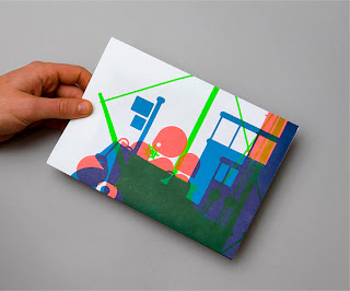
I saw three ships come sailing by...

Here's one of the lovely pieces that I received at Christmas. Printed on Offenbach Bible 60gsm. To tie in with the ships theme, each of three ships is printed in a different colour, it is printed offset litho - and the colours are overprinted which also creates the effect of more colours.
Fenner Paper also supplied the snazzy C5 envelopes as well!
Overprinting (colour on top of another colour) was commonplace back in the days of letterpress, and when creating colours out of CMYK was very expensive. However it's a process which is rather forgotten nowadays - probably because it's nigh on impossible to create digitally and the results can only be seen on the press when it's actually being printed. Many people would wrongly assume that it's been printed silkscreen - but you wouldn't get the effect because (in general) Litho inks are transparent and silkscreen inks are opaque.

Design is by Maddison Graphic based in Ely and litho printing is by Identity in Paddock Wood in Kent.
Posted by Justin Hobson 10.01.2011

Thursday, 6 January 2011

The new It's Nice That...

Just received the January Newsletter about the tweaks on the "It's Nice That" site including the new listings section ...check it out: http://www.itsnicethat.com/
Posted by Justin Hobson 06.01.2011

Tuesday, 4 January 2011

Jobs from the past - Number 15

Happy New Year!

Followers of this blog will know that my first post of every month is a "job from the past" so that I can show some of the really good work from years gone by. ...here's the first post for 2011.

Merchant Handbook - 2002

Merchant is the corporate reporting arm of global PR firm Brunswick. In the 1990's years they used to produce a report called the Merchant Handbook, showing FTSE listed companies and which agency did their reporting and who printed it etc. - it used to be quite interesting reading. By the 2000's the burden of collating this information was too great and the Merchant Handbook became a yearly publication of relevant articles about reporting, CSR and investor relations.

At that time Merchant managed the production and design and used a collection of independent studios to do the creative work. This report was designed by NB:Studio.

The report contains articles on six different subjects and each one forms it's own booklet. Each booklet is designed in a completely different style, either purely typographic, illustrative image based etc. and to emphasise the difference, each booklet is on a different material. Some are printed CMYK, some 2 colour and 1 colour plus silkscreen.
Each individual booklet was saddle stitched and they were then 'double-sided' to each other (back to front covers) along the spines only allowing each booklet to open freely but giving the appearance of a neatly stacked pile of different booklets from the front. The overall size of the job is 225x280mm portrait (cover size) with a 14mm spine.

The materials used were Episiode IV 115gsm, Alga Carta 90gsm, Millennium Real Art 170gsm, Dali Neve 160gsm, Neptune Unique 135gsm, Appledawn Cream Velvet 150gsm, some of which are now defunct.

One of the crucial factors that contibuted to the success of the job was the selection of the board for the cover. Being a 4pp cover but with a parallel creased 'freestanding' spine and all the weight being stuck into the inside back cover, it needed to be a substantial piece of board. Our Aerographic Twin 500gsm was used with a gloss lamination on the outside cover and it really works.
Creative directors on the project at NB: Studio were the three partners (Nick, Ben and Alan) and the designer was Nick Vincent. This is just a lovely piece of printed literature - it is extremely engaging. However from memory I don't think it was nominated or won any awards which was a shame and a bit of a surprise. The  2003 Handbook (also designed by NB) was nominated for illustration at D&AD and was also on our paper, so maybe I'll write about that some other time!

The publication was produced under Managing Director, Robert Moser's watchful eyes and the project was managed by Leonie Dixon. Russell Thompson oversaw the print production and finishing (most importantly) of the job which was printed by Impressions in Wimbledon, who (like many printers from that era) don't exist anymore.

So where are they all now? Russell Thompson is production director at Merchant, Nick and Alan remain at the eponymous NB:Studio (http://www.nbstudio.co.uk/), Ben Stott now works independently on his own projects (http://www.benstott.com/) and  Nick Vincent set up his own studio (http://www.vincentdesign.co.uk/) ...oh, and I'm still at Fenner Paper!

Posted by Justin Hobson 04.01.2011
Friday, 31 December 2010

Best of 2010 Xmas/New Year pieces

Thanks to all those people who very kindly sent me Christmas cards and some exceptionally fine and humorous Xmas and New Year promo pieces.

Here are two of the best:

A beatifully packaged and well presented pair of Red and White Christmas socks. They were mailed in a bespoke envelope shaped wallet (made using Colorset, Bright Red 270gsm) and held together with a 'seal' shaped sticker. The pair of socks with the 'warm wishes from Bob' tag is hot foiled blocked (on Matrisse 200gsm) and held on by red ribbon and a lovely little gold coloured safety pin. The attention to detail is fantastic.  

Again, this is a piece which is produced with fantastic attention to detail (and it's not even produced using our paper!). Simply (but very nicely) wrapped in brown paper, there is a well produced white box inside which when opened reveals the number of the limited edition snowball and the message "catch you in the new year". Inside is a lovely snowball (fake, but very realsistic) and some loose snow! Really excellent production:  

...and what about the rest?
The above pieces are just two that I thought were worth highlighting because of their exceptionally high production values but I also received some other excellent cards, calendars, bookmarks and novelties. HOWEVER, I also received some items which those design companies should simply be ashamed of - especially if these were the same items as were sent to clients or potential clients. Here are three examples (names witheld!):
  • An item where the wrong postage amount had been put on it so it arrived with a postage to be paid sticker (if mine was wrong, so were all the rest).
  • A fairly well produced notebook, the effect of which was ruined by it being put into a 'jiffy' bag together with a compliment slip which had a greeting laser printed onto it.
  • Beautifully silkscreened tea towel and lovely tag, badly let down by being sent out in a wrongly sized, bog standard C5 "Office Depot" business envelope!
The point to be made here is to only send something out into the market that represents what you can do best. If an item is let down by incorrect postage or a badly thought out envelope or content, it won't impress a new client and might even make an existing client think again. If you aren't going to see it through and produce something of the same quality and production values that you would be happy to produce for a client - my advice is, don't do it!
Posted by Justin Hobson 31.12.2010