Monday, 24 January 2011

Maurice Payne Colourprint founder dies

It was announced in Printweek today that Maurice Payne, founder of Theale, Reading-based Maurice Payne Colourprint, died this weekend (22 January), following a long illness.

He started his career in print in the late 1960s, founding Maurice Payne Colourprint in 1983. During his 27 years at the company he secured a number of firsts, including the UK's first five-colour press (yep, back in those days four colour presses were the norm) and the world's first installation of two 12-colour perfectors.

Although I didn't know Maurice Payne personally, he was certainly a legend in the UK print market. Our sympathies go to his family.

You can read more:
http://www.printweek.com/PrintWeekDaily/News/1051172/Maurice-Payne-Colourprint-founder-dies/?DCMP=EMC-PrintWeekDailyBulletin

http://www.mp-colourprint.co.uk/
Posted by Justin Hobson 24.01.2011

Thursday, 20 January 2011

Granite Colour goes into Liquidation.

Sad news yesterday, as Printweek reported that Granite, a printing company based in Leigh on Sea in Essex, has gone into Liquidation (in laymans terms that means they've gone bankrupt).

It's very sad news as they have been an excellent quality print company in the design and corporate sector. In fact only last year, they won the award for "Brochure printer of the year" and "Report and Accounts printer of the year". Below are pictured Danny Kirk, Trevor Buck and Mark Shields accepting the awards (Hugh Dennis didn't work for them, he was giving out the awards!)
Last year they bought Good News Press which went badly wrong and ended up with Good News Press going bankrupt in August and being closed down leaving large debts to many suppliers.

I have worked on some very nice projects with Granite in days gone by, including the Rainforest Action Network job which won a Designweek award and other pieces which have appeared on this blog. They were an excellent printers, so I hope that all the staff are able to find new employment and that their suppliers haven't been too badly hit.

If you want to read more about it, here's a link:
http://www.printweek.com/PrintWeekDaily/News/1050166/Granite-Colour-administration-going-concern-sale-close/?DCMP=EMC-PrintWeekDailyBulletin
Posted by Justin Hobson 20.01.2011

Wednesday, 19 January 2011

CIA Calendar 2011

This is a really lovely desk calendar produced by the Central Illustration Agency (CIA). There are 52 illustrations (one per week) and all the illustrations all relate to this years theme "If I were..."

The job is printed in four colours (CMYK) but it's been produced very well given the vibrant reproduction achieved. The cover is printed with a fluorescent pink and is Lasercut on our Astralux [1 sided] 250gsm and is designed by Kai and Sunny.
The 140mm square calendar is printed on our, 100% recycled, Colorset Light Grey 120gsm and the "tent card" (which is the commonly used term for the supporting cardboard frame) is made from a sturdy sheet of Trojan Whiteback 510gsm (below pic):
Production (at the CIA) was dealt with by the lovely Jules Beazley. Design is by Staziker Jones and print is by Hartleywilprint based in Wales.
Posted by Justin Hobson 19.01.2011

Tuesday, 18 January 2011

Do I push Push?

Over the past few months I've had a couple of people ask me if I have some sort of "tie-up" or "special realationship" with London based printer, Push. So I thought I'd take the opportunity to explain what the score is!

I am happy to have a very good working relationship with the people at Push but not necessarily any better than many other printers that we work with and I know we aren't anywhere close to being their biggest supplier. "So why is their work always appearing on this blog?" I hear you ask. Well the truth is, they do produce nice work BUT the most important factor is they take the time and trouble to send me file copies when they have used our papers.

Generally speaking, a designer that I've been working on a project with, will send me some file copies (as you witness here on this blog) for which I'm very grateful. However, sometimes I find out about work done using our paper by accident or a casual "oh yes, we used your stuff on that job a couple of months ago" or even when I get told "I threw away that box of file copies printed on your stuff, just last week" (...Tom - you know who you are!).

So here's an example of what Push do: A nice note from Emma, sent to me with some file copies...
This particular job is a series of five invitations for the Royal Overseas League (ROSL) annual Scholars Exhibition. They are 406x288mm folding down to 203x144mm, printed CMYK and are really excellent printed samples on our Redeem 100% Recycled 70gsm
This was followed up a few weeks later with another note with some file copies of the catalogue:
The catalogue shows the work of the five artists and very cleverly utilises each individual printed (bound) section as a section for each artist. This is done by having a section sewn text with "open" binding. What has been cleverly devised with this piece is by mounting the text to the inside back cover of a loose 4pp cover (in a similar way that "swiss binding" works), it has protected the open binding and gives the catalogue an added degree of interest. Each of the colours on the introduction page match up with the individual sections.


Size is 143x205mm. 4pp cover is on Redeem 100% Recycled 240gsm and the 88pp text is on Redeem 70gsm. Designing a catalogue for an exhibition showing such a wide variety of work from different artists is not an easy task but designer Joseph Pochodzaj has made a really excellent job of this publication.
So, that brings me to the end of this piece about whether I push Push!  I write this blog to showcase the projects that use our papers and inevitably I can only write about projects if I actually know about them. So to the people that mentioned about me pushing a particular printer - Stop ya moaning, use some of our papers and most importantly, send me some copies!

http://www.roslarts.org.uk/
http://www.joepochodzaj.com/
http://www.push-print.com/
PS - Thanks to Emma at Push for sending me the file copies.
Posted by Justin Hobson 18.01.2011

Friday, 14 January 2011

V&A and me

Here's a job which started life with a brief of a single sheet of paper folded in a seemingly random way (for which I was sent a pdf) like this:
Well that's how this amazing job for the V&A started for me. Michael Johnson and the Johnson Banks studio created this idea for display at the V&A museum during the London Design Festival last year. 

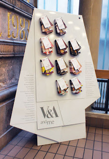
Many creatives find the V&A influential, so the idea to create different maps of the museum, based on notable people’s favourite items was conceived. This set of "maps" was devised for the project and ten different creative people were picked. The maps were then displayed on an exhibition stand.

...and this is how they turned out:
Size is A2 (420x594mm) folded to an unmeasurable size! An open example showing the inside:
...and how they are all displayed on the stand:

From a material point of view it was important to select a material which was substantial enough to take a machine crease but which was light enough so that the final fold wasn't too 'springy'. We made several dummies on a variety of different materials and StarFine White 100gsm was selected because it had the right feel and a good opacity.

Print production was by Gavin Martin Associates and so was the excellent print finishing. The complexity of this folding shouldn't be underestimated plus they had to be accurately punched.

Creative Director on the project was Michael Johnson. Senior Designer was Julia Woollams and the placement paper engineer busy folding up sheets of paper for days on end was Bethan Jones.

You can read more about the project and see more pics on the following link:
http://www.johnsonbanks.co.uk/thoughtfortheweek/index.php?thoughtid=601

http://www.vam.ac.uk/
http://www.johnsonbanks.co.uk/
http://www.gavinmartin.co.uk/
Posted by Justin Hobson 14.01.2011

Wednesday, 12 January 2011

The Rule Book

When someone is made a Freeman of the City of London they are presented with a small book entiltled: Rules for the Conduct of Life. This book was written by a former Lord Mayor, Sir John Barnard (circa 1740).

St Lawrence Jewry is the official Church of the City of London Corporation and ArthurSteenHorneAdamson were commissioned to produce a new design for the publication of this modern version.
Although there is only one book, they produced a series of eleven different coloured dustjackets (8pp) which wrap around the "real" 4pp cover and which makes a set. Each dustjacket is titled differently referring to a particular rule inside. The dustjackets are tint layed, printed in CMYK all on Colorset White 120gsm. The generic 4pp cover is on Colorset Bright Red 270gsm and hot foil blocked in gold metallic foil. The 64pp text (which looks beautiful) is printed on Offenbach Bible 60gsm.  The text was printed as CMY and used PANTONE black 3U as the 4th colour to get the crispest text. The text was printed in four colour, not because there are any pictures or illustrations, the text is all in crisp black and red, but there are some divider pages between sections which again are tint layed solids - they adjusted on press the mix for the divider pages to closely match the dustjackets. The size is A6 portrait. A well thought out and very cost effective solution.
Design is by AthurSteenHorneAdamson. Creative director is Marksteen Adamson, designer was Joe Hole and the project manager was Katy Hudson. The excellent print and production, including foiling, is by R.Young and Sons, based in Croydon. They are one of the few printers who have their own hot foiling machinery.

Although this may seem like a very old fashioned set of rules, they are amazingly pertinent to today's life. Rule 24 looks like it was especially written for me: "If you are very busy, don't panic: sort out the priorities and do one thing at a time". Easy to say, not so easy to do!

http://www.ashawebsite.com/
Posted by Justin Hobson 12.01.2011

Tuesday, 11 January 2011

SV Two Digital in Liquidation

It was reported in Printweek last week, that London-based Digital printer SV Two Digital has gone into liquidation less than six months after its litho sister company (Quantum Print UK) but which traded as SV2, closed. The printer, based in Beckenham has gone into liquidation owing more than £1million (wowee!) to creditors and with 12 jobs lost.
Many people in the design community will have known the SV2 name and the personalities behind the company, William Fletcher, Duncan Summers, Nicolas Ide and Rob Phillips.

You can read more...
http://www.printweek.com/News/1047977/SV-Two-Digital-liquidation/?DCMP=ILC-SEARCH
http://www.printweek.com/News/1049487/SV-Two-firms-collapse-2010-casualties-continue-mount/?DCMP=ILC-SEARCH
Posted by Justin Hobson 11.01.2011