Monday, 12 December 2011

New 2012 Diary

I just received a very nice e-mail from James Blakeborough at Manchester based "Only a northern soul". The e-mail shows a picture of a tired and well loved 2011 diary which is his "freelance booking bible" - and particularly appropriate, given that it is printed on Offenbach Bible! James was simply checking that we were producing a 2012 diary and making sure I had his new address details.

...never fear! The 2012 diary is going in the post this week (hopefully!) so should be with you before Christmas.


I can't tell you what colour it is because you could be getting one of many colours - all printed on our Colorset 100% Recycled 270gsm.

This year, we are also doing a seperate Colorset desk calendar as well...
So keep an eye out for the postman.

...and thanks to James for the pic of his well thumbed diary
www.onlyanorthernsoul.co.uk
Posted by Justin Hobson 12.12.2011

Thursday, 8 December 2011

Surface View

This is an exquisite piece of literature for a company who's business is all about image.

Surface View is an enterprise who are in the business of collaborating with designers and architects to produce bespoke images installed in buildings, spaces, businesses and homes, either as murals, mounted prints, blinds, textiles or a host of other substrates.

This brochure, titled "Handbook" is about what they do and the way they work. With image reproduction being such an important part of their business, it was essential that everything reproduced amazingly! The text chosen for the project is Omnia 120gsm - chosen because the imagery from Marvel to Getty Images to the V&A looks brilliant. The 270gsm cover material is from the other well known, Hull based paper merchant, in Smoke Grey.


Size of the book is 172x240mm, portrait format, section sewn binding. The 4pp cover is silkscreened in white, 50pp text is printed in CMYK throughout - with some particularly good four colour black and white images.

Design is by Ben Stott and it is superb. Print is by Push and it is also superb. Not a lot more to say other than I have used the word "image" six times and "superb" twice in this one post ....but hey, who's counting? 

Posted by Justin Hobson 08.12.2011

Monday, 5 December 2011

University of the Arts 2012

...just the cover makes the difference!

Here's a job that is worth a look, because the cover is used to add to the quality and feel of the whole project. This is the 2012 course guide for the University of The Arts which is produced in many different languages (Russian, Korean, Japanese, Chinese - to name but a few). The size of the job is 170x240mm portrait. This was quite a large run and what makes it a worth noticing is the way in which Omnia 200gsm has been used for the cover to give it a more tactile engaging feel. The text is on an uncoated offset as the budget dictated. The cover is hot foil blocked in matt white foil which gives it a quality feel and keeps it miles away from the naff "glossy" brochures which are often produced for university guides - the cover sets the tone and feel for the publication
This is an excellent example of using a material for a part of a project which can just lift the whole look and feel and make a piece of literature special.

The job is designed by Unlimited in Brighton. Designer on the project is Patrick Morrissey.  It was produced in conjunction with Simon Goode at the Department of Communications and Development at the University of the Arts. Print is by Tradewinds.

www.weareunlimited.co.uk
Posted by Justin Hobson 05.12.2011

Saturday, 3 December 2011

Matt Hill wins World Championship

Ever wondered what other people who follow this blog get up to? Matt Hill is a talented young tap dancer who was selected to represent England at the IDO World Tap dance Championships held last week in Riesa, Germany.

Being selected was one thing, but yesterday evening he walked away with the World Title of Junior Male Soloist on behalf of England.
If the truth be told, Matt isn't particularly interested in paper ...he's still at school, but as a family friend and inveterate blogger he has contributed to my enthusiasm for blogging.
Above are pictured the 2011 World Champions (Matt in centre)

Matt dances with the Redhurst School of Dancing in East Grinstead and with the group Tap Attack. Congratulations to Matt and all in the England team.
www.ido-dance.com
www.mrskayballeastgrinstead.co.uk
www.tapattack.co.uk
Posted by Justin Hobson 03.12.2011

Friday, 2 December 2011

Jobs from the past - Number 26

Regular followers of this blog will know that my first post of every month is a "job from the past" so that I can show some of the really good work from years gone by...

D&AD Membership Campaign
August 2006

Having introduced several new membership categories, D&AD appointed NB to produce a comprehensive promotional campaign. In NB's own words: "To appeal to the target audience – the creative industries – we opted for clarity and wit. Using objects commonly found in creative environments and items related to specific membership benefits, we created collage set pieces which were photographed by John Ross. Striking, cohesive and cost effective, the campaign launched with a fold out poster."

The A1 posters which folded down to A5 were printed on Offenbach Bible in 60gsm because at this weight (and if folded correctly - i.e. concertina and concertina, therefore allowing all air to escape) there are no "crows feet" appearing - if you're not familiar with that term, it's where a rather ugly crease appears crinkled from the centre of the fold, splaying out like the bird's foot.


Creative Directors on the project were Nick Finney Ben Stott and Alan Dye. Designer was Eng Su.

It was printed and finished by Pureprint (48,000 copies, as I recall). Pureprint were the print sposnor of D&AD at that time.
Posted by Justin Hobson 02.12.2011

Wednesday, 30 November 2011

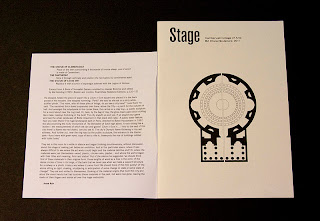
Camberwell College of Arts - BA Hons Sculpture 2011

This is a piece of literature produced for the BA (Hons) Sculpture 2011 course at Camberwell College of Arts.  It is A5 (148x210mm) size and is saddle stitched. It has a lightweight cover which is cut 40mm short at the head, which opens up, like so...

4pp cover on Neptune Unique 120gsm, 20pp text on our recycled Brand X FSC 150gsm which has a warmer, natural, shade which contrasts well with the whiter, lightweight cover material. Cover is printed in one colour (black) both sides, text is CMYK throughout. Nice clean job and fairly economical to produce.
The project was designed by Joe Hales who was working in conjunction with Josie and Julia who are two students on the course. It was printed by Calverts Press in London.
...and thanks to Josie and Julia for their lovely note and for taking the time to send me some file copies.

http://showtime.arts.ac.uk/camberwell/2011/ba-hons-sculpture
http://josiecockram.com/
www.juliagray.co.uk
http://josephhales.co.uk/
www.print.coop
Posted by Justin Hobson 30.11.2011

Tuesday, 29 November 2011

Fish and Chip paper

Some readers of this blog may be old enough to remember when fish and chips were actually served in old newspaper (I do and I'm not that ancient, honest!).
Well, I was pleased to be able to help out on a lovely little touch at a wedding, where they served fish and chips at the evening reception. Two pages of the local newspaper from the day that the couple were both born was reproduced on our Redeem 100% Recycled 60gsm. As you can see from the pics, it all worked rather well!

...and here are the happy couple, Ben and Gemma:
The idea and production was by Phil Bold, designer at GBH, who is Gemma's brother! ...and he lovingly printed them all too.

Posted by Justin Hobson 29.11.2011