Showing posts with label University of the Arts. Show all posts

Wednesday 15 May 2019

CSM Guide 2019

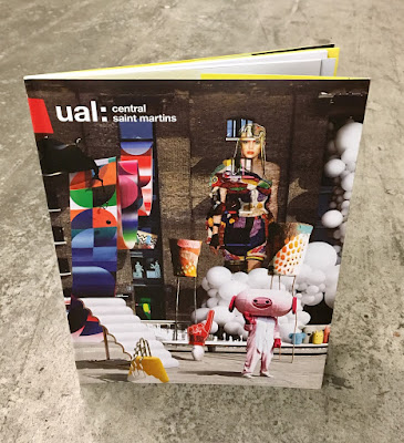
I've written many posts on this blog which includes the phrase "...just the cover makes the difference!" The cover on this prospectus is simply perfect. It is printed on our Astralux, One sided 170gsm, with an amazing image which is a photo composition of 28 works by CSM students,  all laid out with the wonderful King's Cross building as the backdrop.
Click on images to enlarge
The size of the publication is 270x200mm, portrait. The cover has 100mm flaps, which you can see in the birds eye picture below...
The below image shows the opening spread, which shows the 92pp text, which is stepped and printed on a combination of recycled uncoated, gloss art and yellow tinted paper.
Above you can see the way the image wraps around the cover over to the flap - and this is where the real magic happens, because Astralux being a 'Cast Coated' paper it has a high gloss surface one side and is uncoated on the reverse, so you get the juxtaposition of the high gloss coated with the toothy uncoated reverse (printed yellow) as I hope you will be able to see in the image below...
The image below shows the cover in it's entirety, spread out
Click on images to enlarge
The job is PUR bound - a very neat job.
It is a superbly designed piece of literature which has to engage with young creative minds, demonstrate that CSM is a world class arts and design college whilst also satisfying the CSM Alumni! No easy task. Design is by Boyle & Perks.

The excellent print is by Pureprint. It is printed offset Litho throughout in CMYK plus the bright yellow printed as a pantone special.

https://www.arts.ac.uk/colleges/central-saint-martins
http://boyleperks.com/
https://www.pureprint.com/
http://www.favini.co.uk/
Posted by Justin Hobson 15.05.2019

Monday 5 December 2011

University of the Arts 2012

...just the cover makes the difference!

Here's a job that is worth a look, because the cover is used to add to the quality and feel of the whole project. This is the 2012 course guide for the University of The Arts which is produced in many different languages (Russian, Korean, Japanese, Chinese - to name but a few). The size of the job is 170x240mm portrait. This was quite a large run and what makes it a worth noticing is the way in which Omnia 200gsm has been used for the cover to give it a more tactile engaging feel. The text is on an uncoated offset as the budget dictated. The cover is hot foil blocked in matt white foil which gives it a quality feel and keeps it miles away from the naff "glossy" brochures which are often produced for university guides - the cover sets the tone and feel for the publication
This is an excellent example of using a material for a part of a project which can just lift the whole look and feel and make a piece of literature special.

The job is designed by Unlimited in Brighton. Designer on the project is Patrick Morrissey.  It was produced in conjunction with Simon Goode at the Department of Communications and Development at the University of the Arts. Print is by Tradewinds.

www.weareunlimited.co.uk
Posted by Justin Hobson 05.12.2011

Thursday 28 October 2010

University of the Arts 2010

This is one of the most beautifully simple jobs that I have seen all year. It is for the University of the Arts in London and is the book produced for the awards ceremony in July and lists every candidate on every course together with their awards.
Size is 160x230mm, portrait. The job has a 4pp cover with 112pp text with a spine width of about 10mm. One of the most unusual things is that the whole job is printed in just one colour - Pantone Gold (874, I guess). Not only is it unusual to see one colour jobs produced these days in any sort of volume (because the pressure always seems to be on using colour) but using a metallic on an uncoated substrate (Redeem 100% Recycled 240gsm and 130gsm)  is uncommon and yet, as you can see, it works beatifully, both on the text work and the full pages of solid with reversed out extremely fine lines.
Design is by David Preston Studio. It was produced in conjunction with Simon Goode at the Department of Communications and Development at the University of the Arts. Thank you Simon for sending me copies and the lovely note.
It was printed by Tradewinds who are based in Peckam in South London and I have to say, they have made a really lovely job of it.
Posted by Justin Hobson 28.10.2010