Tuesday, 27 December 2011

Ding Dong

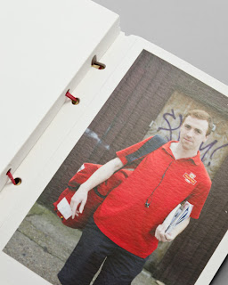
This is the clever little festive greeting card (...or should that be parcel?) from Magpie Studio.
Have a look and then I'll explain...

As Magpie see it, posties are the unsung heroes of Christmas. Up early in all weathers contending with impossible addresses and dogs nipping at their heels, this is their tribute to these troopers.

Working with photographer John Angerson, Magpie contrived to getting as many of the posties from around the Shoreditch area and the various routes (or walks as they call them in the PO) as possible ending up with thirteen in total. Words are written by Scott Perry (Bard of Bray).

The outer cover which looks like a package is formed using our Rib-Tone 2 sided 340gsm and forms both the cover and envelope. The fourteen cards are "bound" in using the Royal Mail red rubber bands that we are so familiar with, littering the outside of many front doors and workplaces!

Print, finishing and rubber-banding (!) is by Gavin Martin Colournet. It's also worth pointing out that the Rib-Tone is printed in 1 colour - white - on their new HP Indigo digital press! not silkscreen or hot foil ...it's white ink! 
 
The cards are printed on our Omnia 280gsm, which as you can see from above, prints a solid red, just beautifully and are also printed on the HP Indigo.

Posted by Justin Hobson 27.12.2011

Thursday, 22 December 2011

RCA Alumni 2010

Current membership of the organisation that represents the Alumni of the Royal College of Art, called AlumniRCA is 5,335. Each year they produce a publication to communicate with and about the Alumni and the current activities/developments at the college.

It is a simple, economical format, easy to use for both mailing and display purposes. The format is a 16pp, closed gatefold. Size is A5 folding out to A2 (420x597mm).

Front Cover:
opening out to...
opening out again to...
folding out to...
Design is by Europa and the designer on the project is Paul Tisdell. The publication is printed on Omnia 120gsm which was chosen because of the tactile feel and the way it would reproduce the images, including the one on the reverse, which is a fantastic photograph by Noemie Goudal  (RCA MA Photography 2010)
The job was printed and finished by Pureprint.

www.rca.ac.uk/alumni
www.europaeuropa.co.uk
www.pureprint.com
Posted by Justin Hobson 22.12.2011

Tuesday, 20 December 2011

New digital installation

I popped in to see London based printer Gavin Martin Colournet last week and they are excitedly experimenting with their new bit of kit, a digital press - an HP Indigo 5500 ...so I took a picture of their new machine:
This new press is their first digital installation and is to compliment with their existing Heidelberg B1 Offset Litho press. The press features a capability to print special colours and opaque white.

Personally I was also excited about their other machine installation, a new Nespresso machine, which Gary Bird was kind enough to operate for me... 
Posted by Justin Hobson 20.12.2011


Friday, 16 December 2011

CIA Calendar 2012

This is an excellent 2012 desk calendar produced by the Central Illustration Agency (CIA). There are 52 illustrations (one per week) and all the illustrations all relate to this year's Olympian theme "The Alternative Games..."
Unusually for a desk calendar, the front sheet is actually a folded poster, printed on Offenbach Bible 60gsm. The Size of the calendar is 140mm square - the poster folds out to 420x560mm
The poster design is by Jonas Bergstrand.

...and now for the calendar itself:
The 140mm square calendar is printed on Omnia Natural 120gsm, chosen so that it would have an uncoated feel but reproduce the wide and diverse illustrations superbly. The "tent card" (which is the commonly used term for the supporting cardboard frame) is made from a sturdy sheet of Trojan Whiteback 510gsm (below pic):
Production (at the CIA) was dealt with by Charlotte Hanlon. Design is by Staziker Jones and print is by Hartleywilprint based in Wales.
Posted by Justin Hobson 16.12.2011

Wednesday, 14 December 2011

V&A 2010/2011

This is a superb piece of print - the 2010/2011 Annual Review published by the V&A.  The report is structured in such a way that it literally goes through the year on a month by month basis, showing the exhibitions and the life of the museum in a close up way.

With image reproduction being so important, it was essential that everything reproduced amazingly! The text chosen for the project is Omnia 150gsm - chosen because the print includes solid colours and images of exhibits - and it looks brilliant.


The cover is hot foil blocked in a grey pigmented foil. It is a 350gsm material from the well known, Hull based paper merchant, in Smoke with a morocco embossing. It has an elastic loop which is riveted to the cover - a very nice touch.
Size of the book is 200x265mm, portrait format, perfect bound. The 72pp text is printed in CMYK throughout - beautifully. Additionally, there are 6 tracing paper inserts.

The report was designed in house at the V&A by Nadine Fleischer and Lindsay Pentelow. Since the publication of the report earlier this year, Nadine and Lindsay have left the museum and set up their own design practice called Irish Butcher (www.irishbutcher.co.uk)

The excellent print, foiling and finishing is by Generation Press.

http://www.vam.ac.uk/
Posted by Justin Hobson 14.12.2011

Monday, 12 December 2011

New 2012 Diary

I just received a very nice e-mail from James Blakeborough at Manchester based "Only a northern soul". The e-mail shows a picture of a tired and well loved 2011 diary which is his "freelance booking bible" - and particularly appropriate, given that it is printed on Offenbach Bible! James was simply checking that we were producing a 2012 diary and making sure I had his new address details.

...never fear! The 2012 diary is going in the post this week (hopefully!) so should be with you before Christmas.


I can't tell you what colour it is because you could be getting one of many colours - all printed on our Colorset 100% Recycled 270gsm.

This year, we are also doing a seperate Colorset desk calendar as well...
So keep an eye out for the postman.

...and thanks to James for the pic of his well thumbed diary
www.onlyanorthernsoul.co.uk
Posted by Justin Hobson 12.12.2011

Thursday, 8 December 2011

Surface View

This is an exquisite piece of literature for a company who's business is all about image.

Surface View is an enterprise who are in the business of collaborating with designers and architects to produce bespoke images installed in buildings, spaces, businesses and homes, either as murals, mounted prints, blinds, textiles or a host of other substrates.

This brochure, titled "Handbook" is about what they do and the way they work. With image reproduction being such an important part of their business, it was essential that everything reproduced amazingly! The text chosen for the project is Omnia 120gsm - chosen because the imagery from Marvel to Getty Images to the V&A looks brilliant. The 270gsm cover material is from the other well known, Hull based paper merchant, in Smoke Grey.


Size of the book is 172x240mm, portrait format, section sewn binding. The 4pp cover is silkscreened in white, 50pp text is printed in CMYK throughout - with some particularly good four colour black and white images.

Design is by Ben Stott and it is superb. Print is by Push and it is also superb. Not a lot more to say other than I have used the word "image" six times and "superb" twice in this one post ....but hey, who's counting? 

Posted by Justin Hobson 08.12.2011