Tuesday, 10 January 2012

Toujouri - Xanadu Collection

This is a beautiful lookbook for fashion house Toujouri produced for the launch of their Xanadu collection.

The size is 174x230mm Portrait, section sewn with an 8pp cover and 48pp text. The text is are printed on Omnia 150gsm and the result is just simply stunning - especially with the amazing embroidery on the evening gowns. The photography (by Thomas Cooksey) is superb and the colours are really vibrant ...see for yourselves


All images on the right hand page with the description on left hand page. Lots of space. Thumbnail images on final spread, below.
Brand Marketing and design is by In+Addition.

Creative Director is Paul Hetherington and production was dealt with by Annalyn King ...and thank you for the lovely note and the file copies.
Print is by Fulmar Colour.
 
This is a fabulous example of print on Omnia - this job does truly have the tactile feel of an uncoated with the reproduction of a coated - it does look amazing. 
http://www.fulmarcolour.com/
Posted by Justin Hobson10.01.2012

Friday, 6 January 2012

Jobs from the past - Number 27

Regular followers of this blog will know that my first post of every month is a "job from the past" so that I can show some of the really good work from years gone by...

V&A Zoomorphic Exhibition Literature
2003/2004
Personally, I think this is one of those projects which will be written about in design books and blogs for many years to come as it is a beautifully clever idea, simply executed.
Johnson Banks designed the campaign to promote this exhibition which is on architecture inspired by animal forms that imagined what animals would look like if drawn as architectural pieces. The project is based around a series of three main posters, with the other event literature using elements from each of the posters.
 Click on the images above and below to get the full effect.
...and the exhibition blurb is as follows:

Zoomorphic looks at the emerging trend towards buildings that emulate nature, presenting leading contemporary architecture inspired by animal form.

The exhibition shows an eclectic mix of architects’ models and preserved animal specimens to illustrate the zoomorphic analogy, with works by leading British and international architects including Santiago Calatrava, Renzo Piano and Wilkinson Eyre. Some of the architects featured employ animal metaphors quite explicitly to create iconic signature buildings, for others the animal likeness emerges as the design evolves.

Zoomorphic documents a highly significant new trend that will extend and enrich the language of modern architecture and asks: What will it be like to live in zoomorphic buildings and walk around zoomorphic cities? and: How might the buildings of the future be transformed as architects continue to explore the lessons of biology in more depth?

The exhibition was curated by Hugh Aldersey-Williams

The main posters (above) are 760x515mm. Other literature includes the A5 leaflet, below, which folds out like so:
...and down again
to reveal the 594x420mm poster:
a different version of the armadillo poster as 394x594mm folding down to 197x297mm:
Simple A6 invitation/reply card:
Design is by Johnson Banks. Creative director on the project was Michael Johnson and the designer (and, most importantly, the illustrator as well) was Sarah Fullerton (now Dezille).

The posters were all printed on our Redeem 100% Recycled 130gsm with the cards on 315gsm. Redeem 100% Recycled was chosen because a blueprinty/dyeline paper feel was required and this was the paper that did it! Interestingly, it might look like that it is just the natural/neutral shade of the Redeem coming through but although it was just printed one colour offset litho in a bluey/purple pantone colour, it was further enhanced by having a very small percentage tint of the colour printed all over the sheet, thereby reducing the hardness of the edges, especially on the "pencil type" lines.

It was printed by a west London printer called Fernedge who were a very progressive printer and one favoured by many design companies at that time. Sadly they have since ceased trading. Pippa Redmond (Mustoe) who was MD at Fernedge, now runs the Norwich Kall Kwik franchise.(http://www.kallkwik.co.uk/norwich/aboutus.cfm). - and I'm dead sure it was printed by them, because as you can see from the label, my file copies are still in the original job bag!

http://www.vam.ac.uk/
Posted by Justin Hobson 06.01.2012

Wednesday, 4 January 2012

Happy New Year

Happy New Year to everyone and especially those that are regular readers of this blog. I hope 2012 will be a peaceful year. In the UK, it should be an exciting one with the Olympics being hosted in London and various locations around the whole country. Whatever some people's misgivings, I think that it will be a great event that will be held in the public consciousness for years to come.

Last year, at the DesignWeek awards, I bumped into Bryan Edmondson from SEA. He was kind enough to give some encouraging words about this blog and mentioned that it would be a great idea if I invited other people to occasionally write for it as well.

www.seadesign.co.uk
Having mulled it over (for some considerable time!) I've decided to introduce a "SOAPBOX" piece. Written by an invited contributor, it will be published on the blog at the end of the month (in the same way that "Jobs from the past" is the first post of every month). The piece doesn't have to be about any particular subject, other than it should be of relevance to the type of designers who are interested to read this blog (...also, it can't be libelous, slanderous or defamatory!)

Anyway, that's my new year resolution, so as the idea was his I'll ask Bryan if he'd like to write the first one, otherwise I might have to start ringing around!
Happy 2012.
Justin
Posted by Justin Hobson 04.01.2012 

Thursday, 29 December 2011

M&S Invitation - A/W 2011 Collection

This is a very luxurious looking invitation to the launch of the Autumn/Winter collection for Marks & Spencer.

The size of the job is 154x218mm portrait. It uses Flockage Colours 400gsm in Navy.  For those of you which are not familiar with this product, it is a flocked board which feels like a velvety cloth/material to the touch but which remarkably you can actually "flatten" the pile by use of a  "heat de-boss". In this case the square pattern is "heat de-bossed" and it is then hot foil blocked in silver.

Flockage is an expensive material, but because of the small quantity used and the fact that only two similar processes are being used on it (and waste is therefore minimal) a luxury, high impact impression can be achieved for a relatively low cost.


To give these invitations extra weight (and gravitas), they have been duplexed together with a chocolate brown board ( ...from the other well know Hull based paper merchant!) The total thickness is just over 1mm and the edge is edge in silver.
Design and Art Direction is by Iain White at Pure Design. Print is by Push.
 
www.push-print.com
Posted by Justin Hobson 29.12.2011

Tuesday, 27 December 2011

Ding Dong

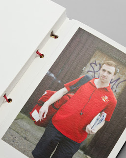
This is the clever little festive greeting card (...or should that be parcel?) from Magpie Studio.
Have a look and then I'll explain...

As Magpie see it, posties are the unsung heroes of Christmas. Up early in all weathers contending with impossible addresses and dogs nipping at their heels, this is their tribute to these troopers.

Working with photographer John Angerson, Magpie contrived to getting as many of the posties from around the Shoreditch area and the various routes (or walks as they call them in the PO) as possible ending up with thirteen in total. Words are written by Scott Perry (Bard of Bray).

The outer cover which looks like a package is formed using our Rib-Tone 2 sided 340gsm and forms both the cover and envelope. The fourteen cards are "bound" in using the Royal Mail red rubber bands that we are so familiar with, littering the outside of many front doors and workplaces!

Print, finishing and rubber-banding (!) is by Gavin Martin Colournet. It's also worth pointing out that the Rib-Tone is printed in 1 colour - white - on their new HP Indigo digital press! not silkscreen or hot foil ...it's white ink! 
 
The cards are printed on our Omnia 280gsm, which as you can see from above, prints a solid red, just beautifully and are also printed on the HP Indigo.

Posted by Justin Hobson 27.12.2011

Thursday, 22 December 2011

RCA Alumni 2010

Current membership of the organisation that represents the Alumni of the Royal College of Art, called AlumniRCA is 5,335. Each year they produce a publication to communicate with and about the Alumni and the current activities/developments at the college.

It is a simple, economical format, easy to use for both mailing and display purposes. The format is a 16pp, closed gatefold. Size is A5 folding out to A2 (420x597mm).

Front Cover:
opening out to...
opening out again to...
folding out to...
Design is by Europa and the designer on the project is Paul Tisdell. The publication is printed on Omnia 120gsm which was chosen because of the tactile feel and the way it would reproduce the images, including the one on the reverse, which is a fantastic photograph by Noemie Goudal  (RCA MA Photography 2010)
The job was printed and finished by Pureprint.

www.rca.ac.uk/alumni
www.europaeuropa.co.uk
www.pureprint.com
Posted by Justin Hobson 22.12.2011

Tuesday, 20 December 2011

New digital installation

I popped in to see London based printer Gavin Martin Colournet last week and they are excitedly experimenting with their new bit of kit, a digital press - an HP Indigo 5500 ...so I took a picture of their new machine:
This new press is their first digital installation and is to compliment with their existing Heidelberg B1 Offset Litho press. The press features a capability to print special colours and opaque white.

Personally I was also excited about their other machine installation, a new Nespresso machine, which Gary Bird was kind enough to operate for me... 
Posted by Justin Hobson 20.12.2011