Monday, 5 August 2013

Whistles - Spring|Summer 2013


This is the lookbook for the Spring/Summer collection from Whistles and it is a superlative piece of literature. Art direction, photography, design, repro and print all combining to make this job look and feel really special.
 
The size is 240x180mm Portrait, saddle stitched. It is printed on our Omnia and has a 4pp cover on 200gsm and a 20pp text on 120gsm. The weights are just right - Omnia is an extremely bulky sheet, so this works perfectly, opening nicely with the pages turning well.
 
As always (...this is the plug for the paper!) the images look superb on the Omnia; the subtle summer shades and the reproduction of the black and white images with their darker areas and heavy ink coverage - keeping all the detail in those heavy areas of CMYK together with uncoated paper tactility which would be lost on any other paper.  The other important thing to note is that unlike most uncoated products, you can successfully gloss UV varnish on this paper (with a single hit) and it works really well - as you can see in the below pic...
 There is a 4pp price guide, also printed on Omnia 120gsm (and also Gloss UV varnished)
Art Direction and design is by Simmonds. Creative Director is Chris Simmonds, designer is Kate Swingler. Photography is by Ben Toms and Styling is by Katie Shillingford. Repro and print, which is superb and the UV varnishing, which has excellent registration/fit, is by South London printer, Push.

http://www.whistles.co.uk/
Posted by Justin Hobson 05.08.2013

Thursday, 1 August 2013

Jobs from the past - Number 46


Regular followers of this blog will know that my first post of every month is a "job from the past" so that I can show some of the really good work from years gone by and here's one from 2007.

Franklyn Rodgers invitation
Black British photographer Franklyn Rodgers has amassed a body of work both personal and commercial, which is breath-taking in its volume and level of accomplishment. The invitation featured here is both a private view invitation and a promotional piece of literature for his first monograph ‘The Philosophy of Strangers’ published by Autograph ABP.

These incredible images simply draw you into the detail of each person and make no mistake, these are beautifully reproduced prints (there is another one in the series but unfortunately I don't have an image for it. although it is equally stunning).
 
The unfolded size of the invitation is A2 (594x420mm), folding down to A6 (148x105mm). As the invitation is unfolded, the information is revealed.  The photographic print is printed on our lovely Offenbach Bible 60gsm, printed offset litho in four colour process. The reproduction is simply stunning.

Design is by Studio8. Creative Directors were ZoĆ« Bather and Matt Willey. Print production is by Principal Colour and they really are an amazing example of what can be achieved on this paper. 
 
www.zoebather.co.uk
www.mattwilley.co.uk
www.principalcolour.co.uk
Posted by Justin Hobson 01.08.2013

Wednesday, 31 July 2013

Fenner Paper joins Greeting Card Association

Fenner Paper is proud to be the first ( ...and as yet, only!) paper company to be granted Associate Membership of the Greeting Card Association (GCA).

Established in 1919, the GCA is an independent not for profit organisation owned by its members. It provides wide-ranging information and specialist resources for publishers, artists and writers. The organisation offers help, advice and support, together with a range of membership services including courses run by members for members. 

Sarah Glennie and Sharon Little
of the GCA
Sarah Glennie (pictured on the left) is the person here at Fenner Paper who specifically works with Greeting Card designers and publishers - and it's worth mentioning that we work with all sizes of publishers ...literally from those producing cards on their kitchen tables upwards! Sarah says "We look forward to being a valuable and active member of the association, particularly supporting new and upcoming card publishers, to help them make the right choices for their card designs"

If any reader of this blog is thinking about starting to publish their own cards and would like some advice and information (things like sizes, envelope availability etc,) you can contact Sarah directly sarah@fennerpaper.co.uk

www.greetingcardassociation.org.uk
Posted by Justin Hobson 31.07.2013


Tuesday, 30 July 2013

The Gleneagles Spa by ESPA

The Gleneagles Hotel is set in 850 acres in the heart of Scotland. Aside from the international reputation as one of the foremost golf resorts, there is a luxurious Spa. The Spa at Gleneagles by ESPA is proud to be one of the Leading Spas of the World. Launched by the exclusive Leading Hotels of the World group, this is the first global evaluation and certification programme for the spa industry.

This beautifully produced piece of literature is available for guests to see the treatments offered. The brochure conveys the luxury and subtlety of both the space and the experience.

Size is 210x148mm, portrait, section sewn. The paper used is our StarFine Natural White 300gsm for the cover and 150gsm for the 32pp text. The uncoated paper is a subtle, neutral, white which perfectly suits the imagery and typography in the publication.
Design is by Burgess Studio. Creative director is Alexis Burgess. Designer on the project is Tom Green. Printing is by Glasgow based 21 Colour.

http://www.gleneagles.com/
www.espa.com
http://burgess-studio.co.uk/
http://www.21colour.co.uk/
Posted by Justin Hobson 30.07.2013

Friday, 26 July 2013

The Marshes

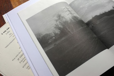
Hackney Marshes are city and wilderness. They are wild and grubby, empty and teeming with rubbish and stories. 'The Marshes' brings together images by Josh Lustig and text by Samuel Wright, in an unconventional design that lets the photographs and writing interact and interweave throughout.

'The Marshes' is the first publication from Tartaruga Press. As sprawling and untamed as its subject, this is a book designed to be explored, played with, and re-read.
The size of the publication is 240 x 165mm, portrait. The 4pp cover is printed on our Flora Avorio, 240gsm, silkscreen printed. For those that aren't familiar with it, Flora is a 50% recycled paper with natural deliberately visible inclusions and fibres. The 52pp main section printed on Shiro Echo, Bright White 120gsm (our 100% recycled). Their are two smaller "insert" sections 220x145mm (1x24pp and 1x28pp) printed on Offenbach Bible 60gsm.
Somewhat surprisingly, but with amazing effectiveness, the images on the main text are all printed single colour, offset litho and the halftone reproduction of the monochromatic images is superb.
There is also a single sheet loose leaf letterpress on the Flora Avorio, 100gsm (below)
It's also worth pointing out that it's beautifully bound. It's "three hole sewn" in black thread which suits the publication perfectly. 


The inset sections on the Offenbach Bible 60gsm are printed in 2 colours, black and a special green ( printed offset litho).
James Cartwright, posting on www.itsnicethat.com, writes "Beautifully printed and bound, The Marshes is a wonderful example of a work that utilises print to the very best of its capabilities, bringing writer, photographer and designer together to make something uniquely tactile and extraordinary"

Design is by Daisy Lumley. The cover was silkscreened by hand in two colours by Max Bondi. Litho printing and finishing is by Paul Martin at Jigsaw Colour. Thanks to Josh and Max for sending me file copies and for their kind note. This is their first publication (limited edition of 300 copies) and I can't wait to see the next one....

Posted by Justin Hobson 26.07.2013

Wednesday, 24 July 2013

Deutsche Bank 365

This is another edition of the CSR literature produced by Deutsche Bank who now have a system of regional newspapers showing how their global strategy is being applied at a local level by the bank and its people. The system has been developed by Studio 2br to extend its CSR communications beyond the normal production of a yearly report (previous issues have appeared on the blog before)
It is a 12pp format with a finished size of 470x315mm 'endorsement folded' to 235x315mm. The layout, content and photography contribute to make this a beautiful looking publication. The material used is our Enviro-Tech 80gsm, which is 100% recycled with good opacity and whiteness and was chosen both for this (because of the format) and it's environmental credentials.
Design is by Studio 2br. Creative Director on the project is David Shalam and the designers are Daniel Hayes and Dave Young. Print is by London based printer The Colourhouse.

I said it before about the previous issue of this job and I'll say it again - if only all pieces of corporate literature could look as good as this...

www.db.co/uk

Posted by Justin Hobson 24.07.2013 

Monday, 22 July 2013

Bob Eight Pop

Bob Eight Pop is a small, boutique silkscreen studio based in East London who have been doing work for an impressive list of clients for over thirty years. Clients such as Cartier, Bibliotheque, The Design Museum, Church of London, Matthew Williamson and Airside to name but a few.

Earlier this year Bob Eight Pop (BEP) became part of the Absolute group of companies, a one stop shop for brands and retailers. They develop packaging solutions, print procurement and all manner of services that brands require on a global basis. Regular readers of this blog may remember the lovely Ted Baker SS|2012 lookbook that Absolute printed on our StarFine last year.
http://justinsamazingworldatfennerpaper.blogspot.co.uk/2012/04/great-exhibitionist.html

Anyway, Absolute are now running a series of workshops for the brands and customers they work with and they invited me along to BEP last week, to see what was going on. Demonstrations by the printers were followed by an invitation to have a go...
One of the prints pictured below. A particularly poignant quote by Frank Lloyd Wright, which thankfully was printed on our Colorset 100% Recycled paper!
BEP has hand bench equipment and also a carousel for textile printing. Below is one of the invited guests in the studio, creating a unique design on a T shirt.
Company founder  Bob Ellis, (you'll recognise him from the identity pic below) flanked by Andrew Towers (Left) and Gary Elliott (Right) Managing Director of Absolute.
It was a great afternoon, very enlightening and educative ...it was great fun as well as they had laid on beer (brewed literally around the corner) with custom "Absolute" labelling.

Too many people to thank for the invitation, suffice it to say thank you to all and I look forward to trying the beer.

Bob Eight Pop is a really interesting small company. They are half a dozen people with a wealth of knowledge and experience together with a real passion for print.

http://www.bobeightpop.com/
 
PS in case you were wondering the excellent Bob Eight Pop identity was created by Dry http://www.dry.uk.com/
Posted by Justin Hobson 22.07.2013