Showing posts with label Studio8. Show all posts

Friday, 15 March 2019

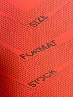
Size | Format | Stock is 10 years old!

The publication Size|Format|Stock was first published ten years ago. This is the booklet that I wrote in collaboration with Zoë Bather at Studio8. Originally written to leave with students after I've given a talk, it has since become a firm favourite with many graphic designers both in the UK and abroad.

The 2019 edition is the fifth printing and in total I've printed and distributed over 30,000 copies! ..through colleges, by post and also through Grafik and Eye Magazine.
The booklet is A5 portrait saddle stitched with a 4pp cover on Colorset, Chilli 120gsm and a 16pp text printed on Offenbach Bible 60gsm.
If you would like a copy, just email me and I'll pop one in the post to you: justin@fennerpaper.co.uk

Posted by Justin Hobson 15.03.2019

Friday, 20 February 2015

Size | Format | Stock - 2015 edition

The latest, revised, edition of Size|Format|Stock is now available. Size Format Stock is the booklet that I wrote in collaboration with Zoë Bather at Studio8. Originally written in mind for the students that I give occasional talks to, it has since become a firm favourite with many graphic designers.
This is now it's fourth printing and I've printed and distributed over 25,000 copies! ..through colleges, by post and also through Eye Magazine.
The booklet is A5 portrait saddle stitched with a 4pp cover on Colorset 120gsm and a 16pp text printed on Offenbach Bible 60gsm.
If you would like a copy, drop me an email and I'll pop one in the post.
 
Posted by Justin Hobson 20.02.2015

Thursday, 2 October 2014

Jobs from the past - Number 60

Regular followers of this blog will know that my first post of every month is a "job from the past" so that I can show some of the really good work from years gone by...

Quartet: 27.01.06
This is a stunning piece of literature produced for an event at the museum back in 2006.  Quartet: Four Literary Walks Through The V&A Quartet contains commissioned short stories by Nicholas Royle, Lucy Caldwell, Peter Hobbs and Shiromi Pinto.
Inspired by the V&A and its collections, the four stories in ‘Quartet’ were annotated with directions, mapping the routes described in the writers’ narratives and thus enabling readers to follow the stories as they moved through the museum.
Size of the publication is 307x255mm, portrait. It is totally unbound, just folded and loose, which given the materials just looks and feels right. Matt and Zoë, who were the designers on the project wanted an interaction between the pages which ties in the words with the layout and different floor levels in the museum. They wanted a lightweight material and a high amount of show-through which of course is NOT what our Offenbach Bible does - it has the most amazing opacity for such a lightweight sheet of paper. I suggest the use of a 'high density' black ink or what is soemtimes termed 'double density black' - this is normal ink, except it just has a higher percentage of pigment (colour) so results in a deeper black - thereby ensuring maximum show through - and a nice solid black as well! The picture below shows the way the design and type was structured to work through the paper.
The 4pp cover is printed on StarFine Natural White 200gsm, which is a good match to the shade of the Offenbach Bible. The text is all printed on Offenbach Bible 60gsm.
Below you can see the schematic which links the stories and their position in the museum.
Detail of the schematics:
The routes were also made available as downloads for Sony PlayStation Portable consoles as the show was upported by Sony Playstation
You can read more about the project here:
http://www.mattwilley.co.uk/Quartet-Four-Literary-Walks-Through-The-V-A

Design is by Studio8 where the Creative Directors were Zoë Bather and Matt Willey. Sadly, Studio8 closed in May 2012 and Matt and Zoë now work on their own projects, many of which have also appeared on this blog. This piece of work was awarded both Type Directors Club (TDC53), 2007 Citation for Typographic Excellence and an ADC 86, 2007 Merit (Corporate & Promotional Design)

This piece was printed in two colours, offset litho, by Principal Colour.

www.zoebather.co.uk
www.mattwilley.co.uk
www.principalcolour.co.uk
Posted by Justin Hobson 02.10.2014
Tuesday, 2 September 2014

Jobs from the past - Number 59

Regular followers of this blog will know that my first post of every month is a "job from the past" so that I can show some of the really good work from years gone by...

Studio8 Brochure
 
This is a particularly unusual piece of literature combining different print processes and binding. Studio8 was established by Zoë Bather and Matt Willey and by 2008 the studio had been established for few years. They had produced a wide and varied portfolio of work and were regularly asked to presentations and required a credentials "leave behind". In the interests of economy, they decided to produce a 100 copies of a digitally printed brochure.
 
Size is 308x220mm (which was the largest size that could economically be printed using the B3 size HPIndigo press) and is portrait. The 8pp dustjacket (see left) is printed letterpress with the help of Bill Bragg at Le Gun and is printed on our Redeem 100% Recycled 80gsm. This 'jacket' wraps around the cover which is unprinted on Colorset Nero 120gsm. The job is constructed using individual cut leaves which is then bound using a binding method called 'cheque book binding' ...simply named as this is the way that cheque books are bound,. basically individual sheets are collated and 'stab-stitched' (that is through all the sheets) with a wire stitch and then binding tape is applied around the spine which covers up the staples - as you can see in the picture below
Close up showing the 'cheque book binding'
The 24pp text is printed on our Marazion Ultra 90gsm. This is a lightweight paper with a matt coating but which has an amazing bulk, tactile feel and excellent opacity for 90gsm. It feels just right for this project, because it just flops over wonderfully which is one of the things with the binding - if the paper choice isn't right, it just won't work and will be virtually unreadable - because you'll be fighting to keep it open!

The beautifully designed spreads work perfectly on this paper. Print reproduction is fantastic and in no way has a 'digital' feel.
Spread showing Studio8's awesome D&AD 2008 awards gala installation
As I hope you'll be able to appreciate from these pictures this is a superb piece of design and print.

The digital print and finishing is by Mark Carey at Impressions, who are based in Essex. mark.carey@impressionscom.com. Combining the digitally printed brochure with the letterpress printed dustjacket is a masterstroke!

Needless to say, design is by Studio8 where the Creative Directors were Zoë Bather and Matt Willey. Sadly, Studio8 closed in May 2012 and Matt and Zoë now work on their own projects, many of which have also appeared on this blog.
 
www.zoebather.co.uk
www.mattwilley.co.uk
http://www.billbragg.co.uk/LE-GUN
www.impressionscom.com
Posted by Justin Hobson 02.09.2014

Monday, 19 August 2013

Size|Format|Stock - latest edition out now...

The latest, revised, edition of Size|Format|Stock is now available.
Size Format Stock is the booklet that I wrote in collaboration with Zoë Bather at Studio8. Originally written in mind for the students that I give occasional talks to, it has since become a firm favourite with many graphic designers. It is A5 portrait saddle stitched with a 4pp cover on Colorset 120gsm and a 16pp text printed on Offenbach Bible 60gsm. This is now in it's third edition and I've printed and distributed over 20,000 copies! ..through colleges, by post and Eye Magazine.
If you would like a copy, drop me an email and I'll pop one in the post.
 
Posted by Justin Hobson 19.08.2013

Thursday, 1 August 2013

Jobs from the past - Number 46


Regular followers of this blog will know that my first post of every month is a "job from the past" so that I can show some of the really good work from years gone by and here's one from 2007.

Franklyn Rodgers invitation
Black British photographer Franklyn Rodgers has amassed a body of work both personal and commercial, which is breath-taking in its volume and level of accomplishment. The invitation featured here is both a private view invitation and a promotional piece of literature for his first monograph ‘The Philosophy of Strangers’ published by Autograph ABP.

These incredible images simply draw you into the detail of each person and make no mistake, these are beautifully reproduced prints (there is another one in the series but unfortunately I don't have an image for it. although it is equally stunning).
 
The unfolded size of the invitation is A2 (594x420mm), folding down to A6 (148x105mm). As the invitation is unfolded, the information is revealed.  The photographic print is printed on our lovely Offenbach Bible 60gsm, printed offset litho in four colour process. The reproduction is simply stunning.

Design is by Studio8. Creative Directors were Zoë Bather and Matt Willey. Print production is by Principal Colour and they really are an amazing example of what can be achieved on this paper. 
 
www.zoebather.co.uk
www.mattwilley.co.uk
www.principalcolour.co.uk
Posted by Justin Hobson 01.08.2013

Monday, 10 June 2013

EYEsight...

Eye 85 has just been launched and here's a fun idea from the publishers...
 
"To celebrate the launch of Eye no. 85, throughout June we are tracking sightings of the magazine as it makes its way around the globe. To enter the competition, take a photo of Issue 85 when it reaches your corner of the world (on your doormat, in the studio, on display in a bookstore, etc.), and upload it to our Facebook page (remembering to tag the location). Whoever takes the most interesting photo (as judged by Eye’s editor and art director) will win a year’s subscription to the magazine for themselves or a friend. The winner will be announced on 1 July 2013"

...and here are some of the photos so far...
by Phraxin

...and as you might have noticed, these particular pictures also include our Size Format Stock booklet that we sent out in partnership with Eye.
Eye85 and ‘Size, Format, Stock’ booklet by Shaun O’Beirne.
EYE85 and insert by Kalimat

Have a look at the other pics from around the world on facebook:
 
Size Format Stock is the booklet that I wrote in collaboration with Studio8. Originally written with the students that I give occasional talks to in mind, it has since become a firm favourite with the mature graphic designer! It is A5 portrait saddle stitched with a 4pp cover on Colorset 120gsm and a 16pp text printed on Offenbach Bible 60gsm. It is now in it's third edition and I've printed and distributed over 20,000 copies. If you would like a copy, drop me an email and I'll pop one in the post.
 
Posted by Justin Hobson 10.06.2013

Tuesday, 23 October 2012

Design by St

What could be better than this?
 
Beautiful new business cards for Design by St. 
 
Design by St is the studio founded by Steve Fenn and Tom Pollard who both used to work at Studio8 until they closed in May this year. Seizing the initiative, they set up their own studio and have been busy ever since! They have a new website as well: http://designbyst.com/home/
 
The lovely cards are hot foiled blocked with gloss black foil and edge printed on Neptune Unique FSC 400gsm and they look beautiful. Print production is by Danny Kirk at Push.

www.designbyst.com
www.push-print.com
Posted by Justin Hobson 23.10.2012

Monday, 29 November 2010

Forever Manchester

I just saw an article that there's to be an exhibition and sale of limited edition posters from prolific illustrator Si Scott at the Tarif Street Gallery in Manchester with proceeds going to local charitable community foundation Forever Manchester. The exhibition runs for two weeks and comprises series of 11 posters. Each uses as its focus lyrics from Manchester bands including The Buzzcocks, Elbow, Oasis, The Stone Roses, The Fall, The Doves and Joy Division. The unique typeface used in the pieces has been specially created by Si for the posters. Prices start from £100 with proceeds going to Forever Manchester.

Now I first met Si Scott way back in 2002 when he and Zoë Bather had just graduated. I didn't know them and they didn't know each other but they had individually won a D&AD competition to design the next issue of D&AD Ampersand magazine. The publication was then designed at Frost in London and Si and Zoë were literally thrown together for two weeks working with senior designer John Dowling at the Frost studio.

Well obviously things have moved a long way on from then! Si Scott is now ranked as one of the top 200 illustrators in the world. Zoë Bather worked at Frost in London with Matt Willey, they then established Studio8 which celebrates it's 5th anniversary this very week! ...so congratulations all round!
http://www.siscottstudio.com/
http://www.dowlingduncan.com/
http://www.studio8design.co.uk/
Posted by Justin Hobson 29.11.2010

Tuesday, 22 June 2010

Invitation to Shop...

Here's a job that's hot off the press. It's the invitation to the launch of SHOP magazine's spring/summer shopping guides. The size is 600x396mm folding to 132x150mm and it's printed on our lovely Offenbach Bible 60gsm. The fantastic illustrations are by Emily Forgot (http://www.emilyforgot.co.uk/)
Design is by Studio8. Steve Fenn is the designer, Creative Director is Zoë Bather.
Print production is by Granite Colour.

www.global-blue.com/en/london
http://www.emilyforgot.co.uk/
http://www.studio8design.co.uk/
http://www.granitecolour.com/
Posted by Justin 22.06.2010

Friday, 28 May 2010

Typographic Circle Talk

Yesterday evening I was invited to a Typographic Circle talk at the JWT offices in Knightsbridge. The talk was by Studio8 with the title "Collaboration in Type & Print" and Zoë Bather went through a number of the studio's projects culminating with their identity work for the Central School launched earlier this year.

What was particularly interesting was the way she showed one project leading to another and the way that a friend, contact, previous colleague (etc. etc.) lead to another project and so on. It was cleverly illustrated as follows: 
All the work featured in the talk is on their site: http://www.studio8design.co.uk/

Anyway, it was an all round excellent evening and there was FREE BEER as well!  - thanks to the Typographic Circle sponsors, who are : JWT, Pentagram, Neoco, GF Smith (that's them not us) and the Wynkyn de Worde society.

Here's some pics (...that's Joe Sharpe from Applied Works (http://www.appliedworks.co.uk/) staring at the camera)


The next talk is on 24th June by Airside - book now or risk disappointment.
Posted by Justin Hobson 28.05.2010

Monday, 26 April 2010

Central School of Speech and Drama

I just thought that this might be of interest, even though it's a type only, one colour job!
Studio8 have designed the new identity for The Central School of Speech and Drama based in Swiss Cottage (London NW3). The new identity was launched in February this year.

Studio8 created a new typeface for the identity and then worked with Bruno Maag at Dalton Maag to realise the font into a workable typeface.

The new typeface was then tested using a variety of different weights and by printing offset litho on a range of different papers (including some which weren't even ours!). I picked some of these "overs" up the other week - which are printed on Redeem 100% Recycled, 100gsm and I think they look rather good just as they are...


Posted by Justin Hobson 26.04.2013