Friday, 27 December 2013

Corpus Christi Christmas Card

This is the very beautiful Christmas card produced for Corpus Christi College, one of the colleges that makes up the University of Oxford. The card, features a specially commissioned woodcut of college founder, Bishop Fox. The college is building up to it's 500th anniversary, having been founded in 1517. The woodcut is itself, shows a statue of Bishop Fox, erected in 1817 to commemorate the 300th anniversary.
 
It is a 4pp card, 180x130mm, portrait, printed CMYK on the outside, one colour, black on the inside. It is printed on our Colorset Natural 350gsm, which has a warm, off white shade and a tactile, natural feel which works well with the woodcut. Colorset is 100% recycled.
Close up of the woodcut:
Picture showing the reverse of the card with the 500th anniversary motif:
The woodcut is by Jane Randfield, an illustrator and printmaker based in the west country. Here are some pictures of the woodcut in progress from Jane's tumblr site:
Design is by Peloton, who are based at Paintworks in Bristol. Creative director on the project is Karen Bird. Printing is by Taylor Brothers, based in Bristol.
 
...and thanks to Karen for the kind note and file copies:

www.ccc.ac.uk
www.pelotondesign.co.uk
http://janerandfield.tumblr.com/
www.taylorbrothers.uk.com
Posted by Justin Hobson 27.12.2013

Friday, 20 December 2013

Watchtower Blues

In 2008, Peter Saville was reported as saying that Record sleeve art, as a medium was dead. Maybe so in mainstream culture, but there are pockets of people in the creative arts who are still innovating and designing for the record sleeve. This is the sleeve for a 10 inch EP (45rpm) titled Watchtower Blues by The Shooting Stars, a new band described as a western 'n' rockin!

The size of the cover is 270mm square and has been produced by artist and letterpress printer Helen Ingham at Hi-Artz Press (who is also is one of the six band members)  ...and it houses a record in Green Vinyl - very,very cool...
Picture showing front and back covers:
The sleeves have been produced in two colour letterpress (red and green) - yes just two colours! look at the colours, overprinted colour and the tint graduation - pretty impressive stuff.

The sleeve has been produced on our Kapok 500gsm, which is a natural, brown coloured board, very stiff and slightly 'polished' on the surface. The sleeves are folded on one edge and the two other closed edges are sewn in a buff coloured thread:
Helen Ingham is an artist, illustrator and letterpress printer based in Luton. Helen also runs the letterpress workshop at Central St. Martins and is a regular demonstrator at the letterpress workshop at the St Brides Foundation. This record sleeve is just beautifully produced, a really lovely object. Thank you to Helen for sending me a copy.

You can see their debut on the following link:
http://www.youtube.com/watch?v=pNyHQTbYGbY

Records available from:
http://www.rhythmrock-it.com/
Helen Ingham: http://www.hi-artz.co.uk/
Posted by Justin Hobson 20.12.2013

Wednesday, 18 December 2013

Bank of England redefines recycling!

As regular readers of this blog will know, from time to time I write about issues which are of more general interest than just paper and print.  This article concerns paper, print and money....

Today the Bank of England announced that after public consultation it would introduce polymer (plastic) banknotes in 2016.

However it looks like the bank has been involved in some rather dodgy "greenwashing". Don't take my word for it, judge for yourself...

It was only on reading my November issue of Private Eye (No 1353) this weekend, that I actually heard about the introduction of these notes and the Bank of England consultation. Given that I keep my eyes and ears open with regards to paper and print news, it has occurred to me that this hasn't exactly been promoted very widely!
Anyway, you can read the Private Eye article here:
http://www.private-eye.co.uk/sections.php?section_link=in_the_back&issue=1353

Personally I would prefer to keep the existing paper notes as I think they serve us pretty well. Paper is a natural product and so, in general, I would always prefer paper over a synthetic, oil based, product. However, I'm not a complete luddite and so was interested to quickly read the published research.
Chris Salmon

A press release which was the forward of the consultation quotes Chris Salmon, the Bank’s Executive Director, Banking Services and Chief Cashier: “The forthcoming consultations demonstrate the Bank’s commitment to transparency in relation to banknote issues, and are aimed at enhancing awareness and understanding of polymer so that the public can feed into the Bank’s decision in an informed way. I am looking forward to participating in a number of consultation events over the next two months.”

I was looking forward to the transparency, understanding and awareness that the report would shed and approached it with an open mind.

Unfortunately there is one paragraph in the environmental impact document which made my blood boil!

"At the end of their life, current Bank of England banknotes are shredded, compacted and then used with other organic materials in the manufacture of agricultural compost. The Bank will recycle polymer banknotes. There are a number of viable options and we are considering these in more detail. For the purposes of the study we assumed that polymer banknotes would be recycled by creating energy directly from waste in a specially designed plant....."

Yes, you might want to read that underlined sentences again...
Yes, you are correct. Burning the plastic notes (to make energy) has been called RECYCLING!

Some people might look at this as a case of semantics, others (definitely me included) think this is deliberately misleading. This report has been written by the Bank of England, by intelligent, well paid, highly educated, literate people, yet this is the most cynical piece of "greenwash" writing I've ever read! You can read the full report here:
http://www.bankofengland.co.uk/banknotes/polymer/Documents/environmentalimpact.pdf

Now don't get me wrong, I do understand that burning plastics in an efficient and controlled way using the latest combined heat and power (CHP) technology is considered a very environmentally friendly way of disposing of waste, however, burning something surely, CANNOT BE DESCRIBED AS RECYCLING. Even if, in the world of the large eco-cost/benefit analysis companies (which lets face it, is big business these days) they describe burning as recycling, it certainly is NOT what the general public understands by the use of the word.

The problem is that using this potentially misleading sentence in a report makes one doubt the veracity of the rest of the report. This sentence alone, surely overshadows any genuinely positive points about the polymer notes.

Something that is further concerning me is that the Polymer notes are being supported by Two Sides, which is the print and paper industry initiative. They appear to have regurgitated the BofE press release and swallowed the lot! In the Two Sides article on their site they state "polymer banknotes are more environmentally friendly..." sounds like they're stating a fact to me!
http://www.twosides.info/UK/Bank-of-England-Press-Release-On-Polymer-Banknotes
http://files.twosides.info:8080/content/newsPDF_1671.pdf

...as do the BPIF (British Printing Industries Federation
http://www.britishprint.com/page.asp?node=43&action=view_news&tid=8807&sec=hi&page=1

In conclusion: I don't know if the proposed polymer notes are a good idea or not - there are bound to be pros and cons. However I object to the fact that burning plastic is called "Recycling" and no one apart from me seem to be disputing it!

I shall be writing to the Governor of the Bank of England. If you would like to do the same please do.

Further reading:
http://www.innoviasecurity.com/Resources/Guardian-Basics/Guardian-facts-and-figures.aspx
http://www.bankofengland.co.uk/banknotes/polymer/Documents/publicconsultation.pdf
http://www.twosides.info/UK/Bank-of-England-Press-Release-On-Polymer-Banknotes
http://www.chpa.co.uk/what-is-chp_15.html
http://files.twosides.info:8080/content/newsPDF_1671.pdf
http://www.britishprint.com/page.asp?node=43&action=view_news&tid=8807&sec=hi&page=1
Posted by Justin Hobson 18.12.2014

Thursday, 12 December 2013

ITV Studios - Formats 2013

 
ITV Studios is the UK's biggest production and distribution company, making distributing and selling over 40,000 hours of television around the globe. The worldwide business is growing fast and
they now have studios in London, Paris, Stockholm, Cologne, New York, Los Angeles, Sydney and Hong Kong together with partners in other regions

ITV Studios don't just make TV shows for ITV, they make them for a wide variety of broadcasters including the BBC, Channel 4, Sky etc.
 
This brochure shows the wide diversity of formats and programmes that they are responsible for, showing images and emphasising the company's capabilities.  
Size is 220x170mm, portrait. it has a 4pp cover with 96pp text and is section sewn. The cover (above) is matt laminated with a sticker which has been applied by hand.
The material used is our Neptune Unique FSC, which is a VERY high white, smooth uncoated paper which reproduces colour fabulously (well I would say that!). Cover is 350gsm, text 160gsm. An uncoated material, gives the publication an engaging 'booky' feel and given the variety of source material, makes the images work together well, whether commissioned photography is sitting next to a screen grab, it has a consistency in look and feel. Printed offset litho in CMYK with a special grey (on the cover).
Flap on inside back cover, with multiple creases, to take subsidiary literature.
Creative direction and design for this and all ITV Studios new marketing collateral and events is by Theobald Fox. Creative Director is Pete Owen. Production and project management is by Sam Stocking. Print is by Principal Colour - just worth pointing out that with some large solids, some tricky CMYK images, they've made a cracking job of this project.

https://www.itvstudios.com/
http://www.theobaldfox.com/
www.principalcolour.co.uk
Posted by Justin Hobson 12.12.2013

Tuesday, 10 December 2013

Links of London Christmas 2013


I've just been sent some copies of this very simple, well executed, promotional piece produced this Christmas for Links of London. It is a 142mm square, 4pp card, produced on StarFine White 240gsm. The material was chosen because it isn't a fluorescent, brilliantly high white! It has a good whiteness and certainly isn't off white but has a more neutral white tone together with a natural feel.
The paper choice has definitely enhanced the project with the material working superbly with the very detailed images of the jewellery (in my opinion!) Printed in CMYK, offset litho.
The design and art direction is 'in house' at Links of London. Printed offset litho by Quadrant, who are based in Hertford and part of the Linney Group. Thanks to David Crompton at Quadrant for kindly sending me some file copies.

Posted by Justin Hobson 10.12.2013

Friday, 6 December 2013

London Centre for Book Arts (LCBA)

Last week, I was lucky enough to visit the London Centre for Book Arts (LCBA) based in East London. The LCBA has been set up by Simon Goode and is an open-access educational and resource centre dedicated to book arts. Firstly I should say that this is a fabulous space - light and airy, not a dark and dingy corner. This centre offers access to letterpress printing, hot foil blocking and binding facilities, processes which many practising designers and artists wish to utilise but where, until now, it has been difficult to access.  
There is a wide range of machinery available: a Vandercook proofing press, a F.A.G proofing press, a Korrex Berlin proof press, a Farley 25 galley proofing press, three Adana 8x5” platen presses, an Autovic platen press plus six bookbinding nipping presses, guillotine and two foil blocking presses, plus a whole range of bookbinding equipment which I couldn't even begin to describe!

The LCBA is the brainchild of Simon Goode. He has collected, paid for, stored and maintained all the equipment at the centre. After leaving university, Simon was frustrated by the fact that he couldn't continue to produce his own publications, because there wasn't a facility that he could use (not in the same way that Printclub serves the silkscreen community, for example). That frustration lead to the establishment of this new centre which is absolutely FANTASTIC!
Simon Goode - LCBA Founder and director
The LCBA ecourages collaboration and dialogue. 'Book Arts' will mean different things to different people - but the important thing is that here is centre where the skills and equipment which all contribute to the creation and production of printed objects can be experienced and learnt. There is a programme of teaching workshops which you can see here: http://londonbookarts.eventbrite.co.uk/
and an exhibition programme highlighting work being done regionally and beyond.

I suggest you have a look at the centre, make a visit, or even a group visit with friends or colleagues from work - I'm sure they'll even arrange company excursions (...I'm not a shareholder, I just think it's great!)

Details as follows: London Centre for Book Arts (LCBA) Unit 18, Ground Floor Britannia Works, Dace Road, London E3 2NQ
www.londonbookarts.org
http://londonbookarts.eventbrite.co.uk/
Posted by Justin Hobson 06.12.2013

Wednesday, 4 December 2013

Jobs from the past - Number 50

Regular followers of this blog will know that my first post of every month is a "job from the past" so that I can show some of the really good work from years gone by. It's not the first post of this month as I wrote a piece on Monday about Advent, but feast your eyes now on this fantastic job from 2005.

The Home Office Project
2005

This is quite simply one of the most stunning books that it has ever been my pleasure to have been involved with. The subject is the development of the new Home Office building which was built on a government site in Marsham Street, SW1 between 2002 and 2005. The project was a large PFI initiative and the architect on the project was Sir Terry Farrell. The book documents all aspects of the development from the history, the consortium, the construction workers, the artists etc.
Size of the book is 245x265mm. It is (just) landscape in format, has 218pp text and is section sewn and casebound. The book is printed entirely on our Omnia 120gsm with the exception of the endpapers. One of the reasons that Omnia was chosen was because of the desired use of gloss UV varnish, even on the cover (below).
The book is presented in a solid steel slipcase.
As you can see from the following spreads, there is a wide variety of imagery used which all looks stunning. Gloss UV varnish is used sparingly and to great effect. The text on Omnia gives the book a special, tactile feel, miles away from the highly polished result that it would be on a coated paper and it has a rich, tactile, engaging feel.
...an occasional surprise, includes a gatefold
...the comic strip illustrations looks superb
Text printed pantone solid silver plus gloss UV varnish
Example of where Gloss UV varnish is used to great effect.
The cover is printed on Omnia, is matt laminated and has a gloss UV varnish. It is then mounted over a foam lined greyboard making a padded cover - feels springy and is just lovely. Hopefully the pictures below give you an idea: 
Headband and ribbon are nice touches and finish it off beautifully.
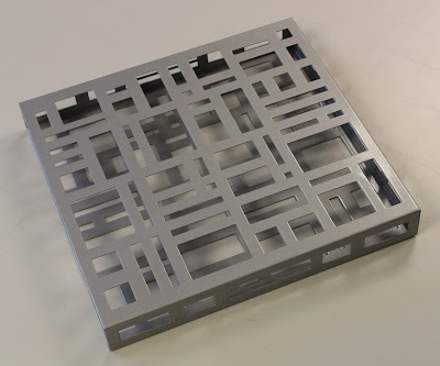
Artist Liam Gillick worked with Farrell and designed the 'brise-soleil', literally a sun-break, which adorns the main entrance. The design is reflected in the steel slipcase produced for the book, produced by AR Engineering - it's very heavy! 
Art direction and design is by Stimulate. Creative director was Stuart Cronin. Stuart has since moved on to his new company Vanilla Pod. There is a long list of photography credits, too long to list here, but the majority is by photographer Marcus Robinson. Scanning is by Bayeux and retouching by Tough Little Graphic.
 
Print was handled by Steve Lincoln at Principal Colour based in Paddock Wood in Kent. Steve has since retired, but Principal Colour are still going strong. The reproduction, print, binding et al is superb and looks just as good today as when it was produced eight years ago.

Posted by Justin Hobson 04.12.2013