Wednesday, 11 March 2015

Take a ticket to a Wedding...

Here are some stunning invitations produced for a wedding, which took place just last month.
Designed in the style of a boarding card, they are printed letterpress on our Plexus 350gsm board, which is a natural, brown coloured board. They are very simply printed letterpress in one colour (black) and are die cut and perforated.
 
Click on the images to enlarge:
Design, print and production is by the lovely Evgenia Kochkina at Stoneberry Press in Edinburgh. The studio does really innovative Letterpress work on interesting materials.

Have a look here and see what else they do....
http://stoneberrypress.co.uk/
Posted by Justin Hobson 11.03.2015

Monday, 9 March 2015

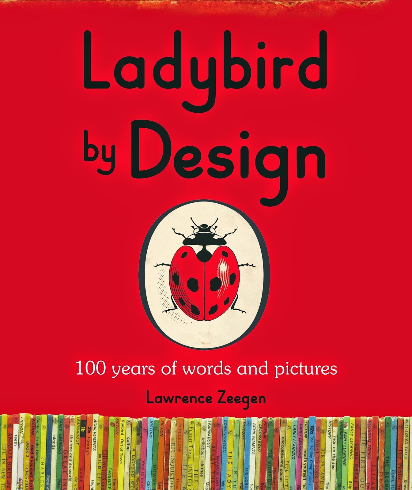
Ladybird By Design - a talk at St Brides

Now who hasn't got a soft spot for Ladybird books? - well certainly those of us who are a certain age! A new book titled Ladybird By Design has just been published last week by Penguin and the author, Lawrence Zeegen, is giving a talk at St Brides in London on Tuesday 24th March.
Lawrence Zeegen is the Dean of the School of Design at London College of Communication and Professor of Illustration at the University of the Arts, London.
For one hundred years, Ladybird books have delighted children, their parents, grandparents and teachers alike, taking readers on a journey of discovery and enlightenment. Affordable and accessible, Ladybird books hold a significant and affectionate place in the collective psyche of the nation, conjuring up, through written word and illustration, life in Britain in more innocent times. The success of Ladybird was as much due to clever format and compelling design, as it was the quality of the writing, presenting a portrait of the time through the use of specifically commissioned illustration. Unparalleled in their perfectly observed attention to detail and unique sense of place, Ladybird’s full-colour, full-page illustrations were often created by well-known illustrators such as Charles Tunnicliffe, Harry Wingfield, Martin Aitchison, Eric Winter, Robert Lumley, John Berry and Robert Ayton.
Lawrence Zeegen has co-curated an exhibition at the De La Warr Pavilion in Bexhill which opened in January and portrays a unique slice of Britain’s social and design history, as seen through the eyes of Ladybird. http://www.dlwp.com/event/ladybird-by-design

Tickets are just £15.00 (concessions available). Great value and you can book here:
http://www.eventbrite.co.uk/e/ladybird-by-design-tickets-15299349767?aff=erelexporg

Don't be a stranger to these events, grab a ticket, go along and stimulate the grey matter ...!
http://www.sbf.org.uk/events/ladybird-by-design

Photographs: © Ladybird Books Ltd
Posted by Justin Hobson 09.03.2015

Friday, 6 March 2015

Hello Handsome!

Here's a cracking new range of Father's Day cards from independent greeting card publisher Blue Eyed Sun. The 'Hello Handsome' range cards are all 160mm square and are sold through the trade to card shops and retailers ...so they are in the shops now!

The cards are printed CMYK, offset litho on our Rib-Tone, 2 sided which is a natural unbleached brown 'kraft' shade with a feint rib and a 100% recycled inner board.
One of the interesting things about Rib-Tone is that although it is a brown shade, it provides a very neutral background for what is printed on it and therefore is one of the few substrates that seems obvious yet, almost becomes invisible and doesn't interfere with the design.
The cards are designed and published by Blue Eyed Sun. Design is by Jo Corner. The cards are printed by Graphite Creative who are based in St Albans.

Blue Eyed Sun is an award winning greeting card company based in Brighton established fifteen years ago. They specialise in handmade and high end design-led cards, which are now sold around the world by some of the best know retailers including Harrods, John Lewis etc.

Joint founder and managing director Jeremy Corner is a leading figure in the greeting card world. He is instrumental within the 'Ladder Club' which helps aspiring greeting card publishers and is on the council of the Greeting Card Association (GCA). He is a real advocate for the industry ...and he still finds time to be a regular blogger! http://www.blueeyedsun.co.uk/blog

www.blueeyedsun.co.uk
Posted by Justin Hobson 06.03.2015

Tuesday, 3 March 2015

Jobs from the past - Number 65

Regular followers of this blog will know that my first post of every month is a "job from the past" so that I can show some of the really good work from years gone by...

My|Your|Our Spitalfields - 2004
Bostock and Pollitt designed the identity and marketing material for the Spitalfields retail development in London. The resulting identity keeps the name of the area, in combination with the strapline My|Your|Our Spitalfields. The project incorporated hoardings and literature, including this brochure.

The design of the brochure and identity is heavily influenced by the Huguenot silk weaving community, who were immigrants to the area after their exodus from France and their cultural influences had a profound impact on the area which is still evident in the locality today.
Click on images to enlarge
As you will be able to see from the image, the design is based on a sewn/cloth/cross-stitch feel. The binding is 'side-sewn' with a red thread, which compliments the design beautifully. Size of the brochure is 245x175mm, portrait with a 36pp text. 
The remarkable feature of this brochure is the cover. Ideally a cloth feel was required on the cover and the designer didn't want to use a linen embossed paper which would have a 'faux' feel. So they looked at bookcloths, however that would have meant only a limited number of processes could be used (silkscreen/foil etc). Readers may not be aware but we, at Fenner Paper, do a very unusual product called Flaxprint Litho Printable Bookcloth. It is a genuine bookcloth which is litho printable. This cover is printed offset litho in CMYK with the 'sand' colour being printed as a special. However, a bookcloth is only one sided, usually with a paper reverse, so it can be mounted onto board to form a casebound cover or slipcase. Because this is a limp bound publication with a soft cover, the solution was to duplex the Flaxprint , back to back, so the 'cloth' appears on both the outside and inside covers. The result looks and feels absolutely amazing.
Flaxprint 74lb cover, really is an amazing product. As far as I am aware this is the only genuine bookcloth (as opposed to paper) which is litho printable and offers amazing versatility. Having the ability to print an image and solid colours on a casebound book on a genuine cloth, rather than a paper alternative, offers a huge range of possibilities. In comparison with paper, a cloth is virtually indestructable! ...which is why it has been used in bookbiding for hundreds of years, The below image shows the close detail of the weave and print detail.
Design is by Bostock and Pollitt, senior designer on the project was Pat Glover. Photography is by John Spinks. The exceptional print and finishing is by Gavin Martin.

I know the images do not do this project justice but hopefully I have given some insight to the project and cover in words. If you are not familiar with Flaxprint and would like a sample, please get in touch.

http://www.bostockandpollitt.com/
http://www.eastphotographic.com/#/artists/johnspinks/
http://www.gavinmartincolournet.co.uk/
Posted by Justin Hobson 03.03.2015

Saturday, 28 February 2015

Rob Ryan 2015

Rob Ryan's work is no stranger to this blog and many readers will be familiar with his work. His studio is based in East London, but his work is in demand all over the globe. He has even taken part in an exhibition with other papercut artists shown in Grand Central station in New York.
 
Rob's 2015 calendar incorporates one of his characteristic papercut designs which has been beautifully lasercut on our Colorset 100% Recycled board.
 
This desk calendar is a very clever construction which arrives flat and pops up showing the lasercut image.
It arrives folded but the flat size is 475x127mm. When this is folded and constructed using the double sided glue strip, it stands 210mm tall.
Above, shows the calendar lying out flat, the image below shows it folded to go out in the post. The calendar is printed in one colour, offset litho onto our Colorset Lime 270gsm.
Below shows the detail of the papercut.
The Lasercutting is by Trilogy Lasercraft in Huntingdon - fantastic job. Print is by Victoire based in Cambridge.
Posted by Justin Hobson 27.02.2014

Wednesday, 25 February 2015

Olivia von Halle - The Tokyo Collection

Olivia von Halle is a British luxury nightwear brand that launched at London Fashion Week in September 2011. The brand can be found in nearly 100 stores in 20 countries including Harrods, Selfridges, Neiman Marcus, Saks Fifth Avenue and online with Net-a-Porter.com.

Focusing on beautifully cut silk pyjamas in stunning exclusive prints, Olivia von Halle has quickly made a name for itself in the world of high-end nightwear. In 2013 the company was awarded the ‘Blue Butterfly Trust Mark’, which is given to brands and companies that have a positive impact on people and the planet.
The publication is sub A4 - 290x205mm, portrait. It has a 4pp cover on Omnia 200gsm and a 16pp text on Omnia 150gsm and is 3 hole sewn.
Unlike many of the fashion lookbooks featured on this blog, which are printed offset litho, this has been digitally printed on an HP Indigo press. The colours are strong and punchy and the whole publication has a matt, tactile look and feel - in fact I can honestly say, every bit as good as litho!
Although Omnia was never originally developed for digital, we now keep it as a stock item with "sapphire treatment". This treatment is often applied to more unusual papers and provides a "key" so that the inks (which are different to litho inks) work on the paper surface. The great thing is the job just doesn't look and feel like a digital job.

These pictures show the binding which is particularly worthy of note. This type of binding is generally known as 'three hole sewn' - because there are three holes! I wrote about the process on this post here: http://justinsamazingworldatfennerpaper.blogspot.co.uk/2014/07/what-is-3-hole-sewn.html

Where the binding on this particular project differs from the three hole sewing that I described in my post is both in the distance between the holes and the fact that this is knotted on the outside - on the spine.

The thread runs 130mm from hole to hole (260mm in total). It's the first time I've seen this and it works superbly.
Art direction is by Tiffany Goody at Erotyka and photography is by Takuya Uchiyama. Graphic design is by Michael Knight, who runs his studio in East London called A New Mark. Print and finishing is by Gavin Martin Colournet.

http://oliviavonhalle.com/
http://www.anewmark.com/
http://erotykatokyoparis.com/
http://www.gavinmartincolournet.co.uk/
Posted by Justin Hobson 25.02.2015

Monday, 23 February 2015

Aylesford Newsprint in administration

Today, the sad news has been announced that Aylesford Newsprint has gone into administration (going into administration effectively means your company is being taken under the management of a court appointed administrator – who must be a licensed insolvency practitioner - appointed by the courts).
Aylesford Newsprint Ltd is a paper mill based near Maidstone in Kent, producing on average 400,000 tonnes of recycled newsprint every year from recycled waste fibre, much of it sourced from London. Paper has been manufactured on the Aylesford site since 1922.

In 1993 they harnessed new recycling technology and became a leader in the production of 100% recycled newsprint under the brand name Renaissance newsprint.
In October 2012 the mill joint owners (SCA and Mondi) sold the mill to Martland Holdings, a US investment group. At the time of the sale SCA reported that the mill had been loss making for several years. However, ahead of the sale, Aylesford Newsprint was recapitalised to leave a business with no debt. Sadly this does not appear to have set them on the road to recovery.

Aylesford Newsprint processes over 500,000 tonnes of recycled waste fibre, produces 400,000 tonnes of newsprint paper operating 365 days a year. The mill is situated on a 100 acre site which, as you'll be able to appreciate from the picture below, is huge.
This is very sad news for the area and the 300 employees that work there. This is 'heavy' industry - the type of industry that once it is lost, is unlikely to come back. I hope that the administrators will be able to restructure the business and find a buyer.

...however it is not all bad news for the UK paper industry. In September 2009, I wrote about a new paper mill opening in Kings Lynn in Norfolk.
http://justinsamazingworldatfennerpaper.blogspot.co.uk/2009/09/paper-mill-actually-opens-in-uk.html

Well, last month they produced the two millionth tonne of newsprint - a remarkable achievement as it was achieved in 12% less time than the initial million tonnes produced on this machine. You can read about it on the following link: http://www.palmpaper.co.uk/en/News/

http://aylesford-newsprint.co.uk/
http://www.kentonline.co.uk/malling/news/aylesford-newsprint-goes-into-administration-32271/

Posted by Justin Hobson 23.02.2015