Monday, 11 January 2021

Private Somm

Private Somm was set up by Nicolas and Sophie to connect wine drinkers to sommeliers. They offer the knowledge, experience and expertise of their friends and colleagues in the industry to recommend some wonderful, hand-made, well-crafted wines, all despatched by a seamless delivery service.
Click on images to enlarge
These A6, Landscape promotional cards are printed on Crush Grape 350gsm, which is manufactured using 15% residues from the processing of grapes, combined with 40% post consumer waste and FSC virgin fibres. You can read more about Crush HERE.
The cards have been digitally printed by Healeys printers. For those that are unfamiliar with Crush, you can see the the detail image below, where you can see the specs and imperfections which are the characteristic of using this natural supplement...
Click on images to enlarge
Healeys are based in Ipswich and are one of a handful of printers who are registered as a 'Carbon Balanced Printer' by the World Land Trust and can offer a totally carbon balanced printing service including the paper and all aspects of production and delivery. 

Thursday, 7 January 2021

Zeta - the paper story

Some exciting news for 2021...

The ZETA range of business papers has been around for decades and should need no introduction. For many years it has been the gold standard for stationery papers in Europe, with it's excellent availability in all European countries and Fenner Paper took became the UK stockist in 2015 after the demise of Paperlinx. For 2021, the range has now been refreshed with the addition of a new Laid finish and new shades, which is now presented in a new swatch designed by Wolfgang Forsch, who has handled the re-brand.

The new swatch is DIN A4 size, portrait format and is a 6pp gatefold. The cover is printed on Zeta Linen, Brilliant 350gsm and is printed in black plus a fluorescent orange.
The swatch shows the new stock range together with all the weights, surfaces and colours...
These fine papers are manufactured at the Reflex Paper mill in the town of Düren in Germany, which was founded in 1857 and the mill also produces transparent papers, label papers and artists papers. All ZETA products are made from Chlorine Free pulp (ECF) and carry the Forest Stewardship Council (FSC) certification.

If you would like one of the new swatches, please email me: justin@fennerpaper.co.uk

Posted by Justin Hobson on 07.01.2021

Monday, 4 January 2021

Jobs from the past - Number 134

Regular followers of this blog will know that my first post of every month is a "job from the past" so that I can show some of the really good work from years gone by and this publication is from only a few years ago in 2017.

The Print Shop - 40 Years of Calverts
Calverts is a workers' cooperative with a history of creating and producing eye-catching print and design. To celebrate Calverts 40th year, they invited Alice Pattullo and publishers Design For Today to work with them on a creative print animation, following the journey of an idea as it transforms into a finished product. It's a whirlwind tour through illustration, art direction, design, file set up and reprographics, with a sprinkling of handy tips along the way.
The size of the publication is 148x95mm, portrait with a 6mm spine.
The below image shows the inside spread with hot foil blocking on the right hand page...
This publication is a long concertina - it is quite simply one long sheet which concertina folds into a pre-creased spine, which forms a cover.
The below image shows a 'birdseye' view which demonstrates how it folds into the spine. Over the last 30 years, I have always referred to this format as a long concertina, however in recent years people have started using the term Leporello to describe this type of folding - personally I think this is just confusing! 
The 26pp book is actually made from two sheets of paper, carefully joined, with a glued tab, which you can just make out in the image below.
The below image shows both sides stretched out fully.
Click on images to enlarge
The publication is printed Offset Litho on our Shiro Echo, White 250gsm, which is 100% Recycled and FSC accredited. The weight of the material is crucial for this format - too heavy and it will be too springy, too light and it won't take the creases and hold together well enough, 250gsm is just perfect. Here are some of the spreads...
Click on images to enlarge
Below is the spread about Riso printing, where there is a 'tipped in' sheet, which is Riso printed on the right hand page.265x168
The page is 265x168mm and is folded once to reveal the below...
...and then folding up.
...there's even information about paper sizes.
It's a really beautifully conceived and executed publication with superb illustrations by Alice Pattullo and excellent writing.

And the great news is that if you would like to have your own copy, you can buy still buy them online HERE.

Posted by Justin Hobson 04.01.2021

Tuesday, 29 December 2020

Royal Opera House Christmas Card

This is the very special 2021 Christmas card produced for the Royal Opera House. The 4pp card is A5 size (210x148mm) portrait. The brief was to create a Christmas card that showed a variety of work done by the ROH since the lockdown in March...
Graphic Designer at the ROH, Ana Peres, collated three pictures showing The Royal Opera, The Royal Ballet, and the Orchestra of the Royal Opera House. The captions for the original pictures are: 
1. Artists of The Royal Ballet in Untouchable in The Royal Ballet: Back on Stage. 
2. Jonathan McGovern in Apollo and Daphne in 4/4, The Royal Opera.
3. Artists of The Royal Ballet in Within the Golden Hour in The Royal Ballet: Back on Stage.
All images © 2020 ROH. All photographs by Tristram Kenton.
Above is a detail image showing the composite mono image. The card is printed in 1 colour (black) on a toner based digital press. The festive look of the final picture is completed with the sparkles of the paper as it is printed on our Stardream, Crystal 285gsm...
Below is an image showing the plain unprinted Stardream,Crystal:
Printing was handled by Indicia, a 'print-farmer' who handles the printing for the ROH.

It is a really well designed, simple and cost effective solution with great impact and perfectly suits this very unusual and strange year. My thanks to Ana for the images and information about the project.

Posted by Justin Hobson 29.12.2020

Thursday, 24 December 2020

When does a rainbow become an Amazebow?

Earlier in the year Superunion designers from around the world came together to create a colouring book for girls from disadvantaged backgrounds.
During the dark days of the first lockdown we were asked by Superunion to collaborate on a colouring book project  Superunion had partnered with I Can Be, a children's charity that breaks down barriers to future opportunities for disadvantaged girls, to create Amazebows, a colouring book designed to remind young girls of their potential and to help them realise the power of their imagination. With 24 unique illustrations created by Superunion creatives from around the world, from Brazil to Singapore, Amazebows shows the girls that something even as predefined as a rainbow can be reimagined.
Initially the project was the idea of  Leanne Kitchen, Stuart Radford, Scott Lambert, Louise Hunter and Inga Howell, the key to the idea was the collaboration with the global network of Superunion creatives. The brief to each creative was left entirely open, to reimagine the rainbow, asking only to include the seven familiar coloured stripes of the rainbow, which start and finish on two sides of the page.
Amazebows was produced pro-bono, sponsored and printed by Identity Print and Fenner Paper, to help girls with no access to online schooling or tools during lockdown. The 200 colouring books were singer sewn with thread to match one of the seven colours of the rainbow as you can see in the below image...
The superb singer sewing was produced by Wayte Fine Binding, who are Identity's own bindery.

Along with each book, the Superunion team gave every girl, rainbow coloured pencils in an origami paper sleeve...
Leanne Kitchen said: "Working with I Can Be during lockdown was really important to us, helping them to reach out to the girls they work with and spread their message to children in those really difficult times. With this in mind, we wanted to build on the familiar symbol of hope, simply allowing their imaginations to explore the idea that if a rainbow can be anything, so can they. We'd created such an open brief, with only a couple of compositional guidelines, so that creatives across our network could really inspire the girls to continue to imagine their own possibilities. This charming objective led to some beautifully unexpected illustrations for the colouring book and brought many of our creatives together at a time of isolation. We're also very grateful to have partnered with Identity Print and Fenner Paper to produce Amazebows, who have been integral in enabling the team to gift a physical colouring book to each of the girls."
It was a superb project to be involved with and is the result of amazing collaboration.

Monday, 21 December 2020

Pergraphica Calendar for 2021

We have a new 2021 'tent' calendar produced for the PERGRAPHICA® range of design papers. Pergaphica is a range of premium design produced in Austria by Mondi and features smooth and rough finishes in High White, Classic and Natural shades.
The size of the calendar is 310x150mm (flat size) and folds into a tent 112x150mm, held in place with a locking tab. 
Click on images to enlarge
The calendar is printed offset litho on Pergraphica, Natural Rough 240gsm. The below image shows the locking tab...
Fenner paper is pleased to be the UK stockist for Pergraphica. One fact that might be of interest is that we keep 120-300gsm in Short Grain B1 sheets - which can be very useful if you are looking for a specific grain direction.

If you would like one of these calendars to adorn your studio desk or more likely your home office! drop me an email and I'll pop one in the post: justin@fennerpaper.co.uk

Posted by Justin Hobson  21.12.2020

Tuesday, 15 December 2020

Community Clothing 04

Founded by British Fashion Designer Patrick Grant, Community Clothing is a social enterprise with a simple mission - to make excellent quality affordable clothes for men and women, to create great jobs for skilled workers and by doing this help to restore real pride in Britain’s textile communities. They do this by working with under utilised UK factories during their quiet periods, which is a great concept.

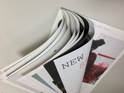
This is Community Clothing's look-book and catalogue CC4 and it is an absolutely superb publication, wonderful art direction, photography and printing. I wrote about the previous publication CC3, last year.
The size is 315x210mm, portrait and is a 32pp self cover which flops and rolls really nicely in the hand....
Click on images to enlarge
The publication is printed on our Shiro Echo, White 80gsm which is 100% Recycled and also carries the FSC Recycled classification. 

Shiro Echo is available in two shades; there is a white shade (which is a natural/off white) which is a bit like a newsprint/newspaper shade and a Bright White shade.
The publication is printed offset litho in CMYK throughout. The colour is bright and vibrant and the image reproduction is excellent as I hope you can see - bear in mind it's printed on an 80gsm 100% Recycled!
Below is a detail image which shows the excellent image quality - note the excellent fleshtone reproduction.
Click on images to enlarge
The below spread explains the mission and the locations in the UK where the 28 factories are located.
Design is by Moving Brands. Printing is by Principal Colour. A really superb piece of design and print.

Posted by Justin Hobson 15.12.2020