Showing posts with label 100% Recycled. Show all posts

Friday 7 July 2023

Blue Angel Certification

 Last week our new 'Blue Angel' certification arrived...

Fenner Paper has been certified for many years and I am often telling people about the Blue Angel mark as here in the UK, it is hardly known about or recognised, whereas in Germany (where it was established) and in mainland European countries, it is both highly visible on products and very highly regarded.

The Blue Angel (Der Blaue Engel) is a German certification for products and services that have environmentally friendly aspects. The Blue Angel mark is the oldest ecolabel in the world, and it covers some 10,000 products in some 80 product categories!

It was originally conceived and put in place by the government of the former West Germany and has been awarded since 1978. The Environmental Label Jury (Jury Umweltzeichen) is an independent, decision-making body for the Blue Angel and includes representatives from environmental and consumer associations, trade unions, industry, the trade, crafts, local authorities, academia, the media, churches, young people and the German federal states. As a result, it isn't open to political interference, industry pressure groups or vested interests, either from industry or the fanatical green groups. This is the reason that I rate the scheme so highly and it frustrates me that the UK government has never had the guts to put such an independent system in place in the UK - equally it's a shame that there isn't a pan European system.
The award of the Blue Angel is preceded by a review of the entire life cycle of the products. Such review considers as many aspects of environmental and health protection as possible for the respective product. Subsequently, the criteria limit or rule out those environmental impacts which are considered to be the most important impacts for the respective product. The Basic Award Criteria for a product are specified for each product group and they are all published.

The Blue Angel covers a wide range of different products including paints, gardening products, construction, electronics and many more, including paper and board.

We carry products which have been awarded the Blue Angel mark. The Creative Print range of 100% recycled text & cover paper manufactured by Koehler Greiz mill carries the Blue Angel mark, as do the majority of the recycled colours in our Colorset range.You can read more about the scheme here:
https://www.blauer-engel.de/en
Posted by Justin Hobson 07.07.2023

Wednesday 17 May 2023

Regent Porto Montenegro

Penthouse Floorplans

Porto Montenegro is being developed as the Mediterranean’s most comprehensive yacht marina. Along with the berths, there are five private residential buildings with a total of 228 apartments.

These are the floorplans for the Penthouses which form part of the collateral produced for the marina. The flat size is 525x750mm folding down to 175x250mm.
Click on images to enlarge
The plans are concertina folded as you can see from the birds eye view below:
Folding out to the full flat size of 525x750mm (18pp)
Click on images to enlarge
The floorplans are printed on our Shiro Echo, White 80gsm which 100% recycled and FSC accredited. It is perfect as a material to print these plans on - almost conjuring up a "blue-print" type feel and rattle, They are printed offset litho and are hot foil blocked in metallic gold foil. Below is a detail of the foiling:
Another thing to note is the absence of a "crows foot" on the folds - this is because it was concertina folded. As you can see from the image below - nice clean, crisp folds and no ugly creasing.
You can read more about "Crow's feet" here:
http://justinsamazingworldatfennerpaper.blogspot.co.uk/2014/04/what-is-number-4.html

The floorplans are just one of the items in the pack of promotional literature which makes up a whole collection of collateral (below) for the exclusive Regent Porto Montenegro apartments.
Art direction and design is by London branding agency &Smith. Creative Directors are Rachel Smith and Dan Bernstein. Print and production is by Gavin Martin.

https://www.portomontenegro.com/
https://andsmithdesign.com/
https://www.gavinmartin.co.uk/
Posted by Justin Hobson 17.11.2023

Wednesday 28 July 2021

LCBA Identity

The new type-led identity for the London Centre for Book Arts (LCBA) is by Studio Bergini which is run by Francesco Corsini and Kristian Hjorth Berge. The striking new identity makes excellent use of our Colorset range of 100% Recycled papers...
The gift cards (below) are hot foil blocked in-house at the LCBA using Colorset 270gsm in Pink Ice, Evergreen and Mango (in the middle!) and are triplexed.
There are also bookmarks and a whole host of other collateral...
Typefaces are Original Sans and Caslon Ionic, both from Commercial Classics. All production is 'in-house' at the LCBA.

Many thanks to Studio Bergini for the images. In a recent email with Fran, he reminded me that he was at a talk I gave at CSM back in 2014. He found my talk about different materials and printing processes  inspiring, which is always lovely to know - thank you Fran.

Posted by Justin Hobson 28.07.2021

Tuesday 15 December 2020

Community Clothing 04

Founded by British Fashion Designer Patrick Grant, Community Clothing is a social enterprise with a simple mission - to make excellent quality affordable clothes for men and women, to create great jobs for skilled workers and by doing this help to restore real pride in Britain’s textile communities. They do this by working with under utilised UK factories during their quiet periods, which is a great concept.

This is Community Clothing's look-book and catalogue CC4 and it is an absolutely superb publication, wonderful art direction, photography and printing. I wrote about the previous publication CC3, last year.
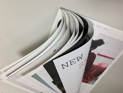
The size is 315x210mm, portrait and is a 32pp self cover which flops and rolls really nicely in the hand....
Click on images to enlarge
The publication is printed on our Shiro Echo, White 80gsm which is 100% Recycled and also carries the FSC Recycled classification. 

Shiro Echo is available in two shades; there is a white shade (which is a natural/off white) which is a bit like a newsprint/newspaper shade and a Bright White shade.
The publication is printed offset litho in CMYK throughout. The colour is bright and vibrant and the image reproduction is excellent as I hope you can see - bear in mind it's printed on an 80gsm 100% Recycled!
Below is a detail image which shows the excellent image quality - note the excellent fleshtone reproduction.
Click on images to enlarge
The below spread explains the mission and the locations in the UK where the 28 factories are located.
Design is by Moving Brands. Printing is by Principal Colour. A really superb piece of design and print.

Posted by Justin Hobson 15.12.2020

Tuesday 4 August 2020

Jobs from the past - Number 129

Regular followers of this blog will know that my first post of every month is a "job from the past" so that I can show some of the really good work from years gone by and this publication is from 2016.
 
Money Talks - The Great Swindle by Santiago Montoya

In February 2016, contemporary Colombian artist, Santiago Montoya, presented Money Talks at the Halcyon Gallery, London, which incorporated his mid career museum retrospective The Great Swindle. Montoya reinterprets paper currency as both a canvas as well as a raw material, exploring the added value beyond its very surface. Montoya’s use of money as an artistic medium, also opens a dialogue on the void between state propaganda and reality itself.
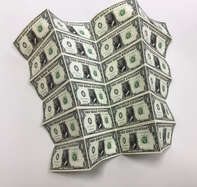
This is the literature which presents the work of Santiago Montoya by the Halcyon Gallery in collaboration with AMA (Art Museum of the Americas) in Washington ...and yes, it looks like a bundle of cash!
This wonderfully deceptive design is actually 48pp folded broadsheet. It is concertina folded vertically and horizontally. The flat size is 398x625mm folding down to 157x65mm and gives the 'wad' of notes a thickness off 4mm. The below image reveals the reverse side.
Click on images to enlarge
In this below image you can see the whole dollar side of the sheet unfolding...
Click on images to enlarge
Above is the dollar side and below is the story about The Great Swindle with a foreword by the Curator José Luis Falconi:
Click on images to enlarge
For would be forgers out there, you will be interested in knowing that this piece of literature is printed on Redeem 100% Recycled 80gsm and is printed offset litho, CMYK on both sides and as you can see from the detail image below the print result is excellent. Redeem is an uncoated paper with a wonderfully neutral tone that somehow gives a lot to the right publication.
The paper band or what is called a "currency strap" in the US, around a 'wad' of notes which is around 4mm thick, finishes the deception perfectly.
Design is by the team at the Halcyon Gallery and the printing and finishing is by Push Print based in London with Anthony Dearlove handling the project.

https://www.halcyongallery.com/
http://www.push-print.com/
Posted by Justin Hobson 04.08.2020

Tuesday 20 August 2019

From _______ To ________

People's History Museum (PHM) in Manchester is the national museum of democracy, telling the story of its development in Britain: past, present, and future. The museum holds the largest collection of political material in Britain.

From 1819 to 2019, from Peterloo to… where?  Marking the 200 year anniversary of the Peterloo Massacre, this exhibition features a wide selection of artworks inspired by that event. While Peterloo undoubtedly remains a horrific chapter in British history, the displayed work is also an exploration of correspondence; looking further than one single time and place.
These crowdsourced works (both from invitees and via an open call) all utilise the humble envelope to creatively explore the idea of ‘From _______ To ________’ highlighting a range of examples where force has been used to control citizens and suppress dissent.

The exhibition includes a fantastic selection of submissions from established designers and artists, alongside emerging student work. Displays include artwork by Craig Oldham, James Cauty, Extinction Rebellion, film director Mike Leigh, and many more.

...and just to reiterate - all the works are either printed on an envelope or are inserts or a montage on an envelope - an inspired idea!

You can see all the exhibited pieces on Instagram on the following link: https://www.instagram.com/frompeterloo/
 
Below is a small selection...
Submission from Thea Koutas / @theakoutas

letterpress submission from Alan Kitching / @thetypographyworkshop

Submission from Craig Oldham / @officeofcraig 
 
Submission from Tony Pritchard / @tonypritchard_

 Darren Leader & Jason Hyde / @studiogram@jasonleehyde 


Rob Scargill and Alex Finney / @robertscargill and @xelafinney

...and our involvement was in supplying the humble envelopes! A box of our lovely Colorset, Light Grey 120gsm (100% Recycled) 155mm square envelopes...as you can see in the picture below. The exhibition is coordinated by Dr Daniel Cookney who is a lecturer at the University of Salford.
The full list of contributors is as follows: Adelina Court, Alan Kitching, Amrit Randhawa, Anthony Sims, Bill Hards, Callum Dawes, Cleon Peterson, Craig Oldham, Daniel Cookney, Darren Leader and Jason Hyde, David Mauger, Dr.ME, Elaine Loader, Emily Schofield, Erik Brandt, Extinction Rebellion, Goodness, Guy Field, Harry O’Brien, himHallows, Ian Morris, Jimmy Cauty, Jody Barton, Joel Sleet, John Rooney, Jonny Pell, Laura D’Eath, Laura Jones, M-Four, Malcolm Garrett, Mark James Works, Mark Kaufman, Mark Murphy, Mark Stewart, Matthew Challenger, Michelle Murray, Mick Marston/du.st, Mike Leigh, Miroslaw Ogorzalek, Nick Bax, North or Nowt, Optigram/Manuel Sepulveda, Rick Myers, Rob Ryan, Rob Scargill and Alex Finney, Simon Harrison, Simon Palmer/ Show\Trial, Supermundane, Tara Collette, Tea Uglow, Thea Koutas, The Print Project, Tim Isherwood, Tony Pritchard, Vicky Carr, Will Bindley.

The exhibition identity is by Jenny Hall, Nicole Candiotto and Harry Steele. The exhibition is coordinated by Dr Daniel Cookney who is a lecturer at the University of Salford.

You should go and visit NOW as the exhibition at the PHM (which is FREE) only runs to 8th September.

https://phm.org.uk/visit/
Posted by Justin Hobson 20.08.2019

Tuesday 18 June 2019

World Cup Wallchart

Our Typographic Wallchart that we have produced for the Women's World Cup has been going down a storm with all you football fans out there

This A1 size typographic wallchart is very simply produced in just two colour offset litho and is printed on our new Creative Print, Diamond 90gsm from German paper manufacturer Euler and is made using 100% recycled fibres.

The wallchart has appeared on the Koehler website here

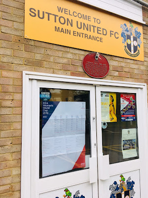
...and our wallchart has also had professional recognition! Below you can see the wallchart at Sutton United FC, where it is proudly displayed on the door and the bar
Design of the wallchart is by David Coates, who is also an ISTD (International Society of Typographic Designers) board member and my thanks to Dave for making it all happen - a perfect way to combine his love of type and football! Printing is by Typecast Colour in Paddock Wood.
 
We are now coming to the end of the group stages and the competition is really hotting up now. We have a few of the wallcharts left, so if you would like one, you can email me Justin@fennerpaper.co.uk
 
Posted by Justin Hobson 18.06.2019

Wednesday 5 June 2019

Creative Print Launch

Today is World Environment Day. This event is the United Nations day for encouraging worldwide awareness and action to protect our environment. Since it began in 1974, the event has grown to become a global platform for public outreach that is widely celebrated in over 100 countries. Above all, World Environment Day is the "people's day" for doing something to take care of the Earth. That "something" can be local, national or global. It can be a solo action or involve a crowd.
What better day for us to launch the latest addition to our range of recycled and environmentally friendly papers...
 
Creative Print is our new range of 100% recycled, uncoated text and cover materials. 
The paper has an uncoated, natural surface and is produced on the "Rolls Royce" of papermaking machines - a twin wire machine which ensures even-sidedness which improves printability over other inferior products. The range is available in two shades, Diamond and Champagne and the weight range is 90, 120, 170, 210, 270 and 350gsm.
 
Creative Print is manufactured by Euler in Germany, which is part of the Koehler Paper Group. The range carries the "Blue Angel" certification. Introduced in 1978, the Blue Angel scheme is the oldest ecolabel in the world, and it covers some 10,000 products in some 80 product categories. After the introduction of Germany's Blue Angel in 1978 as the first worldwide environmental label, other European and non-European countries followed this example and introduced their own national and supra-regional environmental labels. The common goal of these labels is to inform consumers about environmentally friendly products thereby giving global support to product-related environmental protection - perfect for highlighting on World Environment Day!
 If you would like a swatch of this new range, just drop me an email Justin@fennerpaper.co.uk
 
Posted by Justin Hobson 05.06.2019