Monday 26 July 2021

Resonance 1

The Wapping Project is the creation of the Women's Playhouse Trust which was set up in 1981.

Throughout the 80s and the early 90s WPT’s artistic policy was defined by the playwrights it commissioned, produced and published, predominantly at the Royal Court Theatre, London. In 1993 it began to mount work in one of London’s most beautiful, derelict buildings in the East End, the Wapping Hydraulic Power Station; it is at this point that it became known as The Wapping Project, and established a worldwide reputation. It was always described by its founder and director, Jules Wright, as an idea consistently in transition. I have written about projects from this period on this blog before.

This publication titled 'Resonance 1' features an essay by Gareth Evans together with images by Berlin based photographer Karen Stuke.
Size is 210x148mm (A5) portrait and is saddle stitched. The 4pp cover is printed on Astralux 1 sided 'cast coated' board, which is high gloss one side and uncoated reverse. The cover is debossed and hot foil blocked. The deboss on the front cover just draws you in... 
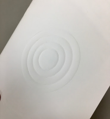
The below image is taken against the light, so you can see the high gloss...
The 48pp text is printed on our Offenbach Bible 60gsm, which works beautifully. The publication is mainly text but these images by Karen Stuke are large format pinhole images that follow the journey of a Jewish child brought on a Kindertransport from Prague.
For interest the above right hand page is backed up by the image below, which demonstrates the excellent opacity. 
Printed offset litho in CMYK, the 48pp text flops and flows beautifully in the hand... 
Mono image used for the centre spread
You can see the black wire used for the staples in this image and you can see them on the outside in the below image. It's a superb detail, a small touch, which works with the hot foil blocking in gloss black foil and makes all the difference.
Using the Offenbach Bible 60gsm means that the total thickness of the 48pp is only 2mm!
Design is by Atelier Dyakova and the creative director is Sonya Dyakova. Printing is by Push and the printing on our Offenbach Bible 60gsm and the finishing is superb. 

Posted by Justin Hobson 26.07.2021

Friday 23 July 2021

One of a Kind

TEENAGE CANCER TRUST IS PROUD TO PRESENT “ONE OF A KIND”, AN EXCLUSIVE EXHIBITION CELEBRATING MUSIC THROUGH ART, CURATED BY TOM HINGSTON.

2020 would have been the 20th Anniversary of Teenage Cancer Trust’s Royal Albert Hall shows – a week long initiative bringing musicians and fans together once a year, to host show stopping performances and raise money for the support and care of young people going through treatment. To mark this milestone, now a year on, ONE OF A KIND brings together 21 artworks from 21 designers, artists and musicians - screen printed, signed and open for auction. This unique collection of works will be exhibited at the Maddox Gallery, Westbourne Grove, W2 from Friday 23rd to Saturday 31st July, with bidding opening yesterday on Thursday 22nd July 2021.
All 21 artworks are silkscreen printed by Bermondsey based Screen-printer K2. All are printed on paper donated by Fenner Paper or our Hull based friends at GF Smith. The below artworks are those printed on paper supplied by Fenner Paper...


All the featured artists are as follows....

  • ANTHONY BURRILL
  • CHRISSIE ABBOTT & KAE TEMPEST
  • DAVID SHRIGLEY
  • DINES® (STUDIO BLUP)
  • ILL-STUDIO & SOULWAX
  • JAMES JOYCE
  • JAMES LAVELLE
  • JASON EVANS & THOM YORKE
  • JEHNNY BETH & JOHNNY HOSTILE
  • JULIAN BROAD & PAUL WELLER
  • KAI & SUNNY
  • KAM TANG & YOUNG FATHERS
  • KEVIN CUMMINS & SCOTT KING
  • LIAM HODGES
  • MARK MATTOCK & STORMZY
  • MATTY BOVAN
  • NICK CAVE
  • RYCA & FATBOY SLIM
  • SIMON TAYLOR & UNDERWORLD
  • SMITH & LYALL & THE CHEMICAL BROTHERS
  • WARREN DU PREEZ & NICK THORNTON JONES & BJÖRK
Every day, seven young people aged 13-24 hear the words “you have cancer”. Cancer can throw young people’s lives into chaos, leaving them feeling isolated, scared and out of control. And it can have a lasting impact on their future, even for those who recover - what better way to help, than supporting this desperate cause by placing a bid NOW.

Posted by Justin Hobson 23.07.2021

Tuesday 20 July 2021

PMC Notes #12

Based in London’s Bedford Square, the Paul Mellon Centre for Studies in British Art is an educational charity that champions new ways of understanding British art history and culture. The Centre was founded in 1970 by the art collector and philanthropist Paul Mellon. It is part of Yale University and a partner to the Yale Centre for British Art. 

PMC Notes is the the Centre's newsletter...
Size is A5, 210x148mm portrait and is saddle stitched. 4pp cover and 28pp text.
It is printed on our Pergraphica Natural Rough, 150gsm for the cover and 100gsm for the text. The natural shade is just perfect to work with the style of publication and images used.
As you can see above, the lightweight materials flow really well in the hand and as you can see in the image below, the centre spread with a really heavy CMYK image, which has printed superbly.
The below image shows the superbly finished saddle stitching, nice neat and flat...
Design is by Baillie Card and Harriet Fisher. Printing is by Principal Colour with Steve Kirkham handling the project. A really superb piece of design and print. 

http://www.principalcolour.co.uk/

Posted by Justin Hobson 20.07.2021

Thursday 15 July 2021

Claymore - Type Specimen Book

This printed booklet from Jeremy Tankard serves two purposes; to show the weights and styles of Claymore and to present a short text, titled Principles of Type. The text comprises a collection of thoughts gathered over several years, and offered as a possible approach to the design thinking of a typeface.
Illuminated manuscripts and stained glass provide the inspiration for the colour pages, and the visual patterns of figured verse and calligrams are referenced for the translucent pages printed in black. In contrast to this, Principles of Type is set cleanly on Colorset Light Grey inserted as a booklet in the centre.
Below image shows the Principles of Type on the right hand side.
Size of the booklet is 152 x 230mm, portrait and is saddle stitched. The main text is printed on our Creative Print Diamond 170gsm, which is 100% recycled. The transparent sheets are printed on Sixties 60gsm. SIXTIES has the same translucency as a tracing paper - but it feels like a normal paper!
Principles of Type is an 8pp section, size is 187x121mm and is printed on Colorset Light Grey 120gsm.
Printed in three specials plus black on various uncoated papers. The specimen was designed to allow a degree of randomness when assembled; resulting in several versions and a final item which is more individual and unique. Below shows the variations... 
It's printed Offset Litho throughout by KMS Litho in Banbury.
Thanks to Jeremy Tankard for sending me file copies and his kind note. The specimen booklet is available HERE

Monday 12 July 2021

100% Tree Free Paper

Our friends at the Favini paper mill in Italy pioneered the use of alternative fibres. In the 1990's Maggie Philbin on BBC Tomorrow's World (...do you remember that?) introduced the original Favini ecological paper Alga Carta and the mill has continued development of other eco-products over the last thirty years.
Tree Free has been setting the standards for papermaking with zero impact on forestry for more than twenty years. Now with an improved recipe and a refreshed range that includes a new 380 gsm weight ideal for tags, cards and packaging, Tree Free uses 75% Bamboo Fibres with 25% cotton linters. Both are renewable annual crops which yield high quality fibres giving a natural tactile finish to the paper and excellent printability. 
To complete the story of sustainability, Tree Free is recyclable, biodegradable and made using EKOenergy from a hydro electric power station. Tree Free carries the FSC™ certification, even though like the name implies it has no impact on forests.
It is available in two shades, Bamboo Natural and Bamboo Cream. If you would like one of these lovely new swatches, please email me: justin@fennerpaper.co.uk

Posted by Justin Hobson 12.07.2021

Saturday 10 July 2021

Letter to Gareth Southgate...

It was lovely of Her Majesty the Queen to write a letter to the England Manager...
I'm not sure what paper was used (I'm sure it's nice) but I hope it does the trick tomorrow evening and we can all complete the final line of the Fenner Paper Euro Wallchart, designed by David Coates.
Come on England!
Posted by Justin Hobson 10.07.2021

Thursday 8 July 2021

#TOGETHERBAND

#TOGETHERBAND is a global movement, uniting us all to share commitment to the 17 Sustainable Development Goals (SDGs) announced by the United Nations in 2015. These SDG's are an urgent call for action by all countries - developed and developing.
Ethically made and sustainably sourced, each #TOGETHERBAND represents a different goal and 100% of the proceeds are donated. #TOGETHERBAND is the brainchild of British luxury sustainable brand BOTTLETOP, co-founded by Cameron Saul and Oliver Wayman, There are 17 friendship bracelets representative of each goal and everyone is invited to choose the goal that matters most to them and share it with someone important to them - How? Well, with every friendship bracelet purchase, you receive a second band to give someone close to you, helping spread the word...
This is the clever and beautifully designed packaging that contains the two bands. There is a slipcase in which there are two angled boxes held tight. Overall size of the slipcase is 80 x 80 x 20mm.
The angled boxes are fastened with a tuck flap, opening out as the below image...
...and then revealing the band itself:
Underneath the band is a 14pp information leaflet 70mm square folding out to 70 x 490mm.
The paper and board chosen for the wrap/boxes is our Shiro Echo, Bright White 300gsm, from Favini, which is 100% recycled, FSC accredited and carbon balanced. You can read more about Shiro Echo here. The leaflet is printed on Shiro Echo, Bright White 90gsm. As you can see from the images, the solid is superbly printed and the board has cut and creased beautifully.
Print and production is by Identity Printers with Paul Winter handling the project and they are just gorgeous - colours are bright and solids are superb, all printed Offset Litho

Posted by Justin Hobson 08.07.2021