Showing posts with label David Coates. Show all posts

Thursday, 6 June 2024

Euro 2024 Wallchart

As we count down to the opening match of the 2024 Euros, I’m pleased to show our typographic wallchart for recording the action. The tournament kicks off on 14th June at the Allianz Arena in Munich when the hosts Germany take on Scotland. 24 teams play in 6 groups. 

This is the latest in a series of beautifully designed typographic wallcharts which have all been designed by David Coates, who is an independent  designer and also a member of the ISTD (International Society of Typographic Designers) and my thanks to Dave for making it all happen - a perfect way to combine his love of type and football!
Click on images to enlarge
The flat size is 880 x 315mm. To accompany the wallchart, we have produced a ready made "sweepstake kit" so that studios, offices and businesses can easily run a sweepstake and get everyone involved.
Click on images to enlarge
The wallcharts are printed on the lovely Zeta Hammer, Brilliant 120gsm, which aptly enough is manufactured in Germany! ...by the Reflex Paper mill in Düren, which is just outside Cologne, where many of the matches are being played

For those not familiar with Zeta Hammer, it has a fantastic aesthetic, a tactile feel and a really interesting look, here is a detail of the finish...
We have sent out a number of these wallcharts to our football loving design clients, but if you want to make absolutely sure you get a copy, you can email me justin@fennerpaper.co.uk ...as long as you promise to use our papers! 
Posted by Justin Hobson 06.06.2024

Friday, 8 December 2023

Fenner Paper Diary 2024

If you are a user of the Fenner Paper ranges and therefore one of our wonderful customers, you may well have already received one of our new 2024 diaries...
This year’s cover has been created by Oswin Tickler, a designer and lecturer based in London. Oswin’s initial experiments with code as a means of generating variable digital print were developed into the software HP Spark by HP Indigo. The result is that each cover is totally unique, generated by HP Spark.
Which one will you get...?
The 4pp cover is printed on our Creative Print, Diamond 270gsm using an HP Indigo digital press. The 40pp text is printed in one colour, on our lovely Offenbach Bible 60gsm, which has a superb opacity and a good writing surface making this an ideal paper for a diary or notebook.

The diary has been designed by long term collaborator and friend David Coates an independent designer and director of ISTD.  As in previous years, the diary is 230x162mm, portrait and retains the popular 'month to view' format.
The typeface used is BWord (2.0) designed by Matt Willey which is available through Buy Fonts Save Lives.
Buy Fonts Save Lives sells typefaces to raise money to support Cancer Research UK and Macmillan Cancer Support. 100% of the proceeds go to the charities and to date, over £115,000 has been raised!
Founded by Paul Harpin in memory of his niece Laura who sadly died from cancer, aged just 26. We’re delighted to support and help promote the initiative with our diaries. Any purchases of the fonts help to raise vital funds that literally save lives.

If you are one of our worthy clients (!), you should be receiving one of our diaries in the post. If you want to make sure you are in our address book, drop me an email: justin@fennerpaper.co.uk. For people who aren't customers, they will be available to purchase through an online store.
Posted by Justin Hobon 08.12.2023

Tuesday, 20 December 2022

Fenner Paper Diary 2023

If you are a user of the Fenner Paper ranges and therefore one of our wonderful customers, you may well have received one of our new 2023 diaries...
This year’s cover has been created by Matt Willey, Partner at Pentagram New York. The internal pages use Matt’s font Timmons NY (2.0) which is available through BuyFontsSaveLives.com
Buy Fonts Save Lives sells typefaces to raise money to support Cancer Research UK and Macmillan Cancer Support. 100% of the proceeds go to the charities and to date, over £100,000 has been raised! We’re delighted to support and help promote the initiative with our diaries. Any purchases of the fonts help to raise vital funds that literally save lives.
The text of the diary has been designed by David Coates, independent designer and board director of ISTD.  As in previous years, the diary is 230x162mm, portrait and retains the popular 'month to view' format.
The 4pp cover is printed on our Creative Print, Diamond 270gsm. The 40pp text is very simply digitally printed in one colour, on our lovely Offenbach Bible 60gsm, which has a superb opacity and a good writing surface making this an ideal paper for a diary or notebook.
If you are one of our worthy clients (!), you should be receiving one of our diaries in the post but if you would rather have it sent to your home than the office or if you want to make sure you are in our address book, drop me an email: justin@fennerpaper.co.uk 

Posted by Justin Hobson 20.12.2022

Tuesday, 15 November 2022

2022 World Cup Wallchart

As we count down to the opening match of the 2022 World Cup, I’m pleased to show our typographic wallchart for recording the action. 

The tournament kicks off on November 20th at the Al Bayt Stadium when the hosts Qatar take on Equador. 32 teams play in 8 groups and it will be the first time the event is played in the Middle East.
Despite more than a few eyebrows being raised when Qatar was awarded the privilege of hosting the World Cup, football fans have hailed this as an important one as it’s likely to be the last that the greats like Cristiano Ronaldo and Lionel Messi will compete in.
This beautifully designed typographic wallchart is by David Coates, who also happens to be a member of the ISTD board (International Society of Typographic Designers) and my thanks to Dave for making it all happen - a perfect way to combine his love of type and football! 
The wallcharts are printed by Identity Printers on our lovely PaperWise Natural 90gsm made using 100% agricultural waste and completely unbleached! The size is 880 x 315mm. Typeface used is Foundry Unie by The Foundry Types.

We have sent out a number of these wallcharts to our football loving design clients, but if you want to make absolutely sure you get a copy, you can email me justin@fennerpaper.co.uk 
Posted by Justin Hobson 15.11.2022

Monday, 13 December 2021

Fenner Paper 2022 Diary x4!

If you are a wonderful customer and therefore a deserving user of our papers! ... you will be receiving your new 2022 diary in the next week or so and here's a sneak preview...
Four diaries? Well, just one diary but there are four different covers! ...which one will you get? This year we have collaborated with both the St Bride Foundation and the International Society of Typographic Designers (ISTD).This year’s cover was designed by Andrew Long and printed by the St Bride Chapel, St Bride Library’s workshop team.
The diary itself has been designed by David Coates, independent designer and board director of ISTD. The internal pages are typset in Foundry Unie from The Foundry Types. As in previous years, the diary is 230x162mm, portrait and retains the popular 'month to view' format. The 40pp text is simply printed in one colour, offset litho, on our lovely Offenbach Bible 60gsm, which has a superb opacity and a good writing surface making this an ideal paper for a diary or notebook.
The cover is printed in three specialson our NEW PaperWise, made using 100% agricultural waste and completely unbleached. The above shows all four cover designs, front and back covers. The design was inspired by Chaostype, a process invented in the late nineteenth century by Cincinnati printer John Franklin Earhart that relied upon the unpredictable and random qualities of hot lead chaos. Below are some test sheets produced back in the Summer...
Andrew Long together with the four different covers in the St Bride Library workshop...
My thanks to all the collaborators and thanks also to Commercial Type for the use of their Commercial Classics catalogue for use on the cover design. They are recreations of historical typefaces inspired by the punches, matrices, specimens and smoke proofs held at St Bride Library. 

If you are one of our worthy clients (!), you should be receiving one of our diaries in the post but if you would rather have it sent to your home than the office or if you want to make sure you are in our address book, drop me an email: justin@fennerpaper.co.uk
 Posted by Justin Hobson 13.12.2021

Saturday, 10 July 2021

Letter to Gareth Southgate...

It was lovely of Her Majesty the Queen to write a letter to the England Manager...
I'm not sure what paper was used (I'm sure it's nice) but I hope it does the trick tomorrow evening and we can all complete the final line of the Fenner Paper Euro Wallchart, designed by David Coates.
Come on England!
Posted by Justin Hobson 10.07.2021

Friday, 4 June 2021

UEFA Euro 2020 is now Euro 2021!

With the delayed Euro 2020 football championship fast approaching, I’m pleased to show you our fabulous wallchart...
Click on images to enlarge
Hosted by 11 countries in 11 cities, the tournament was postponed due to the pandemic but rescheduled with the opening match on June 11th. England are among the favourites to win the tournament and are playing all three matches at Wembley, which will no doubt increase the excitement surrounding the current side. 
This beautifully designed typographic wallchart is by David Coates, who also happens to be a member of the ISTD board (International Society of Typographic Designers) and my thanks to Dave for making it all happen - a perfect way to combine his love of type and football!  As you can see, it's already up on the wall in our office.

The wallcharts are printed by Zone Graphics on our lovely Pergraphica range from Mondi - Pergraphica Classic, Rough 120gsm. The size is 880 x 315mm. Typeface used is Foundry Context by The Foundry Types.
We have sent out a number of these wallcharts to our football loving design clients, but if you want to make absolutely sure you get a copy, you can email me justin@fennerpaper.co.uk
Posted by Justin Hobson 04.06.2021

Tuesday, 8 December 2020

Fenner Paper 2021 Diary

I am pleased to reveal the Fenner Paper 2021 Diary...
As in previous years, the diary is 230x162mm, portrait and retains the popular 'month to view' format. The cover board is printed offset litho in just one colour - silver pantone colour 877 on both Colorset Charcoal and Colorset Deep Blue 270gsm.
This year the diary has been designed by David Coates, independent designer and board director of ISTD.
The 40pp text is typeset in Foundry Tiento and Foundry Unie from The Foundry Types and is simply printed in one colour, offset litho, on our lovely Offenbach Bible 60gsm, which has a superb opacity and a good writing surface making this an ideal paper for a diary or notebook.

If you are one of our worthy clients (!), you should be receiving one of our diaries in the post but if you would rather have it sent to your home than the office or if you want to make sure you are in our address book, drop me an email: justin@fennerpaper.co.uk
Posted by Justin Hobson 08.12.2020

Tuesday, 18 June 2019

World Cup Wallchart

Our Typographic Wallchart that we have produced for the Women's World Cup has been going down a storm with all you football fans out there

This A1 size typographic wallchart is very simply produced in just two colour offset litho and is printed on our new Creative Print, Diamond 90gsm from German paper manufacturer Euler and is made using 100% recycled fibres.

The wallchart has appeared on the Koehler website here

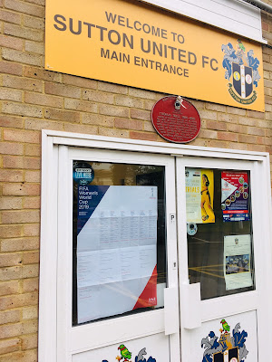
...and our wallchart has also had professional recognition! Below you can see the wallchart at Sutton United FC, where it is proudly displayed on the door and the bar
Design of the wallchart is by David Coates, who is also an ISTD (International Society of Typographic Designers) board member and my thanks to Dave for making it all happen - a perfect way to combine his love of type and football! Printing is by Typecast Colour in Paddock Wood.
 
We are now coming to the end of the group stages and the competition is really hotting up now. We have a few of the wallcharts left, so if you would like one, you can email me Justin@fennerpaper.co.uk
 
Posted by Justin Hobson 18.06.2019

Friday, 24 May 2019

Women's World Cup 2019...

Following the success of the Typographic Wallchart that we produced for the last years World Cup, we have now produced a new wallchart for an even more important event - the Women's World Cup!
This A1 size typographic wallchart is very simply produced in just two colour offset litho and is printed on our new Creative Print, Diamond 90gsm from German paper manufacturer Euler and is made using 100% recycled fibres..
Click on images to enlarge
To accompany the wallchart, we have produced a ready made "sweepstake kit" so that studios can easily run a sweepstake and get everyone involved - the sweepstake idea came about at the suggestion of our friends at Carter Studio - an excellent thought and our thanks to Joe and Phil.
Design of the wallchart and sweepstake kit is by David Coates, who also happens to be a member of the ISTD board (International Society of Typographic Designers) and my thanks to Dave for making it all happen - a perfect way to combine his love of type and football! Printing is by Typecast Colour in Paddock Wood.

We will be sending out some of these wallcharts in the post, but if you want to make absolutely sure you get a copy, you can email me Justin@fennerpaper.co.uk

Posted by Justin Hobson 24.05.2019

Tuesday, 20 November 2018

ISTD 90 Invitations

Founded in London in 1928, the ISTD turned 90 this summer. The Society has always been run on a voluntary basis and in June they organised a special celebration to recognise the huge contribution made over the years by board and committee members past and present.

The wonderfully substantial A5 invitations are hot foil blocked on our SUMO black 2mm thick board.
The invitations are simply hot foil blocked in metallic silver foil on both sides.
Click on images to enlarge
Below is an image of the blocks used for the hot foiling
Hosted at the iconic De La Warr Pavilion in Bexhill on Sea, the event was an informal evening of friends, food and typographic fun provided by Andy Altmann, of Why Not Associates who gave a very amusing talk about the influence of seaside town humour and typography within his work  
As you can see from the image above, 2mm thick is really thick!

Playne Design executed the 90th anniversary identity, designer on the project was David Coates. The invitation was hot foil blocked by Pureprint, who have only just brought pre-press services such as hot foiling and UV varnishing in house.

https://www.istd.org.uk/
https://playnedesign.co.uk/
https://www.pureprint.com/
Posted by Justin Hobson 20.11.2018 

Friday, 29 June 2018

ISTD 90th Anniversary

Yesterday evening I was lucky enough to be invited to the 90th anniversary celebration International Society of Typographic Designers (ISTD) awards held at the wonderful De La Warr pavilion in Bexhill on Sea, East Sussex. It was a wonderful evening at this amazing location.
The De La Warr pavilion is a modernist building by the architects Erich Mendelsohn and Serge Chermayeff which opened in 1936. The enlightened town council opened this new space which was to provide culture and entertainment for the masses – a true people‘s palace.

The evening started with drinks on the rooftop terrace, which was delightful as it was a beautiful evening.
The anniversary dinner was held in the dining area on the second floor, where over a hundred members and guests gathered, including some members coming from as far as Canada.
The wonderful restaurant area has the most amazing panoramic windows looking out to sea, a really perfect backdrop.
The evening began with an introduction by Jonathan Doney, the Chair of ISTD who gave a brief re-cap of the society's history, founded 90 years ago by Vincent Steer who brought together six other like-minded colleagues, for the first meeting of the British Typographers Guild, held at an Italian restaurant in Holborn, London. Jonathan reminded us of the work of the ISTD, including the Student awards which has been running for 45 years and now with programmes in six countries!
After dinner, Andy Altmann, one of the co-founders of Why Not Associates gave a very amusing talk about the influences on his career from the humble Ladybird books, his scrapbooks, to Eric Gill and Why Not's early life as a studio in Soho, shortly after leaving the RCA.
A very special moment in the evening was the award made to Freda Sack (pictured below). Freda was made an Honorary Fellow of the ISTD in recognition of her significant contribution to the Society and the typographic industry. Freda has been a member for over 30 years and has held pretty much every position on the board. Freda managed to achieve this while also running her own successful business.
It was an excellent evening which demonstrated real warmth and friendliness which the world of typography appears to engender. 

 It is so important for the design industry that we nurture and retain organisations such as the ISTD and we must take every opportunity to try and encourage membership, thus ensuring their continued viability. ...and if you aren't a member, have a look http://www.istd.org.uk/- it costs less than £10 per month - which is excellent value! 

Congratulations to the ISTD Board and the events team for arranging an excellent 90th Anniversary -- a huge amount of time and work goes into these events and it is fair that they should be recognised and applauded. 

Posted by Justin Hobson 29.06.2018

Tuesday, 5 June 2018

The World Cup for type lovers...

Here's a World Cup wallchart for the typographic purist!
This A1 size wallchart is very simply produced in just two colour litho and is printed on our wonderful Shiro Alga Carta 90gsm from Italian paper manufacturer Favini. Shiro Alga Carta began life as a way to utilise the damaging algal blooms which were clogging up Venice lagoon. Now the lagoon in Venice has been cleared of this problem, the concept has now been extended to help the clean up process in other fragile marine areas.
Design is by David Coates, who also happens to be a member of the ISTD board (International Society of Typographic Designers). Printing is by Typecast Colour in Paddock Wood.
 
We will be sending out some of these wallcharts in the post, but if you want to make absolutely sure you get a copy for next week, you can email me Justin@fennerpaper.co.uk
 
Posted by Justin Hobson 05.06.2018