Friday 23 February 2024

Life In Ukraine by Sergiy Maidukov

The War in Ukraine reaches a depressing second anniversary tomorrow. Illustrator Sergiy Maidukov has been recording his experiences of the invasion over the last two years. Including previously unseen black and white sketches, it is a snapshot of his life in Ukraine, written in both languages.
Click on images to enlarge
This is the latest in the UNSEEN series by c-ll-ct-v-ly. Founded in 2015 by Mark Leeds and Duncan Johnson c-ll-ct-v-ly is a London based Design and Research studio working in all media and especially editorial and moving image. As a studio project. they publish these limited edition magazines, using unpublished, reordered, remade, refound or newly created artworks. They are a quick-fire collaboration between the studio and a range of creatives ...an easy consumed, visual hit.
Click on images to enlarge
Size is A5 (210x148mm) portrait, saddle stitched. The "cover" is made using strips in the same colours as the Ukrainian flag (Colorset Solar 120gsm and Colorset Midnight 120gsm. There are 16pp of text (8pp on Colorset Light Grey 120gsm and 8pp on Gardapat Kiara 150gsm) plus another two thirds height insert (above) in Colorset Solar 120gsm.
Above shows the centre spread which is printed on Gardapat 13 Kiara 150gsm. For readers not familiar with GardaPat 13, it's a fully coated paper but it really does have a dead flat MATT surface. There are many papers on the market which profess to be matt - some which incorporate the word matt in the name, but aren't! Apart from the high quality matt surface, this paper has an extraordinarily high bulk - this 150gsm text with a thickness of 195mics. If you would like to read more about the bulk, you can read it HERE.
All materials are digitally printed using an HP Indigo digital press and the results are superb, beautifully showing the artworks. As many readers will know, many materials have to be "Sapphire Treated" to work successfully on HP Indigo presses, however the text (Gardapat 13) is printed without sapphire treatment ..and it's superb! The Colorset has been sapphire treated and as you can see from the below image, it is printed in white ink, which looks amazing...
The excellent printing and finishing, including the white ink and also the black wire used on the saddle stitches (below) is by WithPrint who are based outside Bristol in Rooksbridge.
Concept and Design is by Mark Leeds. Illustrations: Sergiy Maidokuv, Typography: KTF Rublena (https://kyivtypefoundry.com/about), Unica PanEuropean,

Posted by Justin Hobson 23.02.2024

Monday 12 February 2024

New award winning innovation in paper

As regular readers of this blog know, I always try and write objectively about the industry rather than just always about our products. This piece of news from the world of sanitary paper caught my eye and I thought I should let you know about it...

Up to now, recycled toilet paper has been made from graphic waste paper. This not only needs to be laboriously cleaned before being reused but because less paper is being used in general (because of digitisation) it is becoming increasingly scarce and expensive. German manufacturer WEPA is making the most of the fact that, alongside this, online shopping is generating more and more waste paper from packaging, and has developed the first sanitary paper made from recycled cardboard packaging and corrugated cardboard - what a brilliant idea!

This innovation was awarded not only the Blue Angel mark (Fenner Paper holds Blue Angel certification which I have written about this before HERE) but also the German Ecodesign Award for sanitary paper innovation – presented by German Minister for the Environment Steffi Lemke. 
Federal Minister for the Environment, Steffi Lemke (centre), presents the German Ecodesign Award to Andreas Krengel, member of the WEPA Management Board (left), and Patrick Schumacher, Director of Marketing & Business Development at WEPA Professional. Photo: Sandra Kühnapfel © IDZ

At the award ceremony in December their innovation Satino PureSoft was honoured with the German Ecodesign Award. This highest national award for ecological design is presented annually by the Federal Ministry for the Environment and the Federal Environment Agency in cooperation with the International Design Center Berlin. 

Congratulations to WEPA for winning the award and by best practice, using the world's resources wisely. Thank you. 

You can read more about the award here:


 Posted by Justin Hobson 12.02.2024

Monday 5 February 2024

Jobs from the past - Number 171

Regular followers of this blog will know that my first post of every month is a "job from the past" so that I can show some of the really good work from years gone by - this project is from ten years ago.

Big Book Parade 2013
This is the invitation to the showcase of new books from Harper Collins. Billed as 'The Big Book Parade', the function was held at the Crimson Bar at The Soho Hotel in May 2013.
Click on images to enlarge 
The size of the invitation is 145 x 975mm which concertinas down to 145 x 195mm. It uses our Modigliani Candido 260gsm, which has a "feltmark" texture similar to that of a watercolour paper which gives it exactly the right feel working with the beautiful illustrations of Brett Ryder (Heart Agency) commissioned to reflect the wide and diverse range of titles 'on parade' at the event.
Design and art direction is by Zoë Bather.

The invitations are printed offset litho in four colour process, machine creased and hand folded. Print was handled by Alan Mountain at Forward Print (sales@forward-print.com)

https://harpercollins.co.uk/
https://www.zoebather.co.uk/
https://www.heartagency.com/
Posted by Justin Hobson 05.02.2024

Thursday 18 January 2024

CC3

Founded by British Fashion Designer Patrick Grant, Community Clothing is a social enterprise with a simple mission - to make excellent quality affordable clothes for men and women, to create great jobs for skilled workers and by doing this help to restore real pride in Britain’s textile communities. They do this by working with under utilised UK factories during their quiet periods. What a wonderful concept.
This is Community Clothing's lookbook and catalogue and it is an absolutely superb publication, wonderful art direction, photography and printing.
 
The size is 330x230mm, portrait and is a 32pp self cover which flops and rolls really nicely in the hand....
The publication is printed on our Shiro Echo, White 90gsm which is 100% Recycled and also carries the FSC Recycled classification.

Shiro Echo is available in two shades; there is a white shade (which is a natural/off white) with a newspapery looks and feel and a Bright White shade too.
Centre spread is a map showing the locations in the UK where the factories are located.
Click on images to enlarge
 Solids look excellent
Below is a detail image which shows the excellent image quality - note the excellent fleshtone reproduction.
Very nicely finished too as you can see from the wire stitching
Design is by Moving Brands. Printing is by Principal Colour. A really superb piece of design and print.

https://communityclothing.co.uk/
https://www.movingbrands.com/
https://www.principalcolour.co.uk/
Posted by Justin Hobson 18.01.2024

Thursday 11 January 2024

Hotel de Russie - Rome

Located between two of Rome’s most picturesque piazzas, Piazza di Spagna and Piazza del Popolo, Hotel de Russie is one of the Eternal City’s most prestigious luxury hotels. An enduring favourite of artists and writers, stars and politicians, Hotel de Russie was dubbed “paradise on earth” by French poet Jean Cocteau in 1917. The hotel incorporates a stunning Mediterranean tiered Secret Garden, with rose bushes, orange trees and mature pine.

This the brochure for the hotel, which follows the new brand identity for Rocco Forte Hotels, created by Pentagram.
Size of the brochure is 266 x 204mm, portrait and is saddle stitched. The cover is an unusual format as there is an 8pp cover with 140mm wide flaps and there is an outer jacket, only 210mm high, also with 140mm flaps. It is the first time I've seen this combination and the effect is superb...
Click on images to enlarge
The materials used for the covers is our Dali range, which is a 'felt-marked' paper with a linear effect and a natural, tactile feel. If you click on the image below, you will be able to see the texture in the paper.
Click on images to enlarge
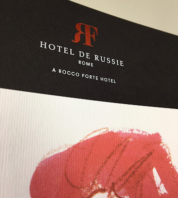
The cover is on Dali Nero 200gsm and is hot foil blocked in matt white and copper foil. The jacket is printed on Dali, Candido, 160gsm and is litho printed in CMYK on one side only.
Click on images to enlarge
The 16pp text is printed offset litho on our Marazion Ultra 135gsm, chosen because of it's dead matt flatness which would reproduce the interior images well without a glossiness which would detract from the classic look and feel of the hotel.
click on images to enlarge
The brochure has a beautiful, quality feel and flows in the hand superbly. The combination of photography, materials and quality print makes this a wonderful piece of print.
Design is by Pentagram. The excellent print, repro and finishing is by Gavin Martin Colournet, based in London.

https://www.roccofortehotels.com/hotels-and-resorts/hotel-de-russie/
https://www.pentagram.com/ 
https://www.gavinmartincolournet.co.uk/
Posted by Justin Hobson 11.01.2024

Wednesday 3 January 2024

Jobs from the past - Number 170

Regular followers of this blog will know that my first post of every month is a "job from the past" so that I can show some of the really good work from years gone by - this project is from ten years ago.

University of Portsmouth - Graduate publication 2014

This is the same year when I attended the New Designers exhibition, where I wrote about one of the students from Portsmouth University (Eric Downer) who was awarded the coveted "New Designer of the Year" title.  This is the course showcase publication which was distributed at the show wwhich was printed on our paper.
 
Size is 225x160mm, portrait and is perfect bound. It has a 4pp cover with a 64pp text and has a superb quality and feel about it ...and there a really clever little twist as well!
The covers, which are all printed just one colour - magenta- have been printed on five different colours of our Colorset, 100% Recycled. This is a wonderful 'print design' solution as maximises the impact and the processes used. It looks and feel like you are getting so much more out of a project, but a no extra cost!
All that is required to make this effective, is a design that will work printed in one colour, that can be applied successfully on a range of colours ...and this does just that, beautifully.
The text is printed on our Redeem 100% Recycled 130gsm which is printed beautifully and does great justice to the wide and varied work of the students. Being a neutral white it gives the publication a 'booky' feel which works really well with the imagery.
The catalogue design team is Andy Lethbridge, Ellie Taylor, Ali Bird and Eric Downer and they have done a superb job. The academic team is Sarah Houghton, Andrew Denham, Mike Harkins, Dan McCabe, Estelle Taylor, Alex Tibus.

...and below you can see the striking result of how the different colour covers look, all stacked up at the New Designers show:
Catalogue production and coordination was handled by Sarah Houghton, Course Leader at the University of Portsmouth. Printing is by PPG Print in Portsmouth who have since gone bust.

https://www.port.ac.uk/
Posted by Justin Hobson 03.01.2024