Wednesday 29 June 2016

Big Book Bonanza 2016

The Big Book Bonanza is the showcase of new books from Harper Collins and this is the bewitching invitation for the launch that was held this April at the Ham Yard Hotel.
The invitation is quite literally a gatefold! The delightfully lasercut gates are hinged over the inner invitation which is tipped onto the back panel of the main invite. 
Finished size of the invitation is 150x265mm with the inner card being 128x245mm. It is printed on Colorset Natural 350gsm (100% Recycled) throughout.
Click on images to enlarge
Below shows the corner cuts where the inner card sits, holding it in place.
Below image shows outside back cover with the corner slits.
Click on images to enlarge
The reproduction on the Colorset Natural is bright and vivid, the colours really lifting off the page.
The lasercut gates are wonderfully crisp and really set this invitation off.
Art direction and design is by London based studio, Design by St. Creative Partners are Steve Fenn and Tom Pollard. The excellent print and production is by Hampshire based Senator Press.

www.harpercollins.co.uk
http://www.designbyst.com/
Posted by Justin Hobson 29.06.2016

Monday 27 June 2016

Thesis InForm

Following on from my visit to CSM last week, a publication arrived in the post today which accompanies a student led symposium and exhibition titled 'Thesis InForm’ at the LCC. The exhibition provides an opportunity for students to develop their research and writing into an exhibition outcome and runs concurrently to the year end main show at LCC. Works selected are from a panel of Contextual & Theoretical Studies and course tutors based on mentored proposals.  
The finished size is A4 (297x210mm) portrait folding out to an A2 size 594x420mm and is printed offset litho in one pantone colour (solid green) on the outside and two colours, fluorescent green and silver on the inside.
Click on images to enlarge
The paper chosen is our lightweight Offenbach Bible 60gsm, which feels beautifully light but retaining a quality feel, flopping and rolling in the hand. The printing of the solid colour is superb.
Below image shows fully folded out broadsheet/poster with the image below being the inside printed in two colours
Design is by Giorgio Marani and Tom Greenhill. Editing and production is by Andrew Slatter (Senior Lecturer Contextual & Theoretical Studies). The publication is expertly printed 'in house' at the LCC at the Elephant and Castle by Litho technician Tony Yard - the print result is truly exquisite, especially given the limitations of the equipment at the LCC. My thanks to Andrew for sending me copies.

www.thesisinform.wordpress.com
www.arts.ac.uk/lcc
Posted by Justin Hobson 27.06.2016

Friday 24 June 2016

Central St Martins - Degree Show 2016

Yesterday evening I was invited to the private view of the Central St Martins Degree Shows at King's Cross. It was a very humid London evening but the show was well attended, laid out on the ground, first and second floors.
I spent most of the time at the BA Graphic Design course where I was shown around by Helen Ingham, from the letterpress workshop.
It was a very busy show with lots of thought-provoking work on display. Interesting (for me) to see just how many final projects still involve paper and printing. There was a superb project by Michal Kuzmierkiewicz, beautifully illustrated, exploring the roots of his family's exodus from Poland to Britain after WW2 (unfortunately I didn't get a pic of that project.) 
Below is the work of Odira Morewabone on Matatuism, a subcultural exploration of the urban youth culture in Nairobi in creating these artworks used on local taxis.
And below is the work of Anna Finch on the Jewellery Design course who has incorporated paper into her work. Through extensive experimentation, including pulping, carving, cutting, laminating, heating and sanding, Anna has been able to create some extraordinary pieces.
This piece is made using paper that she has processed, inlaid with pearl and silver.
Thanks to all staff and people I know at CSM for the kind invitation and a chance to see the work of the new graduates.
http://www.arts.ac.uk/csm/#
Posted by Justin Hobson 24.06.2016

Wednesday 22 June 2016

Coast Lookbook

Coast is one of the leading occasionwear brands for women. Established in 1996, Coast now boasts 52 stand-alone stores with 184 concessions and 46 international stores. This is the lookbook for last Christmas and is a really sublime piece of print
The cover is printed on our Astralux board - this is a one sided 'Cast Coated' board which means it has a high gloss surface and an uncoated reverse. So in this instance, it's been used inside out! The uncoated reverse has been printed offset litho in a silver special solid colour and hot foil blocked in silver metallic foil and used as the outer cover - the high gloss has been printed in a champagne metallic shade which appears on the inside front and back cover.
The cover is printed on Astralux [1 sided] 350gsm. Size of the publication is 240x165mm (which is an economical size to be printed on a B2/B1 size press)
The text material chosen was our Omnia, which would beautifully reproduce the photography with the delicate patterns and dark colours superbly - without forgetting the fleshtones ...and it looks wonderful! The 44pp text is on Omnia White 150gsm, printed offset litho in CMYK throughout.
Click on images to enlarge
Image reproduction is paramount but it was also important that the publication also projected the tactility of the clothes and in the image above and below the detail of jewellery. An ordinary feeling silk or gloss coated paper wasn't an option, so Omnia fitted the bill perfectly.
Click on image to enlarge
Omnia is a very bulky paper, so even though it is only 44pp, the Omnia 150gsm gives it a 5mm spine thickness. As with all quality publications, it is 'section sewn' and here is a close up showing the spine and end of the book with the sewn sections:
Another impressive detail is the spine which is also hot foil blocked in silver metallic foil but which as you can see from the image below centred perfectly within the 5mm spine - great attention to detail
Art direction and design is by Coast. Printing, neat foiling and careful finishing is by Identity Print based in Paddock Wood.

Posted by Justin Hobson 22.06.2016

Monday 20 June 2016

Refurbishment at Fenner Towers!

We have just redecorated our modest reception area at Fenner Paper, we have a new cabinet to display books and magazines and a new bright yellow sign to indicating where the intercom is.
We've used a Crown Matt Emulsion in a pale greeny grey with the imaginative name of 'Potting Shed'! ...to top it off, we have a new framed poster titled 'The Power of Creativity' which is a limited edition poster designed by Johnson Banks, originally produced for D&AD. I wrote about the posters on this blog before here
The design of the poster is such that there is plenty to read on the wall, should any visitors have to spend some time waiting! The posters are produced on Omnia 200gsm and are printed by Gavin Martin Colournet.

They are available to purchase from the studio here: http://johnsonbanks.co.uk/shop/power-of-creativity-poster/

http://johnsonbanks.co.uk/
http://www.gavinmartincolournet.co.uk/
Posted by Justin Hobson 20.06.2106

Thursday 16 June 2016

The Winton Beauty of Mathematics Garden

This is the literature produced for one of the gardens at last month's Chelsea Flower show. This leaflet is about the Winton Beauty of Mathematics Garden, which is the Silver Gilt Medal winner. The garden is designed by Nick Bailey.

"The garden is a celebration of the beauty to be found in the mathematics and algorithms that underpin all plants, growth and life. It features a beautiful flowing copper band, etched with plant growth algorithms and represents an emerging seedling. As it snakes through the garden it takes on different functions from bench to stair banister, to planter pitched 3.5m (11 1/2ft) above the garden, and overflowing with trailing plants"
Finished size is 112x220mm concertina folding out to 448x220mm. It is printed on Omnia 150gsm, which is very bulky (around 200microns thick) which makes the leaflet substantial, but because it has been well pre-creased, it folds well and sits nice and flat.
Pia called to discuss the type of paper she was looking for, wanting something that was tactile and engaging but concerned that the images would reproduce accurately ...well Omnia certainly cracked it! - the printed result is superb. Excellent reproduction but still with tactility that the subject requires. It is printed offset litho in four colour process. The below image shows both sides, spread out flat.
Click on images to enlarge
Below is a hi res image of the actual garden....
The leaflet is designed by Pia Östlund, who is a graphic designer and printmaker with a long background of working with gardens (Chelsea Physic Gardens and Oxford Botanic Gardens). Print is by Severn Print based in Gloucester and was handled by Anita Barry. My thanks to Anita for sending me some copies and a lovely note.
Posted by Justin Hobson 16.06.2016

Tuesday 14 June 2016

UEL Undergraduate Study Guide

The University of East London is world class university, based on three campuses in the Docklands area of London. On becoming a University in 1992, the establishment has grown with a particularly international outlook, having 19,000 students from over 120 countries.
This publication is the Undergraduate Study Guide and rather than being a dry old prospectus, which many of us will be familiar with, this is a far more engaging piece of literature. With all the information being available online, this is a book which stimulates the imagination, rather than just listing the vast array of courses.
Click on images to enlarge
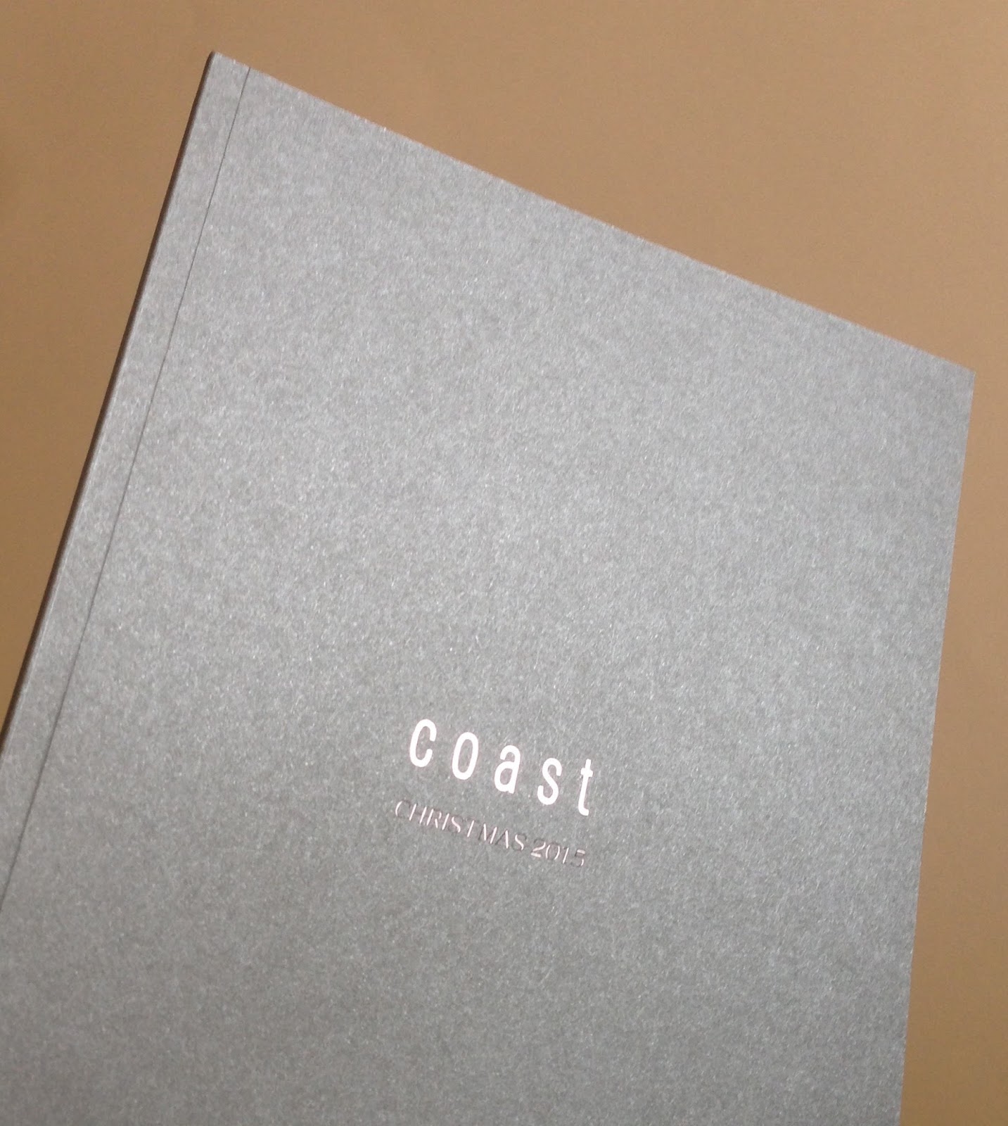
Size is 265x200mm, portrait, with a 4pp cover, 112pp text and perfect bound. The spine is 8mm.
The whole publication is printed on our Shiro range from Italian manufacturer FAVINI. It is all printed on Shiro Echo, which is 100% Recycled, however the guide is cleverly divided into two sections using different shades of paper. The first 'introduction' section is 42pp and is printed on Shiro Echo Bright White 120gsm (see above images) and the second section (70pp) which gives an overview of the 150 courses available is printed on Shiro Echo White 120gsm, which is a more neutral white. You can see the difference in shades from the image below:  
The print result is superb. It is printed Offset Litho in four colour process plus a special - Fluorescent green. As I hope you can tell from these images, the quality of the photography has been enhanced by good repro and excellent printing. 
Click on images to enlarge

You can see the change in the shades of the paper on the foredge of the guide in the image below
Spine is nice and square and well creased and finished.
...no problem with printing a full bleed fluorescent solid green on the Shiro...
As you can see from the image below, the perfect binding is nice and neat.
The excellent art direction and design is by the in house team at UEL, which is lead by creative director Anton Webb, with the print managed by Head of Print Services, Stephen Marlow.
Printing is by Sure Print Services, based in East London, with Bradley Jones looking after the project. A really first rate piece of print.
Posted by Justin Hobson 14.06.2016