Showing posts with label Tony Yard. Show all posts

Tuesday, 2 June 2020

Jobs from the past - Number 127

Regular followers of this blog will know that my first post of every month is a "job from the past" so that I can show some of the really good work from years gone by and this publication is from 2016. 

LCC - Design for Visual Communication (DVC) 2016
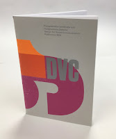
This publication reviews the work of 56 students who have undertaken the Postgraduate Certificate and Diploma in part-time and full-time modes at the London College of Communication (LCC) during 2016. The introductory section includes two features related to design activism and is illustrated using images taken from student submissions to the ISTD student assessment.

Size of the publication is 240x160mm (an oversize A5 which is economical to print using 'B'size paper). The cover design is by Caley Dewhurst and is letterpress printed at the LCC letterpress department by Christian Granados and Alex Cooper.
The 4pp cover is printed on our Colorset (100% Recycled) Light Grey 270gsm and printed in three colour letterpress.
The 64pp text is printed CMYK offset litho at the LCC litho printing department by Tony Yard and the result is excellent. The first pages are for the DVC Postgraduate Certificate
Click on images to enlarge
The second section is for the DVC Postgraduate Diploma...
It's also worth pointing out that one of the students on this course, Chia-Lin Lin (see r/h page below) was awarded the prestigious Vincent Steer prize at the ISTD Student Awards in that summer which you can read about here.
Click on images to enlarge
StarFine is a quality, uncoated paper and as the images show, image reproduction is excellent. The photographic images, montages and illustrations all look equally stunning - a great amount of detail for an uncoated paper.
64pp of StarFine 115gsm is about the maximum that you can successfully saddle stitch without it "gaping" in the centrefold too badly. This publication works but it would be a struggle if there were any more pages....
You can see below the "matrix" crease that means that the cover has been really well finished so that the cover sits as flat as possible and there's no cracking along the spine. Print finishing was also in-house at the LCC by Scott House.
The course leader is Tony Pritchard and this is an excellent example of a high quality publication that can be produced when like-minded individuals come together and in house facilities exist and have been fully utilised.

www.arts.ac.uk/lcc
https://www.istd.org.uk/education/2020-student-briefs
Posted by Justin Hobson 02.06.2020

Thursday, 29 June 2017

Thesis InForm 2017

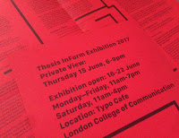
www.thesisinform.wordpress.comThesis InForm is an exhibition showing work produced by a selection of students from across the Design School at the LCC in response to the ideas explored in their final year Thesis. The students were invited to transform and re-interpret these concepts in any visual or physical form imaginable.

This is the literature produced for the exhibition and symposium.
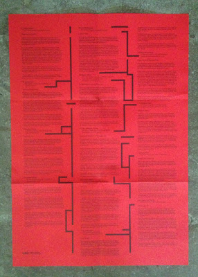
The finished size is 240mm square folding out to 720x480mm and is printed offset litho in one colour black on both sides on our Colorset 100% Recycled 120gsm in Bright Red.
The identity and publication is designed by GMD student Keenen Sutherland. The editor is Tracey Taylor and the organisation is by Andrew Slatter (Senior Lecturer linked to the Graphic Communication Programme).
The publication is expertly printed 'in house' at the LCC at the Elephant and Castle by Tony Yard and Scott House. Really well printed and folded, you can see the job coming out of the folder in the image below
My thanks to Andrew for sending me copies.

www.thesisinform.wordpress.com
https://thesisinform.wordpress.com/2017/06/13/talking-about-identity/
www.arts.ac.uk/lcc
Posted by Justin Hobson 29.06.2017

Monday, 27 June 2016

Thesis InForm

Following on from my visit to CSM last week, a publication arrived in the post today which accompanies a student led symposium and exhibition titled 'Thesis InForm’ at the LCC. The exhibition provides an opportunity for students to develop their research and writing into an exhibition outcome and runs concurrently to the year end main show at LCC. Works selected are from a panel of Contextual & Theoretical Studies and course tutors based on mentored proposals.  
The finished size is A4 (297x210mm) portrait folding out to an A2 size 594x420mm and is printed offset litho in one pantone colour (solid green) on the outside and two colours, fluorescent green and silver on the inside.
Click on images to enlarge
The paper chosen is our lightweight Offenbach Bible 60gsm, which feels beautifully light but retaining a quality feel, flopping and rolling in the hand. The printing of the solid colour is superb.
Below image shows fully folded out broadsheet/poster with the image below being the inside printed in two colours
Design is by Giorgio Marani and Tom Greenhill. Editing and production is by Andrew Slatter (Senior Lecturer Contextual & Theoretical Studies). The publication is expertly printed 'in house' at the LCC at the Elephant and Castle by Litho technician Tony Yard - the print result is truly exquisite, especially given the limitations of the equipment at the LCC. My thanks to Andrew for sending me copies.

www.thesisinform.wordpress.com
www.arts.ac.uk/lcc
Posted by Justin Hobson 27.06.2016

Friday, 13 May 2016

Hardcover - a step by step guide

This is a delightful publication called Hardcover. It is a step by step guide about the techniques and tools required for flat-back case binding. It is written and produced by Veronica Rafa and Rahel Zoller,
The design is by Veronica, an MA student at the LCC and the content is by Rahel, who is a book arts and design technician in the Book Arts Department at the LCC.  
The publication is a 16pp self cover. Size is 215x150mm (interesting that it's not a standard A5 size) portrait and is saddle stitched. It is printed offset litho in two special colours (red and blue).
Click on images to enlarge
It is printed on our Flora Noce 100gsm. If you aren't familiar with Flora, it is a part recycled text and cover paper with a deliberately recycled look and feel with specks and inclusions, so it looks overtly recycled. You can see just how flecky and specky it is in the image below:
However, just because it has flecks and specks in it doesn't mean you can't print all over it! as the spread below ably demonstrates....
Click on images to enlarge
A superb solid blue - which for those not 'in the know' is by far the hardest colour to print successfully.
Click on images to enlarge
This piece of literature is just superbly written, illustrated and printed. All detailing is just superlative, as you can see from the red wire stitching in the image below:
...and if all this wasn't remarkable enough, I can tell you it was printed 'in house' at the LCC at the Elephant and Castle by Litho technician Tony Yard. Below is an image taken of the press sheets in the viewing booth, when the job was on press
...and I also received a thoughtful thank you note:
...you can't beat a handwritten thank you.
You can read more about the project here:
http://veronicarafa.com/subpages/bookbinding/bookbinding.html
https://www.instagram.com/book.arts.workshop/

Thanks to Rahel and Veronica for sharing with me. I should also point out that the credit in the publication says the following:
"This publication was made possible through the support of the Student Experience & Engagement Fund at London College of Communication and with the help of Tony Yard for printing it". Credit, where credit is due.
Posted by Justin Hobson 13.05.2016

Wednesday, 12 February 2014

This week is Green Week...at the LCC

Green Week is an event hosted at the London College of Communication (LCC) where staff and students are encouraged to take part in workshops, talks, installations and exhibitions. This year the subject of Green Week is SURVIVAL and during the week, the events will seek to investigate how designers, filmmakers, journalists, photographers and communicators are responding to the issues of our time.

The programme for the week has been printed at the LCC on their own Heidelberg B2 press by the resident technicians Tony Yard and Scott House. 
The booklet is 148x105mm (A6) portrait and is a 16pp self cover - which is a very "green" format - that is to say it is made up out of one SRA3 sheet which maximises both the press format and the paper. The book shows the timetable of events happening throughout the five days (10-14th February 2014)
The edge of each of the pages is coloured, which relates to the timetable in the front. A nice touch although this makes it more challenging from a print finishing point of view, but as you can see from the picture below, it's been very successfully achieved.
 
The programme is printed on our Shiro Echo, White 80gsm (100% recycled) from Favini in Italy - just perfect for Green Week. Printed CMYK offset litho throughout.
 
Publication design is by Tom Box. Cover illustration is by Josie Molloy.
 
There are many events which are free to go to, so have a look at the links below and see if one takes your fancy.
 
Conscientious Communicators was formed in 2011 at London College of Communication to develop and consolidate a community of practice around environmental and social creativity. Thanks to Course Director, Sarah Temple for getting me involved.
  
Posted by Justin Hobson 12.04.2014