Thursday 5 May 2011

Whistles S/S 2011

This is the latest Spring Summer lookbook for fashion retailer Whistles.
The size is 235x290mm Portrait, saddle stitched. It has a 4pp cover (which is deliberately lightweight) on our Colorset (100% Recycled) Light Blue 120gsm which is printed in just one colour litho (black) with a 28pp text on Marazion Ultra 90gsm, so the whole job has a deliberately 'floppy' feel.
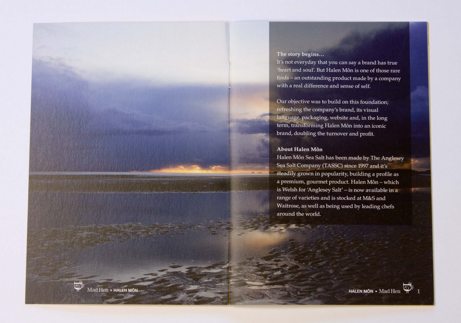
As with the previous issue, there is lovely sense of light and space with this piece with some spreads having a completely blank page on left or right. It really allows the superb photography and the subject room to breathe. The brochure is printed in one colour (cover) and CMYK for the text.

Art Direction and design is by Simmonds Ltd. Photography is by Karim Sadli and Styling is by Francesca Burns.

Print is by Boss based in West London - incidentally their press, which is a Heidelberg CD 74-6LX is fitted with an inking/blanket/impression cylinder washup device - which (in theory) means "hickey" free printing ...impressive stuff! (and interesting in a sort of nerdy way!)

NOTE - Added 26.10.2011. Following my visit to Heidelberg UK, I've found out that this system is called a Vario Dampening System and here's how it works: "Vario operation reduces the formation of hickeys on the printing plate due to a differential speed from the dampening form roller to the plate. The reduced speed is attained by the separately driven distributor roller spinning around 12% slower" ...very clever stuff.  Thanks to Paul Chamberlain at Heidelberg (www.uk.heidelberg.com) and Fenton Smith at Boss for explaining it all to me.
http://www.simmondsltd.com/
http://www.bossprint.com
Posted by Justin Hobson 05.05.2010

Tuesday 3 May 2011

Jobs from the past - Number 19

Regular followers of this blog will know that my first post of every month is a "job from the past" so that I can show some of the really good work from years gone by. Here's one from 2006...


RIBA - Crown Estate Conservation Award 2006

The Crown Estate Conservation Award is made to the architects of the best work of conservation which demonstrates successful restoration of an architecturally significant building. The shortlist is selected from the conservation schemes to have won RIBA Awards in that year. The £5000 prize is the most prestigious in conservation architecture and was established in 1998 with The Crown Estate sponsoring it since that year.

The 2005 award was won by Avanti Architects for the conservation of the iconic Grade I listed Isokon apartments in London, NW3 and that is the (superb) image used on the cover of the 2006 awards booklet.
This is not a big flashy job. It's purpose is simply to list the five shortlisted entries. The flat size is 297x315mm folding up to form a 12pp A6 finished size piece. Nothing too elaborate, just functional, well designed and printed. The paper chosen for the job was our Neptune Unique 120gsm. Reproduction is good and it folded well.
Design is by The Small Back Room based in London and the designer on the project was Phillip Southgate (who has since moved and now lives and works near Bristol). Printing was by Crucial Colour based in Tunbridge Wells. The image below shows the 12pp folded out with a folded version placed in the middle:
...and there's even a small piece of personal interest in the job (for me anyway!). One of the projects (also by Avanti Architects) shortlisted for this award, was the restoration of a Grade II listed modernist house called Harbour Meadow in Birdham.  Originally designed by Peter Moro and Richard Llewelyn Davies in the late 1930s, this was actually built for the grandparents of one of my friends from school - a little known fact is that Peter Moro was interned during the war not least because he was of German descent but also because intelligence officers claimed that the recently constructed house, if viewed from the air, resembled half a Swastika and could be used for navigation by Nazi bombers! Mr. Tawse vouched for him and also persuaded the authorities that the aerial 'half swastika' was a ridiculous idea and the architect was finally released in 1941. You can see more of this house: http://www.avantiarchitects.co.uk/#/proj_9

Harbour Meadow, Birdham
Photo: Nick Kane
RIBA: http://www.architecture.com/
Posted by Justin Hobson 03.05.2011

Friday 29 April 2011

Royal Wedding Day

Contrary to popular belief (and my april fool post) I won't actually be at the wedding today! However, to celebrate, I thought I would share this extremely collectable plate titled "cheers for the day off" by El Famoso Illustration!
Congratulations to the happy couple....
Posted by Justin Hobson 29.04.2011

Thursday 28 April 2011

Pentawards 2011

Now you don't see much about pacakging on this blog, because apart from a few pieces of quite specialist stuff, we aren't really involved in mainstream packaging.  However, I thought it would be worth drawing you attention to an international competition called the Pentawards ( ...no, nothing to do with Pentagram!)

Pentawards is the first and (apparently) only worldwide competition exclusively devoted to packaging design in all its forms. It is open to everybody in all countries who are associated with the creation and marketing of packaging. The winners receive bronze, silver, gold, platinum or diamond Pentawards according to the creative quality of their work.
2011 entry is open up to the 20th of May. You can read more at:  http://www.pentawards.org/
Posted by Justin Hobson 28.04.2011

Tuesday 26 April 2011

Mad Hen - Case Study

This publication is the first in a series of "case studies" published by design company Mad Hen, who are based in Wales.

This case study is about Halen Môn Sea Salt which over the last decade has built up a profile as a premium, gourmet product.

The booklet is a saddle stitched, 12pp self cover, A6 (148x105mm) portrait produced on Omnia 150gsm.
Design is by Creative Director Sid Madge at Mad Hen. Omnia was chosen because the colour reproduction is superb as are the solids combined with the fact that this little job just feels 'special' - and as Sid says in his lovely note to me:  Omnia ...Yum!
It does occur to me that this is a great way of a design company getting it's own work out there. I know that these days, the emphasis is very much on websites but you still need to give a client a reason for looking at a site and a simple, clear precise publication like this is just the thing ...food for thought!
http://www.halenmon.com/
http://www.madhen.uk.com/
Posted by Justin Hobson 26.04.2011

Wednesday 20 April 2011

ISTD Typographic Awards - Call for entries

Over the last couple of weeks you may have received the very nice mailing, pictured below:
It is the International Society of Typographic Designers (ISTD) call for entries for the 2011 awards. The mailer is 145x195mm which folds out to a poster sized 390x580mm. It is printed in CMYK on one side only on our Offenbach Bible 60gsm.
Design and Art Direction is by Liam Bonar and Gilmar Wendt. It is printed by Gavin Martin.

Now the deadline is looming, so if you haven't got your entries ready, you'd better get on with it right now! they need to be in by 12th May 2011. There are 19 categories and the judges are Robert Boon, Simon Dixon, Tom Hingston, Lynda Relph-Knight and Astrid Stavro.

If you didn't get a mailer and would like to find out more about the awards, more details are available from www.istd.org.uk/awards

...and thanks to David Coates and the board for the kind note:

http://www.istd.org.uk/
http://www.gavinmartin.co.uk/

Posted by Justin Hobson 20.04.2011

Monday 18 April 2011

Dorchester Collection 2011

This is the 2011 desk calendar for hotel group, the Dorchester Collection. It is a superbly produced calendar of the highest quality (as one might expect!)

The Dorchester Collection has a collection of hotels around the world from the Beverley Hills Hotel to Le Meurice in Paris to the Dorchester itself. Combined, the hotels boast 11 Michelin stars and it is the chefs (and the food) that are the stars of this calendar.

The size of the calendar is 148x200mm wiro-bound onto an extended "tent card" which is 25mm deeper.

The overiding feeling that you get with this piece is one of quality and prestige, which is down to the feel, quality of materials and processes used. The Calendar has been produced using a mixture of our Monoblack 1400mics (yes that's the black material - 1.4mm thick!) which makes a lovely sturdy tent and front cover. The cover is de-bossed and the tent card is hot foil blocked in a silver foil. The seventeen text sheets are printed on our StarFine White 170gsm and there is a 90gsm trace material interleaving the sheets. 
To celebrate the collections outstanding restaurants, photographer Joakim Blockström was commissioned to photograph each Michelin starred chef and signature dish in London, New York, Milan, Paris and Los Angeles. First and foremost it has to work as a functional calendar...
Design and (superb) art direction is by OMD Design and the Creative Director on the project was Chris Mettrick. The beautiful photography by Joakim Blockstrom ...and now we get to the print and production. This was a big project (65,000 copies in total) and required excellent print, finishing and logistics. It was produced by Gavin Martin and I have to say it is a really fantastically produced piece of print and finishing - for example the creases on the tent card have been "kiss-cut"  so they are really sharp and it sits up beautifully square, stable and erect. All in all it's a cracking job Grommit!
Posted by Justin Hobson 18.04.2011