Showing posts with label Aldgate Press. Show all posts

Tuesday 28 December 2021

Maggie's Xmas Card

Maggie’s provides free practical, emotional and social support to people with cancer and their family and friends, following the ideas about cancer care originally laid out by Maggie Keswick Jencks. The first Maggie’s Centre opened in Edinburgh in 1996 and since then Maggie’s has continued to grow, with 27 centres at major cancer hospitals.
The image used on the card is of an apple installation by Rebecca Louise Law at Maggie's Culture Crawl held in 2014. 
Image copyright: Written Light Photography
The cards are printed on our Colorset Crimson 270gsm, our 100% recycled text and cover range. They are printed in halftone, offset litho in one colour, silver and hot foil blocked in matt white foil.

Reverse of card
The below image shows the detail of the white foil:
Design is by Malcom Clarke. Print and foiling is by Aldgate Press, based in London E1.

https://www.maggies.org/
http://www.aldgatepress.co.uk/
Posted by Justin Hobson 28.12.2021

Thursday 25 November 2021

Noodle St

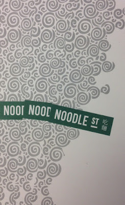
Noodle Street is a traditional Chinese restaurant based in London's busy Canary Wharf. Established in 2010, Noodle Street prides itself of using the freshest ingredients and new dishes from the many and varied regions around China
The new identity has been applied to some swanky new A4 letterheads, printed on Shiro Echo, Bright White 120gsm.
Click on images to enlarge
The stationery is printed in two colours, offset litho. Shiro Echo is 100% Recycled (and FSC accredited) and part of the criteria for this project was that the paper should be recycled.
Detail of noodles!
Print is by Aldgate Press based in London.
Branding and design is by Reason. Design Director is Catherine Hampshire. Thanks to Catherine for sending me file copies and the nice words!
http://noodlestreet.co.uk/
http://www.reasondesign.co.uk/
http://www.aldgatepress.co.uk/
Posted by Justin Hobson 25.11.2021

Friday 17 January 2020

Lightboxes and Lettering

Yesterday, on a cold wet evening I went to the opening of a new exhibition at the Nunnery Gallery in Bow. Lightboxes and Lettering is the culmination of a project about the heritage of the printing industry in East London. Made possible by money raised by National Lottery players, the project focuses on the pre-digital era of printing in Hackney, Tower Hamlets and Waltham Forest and the experiences of people involved in the industry. The project explores how the printing industry has changed with the arrival of digital technologies, and how newer processes have transformed the everyday lives of print workers.
Printing – including lithography, silkscreen, and letterpress – has been an important industry in east London for many years. Access to small presses allowed political and community groups to easily print their books, pamphlets and leaflets, and many of these smaller firms were in east London. In recent years, the industry has changed a great deal, with the number of print workshops now much reduced and those in operation working in very different ways to how they would have done just a few decades ago.
The project maps former businesses, records the experiences of current and former employees, and shows collected printed matter, images of print workshops and details of technical processes.
This is a well researched exhibition and the project is documented in a catalogue (below) printed on Colorset, Shiro Echo and a map printed on our Offenbach Bible. It is printed by Aldgate Press, one of the East London printers featured in the exhibition and designed by Sandra Zellmer.  I'll write about the catalogue another time.
Congratulations to Lucy Harrison and Rosa Ainley from Rendezvous Projects who put the project and the exhibition together. The exhibition runs until 29th March and is at the Nunnery Gallery in Bow Road E3. It is an excellent exhibition and well worth a visit.

http://www.lightboxeslettering.com/
https://bowarts.org/nunnery
Posted by Justin Hobson 17.01.2020

Monday 7 October 2019

The Shepherd’s Whistle

Earlier this year, the John Hansard Gallery, part of the University of Southampton presented an exhibition titled The Shepherd’s Whistle, a commissioned project by Stefan Gec. The exhibition centres around the artist’s fascination with top-secret maps of strategic cities worldwide that were created by Soviet intelligence during the Cold War, alongside an M-72 Soviet army motorbike and sidecar from 1957. Riding the M-72 and navigating using the Soviet maps, Gec journeyed to five UK towns and cities that were identified by the Soviets as having strategic importance.

This is the accompanying literature produced for the exhibition...
The size is A5, portrait and the format is an 8pp right angle fold.
Click on images to enlarge
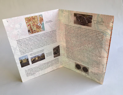
The leaflet is printed offset litho on our Sixties, 60gsm ...and it works superbly as SIXTIES has the same type of translucency as a tracing paper - but it feels like a normal paper! … so it works perfectly for this publication, allowing the map to show through and provide the backdrop for the essay about the exhibition, written by Ros Carter. You can see the way the translucency works in the image below:
Front cover:
...opens to this spread
Open at full size:
Click on images to enlarge
This image shows the Soviet map which appears on the inside of the leaflet.
The publication is printed offset litho in CMYK and the colour reproduction on Sixties is excellent, as you can see in the image above.
Click on images to enlarge
The exhibition ran from February to April this year. Design is by Daly & Lyon who are a studio based in London that specialises in design for the arts. Printing is by Aldgate Press.

http://www.jhg.art/event-detail/374-stefan-gec-the-shepherd-s-whistle/
http://www.daly-lyon.co.uk/
http://www.aldgatepress.co.uk/
Posted by Justin Hobson 07.10.2019

Thursday 3 December 2015

Noodle Street

Noodle Street is a traditional Chinese restaurant based in London's busy Canary Wharf. Established in 2010, Noodle Street prides itself of using the freshest ingredients and new dishes from the many and varied regions around China
The new identity has been applied to some swanky new A4 letterheads, printed on Shiro Echo, Bright White 120gsm.
Click on images to enlarge
The stationery is printed in two colours, offset litho. Shiro Echo is 100% Recycled (and FSC accredited) and part of the criteria for this project was that the paper should be recycled.
Detail of noodles!
Print is by Aldgate Press based in London.
Branding and design is by Reason. Design Director is Catherine Hampshire. Thanks to Catherine for sending me file copies and the nice words!
http://noodlestreet.co.uk/
http://www.reasondesign.co.uk/
http://www.aldgatepress.co.uk/
Posted by Justin Hobson 03.12.2015

Wednesday 24 December 2014

Maggie's Christmas Card

I received this lovely, simple, Christmas card for cancer care charity Maggie's.

Maggie’s provides free practical, emotional and social support to people with cancer and their family and friends, following the ideas about cancer care originally laid out by Maggie Keswick Jencks. The first Maggie’s Centre opened in Edinburgh in 1996 and since then Maggie’s has continued to grow, with 17 centres at major cancer hospitals.
The image used on the card is of an apple installation by Rebecca Louise Law at Maggie's Culture Crawl held in 2014. 
Image copyright: Written Light Photography
The cards are printed on our Colorset Crimson 270gsm, our 100% recycled text and cover range. They are printed in halftone, offset litho in one colour, silver and hot foil blocked in matt white foil.

Reverse of card
The below image shows the detail of the white foil:
Design is by Malcom Clarke. Print and foiling is by Aldgate Press, based in London E1.

www.maggiescentres.org
http://www.writtenlight.co.uk/
http://www.aldgatepress.co.uk/
Posted by Justin Hobson 24.12.2014

Tuesday 22 July 2014

Esme Winter Stationery

Esme Winter is a London-based designer partnership creating lifestyle accessories and stationery. Esme, working with Richard Sanderson produce items that are crafted with hand-binding, weaving and beautiful print. You can see their work here: http://www.esmewinter.co.uk/
They have recently printed their own stationery items on our lovely Flora Giglio 160gsm (paper) and 350gsm for the board. Flora is a 50% recycled paper (and FSC accredited) with natural, deliberately visible, inclusions & fibres - looks just great with this simple, classical use of type.  
 
The bespoke envelopes are 255x190mm (which I guess fit the notebooks they produce) and are produced on 160gsm, as are the compliment slips which are A6 (148x105mm) and the business cards are traditional 85x55mm on the 350gsm

The elongated cards (170x55mm) which could double up as compliments cards and bookmarks are also on 350gsm and are printed on the reverse in a variety of their 'trademark' designs.
Printed offset litho by Whitechapel based Aldgate Press.
Thanks to Richard and Esme for taking the time to send me some file copies of the various items and their lovely note. Just another excellent example of the correct choice of paper enhancing design.

http://www.esmewinter.co.uk/
http://www.aldgatepress.co.uk/
Posted by Justin Hobson 22.07.2014