Showing posts with label CPI Colour. Show all posts

Wednesday 10 May 2017

Jo Malone - Rare Teas

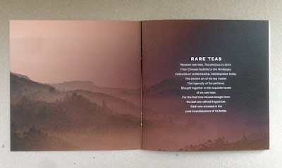
This new collection of colognes is a first in perfumery. Made using fragrance from ultra rare teas grown in the foothills of China to the Himalayas. The ancient art of the tea master is combined with the ingenuity of the perfumer to create these new scents. There are six colognes based on different teas - delicately floral Silver Needle Tea, sparkling and sweet Darjeeling Tea, herbaceous green Jade Leaf Tea, rich and earthy Oolong Tea, deeply seductive Midnight Black Tea and spicy Golden Needle Tea.

This is the promotional brochure produced by Jo Malone. Size is 150mm square and is saddle stitched.

The 4pp cover is on Omnia 280gsm with 12pp text on Omnia 150gsm. The reason that Omnia was chosen is because it would work with the rich detail that is present in the images but that would give a natural look and tactile feel.
Click on images to enlarge
It is printed offset litho in four colour process (CMYK) and as you can see from images, some of the photography is quite dark, but there is no loss of detail, which is what can often happen printing on an uncoated paper, which is why the Omnia was chosen.
Click on images to enlarge
The image below shows the outside back cover printed in solid black and as you can see, the solid looks great...
The image below shows the detail and the way the glass and fine detail has reproduced.
Art direction and design is by the Jo Malone design team. Superb repro, print and finishing is by CPI Colour with Mark Pitman handling the project.

http://www.jomalone.co.uk/rareteas
http://www.cpicolour.co.uk/
 Posted by Justin Hobson 10.05.2017

Tuesday 29 March 2016

8 Lloyd's Avenue

I've written many posts on this blog which includes the phrase "...just the cover makes the difference!" The cover on this property brochure certainly does - it's simply a stunning piece of design with amazing hot foil blocking.  
The size of the brochure is A4, portrait and has a 4pp cover with a 12pp text. The cover is hot foil blocked in metallic gold foil and white matt foil. The cover is produced on our Notturno 450gsm and the text pages printed offset litho in four colour process on 'house silk' 200gsm
Click on images to enlarge
For those not familiar with the Notturno range, it is a range of black papers and boards from Cordenons. The range has a wide range of substances 90, 110, 140, 170, 200, 250, 300, 350, 390, 450 and 700gsm - a pretty big range!

A lovely finishing touch is the use of brass wire stitches
Print and the superb hot foil blocking is by CPI Colour. It's worth noting that CPI have their own 'in house' foiling facilities in Croydon, including their own blockmaking. 
Art direction and design is by London design studio Cre8te. Print is by CPI Colour with James Lager handling the project.
www.8lloydsavenue.London
http://www.cre8tedesignuk.com/
http://www.cpicolour.uk/
Posted by Justin Hobson 29.03.2016

Friday 4 March 2016

Grosvenor in Mayfair

33 Grosvenor Street is a period townhouse reimagined as a headquarters building. The building’s contemporary new Grade A office accommodation is joined with listed period space to provide an a business environment in one of London’s most prestigious addresses, Mayfair. The building is situated on the north side of the street between Grosvenor Square and Davies Street.

This luxuriously presented brochure conveys all the attributes of the building is a tactile and engaging way. The size of the brochure is 285x216mm, portrait and comes wrapped in printed tissue, affixed with a label.  
The 4pp cover is hot foil blocked on sandgrain embossed, dark grey 350gsm coverboard, from the other "Hull based" paper merchant!
The construction is actually quite unusual. The text is 'singer sewn' and, because there is a translucent flysheet on tracing paper, the flysheet is affixed to the back of the text and then the back of the flysheet is then affixed to the inside back page of the cover. A good solution allowing the text to sit nice and flat.
Click on images to enlarge

The 32pp text is printed on Omnia 150gsm and is simply sumptuous. The text is printed offset litho in four colour process plus a 'special' colour which is a dark grey. The dark grey solid is grey and very solid - just right. Omnia was selected because it would work with the rich detail that is present in the images of the interiors but that would still give a natural look and tactile feel. As you can see from images, some of the photography has dark areas, but there is no loss of detail, which often happens when printing on a traditional uncoated paper.
Detail showing printed solid
The interiors look fantastic - the classical meeting the contemporary.
...and this is something that sometimes people miss - text on it's own (below) just looks, and feels, good printed on Omnia. The type stays sharp and the black looks very black.
Art direction and design is by London design studio Cre8te. The excellent repro, print and finishing is by CPI Colour with James Lager handling the project (inspire@cpicolour.co.uk)

http://www.33grosvenorstreet.com/
http://www.cre8tedesignuk.com/
http://www.cpicolour.uk/
Posted by Justin Hobson 04.03.2016

Thursday 28 January 2016

Mulberry Christmas

Inspired by the cool of the city and the craft of the countryside, Mulberry is known for its classic fashion sense and strong links to British craft and design. Founded in 1971 in Somerset, England, the brand is globally recognised for its signature natural leathers and English design influences. Mulberry has Design Headquarters in London, and two flagship factories in Somerset, close to the Roman city of Bath. Mulberry goes from strength to strength, creating an international reputation for super-desirable products with a playful English sense of eccentricity and quality.

This is the outstanding piece of literature produced for the Mulberry Christmas promotion.
The finished size is 224x160mm and is printed offset litho in CMYK with hot foil blocking in metallic gold foil.
This project is a strange format to describe, so I hope this birds eye picture will help. The cover is 6pp plus a pocket on the inside back cover. The text is a 10pp concertina, the end page of which is inserted into the pocket
Below image shows inside front cover (which is a flap) and page 1 of text on right hand side
...the next image (below) shows the flap open, revealing the image of the small 'clipper' bag in black:
More birds eye images to help explain the format...
The images below, shows the concertina text, fully extended
Click on images to enlarge
The paper used throughout is our lovely Omnia text and cover range - 320gsm for the cover and 150gsm for the text. As you can see from the images, there are many metallic tones together with deep colours and dark shades - lots of heavy ink coverage going down and it looks great on the Omnia, reproducing the metallic in the images amazingly and those bright vibrant colours, whilst retaining detail in the dark areas as shown in the image below. Flat, matt and tactile. 
The hot foil blocking is inspired and it endorses the quality of the brand.
The sublime art direction and design is by Mulberry. Designers on the project are Jack Foreman and Tom Speirs. The truly exceptional repro, print and hot foil blocking (in four languages!) is by CPI Colour with James Lager handling the project (inspire@cpicolour.co.uk)

http://www.mulberry.com/
www.cpicolour.co.uk
Posted by Justin Hobson 28.01.2016

Monday 17 November 2014

Jo Malone - Michael Angove

Jo Malone is a London based company renowned for British bespoke fragrances for Women, Men and the Home. Michael Angove who specialises in refined highly detailed chinoiserie wallpaper has created exquisite, bespoke designs for Jo Malone London inspired by Blackberry & Bay and Orange Blossom. This is the literature for this limited edition home collection.
The 8pp, self cover, booklet is 150mm square and is saddle stitched. Reflecting the tactile, natural subject matter, the paper chosen is Modigliani Candido 260gsm - it is a feltmarked paper with a texture reminiscent of a watercolour paper.  
The reproduction of these softly rendered images on the Modigliani is just right, while the inside back spread (below) reflects the style of the brand packaging in a signature cream box with black corners - packaging which defines quality and an understated style.
Art direction and design is by the Jo Malone design team. Print production is by Mark Pitman at CPI Colour based in Croydon.

www.jomalone.co.uk
http://cpibooks.com/uk/commercial/
Posted by Justin Hobson 17.11.2014

Thursday 18 July 2013

The Lakes by yoo

This is a beautiful brochure for a luxury development of second homes. The Lakes is a private estate set amongst 650 acres of idyllic Cotswold countryside. The project is a joint venture between developer The Raven Group and property design experts yoo.
 
The Lakes is an gated community where nature and design work in harmony to provide the ultimate rural retreat and lifestyle and it was important that the brochure projected these values and assets.

The brochure size is 210x270mm, landscape and is perfect bound with a 48pp text printed on Omnia 150gsm.The striking commissioned photography has reproduced brilliantly on the Omnia whilst not losing the tactility and natural uncoated feel that was required. The look and feel is a confident piece of literature, not some "glossy property brochure"...
 
Art direction and design is by London based agency Bold & Bold. It is worth pointing out that this exquisite brochure was only part of this project. As well as the literature, there is the website and an extensive press and on-line advertising campaign which all tied together. Creative directors are Emily Bold and Phil Bold.
 
Printing is by CPI Colour.
 
www.thelakesbyyoo.com
www.boldandbold.com
www.cpicolour.co.uk
Posted by Justin Hobson 18.07.2013