Showing posts with label Casebound. Show all posts

Monday, 4 February 2019

Jobs from the past - Number 112

Regular followers of this blog will know that my first post of every month is a "job from the past" so that I can show some of the really good work from years gone by. This project is from the year 2000.

Traveller - Pictor.com
In the pre-internet age, if you wanted an image, you used to have to search through printed catalogues supplied by photo libraries. You would then either, phone, fax or even write a letter (!) ordering the transparency for which you would be charged. As digital technology developed, photo libraries were able to provide a larger volume of images on disc, but to promote the images from the library, they would often also send a book showing a selection of printed images. This is one such publication produced in the Summer of 2000, just at the time when the internet was enabling the exchange of digital files and at the time of the first dotcom boom.
It is an unusual format of 140x297mm, Landscape. It is section sewn and casebound with a 56pp text plus printed endpapers.
The images are of the highest quality and this publication is just to give a flavour of the bigger selection of images available on disk, so the first couple of pages show the areas in the world where the different sections have been shot...
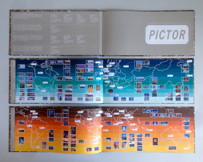
Click on images to enlarge
The text is printed on Neptune Unique FSC 135gsm and looks truly amazing! Neptune is smooth uncoated with a high white shade and the images have reproduced amazingly (in no small way, due to the printer as well). Printed offset litho in CMYK plus a special pantone color for the printed end papers. At this time, most stock photography catalogues were printed on coated papers, so that reproduction was ensured, but at this time, although image reproduction was important, it was also important to show how images might look in use and it was at a time when the use of quality uncoated papers was becoming more prevalent.
In those days there needed to be a disc included as file transfer over the internet was still to come, so as you can see below, a disc affixed on the inside back cover...
Image showing the thread of the section sewing...
Creative direction and design is by the in house team at Pictor. It seems that Pictor no longer exists as a picture library, but I guess the world of stock image photography has changed beyond all recognition since the millennium.

The excellent printing and binding was by Fulmar, based in Croydon, Surrey and this project was handled by Keith Marley. Fulmar was a printer founded in 1971 by Mike Taylor and was a forward thinking, successful and large print group. Mike Taylor sold Fulmar in 2006 to the CPI group and they are still printing in the same factory and still producing lovely work!

Keith Marley now runs his own printing consultancy: http://keithmarley.co.uk/

http://www.cpi-print.co.uk/
https://bapla.org.uk/
Posted by Justin Hobson 04.02.2019

Tuesday, 27 February 2018

Kingwood

Finchatton was founded in 2001 by founders Andrew Dunn and Alex Michelin. Their aim was to create the most exceptional homes in the world. They have since designed, managed and financed over 60 major development projects around the world, and completed over 75 private commissions.
 
Kingwood is a development of ten apartments in the heart of Knightsbridge, facing south over the gardens of Hans Place. The building has been completely rebuilt and immaculately designed by Finchatton. This wonderful book has been produced to show the development, the surrounding area and the wonderful interiors.
The size of the book is 345x245mm, portrait. It is case-bound and covered in a deep blue bookcloth which is hot foil blocked in metallic silver foil and beautifully debossed with a leaf design around the front and back cover.
The book begins with these lovely printed end-papers...
...followed by exterior images of the building:
The text is printed on our Omnia, White 150gsm throughout and is printed offset litho, beautifully.
The striking commissioned photography has reproduced brilliantly on the Omnia whilst not losing the tactility and natural uncoated feel that was required. The look and feel is a confident, beautifully crafted piece of literature, certainly not some "glossy property brochure"!
A cool grey solid is used throughout the book for the sections where the floorplans appear and these sections incorporate throw-outs...
...a throw-out to the right
...throw out to both right and left
The Omnia has worked brilliantly, in reproducing the exterior and interior photography.
As one might expect, the book is 'section sewn' and below you can see what a neat and tidy example this is:
The book has 86pp plus an additional six 'throw-outs'
The spine measures 15mm.
Birds eye view showing the ribbon and the section sewing plus you can see how many throw outs there are, but it has been very well bound, so it doesn't upset the balance of the book in the spine.
The excellent print, repro and finishing is by Gavin Martin Colournet, based in London.

https://www.finchatton.com/
http://www.gavinmartincolournet.co.uk/
Posted by Justin Hobson 27.02.2018

Tuesday, 5 September 2017

The Wardian

Wardian London is a residential-led development under construction on the Isle of Dogs, London from Eco World-Ballymore and designed by architect firm Glenn Howells. The scheme consists of two skyscrapers and groundworks were started in 2015. Upon completion, expected to be in 2019, Wardian London will be one of the tallest residential developments in London and the UK.

This property brochure is not really a brochure at all - it is an amazingly produced, sumptuous case-bound book.

The size of the book is 320x245mm, portrait. It is case-bound with an 18mm spine and the text is section sewn 
 
The introduction 'flysheet' is actually a series of flysheets or end-papers, setting the scene of this development where each apartment has it's own 'sky garden' and the emphasis is on plants and the seasons.
There are 8pp of these flysheets/end-papers in both the front and back and they are printed on our lovely Offenbach Bible 60gsm  - just look at the print result, it's truly amazing, just remember this is a 60gsm sheet of uncoated paper! ...it just feels beautiful.
The majority of this 126pp book is printed on our Omnia 120gsm.The reason that Omnia was chosen is because it would beautifully reproduce the photography with the rich greens of the gardens, solid colours and dark photography and most importantly feel special - with the reproduction that you would expect on a silk or gloss but with a natural tactile uncoated feel.
Click on images to enlarge
There are six chapters within the book. Each of the chapters is preceded by a 'tip in' featuring a pen and ink illustrations of the type of plants studied by Nathaniel Ward after whom the development is named.
The size of the 'tip in' is 230x162mm and printed on our Astralux 90gsm which is a 1 sided cast coated paper. The illustration is printed on the uncoated side with the credit being printed in one colour on the reverse (glossy) side.
Throughout the publication there are 14 half pages which are 162mm wide. The dividers highlight particular features of the development as you can see below...
Click on images to enlarge
The below image shows the half page titled 'Natural Fragrances'. As you can see the half pages sit in these wonderfully luxurious spreads without disruption, they enhance the experience for the reader.
 The book is printed Offset litho throughout in CMYK plus a metallic gold pantone 'special' ink. This is the other very good reason that Omnia was chosen for this project. On most traditional uncoated papers, metallic inks can look flat and gold can just look a bit brown, but as I hope the below image demonstrates, the metallic gold type really does look metallic on Omnia.

Another feature is the use of gloss UV varnish. Unlike most uncoated products, you can successfully gloss UV varnish on Omnia (with a single hit) and it works really well - as you can see in the below pic...
This is a very effective and subtle use of gloss UV varnish.
For the floorplans there is also a 'throw- out'. Printed solid black plus the metallic gold keylines and type.
Click on images to enlarge
The book is beautifully bound, section sewn and neat black headbands and a divider ribbon.
Click on images to enlarge
This is an exquisitely produced book which using a great choice of materials does convey all the special features and luxury that this development offers. Design is by Made Thought.

Print production is by Push based in London. The quality of reproduction on the different materials and the excellent binding and attention to detail has simply got to be seen to be believed, it is a truly stunning job.

I'm sure that you can tell from the way that I've written about this project that this really is a special piece of print - it's one of those rare projects where all those elements that go into producing a piece of literature (concept/design/illustration/photography/print/paper/finishing etc) come together and combine to produce the most superlative result.
http://www.push-print.com/
Posted by Justin Hobson 05.09.2017

Thursday, 6 July 2017

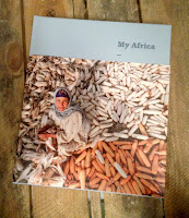
My Africa

This book called 'My Africa' is published by The Mo Ibrahim Foundation in celebration of the 10th anniversary of the charity. The book is a result of a competition run by the foundation where entries were submitted from all over the African continent from professional photographers, amateurs and students.

The charity was founded in 2006 with a focus on the critical importance of leadership and governance in Africa and was founded by Dr. Mo Ibrahim, a Sudanese philanthropist and businessman. As Mr Ibrahim says in the introduction "We were determined not to produce yet another impressive coffee table book, with beautiful pictures of Africa - there are already so many of these. Instead we wanted to see our continent and our future, through the eyes of our fellow citizens"

The end result is a superbly produced piece of print designed by
Maria Tsirodimitri and overseen by Pentagram in London.
The book is 275x230mm, portrait with a 27mm spine. It is casebound with a mid grey book-cloth over the cover. There is a two thirds height matt laminated 'dustjacket' around the cover.
Introduction pages....
The 192pp text of the book is printed on our Shiro Echo, White 160gsm. This paper is made from 100% recycled fibres and also has FSC Mix certification, made by Favini in Italy.
Click on images to enlarge
 

The paper is a neutral white shade which is perfect both because books really should not be bright white (high whites are great for advertising but not relaxing to look at and read) and the paper works very sympathetically with the images. 
It is not possible to truly demonstrate the quality of the images (which, don't forget, are from professionals, amateurs and students - and all Africans) but I also can't do justice to the quality of the printing, which is absolutely superb. I hope the image above and the detail image below demonstrates a little of what I mean.
Image by Marco Silva (Cabo Verde)
I would like to suggest that you follow this link where you can see all the images, which will look a lot better than what I can show here: http://mo.ibrahim.foundation/my-africa/
 
There are four sections in the book, each separated with a solid colour spread of which this is one. Superb printing of a solid made out of CMYK.
This also happen to be the middle of the sewn section, so you can see the thread running neatly down the spine...
Image showing the 27mm spine with the sections and the ribbon marker.
This book has really succeeded in being a 'coffee table book' however it's been achieved with content supplied by ordinary people, thoughtful design and exemplary print and binding - not just another glossy book about Africa, so I think Dr Ibrahim's aims has been achieved.

Design is by Maria Tsirodimitri. Pentagram in London oversaw the project (Domenic Lippa's team). The superb printing is by Leycol in London with Richard Davey handling the print.

http://mo.ibrahim.foundation/my-africa/
http://mo.ibrahim.foundation/
https://www.behance.net/mariatsirodimitri
http://www.pentagram.com/
http://www.leycol.com/
Posted by Justin Hobson 06.07.2017