Showing posts with label Neptune Unique FSC. Show all posts

Thursday, 22 June 2023

Today is World Rainforest Day

As today is World Rainforest Day what better day to have a 'Throwback Thursday' and show you this amazing job for the Rainforest Action Network produced in 2007...

 At This Rate is a printed publication produced to highlight the scale of the destruction of the world's rainforests.

Click on images to enlarge
Design is by Studio8, Matt Willey and Zoƫ Bather were designers on the project. The amazing photography is by Giles Revell.
Inside front cover spread


The size of the job is 220mm x160mm portrait and has an 8pp cover with a 24pp text.

The book forms a series of spreads which really show off the stunning photography of the skeletal leaves, which look so much like aerial views of cities and make the spreads very powerful. Below is "Every day we lose an area larger than all five boroughs of New York City"

As mentioned before, it is best described as an 8pp cover with a 24pp text, but the text is actually formed by a long concertina (with one join) and the 8pp cover, which has a 10mm capacity spine actually works as a "dustjacket" as you can see in the birdseye pic, below...

It was constructed like this for reasons of both economy and ecology! The whole job actually comes out of one B1 sheet of paper meaning that it was relatively economical from a printing point of view and it was also not wasteful which is in line with the clients aims and objectives.

On the reverse of the long concertina, which is hidden from view, is an image taken around the outside trunk of a tree from a tropical rainforest...

It is quite simply a stunning job both from the concept, design, photography, format, printing and finishing. It deservedly won 2008 DesignWeek award for Editorial Design.

The images were offset litho printed as a Tritone with a high density black ink. The repro and superb print is by Granite, who have since gone bust. The material choice is Neptune Unique FSC 200gsm which not only printed fantastically but was also the environmental choice by having Forestry Stewardship Council certification, which was more unusual for fine papers in those days.

Posted by Justin Hobson 22.06.2023

Thursday, 2 March 2023

Jobs from the past - Number 160

Regular followers of this blog will know that my first post of every month is a "job from the past" so that I can show some of the really good work from years gone by and this one is from 2013...
 
ITV Studios is the UK's biggest production and distribution company, making distributing and selling over 40,000 hours of television around the globe. The worldwide business is growing fast and
they now have studios in London, Paris, Stockholm, Cologne, New York, Los Angeles, Sydney and Hong Kong together with partners in other regions

ITV Studios don't just make TV shows for ITV, they make them for a wide variety of broadcasters including the BBC, Channel 4, Sky etc.
 
This brochure shows the wide diversity of formats and programmes that they are responsible for, showing images and emphasising the company's capabilities.  
Size is 220x170mm, portrait. it has a 4pp cover with 96pp text and is section sewn. The cover (above) is matt laminated with a sticker which has been applied by hand.
The material used is our Neptune Unique FSC, which is a VERY high white, smooth uncoated paper which reproduces colour fabulously (well I would say that!). Cover is 350gsm, text 160gsm. An uncoated material, gives the publication an engaging 'booky' feel and given the variety of source material, makes the images work together well, whether commissioned photography is sitting next to a screen grab, it has a consistency in look and feel. Printed offset litho in CMYK with a special grey (on the cover).
Flap on inside back cover, with multiple creases, to take subsidiary literature.
Creative direction and design for this and all ITV Studios new marketing collateral and events is by Theobald Fox. Creative Director is Pete Owen. Production and project management is by Sam Stocking. Print is by Principal Colour - just worth pointing out that with some large solids, some tricky CMYK images, they've made a cracking job of this project.

https://www.itvstudios.com/
https://theobaldfox.com/
www.principalcolour.co.uk
Posted by Justin Hobson 02.03.2023

Monday, 4 February 2019

Jobs from the past - Number 112

Regular followers of this blog will know that my first post of every month is a "job from the past" so that I can show some of the really good work from years gone by. This project is from the year 2000.

Traveller - Pictor.com
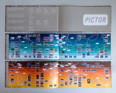
In the pre-internet age, if you wanted an image, you used to have to search through printed catalogues supplied by photo libraries. You would then either, phone, fax or even write a letter (!) ordering the transparency for which you would be charged. As digital technology developed, photo libraries were able to provide a larger volume of images on disc, but to promote the images from the library, they would often also send a book showing a selection of printed images. This is one such publication produced in the Summer of 2000, just at the time when the internet was enabling the exchange of digital files and at the time of the first dotcom boom.
It is an unusual format of 140x297mm, Landscape. It is section sewn and casebound with a 56pp text plus printed endpapers.
The images are of the highest quality and this publication is just to give a flavour of the bigger selection of images available on disk, so the first couple of pages show the areas in the world where the different sections have been shot...
Click on images to enlarge
The text is printed on Neptune Unique FSC 135gsm and looks truly amazing! Neptune is smooth uncoated with a high white shade and the images have reproduced amazingly (in no small way, due to the printer as well). Printed offset litho in CMYK plus a special pantone color for the printed end papers. At this time, most stock photography catalogues were printed on coated papers, so that reproduction was ensured, but at this time, although image reproduction was important, it was also important to show how images might look in use and it was at a time when the use of quality uncoated papers was becoming more prevalent.
In those days there needed to be a disc included as file transfer over the internet was still to come, so as you can see below, a disc affixed on the inside back cover...
Image showing the thread of the section sewing...
Creative direction and design is by the in house team at Pictor. It seems that Pictor no longer exists as a picture library, but I guess the world of stock image photography has changed beyond all recognition since the millennium.

The excellent printing and binding was by Fulmar, based in Croydon, Surrey and this project was handled by Keith Marley. Fulmar was a printer founded in 1971 by Mike Taylor and was a forward thinking, successful and large print group. Mike Taylor sold Fulmar in 2006 to the CPI group and they are still printing in the same factory and still producing lovely work!

Keith Marley now runs his own printing consultancy: http://keithmarley.co.uk/

http://www.cpi-print.co.uk/
https://bapla.org.uk/
Posted by Justin Hobson 04.02.2019

Tuesday, 13 September 2011

CN Originals

This is an interesting job which is effectively a look book for Cartoon Network’s Originals, which highlights how brands can licence and apply the crazy original characters to create retro merchandise with attitude. So the items displayed are not available, it's setting the look and feel of possibilities.
The book is 280x195mm, portrait. Binding is "singer sewn" with yellow thread. 4pp cover on our Neptune Unique FSC 250gsm and 28pp text on Neptune Unique FSC 120gsm

The designs incorporate Cartoon Network characters - Samurai Jack, Johnny Bravo and friends and the characters are used on everything from clothing to mugs, pictures, cereal bowls etc.

The book is encased in a bespoke yellow envelope with a lovely "disc and string" closure - lovely! - see pic below. The piece was commissioned to be used at the International Licensing Expo in Las Vegas.
For those that aren't familiar with the term "disc and string" - here, goes!
Basically, it's a fairly self explanitory term. A pair of small discs of board - in this case the same material that the envelope is made from (so it's colour coordinated) is cut out and riveted onto the envelope. A piece of thin string (in this case black) is then riveted/glued under one of the discs. The string is then wound in a figure of eight pattern around the discs. It's a lovely idea and solves the problem of permanently sealing with glue, an envelope which may need to be re-opened several times.
Design and Art Direction is by CRUSH based in Brighton. Print production is by Print-Source, who it's worth pointing out, made a superb job of the "disc and string" envelopes
Posted by Justin Hobson 13.09.2011

Monday, 1 February 2010

Jobs from the Past - Number 5

Regular followers will know that my first post of every month is a "job from the past" (see posts on 01.10.2009, 01.11.2009 & 01.12.2009 etc etc.) so that I can show some of the memorable jobs from times past, and here's one from back in 2007.

At this Rate - awareness campaign
This job is for the Rainforest Action Network. The purpose of the publication is to highlight the scale of the destruction of the world's rainforests. Design is by Studio8, Matt Willey and Zoƫ Bather were designers on the project. The amazing photography is by Giles Revell.

The size of the job is 220mm x160mm portrait and is best described as an 8pp cover with a 24pp text. The text is actually formed by a long concertina (with one join) and the 8pp cover, which has a 10mm capacity spine actually works as a "dustjacket". It was constructed like this for reasons of both economy and ecology! The whole job actually comes out of one B1 sheet of paper meaning that it was relatively economical from a printing point of view and it was also not wasteful which is in line with the clients aims and objectives.

The book forms a series of spreads which really show off the stunning photography and make the spreads very powerful. Below is "Every day we lose an area larger than all five boroughs of New York City" It is quite simply a stunning job both from the concept, design, photography, format, printing and finishing. It deservedly won 2008 DesignWeek award for Editorial Design. Thumbnail of the entire job is below:

The photography was printed as a Tritone with a high density black ink. The repro and superb print is by Granite. The material choice is Neptune Unique FSC 200gsm which not only printed fantastically but was also the environmental choice by having Forestry Stewardship Council certification.

I do still have a few copies available so if you would like one, send me an e-mail and I'll see what I can do!
http://www.ran.org/
http://www.studio8design.co.uk/
http://www.gilesrevell.com/
http://www.granitecolour.com/