Jaguar is a purpose-led organisation and their purpose is to excite the senses. This superb publication commissioned by the Jaguar PR and press department is to convey this purpose. This piece of literature embodies all the core values that Jaguar stands for and is produced to a very high specification.
The size of the publication is 165x240mm, landscape. The outside cover is case-bound using a combination of a soft touch covering material and 'quarter bound' in black book-cloth. The front cover is hot foil blocked in a gloss black foil.
The binding is what is generally called "swiss-bound", so the text is mounted onto the inside back cover with the front cover and freestanding spine. The below image shows the inside front cover, inside spine and page one of text.
However, what is unusual about the binding is that the text is section sewn but left as what I describe as "open-bound" with the sections being held together with just thread and a very small amount of glue.
 |
| Click on images to enlarge |
One of the things about this project which is so exciting is the use of different materials. The introduction is an 8pp section printed on Offenbach Bible 60gsm - which is printed sensationally with an amazing image ...the alloy wheel below:
...and below you can see the way the very lightweight Offenbach Bible flops and flows:
The majority of text is printed on our Omnia 120gsm. The majority of pages are printed in a solid black, which looks wonderful on the Omnia.
 |
| Click on images to enlarge |
...but to keep the reader stimulated there are eight "tip- ins" 140x110mm, which are printed on our Astralux 1 sided 90gsm, which is high gloss one side and an uncoated reverse.
The below image shows the way the uncoated and coated combination of the Astralux works really well.
Many of the spreads are also vibrant colours or solids which all work equally well on the Omnia.
The publication is printed offset litho throughout and there is also gloss UV which runs throughout the book. Unlike most uncoated products, you can successfully gloss UV varnish on Omnia (with a single hit) and it works really well - as you can see in the below pic...
 |
| Click on images to enlarge |
Another luxurious touch is the use of coloured thread for the section sewing:
Concept, art direction and design of the publication is by
Brand Union.
This is an exquisitely produced book which using a great choice of materials does "excite the senses". The project is printed offset litho throughout. Print is by
CPI Colour with Alan Gillespie handling the project.
https://www.jaguar.co.uk/index.html
Posted by Justin Hobson 27.07.2017


 In September 2014 the British Museum staged a major exhibition in the new Sainsbury Exhibitions Gallery on a golden age in China’s history. The exhibition explored the years 1400 – 1450, a pivotal 50 year period that transformed China during the rule of the Ming dynasty. The exhibition included rare loans of some of the finest objects ever made in China, shedding light on this important part of world history that is little known in Europe. China’s internal transformation and connections with the rest of the world led to a flourishing of creativity from what was, at the time, the only global superpower.
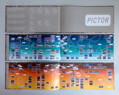
 In the pre-internet age, if you wanted an image, you used to have to search through printed catalogues supplied by photo libraries. You would then either, phone, fax or even write a letter (!) ordering the transparency for which you would be charged. As digital technology developed, photo libraries were able to provide a larger volume of images on disc, but to promote the images from the library, they would often also send a book showing a selection of printed images. This is one such publication produced in the Summer of 2000, just at the time when the internet was enabling the exchange of digital files and at the time of the first dotcom boom.
 Jo Malone and husband Gary opened their first store in Walton Street, London in 1994. Since then Jo Malone London has become a name internationally synonymous with all that is most coveted in British style. In 1999, the company was acquired by the Estée Lauder group ensuring investment and a truly global outlook. In November 2001, Jo Malone Express – a bespoke delivery service for sending gifts worldwide was introduced. and this was one of the pieces of collateral used to promote the service.


 Beau House contains eight luxury appartments situated in Jermyn Street in London's west end. Developed by Dukelease, the Architects are Brimelow McSweeney with interiors by Oliver Burns. This book is for the Brummell Penthouse, so named after the Regency dandy Beau Brummell. This magnificent publication has a casebound cover. The size is 320x245mm, portrait.


 Jaguar is a purpose-led organisation and their purpose is to excite the senses. This superb publication commissioned by the Jaguar PR and press department is to convey this purpose. This piece of literature embodies all the core values that Jaguar stands for and is produced to a very high specification.


