Showing posts with label Omnia. Show all posts

Wednesday 3 May 2023

Jobs from the past - Number 162

Regular followers of this blog will know that my first post of every month is a "job from the past" so that I can show some of the really good work from years gone by and this one is from 2015...

Spring/Summer 2015 - The Tokyo Collection

Olivia von Halle is a British luxury nightwear brand that launched at London Fashion Week in September 2011. The brand can be found in nearly 100 stores in 20 countries including Harrods, Selfridges, Neiman Marcus, Saks Fifth Avenue and online with Net-a-Porter.com.

Focusing on beautifully cut silk pyjamas in stunning exclusive prints, Olivia von Halle has quickly made a name for itself in the world of high-end nightwear. In 2013 the company was awarded the ‘Blue Butterfly Trust Mark’, which is given to brands and companies that have a positive impact on people and the planet.
The publication is sub A4 - 290x205mm, portrait. It has a 4pp cover on Omnia 200gsm and a 16pp text on Omnia 150gsm and is 3 hole sewn.
Unlike many of the fashion lookbooks featured on this blog, which are printed offset litho, this has been digitally printed on an HP Indigo press. The colours are strong and punchy and the whole publication has a matt, tactile look and feel - in fact I can honestly say, every bit as good as litho!
Although Omnia was never originally developed for digital, we now keep it as a stock item with "sapphire treatment". This treatment is often applied to more unusual papers and provides a "key" so that the inks (which are different to litho inks) work on the paper surface. The great thing is the job just doesn't look and feel like a digital job.

These pictures show the binding which is particularly worthy of note. This type of binding is generally known as 'three hole sewn' - because there are three holes! I wrote about the process on this post here: http://justinsamazingworldatfennerpaper.blogspot.co.uk/2014/07/what-is-3-hole-sewn.html

Where the binding on this particular project differs from the three hole sewing that I described in my post is both in the distance between the holes and the fact that this is knotted on the outside - on the spine.

The thread runs 130mm from hole to hole (260mm in total). It's the first time I've seen this and it works superbly.
Art direction is by Tiffany Goody at Erotyka and photography is by Takuya Uchiyama. Graphic design is by Michael Knight, who runs his studio in East London called A New Mark. Print and finishing is by Gavin Martin.
https://oliviavonhalle.com/
https://anewmark.com/
https://www.gavinmartin.co.uk/
Posted by Justin Hobson 03.05.2023

Monday 24 April 2023

Zollanvari International

Zollanvari carpets embody the spirit of carpet design and weaving – an extraordinary art form that has been treasured across the world for more than 2,000 years. The story of Zollanvari began in 1947, when Gholamreza Zollanvari joined his father’s carpet business, a legacy that had been handed down from his great grandfather. In 1985 Gholamreza’s son Reza established the company in Zurich to directly access the European market and established the Zollanvari name as a global trail-blazer in creating carpet art.

This wonderful catalogue tells the story, explains the types of carpet showing the range and possibilities.
Size of the catalogue is 274x173mm, portrait and is 'singer sewn'. There is a 4pp cover and a 36pp text. It is printed throughout on Omnia 280gsm and 150gsm which gives the publication a tactile uncoated feel but with a great print result.
The publication is digitally printed by Identity Print. It was printed on their Ricoh digital press (dry toner) and the result is exceptional. The great thing is the job just doesn't look and feel like a digital job, which is mainly down to the choice of substrate.
Click on images to enlarge
The images have reproduced superbly and are totally lush and even the flat solid grey/brown looks flat and even, which can sometimes be a problem printing digitally.
The colour is so vibrant and works brilliantly on the Omnia as you can see in the detail image below...
Click on images to enlarge
Above is the centre spread. This catalogue is singer sewn, so you can see the way the thread runs along the inside of the spine - see detail image below...
...and on the outside of the spine below.
Printing is by Identity Print with Paul Martin handling the project. Finishing and singer sewing is by Wayte Binding in Tunbridge Wells who are part of the Identity Print group, so they are are one of the few print companies with their own bindery.  

Posted by Justin Hobson 24.04.2023

Thursday 9 February 2023

Matt Russell Photographer

Matt Russell is a London-based photographer specialising in food, travel, lifestyle and portraiture. With a strong reputation for his natural style and ability to capture life, Matt has established himself internationally as a trusted, reputable photographer. He has an inherent ability to work closely with clients to achieve their vision for both editorial and advertising.
“I absolutely love my job and the places that it takes me, not to mention the amazingly talented and passionate people that I get to work with everyday. I feel incredibly privileged.”
This 40pp portfolio shows Matt's wide ranging photography skills in one superbly produced package. The size is 285x225mm (a good economical size out of a B1 sheet)
Click on images to enlarge
It has a 40pp text printed on our Omnia 120gsm. For those readers not familiar with Omnia, it is an uncoated paper with a surface treatment. What this means is that it feels like an uncoated paper but because the surface treatment minimises 'dot-gain', the print result is much more like that of a coated silk or gloss coated paper.
Centre spread...
There are so many good images here which look so good, that it's hard not to show you every spread!
The publication is printed offset litho throughout in CMYK. As you can see from images, some of the images are quite dark, but there is no loss of detail, which is what can often happen printing on a true uncoated paper. As you can see from the detail image below, the reproduction is simply stunning.
The brochure is saddle stitched and even though Omnia is a very bulky paper, even with 40pp the spine looks good and doesn't "gape" in the middle, as you can see below.
Another lovely feature is the use of copper wire stitches. Just another lovely touch which makes this publication superb
Design is by Sandra Zellmer. Printing is by Ambrose Press. Jonathan Savory handled the project. Particular care has been taken over the repro - as with all projects for photographers, there is detail in the images which can only be truly appreciated by the photographer and it is the skill of the printer to be able to listen and interpret these comments in the finished printed job. Not always easy to do but this is a beautiful piece of printed literature.

https://mattrussell.co.uk
http://www.sandraswork.com/
http://www.ambrosepress.co.uk/
Posted by Justin Hobson 09.02.2023

Monday 9 January 2023

Jobs from the past - Number 158

Regular followers of this blog will know that my first post of every month is a "job from the past" so that I can show some of the really good work from years gone by and this one is from 2015...

This is the season's promotional literature for Wrangler’s Spring Summer 2015 collection for women. Live in Denim is Wrangler’s new collection for women which incorporates Shape Keeper jeans using Lycra® and dualFX® to create stretch denim and silk soft jeans which achieves it's delicate touch through Cotton-Tencel® denim blends.

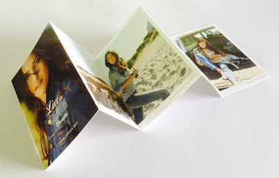
This 10pp concertina brochure is 190x135mm, expanding to 190x675mm. It is printed in CMYK offset litho on our Omnia, White FSC 320gsm and is printed and finished beautifully.

Front cover, below:

Birds eye view...

Click on images to enlarge

Although this is a simple publication, it's often the simple jobs which don't get the attention to detail. This is well creased and folded square which is just perfect.

Omnia was chosen because it would work with the rich detail that is present in the images but that would still give a natural look and tactile feel. As you can see from images, some of the photography is quite dark, but there is no loss of detail, which is what can often happen printing on an uncoated paper - fleshtones look superb!

Art direction and design is by JJ Marshall Associates. Creative Director is Jethro Marshall and thanks to Jethro for sending file copies and a note...

Excellent print and finishing is by Principal Colour based in Paddock Wood, Kent.

http://www.principalcolour.co.uk/
Posted by Justin Hobson .09.01.2023

Wednesday 7 December 2022

Hawkins Brown Literature

This is a suite of brochures for Hawkins Brown, an internationally-renowned award winning practice of over 200 architects, interior designers, urban designers and researchers. Design is by Shoreditch based studio, Huddle.

The size of the publication is 310x230mm, portrait and is saddle stitched. It has a 4pp cover on 280gsm and a 28pp text on 120gsm, all printed on our Omnia. As you can see from the image above, it looks like there are four separate brochures, however they are all the same brochure, just featuring different covers ...and this is what Huddle say about the covers:
"The covers of the new practice brochures break with convention by featuring ‘abstract’ close-ups of structural elements of Hawkins\Brown projects, reflecting how the practice does things differently. And because each brochure’s colour picks up on a colour from its image, the secondary colour palette is in effect infinite, yet is a flexible, coherent and distinctive asset for the practice."
Click on images to enlarge
As you can see from the above images above and below, inside there are lots of colour images and solids throughout - and it just looks (and feels!) just beautiful on the Omnia - no mottle - just gorgeously even, solid areas. The four colour images look amazingly detailed and vibrant.
Click on images to enlarge
Of course, the solid colours used on the front covers, wrap around to the back cover giving a satisfying display of rich tones.
Creative Director is Louise Desborough. Lead designer on the project is Tom Ward, together with Mike Bone and the account handler is Nicole Posner. The superlative print is by Leycol handled by Richard Davey.


Posted by Justin Hobson 07.12.2022