Showing posts with label StarFine. Show all posts

Friday 12 July 2019

Villa Saletta 980AD

Villa Saletta is a 1,760-acre estate in the heart of Tuscany, featuring an historic borgo, three luxurious holiday villas and a boutique winery. The estate was purchased by British investor, Guy Hands around 15 years ago and a great investment has been made in the vineyard.

This promotional booklet is an introduction to the winemaking on the estate and the 2015 vintage.
The size is 170x100mm portrait, with a 4pp cover and an 8pp text. The cover is hot foil blocked in gold metallic foil and the text is digitally printed using an HP Indigo press.
Click on images to enlarge
The paper used is our StarFine Natural White 150gsm. This uncoated paper is a subtle, neutral, white which perfectly suits the imagery and typography in the publication. The images have reproduced superbly, as you can see from the vibrant indigo blue shirt below.
...another nice touch, which is worth noting is the use of copper wire for the stitches which works well with the gold foiled cover.
Printing and production is by Stuart Van Den Bergh at Intaglio Communications who are based in London.

https://www.villasaletta.com/
http://www.intaglioltd.co.uk/
Posted by Justin Hobson 12.07.2019

Friday 26 April 2019

De La Warr Pavilion Events Guide

This is the latest events guide for the De La Warr Pavilion. The De La Warr pavilion is on the seafront in Bexhill in Sussex and is an iconic modernist building by the architects Erich Mendelsohn and Serge Chermayeff which opened in 1936. Following a major renovation in 2005, the pavilion hosts many shows, exhibitions and cultural events.
The finished size is 210x111mm, folding out to 420x553mm and is a 20pp concertina letter fold. Side view.... 
Click on images to enlarge
Below image shows the concertina folding...
This guide is printed on our StarFine White 130gsm which means that rather than feeling like the vast majority of mass produced leaflets printed on a bit of silk or gloss, this has real character and value. The design is such that the listings of the exhibitions, activities and events are all listed on one side (outside)
Click on images to enlarge
...with the inside being reserved for a full size image from the exhibition.
Lucy Orta , Procession Banners 1918-2018
The new De La Warr identity and design (including the website) is by Playne Design who have studios in London and Hastings. Creative Director is Clare Playne. Print production is handled by Simon Hack. You can read more about the creation of the new identity here:
https://playnedesign.co.uk/our-work/de-la-warr-pavilion/#branding-modernist-cultural-icon
 
The project is printed offset litho in CMYK by Empress Litho with Jason Maclaren handling the project - and my thanks to Jason for very kindly sending me some file copies.
http://www.playnedesign.co.uk/
https://www.empresslitho.com/
Posted by Justin Hobson 26.04.2019

Tuesday 23 October 2018

Villa Saletta

This is one of the most wonderful books to have appeared on this blog, it is quite simply stunning. Villa Saletta is a 1,760-acre estate in the heart of Tuscany, featuring an historic borgo, three luxurious holiday villas and a boutique winery. The estate was purchased by British investor, Guy Hands around 15 years ago and it is used both as a family holiday home and is also being developed with apartments and houses as a resort for Tuscany loving guests.

This superb case-bound book is bound in leather. The size of the book is 300mm square and has 284pp text pages given an overall spine thickness of 35mm.
The book which is subtitled 'History in the Making' is divided into seven chapters, explaining the history, the estate, the wine and produce and the vision for the future...
In the centre of the book there is a gatefold throw out showing a stunning panorama of the Italian countryside surrounding the Villa.
The one thing that has struck me about this publication is the space. It is unhurried and nothing is crammed in. Photography by Richard Waite is allowed the space to breath and it really makes the most of the wonderful images.
It is printed offset litho throughout in CMYK. The paper chosen is our StarFine, White 170gsm. StarFine is a quality, uncoated paper and as the images show, image reproduction is excellent. The solids chapter dividers, photographic images and the illustrations all look equally stunning - a great amount of detail for an uncoated paper.
One of the chapter divider spreads, the terracotta colour is made out of CMYK, not a solid special colour.
Image below shows the head and tail bands and the way the text moves. The edge of the book is gilt edged in gold.
The below image shows the thread in the centre of the 24pp sections...
Below image shows the ribbon marker and also the gilt edge binding.
The book is published by Terra Firma Holdings Ltd. Photography is by Richard Waite.

The truly stunning printing and production is by Stuart Van Den Bergh at Intaglio Communications who are based in London.

https://www.villasaletta.com/
http://www.intaglioltd.co.uk/
Posted by Justin Hobson 23.10.2018

Tuesday 14 August 2018

De La Warr Pavilion Events Guide

This is the latest events guide for the De La Warr Pavilion. The De La Warr pavilion is on the seafront in Bexhill in Sussex and is an iconic modernist building by the architects Erich Mendelsohn and Serge Chermayeff which opened in 1936. Following a major renovation in 2005, the pavilion hosts many shows, exhibitions and cultural events.
The finished size is 210x111mm, folding out to 420x553mm and is a 20pp concertina letter fold (I had to look that up!). Side view....
This guide is printed on our StarFine White 130gsm which means that rather than feeling like the vast majority of mass produced leaflets printed on a bit of 115gsm silk or gloss, this has real character and value. The design is such that the listings of the exhibitions, activities and events are all listed on one side (outside)
...with the inside being reserved for a full size image of the exhibition.
As you can see from the image above, it's very dark but has reproduced superbly on the StarFine 130gsm. The project is printed offset litho in CMYK by Banbury Litho.

The new De La Warr identity and design (including the website) is by Playne Design who have studios in London and Hastings. Creative Director is Clare Playne. Print production is handled by Simon Hack. You can read more about the creation of the new identity here:

https://www.dlwp.com/
http://www.playnedesign.co.uk/
http://www.banburylitho.co.uk/
Posted by Justin Hobson 14.08.2018

Tuesday 17 July 2018

ISTD Student Awards 2018
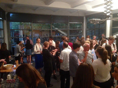
Last Friday, I was invited to  the International Society of Typographic Designers (ISTD) Student awards, hosted by Pentagram at their wonderful studio in Notting Hill. Pentagram partner, Sascha Lobe, presented the certificates to the successful students and tutors.

It was a beautiful summer evening, only slightly marred by a tropical deluge! This is the 90th anniversary year of the ISTD, so a special year for all concerned.
This presentation evening is for the main Student Assessment scheme held in the UK and Ireland. Students from Universities and Institutions around the UK and Ireland answered a number of briefs written by the ISTD's Education team. This is an international education scheme and the assessments for other regions of the globe are on-going.
As with all ISTD events it was a very warm and friendly occasion with beer, wine and nibbles all laid on, for well over a hundred guests. The evening began with an introduction by Jonathan Doney, the Chair of ISTD (below) who gave a brief re-cap of the society's history, founded 90 years ago by Vincent Steer Jonathan reminded us that the Student awards programme has been running continuously for 43 years! ...with programmes in six regions around the world.
The most recent Pentagram partner, Sascha Lobe gave a brief talk and presented all the certificates (printed on our StarFine) and also an excellent goody bag (sponsored by Cass Art). There were students from universities from all over the country and further afield, with one student from Canada!
Sascha Lobe, Pentagram partner
My thanks to the ISTD board for inviting me and as I have said many times on this blog before, it's very important to support organisations such as the ISTD and events such as this. A big thank you to all those members of the ISTD board and education committee who freely give their time for the benefit of others.

Thanks must also go to Pentagram and to Sascha Lobe. It is wonderful that a respected agency such as Pentagram freely gives their resources for such an event, it is inspirational for the students and is a great way for the partnership to give something back to education.
 
You can read more about it on the Pentagram newsfeed:
https://www.pentagram.com/news/istd-student-awards-2018

Posted by Justin Hobson 17.07.2018

Friday 23 March 2018

Working at RBB

RBB Economics is a specialist in the field of economics of competition law. Attracting and employing the best post-graduate level employees is essential to their business. This piece of literature is designed to inform and attract potential candidates to the business.
The size is A5, portrait and is saddle stitched with a 20pp text. This brochure cleverly works by neatly dividing itself into two, the introduction and Insights It is made around a 4pp cover with a flap on the inside back cover and the cover is cut 20mm short, the first 8pp of text is cut 10mm short and printed with a green band and the Insights section, which is printed solid grey is the full width of A5

This clever format enables the content to be separated, the more formal text of the introduction with the more informal 'insight' section with images and quotes. Very effective. The below image shows the short pages:
The cover is printed on our StarFine White 350gsm, which is an uncoated text and cover range. The cover is printed two specials (grey and green). Text is printed on our Marazion Ultra 135gsm and is printed in CMYK throughout Marazion Ultra was chosen because of it's matt flatness. Marazion Ultra is a simple but effective choice of materials. This project has a lovely engaging feel, the combination of uncoated and coated materials being just right.
Birdseye view showing the short cover, text and flap on inside back cover ....
The below image shows the card inserted in the flap at the back of the brochure showing the global locations. Also printed on StarFine White 350gsm.
Art direction and design is by Hatton Garden based consultancy, 400. Creative Director is Paul Dennis, designer on the project is Andrew Pitchford. Print and finishing is by Pureprint

www.rbbecon.com
www.400.co.uk
http://www.pureprint.com/
Posted by Justin Hobson 23.03.2018

Friday 10 November 2017

De La Warr Pavilion

Q: When is a leaflet, not a leaflet? ....A: When it's designed and produced like this one!
I just received some file copies of this lovely new guide for the De La Warr Pavilion and it just looks and feels great. The De La Warr pavilion is on the seafront in Bexhill on Sea in Sussex. It is an iconic modernist building by the architects Erich Mendelsohn and Serge Chermayeff which opened in 1936. The enlightened town council opened this new space which was to provide culture and entertainment for the masses – a people‘s palace. Following renovation in 2005, the pavilion hosts many shows, exhibitions and cultural events.

Ostensibly, this is a leaflet but this has been printed on our StarFine White 130gsm which means that rather than feeling like the vast majority of mass produced leaflets printed on a bit of 115gsm silk or gloss, this has real character and value. Equally the design and beautiful imagery, really work to make this feel anything but a leaflet!
The finished size is 210x111mm, folding out to 420x509mm. The design is such that the listings of the exhibitions, activities and events are all listed on one side (outside) with the inside being reserved for a full size image of the exhibition.

...and there's a really neat design feature here, which is that the last fold on the right hand side forms a 65mm wide short panel, as you can see in the below image: 
This short panel is used to print the text about the exhibition, which folds back to reveal just the image in all it's glory without any unwanted interference as you can see in the image below...
The exhibition is called "The way things are" and is by Roy Voss featuring a sculpture that stretches the length of the Pavilion's ground floor gallery space.

The below image shows both sides opened out flat:
The new De La Warr identity and design (including the website) is by Playne Design who have studios in London and Hastings. Creative Director is Clare Playne. Print production is handled by Simon Hack. You can read more about the creation of the new identity here:

This project is just an excellent example of a well thought out and well executed piece of print. Good consideration of the format, materials and printing processes is where this job scores most highly. It's not lavish or expensive and it's entirely appropriate for the client.

The project is printed offset litho in CMYK by Banbury Litho.

http://www.playnedesign.co.uk/
http://www.banburylitho.co.uk/
Posted by Justin Hobson 10.11.2017