Showing posts with label cmyk. Show all posts

Thursday 16 April 2020

Toast - The Making of a Pioneer

TOAST began with loungewear and nightwear, designed in a farmhouse in Wales. Founded by James and Jessica Seaton in 1997, the collections reflected a sense of ease and a slower, more thoughtful way of life.

Today, led by Suzie de Rohan Willner, TOAST creates and curates simple, functional, beautiful clothing and homeware. TOAST has shops throughout the UK and can be found in concept stores across the US and Europe. With studios in both London and Swansea, TOAST continues to design and develop all collections in-house and is proud to be one of the few fashion brands with its own full pattern room – lined with calico toiles and full of pins, papers, chalks and spools of thread, it is a true place of making.
This publication is their wonderful look-book for the AW19 collection titled The Making of a Pioneer and begins with this preface:
Click on images to enlarge
The look-book is A4 size (297x210mm) portrait, saddle stitched with a 90pp text and is printed offset litho in CMYK throughout. 
The superb photography of Jo Metson Scott appears throughout the publication...
The reproduction is excellent as you can see from the image below, you can even see the detail in the dark areas of CMYK
The 90pp text is printed on Shiro Echo, White 90gsm which is 100% recycled and FSC accredited and as you can see, it works just beautifully...
Throughout the publication there are essays, including this one about Eva Hesse written by Corinne Julius
Click on images to enlarge
...and an article titled Inside the Kew Herbarium written by Matt Collins, with photography by Kendal Noctor.
House and Home photography is by Noemie Reijnen.
It's hard to know where to stop, these spreads are just so good, the mono image (reproduced in CMYK) is superb.
The look-book flops and folds in the hand beautifully...
Creative Director is Luciana Newell, who's work has appeared on this blog before. Graphic designer is Mia Shurey. The excellent print and finishing is by Westdale Press, based in Cardiff.

A superbly produced publication; art direction, photography, design, writing and printing is all truly excellent.

http://www.westdale.co.uk/
http://www.jometsonscott.com/
Posted by Justin Hobson 16.04.2020

Monday 7 October 2019

The Shepherd’s Whistle

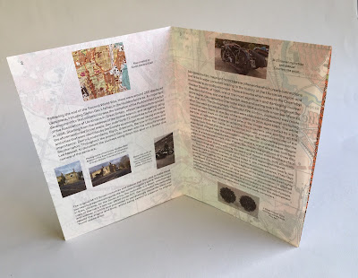
Earlier this year, the John Hansard Gallery, part of the University of Southampton presented an exhibition titled The Shepherd’s Whistle, a commissioned project by Stefan Gec. The exhibition centres around the artist’s fascination with top-secret maps of strategic cities worldwide that were created by Soviet intelligence during the Cold War, alongside an M-72 Soviet army motorbike and sidecar from 1957. Riding the M-72 and navigating using the Soviet maps, Gec journeyed to five UK towns and cities that were identified by the Soviets as having strategic importance.

This is the accompanying literature produced for the exhibition...
The size is A5, portrait and the format is an 8pp right angle fold.
Click on images to enlarge
The leaflet is printed offset litho on our Sixties, 60gsm ...and it works superbly as SIXTIES has the same type of translucency as a tracing paper - but it feels like a normal paper! … so it works perfectly for this publication, allowing the map to show through and provide the backdrop for the essay about the exhibition, written by Ros Carter. You can see the way the translucency works in the image below:
Front cover:
...opens to this spread
Open at full size:
Click on images to enlarge
This image shows the Soviet map which appears on the inside of the leaflet.
The publication is printed offset litho in CMYK and the colour reproduction on Sixties is excellent, as you can see in the image above.
Click on images to enlarge
The exhibition ran from February to April this year. Design is by Daly & Lyon who are a studio based in London that specialises in design for the arts. Printing is by Aldgate Press.

http://www.jhg.art/event-detail/374-stefan-gec-the-shepherd-s-whistle/
http://www.daly-lyon.co.uk/
http://www.aldgatepress.co.uk/
Posted by Justin Hobson 07.10.2019

Monday 4 February 2019

Jobs from the past - Number 112

Regular followers of this blog will know that my first post of every month is a "job from the past" so that I can show some of the really good work from years gone by. This project is from the year 2000.

Traveller - Pictor.com
In the pre-internet age, if you wanted an image, you used to have to search through printed catalogues supplied by photo libraries. You would then either, phone, fax or even write a letter (!) ordering the transparency for which you would be charged. As digital technology developed, photo libraries were able to provide a larger volume of images on disc, but to promote the images from the library, they would often also send a book showing a selection of printed images. This is one such publication produced in the Summer of 2000, just at the time when the internet was enabling the exchange of digital files and at the time of the first dotcom boom.
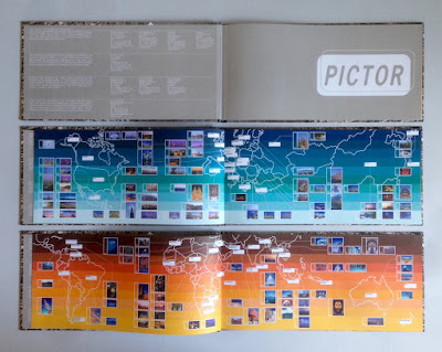
It is an unusual format of 140x297mm, Landscape. It is section sewn and casebound with a 56pp text plus printed endpapers.
The images are of the highest quality and this publication is just to give a flavour of the bigger selection of images available on disk, so the first couple of pages show the areas in the world where the different sections have been shot...
Click on images to enlarge
The text is printed on Neptune Unique FSC 135gsm and looks truly amazing! Neptune is smooth uncoated with a high white shade and the images have reproduced amazingly (in no small way, due to the printer as well). Printed offset litho in CMYK plus a special pantone color for the printed end papers. At this time, most stock photography catalogues were printed on coated papers, so that reproduction was ensured, but at this time, although image reproduction was important, it was also important to show how images might look in use and it was at a time when the use of quality uncoated papers was becoming more prevalent.
In those days there needed to be a disc included as file transfer over the internet was still to come, so as you can see below, a disc affixed on the inside back cover...
Image showing the thread of the section sewing...
Creative direction and design is by the in house team at Pictor. It seems that Pictor no longer exists as a picture library, but I guess the world of stock image photography has changed beyond all recognition since the millennium.

The excellent printing and binding was by Fulmar, based in Croydon, Surrey and this project was handled by Keith Marley. Fulmar was a printer founded in 1971 by Mike Taylor and was a forward thinking, successful and large print group. Mike Taylor sold Fulmar in 2006 to the CPI group and they are still printing in the same factory and still producing lovely work!

Keith Marley now runs his own printing consultancy: http://keithmarley.co.uk/

http://www.cpi-print.co.uk/
https://bapla.org.uk/
Posted by Justin Hobson 04.02.2019

Monday 10 December 2018

Hatch Interiors - Lyon Square

Hatch Interiors is a company which specialises in interiors and furniture for landlords and serves the rental market. London agency 400 to created the Hatch Interiors brand identity a few years ago and this piece of collateral is for a development in Harrow called Lyon Square.
The finished size is 210x118mm and the format is a 12pp roll fold, which folds out to 210x700mm. Hopefully you can see the way it works from the 'birds eye' picture below:
It is printed on our Marazion Ultra 170gsm, chosen because of it's good bulk and printability. At 170gsm it is around 190microns thick, which takes a crease really well but would still fold out well and not feel too rigid - there's always a danger with roll folds in particular that they become too clunky if the weight is too heavy.

It is printed offset litho in CMYK and hot foil blocked with a black gloss foil on the front cover.
To effectively demonstrate the way it works, the pictures below, show how it rolls out page by page...

Opening spread:
 ..folding out to
Click on images to enlarge
 Below shows it fully folded out to the 700mm width
 ...and the below image shows the reverse side:
For readers not familiar with Marazion Ultra, it's a fully coated paper but it really does have a dead flat MATT surface. There are many papers on the market which profess to be matt (and some which incorporate the word matt in the name, but aren't!) ...but this really is - and if you don't believe me, please ask for a sample!
 
You can see from the detail shot below, that the reproduction of the interiors is excellent:
Below is a detail showing the hot foil blocking in a gloss black foil on the front cover. 
Art direction and design is by Hatton Garden based consultancy, 400. Creative Director is Paul Dennis, designer on the project is Andrew Pitchford

Print and finishing is by Dylan Hughes at All About Print.

www.hatchinteriors.co.uk
www.400.co.uk
Posted by Justin Hobson 10.12.2018