Monday, 7 December 2009

The Drawbridge #15

Today, I received the latest edition of The Drawbridge. If you are familiar with this publication, then I imagine you'll stop reading now because you know how good it is and there won't be any point!

For those of you who haven't seen it, do try to see a copy as it really is a fantastic piece of work both from a content and design point of view.
I tried to describe what kind of publication it is but desperately struggled, so I've taken the cheats way out and lifted the following copy from the website: "The Drawbridge is an independent quarterly delivering thought, wit and reflection through words, photography and drawing. It is in turn critically nonsensical and radically serious. With each issue, authors and artists cast an unflinching look at a selected theme. The surprising combination of views and insights pays honest tribute to the progressive reader"
Contributors have included such luminaries as John Berger, J.G. Ballard, Tariq Ali, Umberto Eco, Tony Benn and the list goes on... The publication is edited by the lovely Bigna Pfenninger. It is widely available in creative/literary booksellers and I was in Tate Modern last week and noticed it's available in the bookshop there.
The Drawbridge takes the form of a full-colour newspaper and it is well written, superbly designed and fantastically printed. In particular the images used throughout are of the very highest quality. Design is by Creative Director, Stephen Coates who explores and experiments with the newspaper format with dramatic effect - the way that illustration and photography are combined makes the two media truly complimentary.
Cynics reading this may just think that I'm waxing lyrical about this job just because it's printed on our paper ...however I hope those people who actually know me will realise that whether or not this job was printed on our paper that I would still think this was a lovely piece of work anyway!

The Drawbridge is printed on our Redeem 100% Recycled 70gsm. The size is 288x396mm Portrait and it is a 24pp self cover, saddle stitched with two wires. Up until issue 13, it was a full "broadsheet" size of 578x395mm, 12pp self cover and unstitched (which is a format that I personally preferred). Print is by Push.
These are some of my favourite front covers from previous issues:

http://www.thedrawbridge.org.uk/

Saturday, 5 December 2009

Printer visits Fenner Paper!

Yesterday, we had a customer actually come to visit us! Marisa Ciccarello from printing company Push based in London, came to pay us a visit to see what a paper merchant does. Marisa is a recent graduate and has just started in a sales position at Push .

Apart from showing her our warehouse (... pretty boring stuff as it's just stacked with pallets and pallets of paper!) we also showed her our sample room where we make dummies and send out samples.

Marisa is pictured above behind an "invitation" to a private view for Per Una designed by Rare Creative printed on Flockage Colours which was one of the printed samples I was showing her in our office!

http://www.push-print.com/

Friday, 4 December 2009

Pre-Christmas Hello


I received this pre-christmas illustration from Rich Fairhead.

Have a look....

http://www.richfairhead.co.uk/

Thursday, 3 December 2009

Preen Spring/Summer 2010 Invitation

I've received copies of this lovely invitation for the launch of the PREEN Spring/Summer 2010 collection in New York.

Unfortunately it's a really hard job to photograph satisfactorily. The reasons being that it's printed on our lovely Offenbach Bible 50gsm and therefore has a light feel and "rattle" to it and there is a degree of show through which works really well, but is really hard to demonstrate in a photograph! It starts off as an A5 finished size...
Which folds out to reveal this A3 size invitation...
and below is the reverse side [the bottom right panel is the front of the invitation, as picture 1 at top]
Design by Studio Thomson. Printing is a simple (but very well executed) one colour litho and is by Xtraprint based in London EC2.

Tuesday, 1 December 2009

Jobs From The Past - Number 3

Regular followers will know that my first post of every month is a "job from the past" (see posts on 01.10.2009 & 01.11.2009), so that I can show some of the memorable jobs from times past, and here's one from back in 2002...

Towerscan "the realisation of the electrical energy that passes through an architectural space"It isn't often that I see pieces of work printed on paper which are genuinely three dimensional but this is certainly one of them.

This is a promotional piece for an "intervention project" by the artist Charles Quick. The exhibition in 2002, comprised of a photograph taken out of every window in the Art and Design block of the Leeds Metropolitan University building and this superb piece of literature certainly gets this idea across brilliantly.
Design is by Thompson Brand Partners based in Leeds. Creative directors Ian Thompson and Phil Dean worked on the project.
The job was recently written about in an article about 3D paper projects in Grafik magazine, from which I've lifted this quote from Ian Thompson "The budget was rubbish, of course, so we set ourselves the challenge of making this happen with one sheet of paper only. The solution was a single, folded piece of paper which had a pop-up building inside which could be viewed from inside and out - no gluing, just folds and a couple of cuts"
The finished size is 155x295mm (landscape). The Job was printed on Neptune Unique 250gsm. It was printed in four colour process plus a special grey and three of the large letters were foiled in a gloss black. Unfortunately I can't remember/find out who the printer was that did the job (unless anyone out there knows differently...) It is a great job and has always been popular to show, so as you can probably see from the pictures, my last file copy is on it's last legs!
At this time, I had a colleague called Gary Nightingale based in Leeds, working with me at Fenner Paper and he was actually the person that dealt with this project. He now works for himself under the name Packaging Formats (gary@packagingformats.co.uk).

It's also worth pointing out that Thompson Brand Partners still work with the artist Charles Quick which shows that relationships as well as excellent print jobs can stand the test of time!

http://www.thompsonbrandpartners.com/
http://www.uclan.ac.uk/ahss/creative_performing_arts/charles_quick.php
http://www.grafikmagazine.co.uk/

Saturday, 28 November 2009

Our visit to Favini.

This week we visited a paper mill in Italy called Favini. It was quite a "whistlestop" tour but Chris (Fenner) and I hadn't been there for many years and it was time to become re-acquainted.
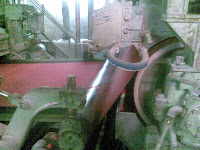
Favini is a group of two mills, one in Rossano (not far from Venice) and one at Crusinallo (pictured). They make a wide and varied range of products including uncoated text and cover papers, feltmarked papers, label papers and Cast Coated papers - many people will be familiar with the ASTRALUX brand of Cast coated papers ...well these are guys that make it!
As you can see from the pictures above, they were making red paper on the day we visited!
Favini have been developing some new products which will hopefully be introduced into the UK market next year. Chris Brown is the Sales and Marketing Director (pictured here) who was showing us around and I must also thank Antonella Agostini, Michele Posco and Caroline Wagner who looked after us very well and who made it a really interesting and enjoyable visit - thank you.

Friday, 27 November 2009

SWARA & CO

I've just picked up some copies of this lovely brochure for a new design agency set up by art director Kuchar Swara.

Drawing on a spectrum of talent including stylists, writers, strategists, Swara & Co is working with some of the best names around Europe.

The brochure is written in both English and Italian and is clearly aimed at customers who will identify with quality and art direction at the highest level.

The brochure is 16pp self cover, the size is 340x230mm portrait. It is printed on our Starfine, Natural White 150gsm (which, for those of you that are not familiar with this paper has a smooth feel and a neutral whiteness). A particularly nice touch is the use of black staples.

Here are some of the spreads....

The job was (very nicely) printed by Principal Colour.

www.swaraandco.com
http://www.principalcolour.co.uk/