Wednesday, 21 November 2012

Bentply

Bentply is a London based shop established by Bruna Naufal in 1989 specialising in 20th century, modernist furniture. This post is about a unique business card produced for Bentply, which also works as a promotional piece - it simply makes up into a cut-out miniature of the iconic 1934 bent plywood chair designed by Gerald Summers.

Now this is a project which began well over a year ago for me, when I was contacted by the designer Richard C. Evans, who explained what he was trying to achieve and was researching into materials and processes. I sent samples and we discussed various print finishing techniques that might make the idea work.
Now this project has already been featured on some design blogs, but as is common with other blogs, not much detail is written about the actual project (...they just show pretty pictures!)

After testing, Richard decided on our Flora Tabacco 240gsm which had the correct "woody" look and feel. As this wasn't a big budget project, Richard struggled to find a printer in the UK who could produce the project within the budget. Eventually he came across a letterpress printer called Elegante Press based in Lithuania. Now unlike some other paper companies, we're not afraid to pack paper up in a strong box and send it overseas! ...so that's exactly what we did. Elegante Press then triplexed the 240gsm board (echoing the properties of plywood) making 720gsm. The card is then letterpress printed in 2 colours and kiss-cut - just beautiful! Size of the card is 57mm x 136mm.
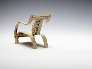
...and here's a close up pic:
I don't know what more I can add. A brilliant idea, perfectly excecuted and on the right material for the job!

www.bentply.com
www.elegantepress.com/
http://richardcevans.com/
Posted by Justin Hobson 21.11.2012

Tuesday, 20 November 2012

Monotype - Pencil to Pixel

I've only just found out about this amazing exhibition which is on this week. Titled ‘Pencil to Pixel’ the exhibition is only on this week (19th-23rd November) and features Monotype’s historic archive of original artwork, type drawings, equipment and publications - in fact, nearly everything to do with type design through the 20th century.
 
The exhibition is on display at Metropolitan Wharf in Wapping. On display is a selection of rarely seen drawings, artefacts, and publications ...and it's free!
 
Posted by Justin Hobson 20.11.2012

Friday, 16 November 2012

OKAY Studio


This is a job from a couple of years ago but it's not really old enough to be a "job from the past" and I've just received some good pictures of it so I thought I'd post it now!

OKAYstudio is a design collective, formed from a core of  RCA graduates (design products course) set up in 2006. Design duo, Cai and Kyn were commissioned to create a brochure for an exhibition, Under the Same Roof, held at London’s Aram Gallery. The work of OKAYstudio is really crafted and hand-made, so the brochure required the same feel.
Being self-funded, the budget was tight and the materials and format had to work within the financial constraints. The size of the brochure is 240x280mm, portrait, saddle stitched - economical out of a B1 sheet and it consists of a 4pp cover and a 48pp text. 
The cover was on our Colorset Solar 270gsm, hot foil blocked in gloss black foil (outside cover only, cover is otherwise unprinted) - in the designer's words "giving it a fancy look without the fancy cost". The text was printed in one colour, black, offset litho, on our Redeem 100% Recycled 70gsm. Images are all halftones - they look great and in no way makes this feel like an economy job - this is probably in no small way helped by the quality of the photography, by Luke Hayes.
This is simply one of the most impressive pieces of literature for the least amount of money that I have worked on in the past few years. No sponsorship was involved, no freebie paper, no deals done on the price - it just required thought and dedication. Print and finishing is by Kent based printer Zone Graphics.

www.okaystudio.org
www.thearamgallery.org
http://www.caiandkyn.co.uk/
Posted by Justin Hobson 16.11.2012

Thursday, 15 November 2012

GLUG Brighton


...whilst I was at St Brides on Friday (see below post) it was all happening in Brighton at an event called GLUG!

This is the ninth "Glug Brighton" event organised by Bighton based agencies, Crush and Agency Rush. Aimed at bringing creative types together for a few drinks and a natter it attracts all sorts, including animators, designers, illustrators and many others in the Brighton area.

It's not some dry business card swapping networking event - oooooh no! It's about like minded people hooking up, listening and seeing something really interesting and having a drink or two. With live art, talks by top creatives, interactive fun, pop up shops and more - sounds like a great way to spend a Friday night!

This event was an all female line up of speakers: Chrissie Macdonald (who I did a talk with at Gallery 71a in London last month), Margot Bowman and Modern Love (Sarah Arnett & Kim Hunt)

Chrissie Macdonald giving her talk
Live art was provided by Eleni Kalorkoti, Karolin Schnoor, Georgina Luck, Suzi Kemp and
Amy Harris.
There was also "live Screen-printing"!  by Parliament of Feathers, a local screen-printing company who teamed up with Séverin Millet who designed a limited edition print for the event which were given out for free on the night. The prints were produced on our Colorset (100% Recycled) 270gsm.

Anyway, sadly I couldn't be there but it certainly sounds like a great evening was had by all - thanks to Rosie for the pictures. So if you live/work in the Brighton area - sign up with meetup now and watch out for the next  GLUG!
www.meetup.com/glugbrighton/

GLUG events were founded in London and now happen at various locations. London events are organised with Studio Output and Made Studio, so look out there as well.

http://www.glugevents.com/talks/
http://parliamentoffeathers.co.uk/
http://www.studio-output.com/
http://www.madestudio.co.uk/
www.crushed.co.uk
Posted by Justin Hobson 15.11.2012

Tuesday, 13 November 2012

Letterpress: Something to Say

 
On Friday, I was lucky enough to go to the St Brides conference titled "Letterpress: Something to Say"

This one-day conference set out "to explore letterpress as a means for delivering real content, be that a set of sharply thought-through design intentions; a re-imagining of the possibilities of the inky process itself; an analogue springboard to new digital visuals and environments; or a reconnection with the power of a simple press to communicate ideas. To step beyond the production of work to be merely admired and consumed, and to reclaim letterpress as a viable means of distributing a message; to tell stories; to galvanize our communities; to allow practice to resonate beyond the frames of our living room walls"

Speakers included Thomas Gravemaker, Ian Gabb, Jono Lewarne & Charlotte Hetherington, L’automatica (Barcelona), Anthony Burrill, Dylan Kendle (Tomato) and Gee Vaucher plus a presentation on the 6x6 project which is a collaboration between staff and students from six colleges with active letterpress workshops (CSM, Brighton, Camberwell, Lincoln, LCC, and Glasgow)
Ian Gabb from the RCA (above) delivering his excellently "shambolic" talk (...his words, not mine!)

Workshop demonstrations were held throughout the day. Richard Lawrence was working on a very interesting linocutting project that he took the time to explain to me.
Helen Ingham from Hi-Artz Press www.hi-artz.co.uk was also in the workshop giving demonstrations and working on projects.

Below is my modest little table of printed examples that I took along to show our papers in action:
 ...and who should have the table next to me, but my industry colleagues from that other well known, Hull based, paper merchant! Mark and Vanessa were good company and we enjoyed the day together.
 As we were in a side room, this is the sign I wrote (...exhibiting no bias at all!)
It was an excellent day and most important of all, it was a sell out. This is the third one day conference that they have run, so the lesson here is book early, to avoid disappointment. Congratulations to the organisers, Catherine Dixon and Rose Gridneff and thanks to them for inviting me along.

http://www.stbride.org/
http://www.eyemagazine.com/blog/post/something-to-say
http://letterpressworkshop.com/
Posted by Justin Hobson 13.11.2012

Thursday, 8 November 2012

V&A 2011-2012


Pieces of print like this don't come along every day! This is the beautiful 2011/2012 Annual Review published by the V&A.  The museum celebrates it's highest attendance ever, at 2.88 million! ...so there's lots to celebrate. The report is divided into various sections combining the pictures and words about the collections and the life of the museum with a major section on the museum's Futureplan.
 
The cover is hot foil blocked in a white gloss pigmented foil on a Cool Grey 350gsm material from the well known, Hull based paper merchant!
With image reproduction being so important, it was essential that everything reproduced amazingly! The text chosen for the project is Omnia 150gsm because the print includes solid colours and images of exhibits - and it looks brilliant.
 
Size of the book is 200x265mm, portrait format, perfect bound. The 68pp text is printed in CMYK throughout - beautifully. Additionally, there are 4 tracing paper inserts as section dividers and an 8pp coloured section for the accounts.

Generation Press have written about it on their blog and they've also taken the time to show the foiling die used for the cover - very nice to see:
http://generationpress.co.uk/archives/3467

Design is by independent designer, Jo Glover. Photography is by David Short and the V&A photography studio.
 
Print, foiling and finishing is by Generation Press.
 
http://www.vam.ac.uk/
http://www.joglover.co.uk/
Posted by Justin Hobson 08.11.2012

Tuesday, 6 November 2012

ESPA Life

Here's a simple promotional piece for the ESPA Life resort in Central London. It's an 8pp "closed gatefold" format. Size is 200mm square.

Front and back cover are mainly left white and printed in a pantone grey special. It is printed on our Omnia 320gsm which is a very substantial board (bulk is around 450 microns!).

As you can see from the above images above and below, inside there is lots of colour and blue and grey are prevalent - and it just looks (and feels!) just beautiful on the Omnia - no mottle - just gorgeously even, solid areas.  Even the images with heavy four colour, dark areas - with loads of ink going down, looks great.
Designed and produced by ESPA.
 
Print is by Leycol, based in London - Richard Davey handled the print production.
 
Posted by Justin Hobson 06.11.2012