Monday, 10 December 2012

Amelia's "Drawn to Joy"

Last Thursday, I was invited to Amelia Magazine's little Christmas soiree hosted at eclectic fashion retailer, JOY in Brick Lane. This was combined with a book signing of her last book "Amelia's Compendium of Fashion Illustration". Drinks were supplied by Adnams and cakes by Molly Bakes.

Amelia Gregory is the founder of the magazine which published (on paper) ten issues over five years and became an independent publishing phoenomenon. Writing about fashion, music, art, photography, illustration and a whole host of other subjects, the publication built a popular following. We at Fenner Paper supplied most of the paper used for the magazines, printed by Principal Colour.  Amelia published her last printed magazine publication about four years ago in favour of concentrating her efforts on the website, blogging and twitter with great success and she also now has a beautiful baby.
Lovely cakes and Adnams ginger beer (alchoholic) ...very nice!
I met several interesting people including illustrator Emma Block (pictured) who makes many of her illustrations out of different papers, often printed paper pieces - they are really beautiful and cleverly put together. Emma is currently working on a children's book.
www.emmablock.co.uk

I also met Michelle Urvall Nyren, an illustrator who is establishing her own fashion range called Ever Reve.
http://www.everreve.com/

It was a lovely evening and great to see that Amelia's Magazine is continuing to go from strength to strength.

www.joythestore.com
http://www.ameliasmagazine.com/
http://www.principalcolour.co.uk/
Posted by Justin Hobson 10.12.2012

Thursday, 6 December 2012

Irrational Marks: Bacon and Rembrandt

Irrational Marks: Bacon and Rembrandt is an exhibition hosted by Savile Row gallery, Ordovas. The exhibition is concerned with the influences of Rembrandt's self-portraits on Francis Bacon's own self-portraits.

Here's the description of the idea by the designer of the book: "Bacon kept a number of documents and source images relating to Rembrandt's work in his studio. The cover image is one of those working documents on show in the exhibition. Covered in paint from his studio, folded and creased, it represents both artists who lived three hundred years apart. The typography draws you into the eyes, something which Bacon refers to in his acknowledgement of the influence of Rembrandt on his work. The red lettering on the cover along with the red endpapers give a spark of energy and echo the life which is present in both the artists' works."
The size of the book is 240x310mm, portrait and is section sewn, casebound in a paper over board cover. The end-papers are our Colorset Bright Red 120gsm. The 88pp text is divided between two papers. The majority of the book with both editorial content and images is printed on our our Omnia 150gsm which works brilliantly with both the reproduction of the oil paintings and the mono photography (below).
The remainder of the text showing the finished works is on 170gsm silk coated paper.

Design and art direction is by Sinéad Madden and it really is a beautifully designed book. Sinéad also created the exhibition identity, invitations, signage and advertising.
 
Faultless print and finishing is by Pureprint.
 
Posted by Justin Hobson 06.12.2012

Tuesday, 4 December 2012

Jobs from the past - Number 38

 
Regular followers of this blog will know that my first post of every month is a "job from the past" so that I can show some of the really good work from years gone by and here's one from 2004.

Annual Review 2003
Campaign to Protect Rural England
 
This modest, yet exceptionally beautifully produced, piece of literature is deliberately "newsy" in look and format. It's A3, portrait in size and is a 24pp self cover on our Redeem 100% Recycled 70gsm to give it that large, floppy, newsprinty look and feel. It is saddle stitched with two wires.
With a foreward by the then president, Sir Max Hastings, this is a hard hitting policy document - not just to contain some pretty pictures of the countryside (I remember being told that when I was being briefed on the job by Andrew) but to get across the CPRE objectives and to be used for lobbying. It also neede to be produced on recycled paper.

 
The photography is by Phil Sayer and the images are amazing. It looks as fresh today as it did then. Images are printed in Duotone on the Redeem 100% Recycled, printed in black and grey.
 
Art direction and design is by Andrew Ross at Osborne Ross. Big format with lots of space  and dramatic photography gives this job a beatifully crafted feel.
 
It was printed by a west London printer called Fernedge who have sadly since gone bankrupt and disappeared.
 
Posted by Justin Hobson 04.12.2012

Friday, 30 November 2012

Hans Hartung Exhibition Catalogue


This is an exceptional exhibition catalogue for the artist Hans Hartung which features an essay by Odile Burluraux alongside the work. Published by the Timothy Taylor Gallery.

It is a casebound (hardback) book which is 260 x 200mm, portrait format and is section sewn. It features endpapers and two different materials for the text.
The casebound cover is printed on Neptune Unique FSC 135gsm, offset litho and is matt laminated, mounted onto the case, hot foil blocked in silver metallic foil and debossed. The unprinted, black endpapers are on our Notturno 170gsm.
Text is made up using 16pp of Neptune Unique 135gsm (uncoated) which is printed in the special PMS yellow and black. The artwork is reproduced on a 48pp text section printed on printers "house" coated silk 170gsm.
Design is by Matt Bucknall. Print and the excellent binding is by Chapter Press.

Posted by Justin Hobson 30.11..2012

Wednesday, 28 November 2012

Alfred Dunhill - AW 2012


On this piece of literature - just the cover makes the difference!
 
This piece of literature is one that my colleague Gillian Thomas worked on, together with London design studio, Small. This job particularly uses the cover material to increase the quality and feel of the whole project.

It is the first issue of a new publication from luxury brand Alfred Dunhill produced as part lookbook part magazine, titled "To the Ends of the Earth". It features images of David Adjaye, Jamie Hewlett, James Marsh and John Hurt, the photography is by David Sims. The four images feature on four individual covers, the print run being divided between each.
The size of the job is 230x302mm portrait, perfect bound. It has a 4pp cover and 120pp text. Our Omnia 200gsm was chosen for the cover to give it a more tactile engaging feel, whilst reproducing these mono images with great quality. The cover alone gives the publication a luxury feel and keeps it a million miles away from the naff "glossy" magaziney type covers which is often produced for this type of publication.  
The text paper is on a coated recycled (Cyclusprint - which works well and fitted the budget) but the cover has already set the tone and feel.
Design is by Studio Small, creative directors on the project are David Hitner and Guy Marshall. Print production is by Nirvana CPH.

An excellent example of using a material for a part of a project which can just lift the whole look and feel and make a piece of literature really special.

www.dunhill.co.uk
http://www.studiosmall.com/
http://www.nirvanacph.com/
Posted by Justin Hobson 28.11.2012

Tuesday, 27 November 2012

Monotype Exhibition Review

On Friday, I went to the Monotype - Pencil to Pixel exhibition at Metropolitan Wharf. It featured material from Monotype’s historic archive of original artwork, type drawings, equipment and publications.
However, I was personally a little disappointed...
 
Don't get me wrong, it was a beautifully designed exhibition. It did indeed feature original type drawings, artefacts, publications and assorted ephemera. It was held in a posh space with some very nice glass topped display cases and slick exhibition graphics. It was very, very interesting but I guess I was just expecting something more ...physical.
It's not that I was expecting some heavy metal letterpress typefest but I think that there was just a lack of sheer physicality! It may have conveyed the the day to day workings of a drawing office in an academic sense but I feel it missed the part that the manufacturing process played in the practicalities of type design in a historical context.

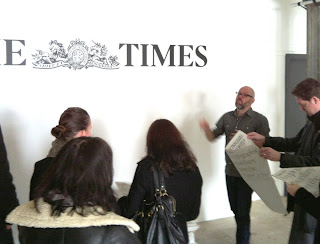
Luckily for me, the tour that I was on was conducted by Dan Rhatigan from Monotype (below) who was an excellent guide - very interesting and he made the exhibition come alive.
There was archive film about Linotype machines and many past issues of the Monotype Recorder - (although I can't recall reference to Beatrice Warde, surely the most well known editor, although I may have missed this) and they were all safely in glass cabinets.

It contained much about the design of particular typefaces - all interesting stuff but I just thought that as an "archive" show, it was a little lacking in the explanation and possibly demonstration about just how physical and industrial the world of type and print was, back in the 20th century - all a bit too smart and shiny for me! (...and possibly a bit more pixel than pencil).

Pretty good but not brilliant ( ...in my opinion!)

Pencil to Pixel is supported by: SEA Design | D&AD | The University of Reading | Eye Magazine | The Drum| Pureprint Group | That other paper company based in Hull!
 
Posted by Justin Hobson 27.11.2012

Friday, 23 November 2012

Futureproof

Jacobson Space is a fine art dealership specializing in modern and contemporary international art in all mediums. Futureproof is an exhibition showing a selection of the very best post-war art for collectors. Artists included in this show are Bram Bogart, Larry Bell, Anthony Caro, Helen Frankenthaler, Lucian Freud, Donald Judd, Louis le Broqcuy, Robert Motherwell, Bridget Riley, Pierre Soulages, Frank Stella, William Tillyer and Marc Vaux.

Reflecting the theme of technology and the fast-maturing space age of the time that these works reflect, the invitation for the private view is a panorama of the final frontier!
The A5 (148x210mm) invitations have been hot foil blocked in white matt foil on our Notturno 700gsm, giving a nice rigid feel.
Art direction and design is by Fraser Muggeridge Studio. Foil blocking is by Anglia Foil blocking.

The exhibition is on from 15th November - 21st December 2012.

www.jacobsonltd.com
www.pleasedonotbend.co.uk
www.angliafoilblocking.com
Posted by Justin Hobson 23.11.2012